There’s been a lot talk on SitePoint recently about dropdown menus, and not all of it entirely accurate. So I felt the need to chip-in and set the record straight on matters of best-practice, when it comes to JavaScript menus in all their forms.
First, let’s look at the key issues that impact on good usability:
- mouseover-driven menu should have timers that delay their opening and closing. Open-timers mean that casual mouse movement doesn’t trigger menus when they’re unwanted. Close-timers mean that if your mouse momentarily slips-off or moves outside a menu, it doesn’t close abrubtly. And a synchronised combination of the two means that you can move your mouse from one link to another without triggering other menus as you pass over intervening links
- menus should be able to reposition on-the-fly, so that if they approach or go over the edge of the window, they shift or invert position to avoid this
- menus must be navigable by keyboard actions alone. Being able to tab through the links and have child-menus open sequentially is acceptable; being able to navigate with the arrow keys is ideal
Now those three things together make the difference between a menu that is functionally useable, and a menu that is disastrously unuseable and a nightmare for users to deal with. All three of these things need scripting to implement, and that brings me onto the next crucial questions of implementation and fallback content:
- the top-level links of a menu should link to pages which provide access to all the same content, so that everything which was accessible from the menu is also accessible without it. The top-level links are the core content of a menu; the submenus are a progressive enhancement
- if scripting is not available, menus cannot be made decently useable, and therefore should not work at all — do not use pure-CSS menu triggers
Pure CSS menus are an interesting proof of concept, but that’s all they are. Eric Meyer’s invention of them led the way to our re-thinking how menus should be built in the first place (before then, menus were all built with endless reams of document.written tables and divs; Eric showed how a semantic structure could be converted into a menu), but in of themseleves they are not suitable for real-world production use.
We also need to consider exactly how the show/hide mechanism of a menu should be implemented, in order to ensure accessibility to browser-based screenreaders:
- menus should not be hidden with display, visibility, overflow or clip, as doing so also hides them from browser-based screenreaders. The correct approach is to use absolute positioning with a large negative left offset (so-called
offleft positioning
), which moves them off the screen and hence apparently invisible to sighted users, but does not remove them from the rendered output and therefore doesn’t affect assistive devices
Finally, there are details of the content of menus themselves, and the finer points of design that make for a better user experience:
- a dropdown menu is not a sitemap; it should not link to every page of a site
- a single menu shoud not contain more links than can fit above the fold and should not require the user to scroll
- the menu links, or preferably the entire menu structure, should scale with font size
- the rollover state of menu links should persist down the tree, so that a user can see at a glance the path through the structure to where they are now
Before I finish, I’ll make one more point about styles and types of menu. So-called mega menus
are not different from what we know as dropdown menus. They have different content and styling in the submenus, and that’s all. Jakob Neilson’s recent piece on the subject has muddied the water by implying that this type of menu is inherently more useable and accessible, but that simply isn’t true. To prove his point he’s comparing aspects of good mega menus with aspects of bad conventional dropdown menus, which is not a fair or scientific comparison, because he’s not comparing like with like. His arguments fall flat when you compare with a well implemented dropdown.
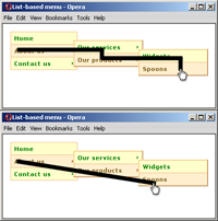
In this short post I hope I’ve clarified what it takes to make a menu, that is useable, accessible, and built with the principles of progressive enhancement in mind. And to illustrate, here are two demos that exemplify all of these points:
You can also download both examples
These menus, incidentally, are straight out of SitePoint’s JavaScript Anthology, and are fully documented in Chapters 15 and 16, which as you’d probably guess, I wrote!
James is a freelance web developer based in the UK, specialising in JavaScript application development and building accessible websites. With more than a decade's professional experience, he is a published author, a frequent blogger and speaker, and an outspoken advocate of standards-based development.


