
Data visualizations are a powerful way to represent complex information in a digestible and engaging manner. React, a popular JavaScript library for building user interfaces, can be integrated with D3.js to create stunning and interactive data visualizations.
This guide will walk through building data visualizations in React using D3.js. From understanding how D3.js works and how to integrate it with React to crafting an interactive world population dashboard, each section of this guide will provide comprehensive insights and practical examples.
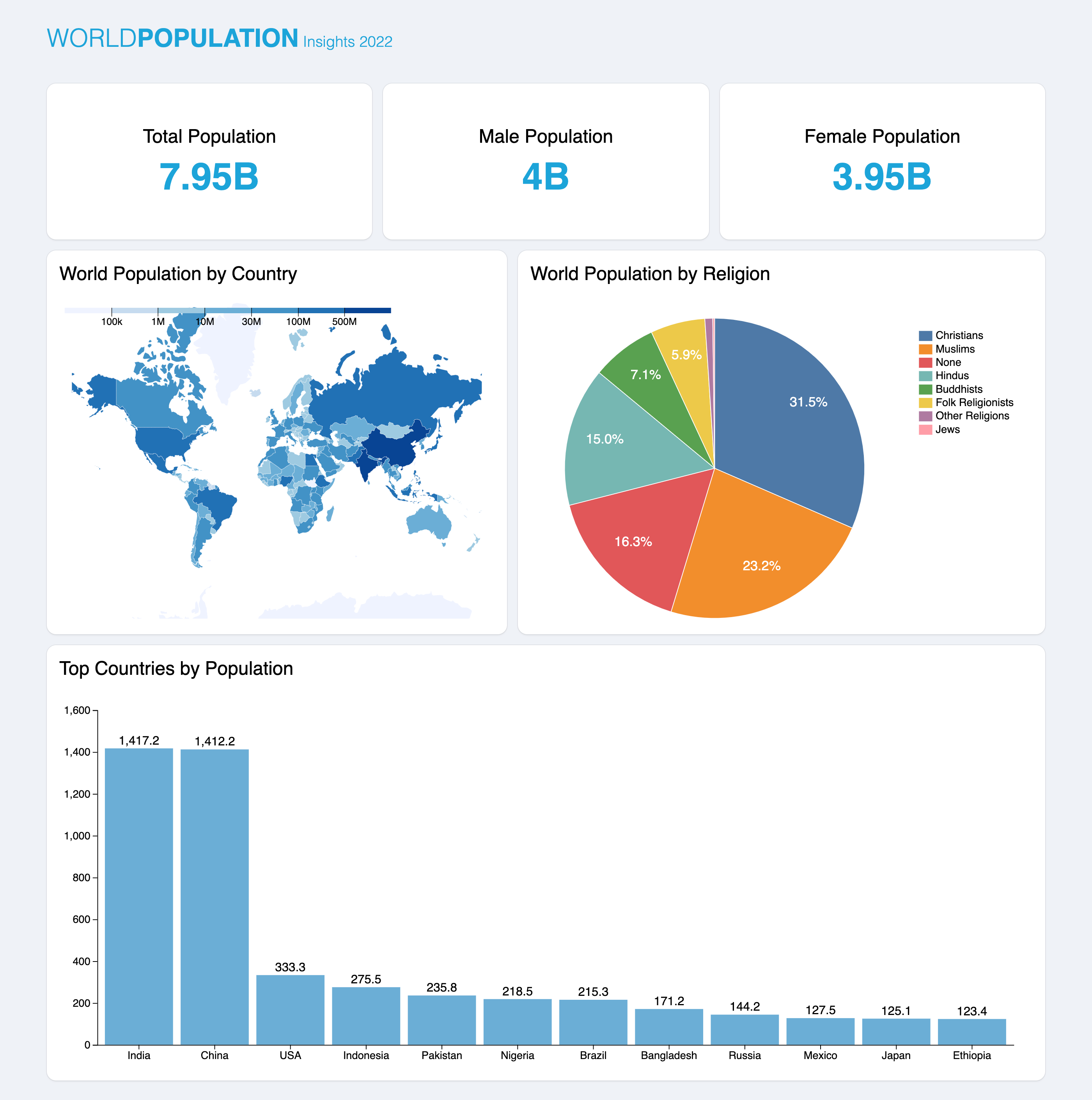
The image below shows a sneak peek at our final product.
You can check out the live demo and find the complete source code on GitHub.
Let’s get started!
Prerequisites
Before we delve into this guide, it’s essential to have a basic understanding of React. If you’re new to React, consider reviewing the official documentation and completing a few introductory tutorials. Familiarity with JavaScript and ES6 syntax will also be helpful.
Understanding D3.js and React Integration
D3.js, or Data-Driven Documents, is a JavaScript library that facilitates the creation of visualizations in the browser. Its core strength lies in binding data to the document object model (DOM) and applying data-driven transformations to the document. It also operates on standard web technologies like HTML, CSS, and SVG, making it an ideal companion for React applications.
Advantages of using D3.js with React
-
Rich set of features. D3.js provides comprehensive features for creating various visualizations, from simple bar charts to complex hierarchical visualizations. Its versatility makes it a go-to choice for data-driven applications.
-
Component reusability. React’s component-based structure allows for creating reusable visualization components. Once you’ve crafted a D3.js-powered component, you can easily integrate it into different parts of your application.
-
Efficient state management. React’s state management ensures that your visualizations update seamlessly in response to changes in the underlying data. This feature is particularly beneficial for real-time applications.
Installing D3.js and React
Getting started with D3.js in your React apps is a breeze. You can begin by creating a new React project using Vite:
# Using NPM
npm create vite@latest react-d3-demo -- --template react

# Using Yarn
yarn create vite react-d3-demo --template react
Once your project is set up, install D3.js using npm or Yarn:
# Using NPM
npm install d3

# Using Yarn
yarn add d3
Selecting and modifying elements in D3.js
Before delving into building visualizations, we must look at some fundamental concepts in D3. The first concept we’ll examine is selecting and modifying elements with D3.js. This process involves identifying elements in the DOM and modifying their properties.
Let’s look at an example below:
// /App.jsx
import { useEffect } from "react";
import * as d3 from "d3";
function App() {
useEffect(() => {
// Select a paragraph element and change its text content
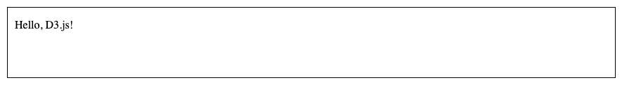
d3.select("p").text("Hello, D3.js!");
}, []);
return <p></p>;
}
export default App;
In the code above, we select the <p> element using D3’s select() method. This method selects the first element in the DOM that matches the specified selector.
After selecting the element, we modify it using the text() method that changes the text content of the selected paragraph to “Hello, D3.js!”.
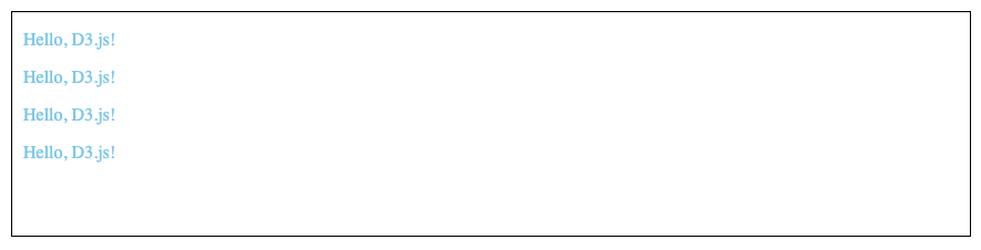
When dealing with visualizations where multiple elements represent different data points, selecting just one element might not be sufficient. This is where D3’s selectAll() method comes into play. Unlike select(), which picks the first matching element, selectAll() grabs all elements that match the specified selector:
// /App.jsx
import { useEffect } from "react";
import * as d3 from "d3";

function App() {
  useEffect(() => {
    d3.selectAll(".text").style("color", "skyblue").text("Hello, D3.js!");
  }, []);

  return (
    <div className="texts">
      <p className="text"></p>
      <p className="text"></p>
      <p className="text"></p>
      <p className="text"></p>
    </div>
  );
}

export default App;
Joining data in D3.js
D3.js employs a data join concept to synchronize data with DOM elements. Consider the following example:
// /App.jsx
import { useEffect } from "react";
import * as d3 from "d3";
function App() {
useEffect(() => {
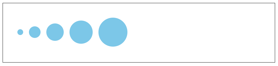
const data = [10, 20, 30, 40, 50];
// Select the svg element and set its width and height
const circles = d3
.select("svg")
.attr("width", "100%")
.attr("height", "100%");
// Join each data point with a circle element within the svg element
circles
.selectAll("circle")
.data(data)
.join("circle")
.attr("cx", (d, i) => i * d + (3 * d + 20))
.attr("cy", 100)
.attr("r", (d) => d)
.attr("fill", "skyblue");
}, []);
return <svg></svg>;
}
export default App;
In this code snippet above:
- The
selectAll()method is used to create a selection of existing circle elements in an SVG. - The
data()method binds the data array to this selection. - The
join()method is then used to handle the new data points by appending new circle elements for each data point. - We also modify each
circleattribute based on the data (d) using theattr()method.
Loading data in D3.js
D3.js provides various data-loading methods to accommodate different data formats. For instance, the d3.csv() method loads data from a comma-separated values (CSV) file. Similarly, there are methods like d3.tsv() for tab-separated values and d3.text() for plain text files. The versatility of these methods allows you to integrate different data sources into your visualizations seamlessly. You can refer to the D3 documentation to view all the file formats you can parse using D3.js.
Let’s look at a simple example using d3.json() to load JSON data into a table:
// /App.jsx
import { useEffect } from "react";
import * as d3 from "d3";

function App() {
  useEffect(() => {
    // Fetch JSON data using d3.json
    d3.json(
      "https://js.devexpress.com/React/Demos/WidgetsGallery/JSDemos/data/simpleJSON.json",
    ).then((data) => {
      // Select the table
      const table = d3.select("#salesTable");

      // Add table headers
      table
        .append("thead")
        .append("tr")
        .selectAll("th")
        .data(Object.keys(data[0])) // Assuming all objects have the same keys
        .join("th")
        .text((d) => d);

      // Add table rows with data
      table
        .append("tbody")
        .selectAll("tr")
        .data(data)
        .join("tr")
        .selectAll("td")
        .data((d) => Object.values(d))
        .join("td")
        .text((d) => d);
    });
  }, []);

  return <table id="salesTable"></table>;
}

export default App;
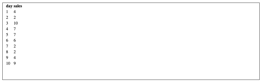
This example uses the d3.json() method to load data from a JSON file asynchronously. Once the data is loaded, we leverage it to create our table by applying the selection, modification, and data join methods we’ve explored earlier in this guide.
Let React take the lead in rendering
In our previous examples, we’ve been using D3 (join()) to add elements to the DOM on mount, but this isn’t the best approach. React is a rendering library optimized for web applications, and directly manipulating the DOM using D3 instead of JSX can work against these optimizations.
Another advantage of using React for rendering is its declarative nature. Unlike the imperative approach with D3, where you specify how to draw each element, React’s JSX allows you to describe what is being drawn. This paradigm shift simplifies code comprehension and maintenance, which makes the development process more intuitive and collaborative.
With these advantages in mind, let’s modify our previous code example to use React for rendering our elements:
// /App.jsx
import { useEffect, useState } from "react";
import * as d3 from "d3";

function App() {
  const [data, setData] = useState([]);
  const [loading, setLoading] = useState(true);

  useEffect(() => {
    const fetchData = async () => {
      setLoading(true);
      // Fetch JSON data using d3.json
      await d3
        .json(
          "https://js.devexpress.com/React/Demos/WidgetsGallery/JSDemos/data/simpleJSON.json",
        )
        .then((data) => {
          setData(data);
        });
      setLoading(false);
    };
    fetchData();
  }, []);

  if (loading) return <p>Loading...</p>;

  return (
    <table id="salesTable">
      <thead>
        <tr>
          {Object.keys(data[0]).map((d) => (
            <th key={d}>{d}</th>
          ))}
        </tr>
      </thead>
      <tbody>
        {data.map((d) => (
          <tr key={d.day}>
            <td>{d.day}</td>
            <td>{d.sales}</td>
          </tr>
        ))}
      </tbody>
    </table>
  );
}

export default App;
In the snippet above:
- We added a
loadinganddatastate to track the request’s status and save the data. - We use D3 to fetch the JSON data within a
useEffectand then use JSX to render the table, leading to much cleaner and more efficient code.
Creating Basic Data Visualizations
Creating a Bar Chart: Scales and Axes in D3
Now that we’ve established some groundwork for integrating D3.js with React, let’s dive into creating the first visualization for our dashboard — a classic bar chart. This visualization will also serve as a solid foundation to grasp critical concepts like scales and axes in D3.
First, let’s learn how to draw bars in a bar chart. Create a BarChart component in your components directory and add the following code:
// /components/BarChart.jsx
const barWidth = 60;

const BarChart = ({ width, height, data }) => {
  return (
    <div className="container">
      <svg className="viz" width={width} height={height} viewBox={`0 0 ${width} ${height}`}>
        <g className="bars">
          {data.map((d, i) => (
            <rect
              key={i}
              width={barWidth}
              height={d}
              x={i * (barWidth + 5)}
              y={height - d}
              fill="#6baed6"
            />
          ))}
        </g>
      </svg>
    </div>
  );
};

export default BarChart;
In this code:
- The
dataarray contains values representing the height of each bar in the chart. - The
heightandwidthprops represent the dimensions of thesvgcontainer while thebarWidthdefines the width of each bar in the chart. - Within the
<g>element, we map through thedataarray, create a<rect>element for each bar in the chart, and then appropriately set theirwidth,height, andviewBoxattributes. - We use
i * (barWidth + 5)for eachxcoordinate because we want the bars to have5pxspace between each other. - For the
ycoordinate, we useheight - dto make the bars go from bottom to top and look natural. - The
fill=" #6baed6"attribute sets the fill color of each bar to a shade of blue.
Note: we typically use <svg> elements for visualizations because they are scalable (you can scale them to any size without losing quality) and suitable for representing various shapes essential for creating diverse charts.
Next, let’s render our bar chart in the App component:
import BarChart from "./components/BarChart";

const data = [130, 200, 170, 140, 130, 250, 160];

function App() {
  return <BarChart width={450} height={300} data={data} />;
}

export default App;
And with that, we have some bars in our bar chart using dummy data.
Next, we need to learn about scales. Scales in D3.js are functions that help you map your data domain (the range of your data values) to a visual range (the size of your chart). They make your visualizations look precise by accurately portraying your data on the canvas.
For example, let’s take a look at the data we’ll be using in the bar chart for our dashboard:
const data = [
  { country: "India", population: 1_417_173_173 },
  { country: "China", population: 1_412_175_000 },
  { country: "United States", population: 333_287_557 },
  ...
];
The data above represents the twelve most populous countries in the world. Without using scales, you might find yourself dealing with the population data using pixel (px) values, which are impractical to handle manually.
Let’s explore how using scales simplifies this process. Navigate to the App component and add the following code:
// /App.jsx
import BarChart from "./components/BarChart";

const data = [
  { country: "India", population: 1_417_173_173 },
  { country: "China", population: 1_412_175_000 },
  { country: "United States", population: 333_287_557 },
  { country: "Indonesia", population: 275_501_339 },
  { country: "Pakistan", population: 235_824_862 },
  { country: "Nigeria", population: 218_541_212 },
  { country: "Brazil", population: 215_313_498 },
  { country: "Bangladesh", population: 171_186_372 },
  { country: "Russia", population: 144_236_933 },
  { country: "Mexico", population: 127_504_125 },
  { country: "Japan", population: 125_124_989 },
  { country: "Ethiopia", population: 123_379_924 },
];

function App() {
  return <BarChart width={700} height={500} data={data} />;
}

export default App;
In the snippet above, we’ve updated the data array to our population data and increased the width and height of the bar chart to account for the increased data points.
Next, let’s update our BarChart component to have scales:
// /components/BarChart.jsx
import * as d3 from "d3";

const BarChart = ({ width, height, data }) => {
  // Create the horizontal scale.
  const xScale = d3
    .scaleBand()
    .domain(data.map((d) => d.country))
    .range([0, width])
    .padding(0.1);

  // Create the vertical scale.
  const yScale = d3
    .scaleLinear()
    .domain([0, d3.max(data, (d) => d.population)])
    .nice()
    .range([height, 0]);

  return (
    <div className="container">
      <svg width={width} height={height} className="viz" viewBox={`0 0 ${width} ${height}`}>
        <g className="bars">
          {data.map((d) => (
            <rect
              key={d.country}
              x={xScale(d.country)}
              y={yScale(d.population)}
              height={height - yScale(d.population)}
              width={xScale.bandwidth()}
              fill="#6baed6"
            />
          ))}
        </g>
      </svg>
    </div>
  );
};

export default BarChart;
Let’s explain what’s new here:
-
xScale:- This uses D3’s
scaleBand()for a band scale on the horizontal axis. - The
domainis set to the unique country names in the data for each band. - The
rangeis from0to the total width of the<svg>container. - The
paddingintroduces space between the bands.
- This uses D3’s
-
yScale:- This uses D3’s
scaleLinear()for a linear scale on the vertical axis. - The
domainis set from0to the maximum population value in the data. - The
nice()method adjusts the scale to include nice, round values. - The
rangeis from the total height of the<svg>container to0(reversed to match<svg>coordinates).
- This uses D3’s
-
We set the
xandycoordinates of each<rect>created according to their respective scales (x={xScale(d.country)}andy={yScale(d.population)}). -
We set the width of each
<rect>usingxScale.bandwidth()so D3 sizes them relative to the width of our<svg>. -
Lastly, we set the height of each
<rect>to the<svg>height and then subtract the height generated by theyScale(d.population), making sure each<rect>is represented correctly.
While our scaled bar chart can now accurately represent data, it’s missing some context. A user viewing this wouldn’t know what each bar represents or what value the height translates to. This is where axes come into play. Axes in D3 provide reference points and labels, aiding viewers in understanding the scale of the visualization.
For our bar chart, we want two axes:
- One at the bottom of our chart that marks the name of each country on its respective bar.
- One at the left side of our chart provides reference points for the population in millions.
To add these axes properly, we also need to add margins to our <svg> container to account for the axes. Let’s update our BarChart component to implement these additions:
// /components/BarChart.jsx
import { useEffect } from "react";
import * as d3 from "d3";

const marginTop = 30;
const marginBottom = 70;
const marginLeft = 50;
const marginRight = 25;
const oneMillion = 1_000_000;

const BarChart = ({ width, height, data }) => {
  const chartBottomY = height - marginBottom;

  // Create the horizontal scale and its axis generator.
  const xScale = d3
    .scaleBand()
    .domain(data.map((d) => d.country))
    .range([marginLeft, width - marginRight])
    .padding(0.1);

  const xAxis = d3.axisBottom(xScale).tickSizeOuter(0);

  // Create the vertical scale and its axis generator.
  const yScale = d3
    .scaleLinear()
    .domain([0, d3.max(data, (d) => d.population / oneMillion)])
    .nice()
    .range([chartBottomY, marginTop]);

  const yAxis = d3.axisLeft(yScale);

  useEffect(() => {
    d3.select(".x-axis")
      .call(xAxis)
      .selectAll("text")
      .attr("font-size", "14px")
      // Rotate the labels to make them easier to read.
      .attr("transform", "rotate(-45)")
      .attr("text-anchor", "end");
    d3.select(".y-axis")
      .call(yAxis)
      .selectAll("text")
      .attr("font-size", "14px");
  }, [xAxis, yAxis]);

  return (
    <div className="container">
      <svg
        width={width}
        height={height}
        viewBox={`0 0 ${width} ${height}`}
        className="viz"
      >
        <g className="bars">
          {data.map((d) => (
            <rect
              key={d.country}
              x={xScale(d.country)}
              y={yScale(d.population / oneMillion)}
              height={chartBottomY - yScale(d.population / oneMillion)}
              width={xScale.bandwidth()}
              fill="#6baed6"
            />
          ))}
        </g>
        <g className="x-axis" transform={`translate(0,${chartBottomY})`}></g>
        <g className="y-axis" transform={`translate(${marginLeft},0)`}></g>
      </svg>
    </div>
  );
};

export default BarChart;
Let’s break this down bit by bit:
-
Component constants:
marginTop,marginBottom,marginLeft, andmarginRightare the constants that define the margins around the SVG chart area.oneMillionis a scaling factor used to normalize population values for better representation on the y-axis of the bar chart. For example, if a country has a population of 3,000,000, the scaled-down value will be 3. This scaling makes the axis labels and tick marks more manageable for the viewer.chartBottomYis calculated asheight - marginBottom, representing the y-coordinate of the bottom edge of the chart area.
-
Horizontal (X) scale and axis:
xScale.range()adjusts for the left and right margins.xAxisis an axis generator for the x-axis, configured to usexScale.tickSizeOuter(0)removes the tick mark at the outer edge of the x-axis.
-
Vertical (Y) scale and axis:
yScale.range()adjusts for the top and bottom margins.yAxisis an axis generator for the y-axis, configured to useyScale.
-
useEffectfor axis rendering:- The
useEffecthook renders the x-axis and y-axis when the component mounts or when thexAxisoryAxisconfigurations change. - The
selectAll("text")part selects all text elements within the axis for further styling.
- The
-
SVG groups for axes:
- Two
<g>(group) elements with class names"x-axis"and"y-axis"are appended to the SVG. We use these groups to render the x-axis and y-axis, respectively. - We use the
transformattribute to position the groups based on the margins.
- Two
With these margin calculations and axis setups in place, our bar chart is much more organized and readable.
To make our bar chart even more readable, let’s add labels to each bar in our chart to represent their exact population:
...
<g className="bars">
    ...
</g>
<g className="labels">
  {data.map((d) => (
      <text
          key={d.country}
          x={xScale(d.country) + xScale.bandwidth() / 2}
          y={yScale(d.population / oneMillion) - 5}
          textAnchor="middle"
          fontSize={14}
        >
          {Number((d.population / oneMillion).toFixed(1)).toLocaleString()}
      </text>
  ))}
</g>
<g
  className="x-axis"
  ...
></g>
...
And there you have it! With the scales, axes, and labels, our bar chart now accurately represents the data and provides valuable context.
Creating a pie chart
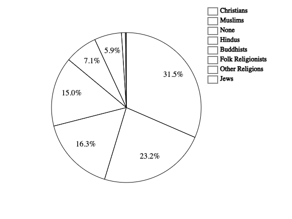
The next component we’ll build for our dashboard is a pie chart. In D3.js, creating a pie chart involves using the pie() method to generate angles for the data and the arc() method to define the shape of each slice. We’ll also append a legend to the right side of the pie chart to link each arc’s color with a label.
The pie chart will be visualizing the world population by religion using this data:
const pieChartData = [
  { name: "Christians", value: 2_173_180_000 },
  { name: "Muslims", value: 1_598_510_000 },
  ...
];
In the components directory, create a PieChart component and add the following code:
// /components/PieChart.jsx
import * as d3 from "d3";

const offsetX = 70;

const PieChart = ({ width, height, data }) => {
  // Calculate the total value
  const totalValue = data.reduce((sum, religion) => sum + religion.value, 0);

  // Calculate the percentage for each religion and format the result
  let percentageData = {};
  data.forEach((religion) => {
    percentageData[religion.name] = (
      (religion.value / totalValue) *
      100
    ).toFixed(1);
  });

  // Create the color scale
  const color = d3
    .scaleOrdinal(d3.schemeTableau10)
    .domain(data.map((d) => d.name));

  // Create the pie layout and arc generator.
  const pie = d3
    .pie()
    .value((d) => d.value);

  const outerRadius = Math.min(width - 2, height - 2) / 2 - offsetX;

  const arc = d3.arc().innerRadius(0).outerRadius(outerRadius);

  // A separate arc generator for labels.
  const labelRadius = arc.outerRadius()() * 0.75;
  const arcLabel = d3.arc().innerRadius(labelRadius).outerRadius(labelRadius);

  const arcs = pie(data);

  return (
    <div className="container">
      <svg
        width={width}
        height={height}
        viewBox={`${-width / 2 + offsetX} ${-height / 2} ${width} ${height}`}
        className="viz"
      >
        {arcs.map((d, i) => (
          <g key={d.data.name} stroke="white">
            <path d={arc(d)} fill={color(data[i].name)} />
            <text
              x={arcLabel.centroid(d)[0]}
              y={arcLabel.centroid(d)[1]}
              textAnchor="middle"
              stroke="none"
              fontSize={16}
              strokeWidth={0}
              fill="white"
            >
              {percentageData[d.data.name] > 5
                ? `${percentageData[d.data.name]}%`
                : ""}
            </text>
          </g>
        ))}

        {/* Legend */}
        <g>
          {data.map((d, i) => {
            const x = outerRadius + 14;
            const y = -height / 2 + i * 20 + 20;

            return (
              <g key={d.name}>
                <rect x={x} y={y} width={20} height={15} fill={color(d.name)} />
                <text
                  x={x}
                  y={y}
                  dx={25}
                  fontSize={14}
                  alignmentBaseline="hanging"
                >
                  {d.name}
                </text>
              </g>
            );
          })}
        </g>
      </svg>
    </div>
  );
};

export default PieChart;
Let’s analyze the code:
-
Total value calculation:
- The
totalValueis calculated by summing up each data point’svalueproperty.
- The
-
Percentage data calculation:
- The percentage contribution to the total value is calculated and formatted for each data point. We then store the results in the
percentageDataobject.
- The percentage contribution to the total value is calculated and formatted for each data point. We then store the results in the
-
Color scale creation:
- The color scale (
color) is created usingd3.scaleOrdinalwith the Tableau 10 color scheme, mapping each religion’s name to a color.
- The color scale (
-
Pie layout and arc generator setup:
- The
pielayout is created usingd3.pie().value((d) => d.value). Thevalue((d) => d.value)snippet determines how the pie will extract the data values for each slice. - An outer radius (
outerRadius) is calculated based on the minimum value between the width and height, and then an offset (offsetX) is added to the result. - An arc generator (
arc) is created with an inner radius of 0 and the calculated outer radius. - A separate arc generator (
arcLabel) is created for displaying labels. It has a specific inner and outer radius.
- The
-
Pie data generation:
- The pie layout is applied to the data (
pie(data)), generating an array of arcs.
- The pie layout is applied to the data (
-
SVG rendering:
- The
<svg>container has specifiedwidth,height, andviewBoxattributes. TheviewBoxis adjusted to include an offset (offsetX) for better centering. - For each arc in the
arcsarray, a<path>element is created, representing a pie slice. We set thefillattribute using the color scale. - Text labels are added to each pie slice. The percentage value is displayed if the percentage is greater than 5%.
- The
-
Legend rendering:
- A legend entry is created for each data point with a colored rectangle and the religion name. We position the legend to the right of the pie chart.
Next, let’s add our data and pie chart to the App.jsx file:
// /App.jsx
import PieChart from "./components/PieChart";

const pieChartData = [
  { name: "Christians", value: 2_173_180_000 },
  { name: "Muslims", value: 1_598_510_000 },
  { name: "None", value: 1_126_500_000 },
  { name: "Hindus", value: 1_033_080_000 },
  { name: "Buddhists", value: 487_540_000 },
  { name: "Folk Religionists", value: 405_120_000 },
  { name: "Other Religions", value: 58_110_000 },
  { name: "Jews", value: 13_850_000 },
];

function App() {
  return <PieChart width={750} height={450} data={pieChartData} />;
}

export default App;
And here’s our preview:
Creating a map
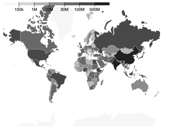
The last component we’ll create for our dashboard is a choropleth map, which we’ll use to visualize the world population by country. This choropleth map will visually represent the population distribution, coloring each region according to a numeric variable.
To construct a choropleth map, we first need the 2D coordinates outlining the boundaries of each region — in our case, the countries. This information is typically stored in a GeoJSON format. GeoJSON is a standard file format used in geographic information systems, representing geographical features and their attributes:
// Example GeoJSON structure
{
  "type": "FeatureCollection",
  "features": [
    {
      "type": "Feature",
      "id": "AFG",
      "properties": { "name": "Afghanistan" },
      "geometry": {
        "type": "Polygon",
        "coordinates": [/* ... */]
      }
    },
    // More features...
  ]
}
We’ll also need the population data that provides a population value for each country in the GeoJSON file. Let’s fetch these resources in our App component:
// /App.jsx
import { useEffect, useState } from "react";
import * as d3 from "d3";

const pieChartData = [
  ...
];

function App() {
  const [worldPopulation, setWorldPopulation] = useState(null);
  const [topography, setTopography] = useState(null);
  const [loading, setLoading] = useState(true);

  useEffect(() => {
    const getData = async () => {
      setLoading(true);

      let populationData = {};
      await Promise.all([
        d3.json(
          "https://res.cloudinary.com/tropicolx/raw/upload/v1/Building%20Interactive%20Data%20Visualizations%20with%20D3.js%20and%20React/world.geojson"
        ),
        d3.csv(
          "https://res.cloudinary.com/tropicolx/raw/upload/v1/Building%20Interactive%20Data%20Visualizations%20with%20D3.js%20and%20React/world_population.csv",
          (d) => {
            populationData = {
              ...populationData,
              [d.code]: +d.population,
            };
          }
        ),
      ]).then((fetchedData) => {
        const topographyData = fetchedData[0];
        setWorldPopulation(populationData);
        setTopography(topographyData);
      });

      setLoading(false);
    };

    getData();
  }, []);

  if (loading) return <div>Loading...</div>;

  return (
    <WorldMap width={550} height={450} data={{ worldPopulation, topography }} />
  );
}

export default App;
In our updated App component:
- The
useEffecthook is employed to fetch data from two different sources: a GeoJSON file and a CSV file. - The GeoJSON data represents the world topography, while the CSV data contains population information by country code.
- The fetched data is stored in state variables (
worldPopulationandtopography), which we pass into theWorldMapcomponent as a prop.
Next, let’s create a Legend component for our map to render a color scale legend based on the provided color scale:
// /components/Legend.jsx
import { useEffect, useRef } from "react";
import * as d3 from "d3";

const Legend = ({
  color,
  tickSize = 6,
  width = 320,
  height = 44 + tickSize,
  marginTop = 18,
  marginRight = 0,
  marginBottom = 16 + tickSize,
  marginLeft = 0,
  ticks = width / 64,
  tickFormat,
  tickValues,
} = {}) => {
  const svgRef = useRef(null);

  // Threshold
  const thresholds = color.thresholds
    ? color.thresholds() // scaleQuantize
    : color.quantiles
      ? color.quantiles() // scaleQuantile
      : color.domain(); // scaleThreshold

  const thresholdFormat =
    tickFormat === undefined
      ? (d) => d
      : typeof tickFormat === "string"
        ? d3.format(tickFormat)
        : tickFormat;

  const x = d3
    .scaleLinear()
    .domain([-1, color.range().length - 1])
    .rangeRound([marginLeft, width - marginRight]);

  tickValues = d3.range(thresholds.length);
  tickFormat = (i) => thresholdFormat(thresholds[i], i);

  useEffect(() => {
    let tickAdjust = (g) =>
      g.selectAll(".tick line").attr("y1", marginTop + marginBottom - height);

    d3.select(".ticks")
      .call(
        d3
          .axisBottom(x)
          .ticks(ticks, typeof tickFormat === "string" ? tickFormat : undefined)
          .tickFormat(typeof tickFormat === "function" ? tickFormat : undefined)
          .tickSize(tickSize)
          .tickValues(tickValues),
      )
      .call(tickAdjust)
      .call((g) => g.select(".domain").remove())
      .call((g) => g.selectAll("text").attr("font-size", "14px"));
  }, []);

  return (
    <svg ref={svgRef} width={width} height={height}>
      <g>
        {color.range().map((d, i) => (
          <rect
            key={d}
            x={x(i - 1)}
            y={marginTop}
            width={x(i) - x(i - 1)}
            height={height - marginTop - marginBottom}
            fill={d}
          />
        ))}
      </g>
      <g
        className="ticks"
        transform={`translate(0, ${height - marginBottom})`}
      ></g>
    </svg>
  );
};

export default Legend;
A lot is going on here, but let’s simplify it by breaking down the essential components:
- The
thresholdsvariable extracts threshold values from the color scale. - We position the tick marks on the legend using the
xlinear scale. - The
useEffecthook sets up the axis usingd3.axisBottom(x)and adjusts tick positions. It also removes the domain line and sets the font size for better visibility. - Colored rectangles are rendered based on the color scale’s range, representing different colors in the legend.
- The returned JSX renders an SVG element containing colored rectangles and an axis for reference.
Now that we’ve set up our map’s data and legend, let’s delve into our WorldMap component:
// /components/WorldMap.jsx
import * as d3 from "d3";

import Legend from "./Legend";

const WorldMap = ({ width, height, data }) => {
  const worldPopulation = data.worldPopulation;
  const topography = data.topography;

  // Map and projection
  const path = d3.geoPath();
  const projection = d3
    .geoMercator()
    .scale(85)
    .center([0, 30])
    .translate([width / 2, height / 2]);

  const pathGenerator = path.projection(projection);

  // Color scale
  const colorScale = d3
    .scaleThreshold()
    .domain([100000, 1000000, 10000000, 30000000, 100000000, 500000000])
    .range(d3.schemeBlues[7]);

  return (
    <div className="container">
      <svg
        className="viz"
        width={width}
        height={height}
        viewBox={`0 0 ${width} ${height}`}
      >
        <g className="topography">
          {topography.features.map((d) => (
            <path
              key={d.id}
              d={pathGenerator(d)}
              fill={colorScale(worldPopulation[d.id] || 0)}
              stroke="#FFFFFF"
              strokeWidth={0.3}
            />
          ))}
        </g>

        {/* Legend */}
        <g className="legend" transform="translate(10,10)">
          <Legend
            color={colorScale}
            width={height / 1.25}
            tickFormat={d3.format("~s")}
          />
        </g>
      </svg>
    </div>
  );
};

export default WorldMap;
Let’s break down each section of the code:
-
Projection and path generator:
- We define a
projectionusingd3.geoMercator()to transform 3D GeoJSON coordinates into a 2D space. - We use
scale()method on the projection to determine the zoom level of the map. - We use the
center()method to set the center of the map in geographical coordinates. - The
translate()method shifts the projection’s center to a specific point on the SVG canvas. We use[width / 2, height / 2]as the coordinates to place the center of the map at the center of the SVG canvas - The
pathGeneratorutilizes this projection to generate paths for each region.
- We define a
-
Color scale:
- A
colorScaleis created usingd3.scaleThreshold()to map the population values to colors. It’s a sequential color scheme from light to dark blue (d3.schemeBlues[7]) in this case.
- A
-
Rendering topography features:
- We map through GeoJSON features, generating a
<path>element for each country. The color scale determines thefillattribute based on the corresponding world population data.
- We map through GeoJSON features, generating a
-
Legend component:
- We include the legend component to provide a visual guide to interpret the color scale.
The demo below shows the output.
Enhancing Interactivity
We’ve built out all the visualizations for our dashboard, but they still lack something important: interactivity. Adding interactive elements to your visualizations allows users to explore the data dynamically, making it easier to gain insights by interacting directly with the visualization. Let’s explore how to implement interactive features like tooltips, zooming, and panning using D3.js.
Implementing tooltips
Tooltips are a simple yet effective way to provide additional information when users hover over data points. Let’s start by enhancing our pie chart with tooltips:
// /components/PieChart.jsx
import { useState } from "react";
...

const PieChart = ({ width, height, data }) => {
  const [tooltipVisible, setTooltipVisible] = useState(false);
  const [tooltipData, setTooltipData] = useState({
    ...data[0],
    x: 0,
    y: 0,
  });

  ...

  return (
    <div className="container">
      <svg
        ...
      >
        {arcs.map((d, i) => (
          <g
            ...
            onMouseOver={() => setTooltipVisible(true)}
            onMouseLeave={() => setTooltipVisible(false)}
            onMouseMove={() => {
              setTooltipData({
                ...data[i],
                x: arcLabel.centroid(d)[0],
                y: arcLabel.centroid(d)[1],
              });
            }}
          >
            ...
          </g>
        ))}

        {/* Legend */}
        <g>
          ...
        </g>

        {/* Tooltip */}
        <g
          onMouseEnter={() => setTooltipVisible(true)}
          onMouseLeave={() => setTooltipVisible(false)}
          className={`tooltip ${tooltipVisible ? "visible" : ""}`}
        >
          <rect
            width={200}
            height={60}
            x={tooltipData.x - 10}
            y={tooltipData.y + 10}
            stroke="#cccccc"
            strokeWidth="1"
            fill="#ffffff"
          ></rect>
          <g>
            <text
              textAnchor="start"
              x={tooltipData.x}
              y={tooltipData.y + 35}
              fontSize={16}
            >
              {tooltipData.name}
            </text>
          </g>
          <g>
            <text
              textAnchor="start"
              x={tooltipData.x}
              y={tooltipData.y + 55}
              fontSize={16}
              fontWeight="bold"
            >
              {tooltipData.value.toLocaleString()}
              {` (${percentageData[tooltipData.name]}%)`}
            </text>
          </g>
        </g>
      </svg>
    </div>
  );
};

export default PieChart;
Let’s explain what’s going on here:
-
State for tooltip visibility and data:
- Two pieces of state are introduced using the
useStatehook:tooltipVisibleto track whether the tooltip is visible, andtooltipDatato store the data for the tooltip.
- Two pieces of state are introduced using the
-
Mouse events in pie slices:
- For each pie slice (
<g>element representing a slice), we add theonMouseOver,onMouseLeave, andonMouseMoveevent handlers. onMouseOverandonMouseLeavesetstooltipVisibleto true and false, respectively.onMouseMoveupdates thetooltipDatawith the corresponding data and the centroid coordinates for the tooltip position.
- For each pie slice (
-
Tooltip rendering:
- A separate
<g>element is added to the SVG to represent the tooltip. - The
onMouseEnterandonMouseLeaveevent handlers are also attached to this tooltip group to control its visibility. - The CSS class
visibleis conditionally applied to the tooltip group based on thetooltipVisiblestate to control the tooltip’s visibility. - Within the tooltip group, we add a
<rect>element to create a background for the tooltip, and we use two<text>elements to display the religion’s name and value.
- A separate
-
Tooltip positioning:
- The
xandyattributes of the<rect>element are set based on thetooltipData.xandtooltipData.yvalues. This method ensures that the tooltip’s position is at the centroid of the corresponding pie slice. - The text elements inside the tooltip are positioned relative to the
tooltipData.xandtooltipData.yvalues.
- The
-
Conditional display of tooltip content:
- The tooltip’s content is dynamically set based on the
tooltipData, displaying the religion name, value (formatted withtoLocaleString()), and the percentage.
- The tooltip’s content is dynamically set based on the
-
CSS styling for tooltip visibility:
- The CSS class
visibleis conditionally applied to the tooltip group based on thetooltipVisiblestate. This class controls the visibility of the tooltip.
- The CSS class
Next, let’s head to the index.css file and add the following CSS code:
/* /index.css */
* {
  margin: 0;
  padding: 0;
  font-family: "Roboto", sans-serif;
  box-sizing: border-box;
}

.container {
  position: relative;
  overflow: hidden;
}

.tooltip {
  display: none;
  background: white;
  border: solid;
  border-width: 2px;
  border-radius: 5px;
  padding: 5px;
  position: absolute;
}

.tooltip.visible {
  display: block;
}
In the snippet above, we’ve defined the container properties for the chart and styled the tooltip that appears when interacting with the pie chart. Additionally, we’ve added the visible class to dynamically control the visibility of the tooltip based on its state.
The demo below shows the output.
With all this in place, when users hover over each slice in the chart, they’ll receive instant insights into the corresponding data points.
Our WorldMap visualization also needs tooltips to show more details about each country when interacting with it. Let’s head over to the WorldMap component and add the following code:
import { useRef, useState } from "react";
import * as d3 from "d3";

import Legend from "./Legend";

const WorldMap = ({ width, height, data }) => {
    ...

    const chartRef = useRef(null);
    const [tooltipVisible, setTooltipVisible] = useState(false);
    const [tooltipData, setTooltipData] = useState({
        name: "",
        population: "",
        x: 0,
        y: 0,
    });

    ...

    return (
        <div className="container">
            <svg
                ref={chartRef}
                ...
            >
                <g className="topography">
                    {topography.features.map((d) => (
                        <path
                            ...
                            onMouseEnter={() => {
                                setTooltipVisible(true);
                            }}
                            onMouseLeave={() => {
                                setTooltipVisible(false);
                            }}
                            onMouseMove={(event) => {
                                const population = (
                                    worldPopulation[d.id] || "N/A"
                                ).toLocaleString();

                                // get x and y position relative to the chart
                                const [x, y] = d3.pointer(
                                    event,
                                    chartRef.current
                                );

                                setTooltipData({
                                    name: d.properties.name,
                                    population,
                                    left: x - 30,
                                    top: y - 80,
                                });
                            }}
                        />
                    ))}
                </g>

                {/* Legend */}
                <g className="legend" transform="translate(10,10)">
                    ...
                </g>
            </svg>

            {/* Tooltip */}
            {tooltipData && (
                <div
                    className={`tooltip ${tooltipVisible ? "visible" : ""}`}
                    style={{
                        left: tooltipData.left,
                        top: tooltipData.top,
                    }}
                >
                    {tooltipData.name}
                    <br />
                    {tooltipData.population}
                </div>
            )}
        </div>
    );
};

export default WorldMap;
This implementation is very similar to our previous example, but with a few distinctions:
- We use
d3.pointer()to position the tooltip based on the current mouse or touch event coordinates relative to the<svg>element. - We use a
<div>element outside the<svg>for the tooltip instead of a<g>element within the<svg>.
Implementing zooming and panning
Zooming and panning add a layer of sophistication to our visualizations, enabling users to easily explore large datasets. Let’s enhance our map with zooming and panning capabilities:
// /components/WorldMap.jsx
import { useEffect, useRef, useState } from "react";
...

const WorldMap = ({ width, height, data }) => {
    ...

    const zoom = d3
        .zoom()
        .scaleExtent([1, 8])
        .on("zoom", (event) => {
            const { transform } = event;
            setMapStyle({
                transform: `translate(${transform.x}px, ${transform.y}px) scale(${transform.k})`,
                strokeWidth: 1 / transform.k,
            });
        });

    function reset() {
        const svg = d3.select(chartRef.current);
        svg.transition()
            .duration(750)
            .call(
                zoom.transform,
                d3.zoomIdentity,
                d3.zoomTransform(svg.node()).invert([width / 2, height / 2])
            );
    }

    useEffect(() => {
        const svg = d3.select(chartRef.current);
        svg.call(zoom);
    }, [zoom]);

    return (
        <div className="container">
            <svg
                ...
                onClick={() => reset()}
            >
                ...
            </svg>

            ...
        </div>
    );
};

export default WorldMap;
Let’s break down what’s going on here:
-
Setting up the zoom behavior:
- The
d3.zoom()function creates a zoom behavior that we can apply to our<svg>element. .scaleExtent([1, 8])sets the allowable scale range for zooming. We can zoom in on the map up to 8 times and zoom out to a scale of 1..on("zoom", (event) => {...})attaches a zoom event listener. The callback function will execute whenever a zoom event occurs.- The callback function extracts the transformation details (
transform) from the zoom event, which we use to adjust the map style dynamically based on the zoom transformation. transform.xandtransform.ycontrol the translation (panning) of the map whiletransform.kcontrols the scaling of the map.strokeWidth: 1 / transform.kensures that the stroke width is inversely proportional to the scale, preventing strokes from becoming too thick on zooming in.
- The
-
Reset function:
- This function resets the zoom level and translation to the initial state.
- The
d3.zoomIdentityrepresents the initial zoom state (no zoom or translation). invert([width / 2, height / 2])inverts the transformation to ensure that the reset occurs around the center of the SVG canvas.
-
Applying zoom to SVG:
- We add a
useEffectthat attaches the zoom behavior to the<svg>element when the component mounts. - The
onClickevent on the<svg>triggers theresetfunction, allowing the user to reset the zoom level and translation with a click.
- We add a
With these additions, the WorldMap component now incorporates zooming and panning capabilities. Users can interactively explore the choropleth map by zooming in and out and resetting the view. This feature enhances the user experience and provides a more detailed examination of the global population distribution.
Real-world Example: World Population Dashboard
Building the dashboard
Building on our foundation of interactive visualizations, let’s take the next step and create our full dashboard. Firstly, let’s put all the pieces together in our App component:
import { useEffect, useState } from "react";
import * as d3 from "d3";

import BarChart from "./components/BarChart";
import PieChart from "./components/PieChart";
import WorldMap from "./components/WorldMap";

const pieChartData = [
    { name: "Christians", value: 2_173_180_000 },
    { name: "Muslims", value: 1_598_510_000 },
    { name: "None", value: 1_126_500_000 },
    { name: "Hindus", value: 1_033_080_000 },
    { name: "Buddhists", value: 487_540_000 },
    { name: "Folk Religionists", value: 405_120_000 },
    { name: "Other Religions", value: 58_110_000 },
    { name: "Jews", value: 13_850_000 },
];

function App() {
    ...
    const [barChartData, setBarChartData] = useState([]);
    const [loading, setLoading] = useState(true);

    useEffect(() => {
        const getData = async () => {
            ...
            await Promise.all([
                ...
            ]).then((fetchedData) => {
                const topographyData = fetchedData[0];
                const barChartData = topographyData.features
                    .map((d) => ({
                        country: d.properties.name,
                        population: populationData[d.id] || 0,
                    }))
                    .sort((a, b) => b.population - a.population)
                    .slice(0, 12);
                setBarChartData(barChartData);
                ...
            });
            ...
        };

        getData();
    }, []);

    if (loading) return <div>Loading...</div>;

    return (
        <div className="dashboard">
            <div className="wrapper">
                <h1>
                    <span className="thin">World</span>
                    <span className="bold">Population</span> Insights 2022
                </h1>
                <main className="main">
                    <div className="grid">
                        <div className="card stat-card">
                            <h2>Total Population</h2>
                            <span className="stat">7.95B</span>
                        </div>
                        <div className="card stat-card">
                            <h2>Male Population</h2>
                            <span className="stat">4B</span>
                        </div>
                        <div className="card stat-card">
                            <h2>Female Population</h2>
                            <span className="stat">3.95B</span>
                        </div>
                        <div className="card map-container">
                            <h2>World Population by Country</h2>
                            <WorldMap
                                width={550}
                                height={450}
                                data={{ worldPopulation, topography }}
                            />
                        </div>
                        <div className="card pie-chart-container">
                            <h2>World Population by Religion</h2>
                            <PieChart
                                width={650}
                                height={450}
                                data={pieChartData}
                            />
                        </div>
                        <div className="card bar-chart-container">
                            <h2>Top Countries by Population (in millions)</h2>
                            <BarChart
                                width={1248}
                                height={500}
                                data={barChartData}
                            />
                        </div>
                    </div>
                </main>
            </div>
        </div>
    );
}

export default App;
In our updated App component:
- We use the population data derived for our
WorldMapto generate ourBarChartdata. - The main structure of the dashboard is defined within the
returnstatement. - We added cards displaying the total population, and the male and female populations.
- Containers for the world map, pie chart, and bar chart are set up with corresponding titles.
- Each visualization component (
WorldMap,PieChart,BarChart) receives the required data and dimensions.
Next, let’s style our dashboard. In the index.css file add the following code:
/* /index.css */
...

body {
  background-color: #eff2f7;
}

h1 {
  padding-top: 30px;
  padding-bottom: 40px;
  font-size: 1.2rem;
  font-weight: 200;
  text-transform: capitalize;
  color: #1ca4d9;
}

.thin,
.bold {
  font-size: 2rem;
  text-transform: uppercase;
}

h1 .bold {
  font-weight: 700;
}

h2 {
  font-size: 1.5rem;
  font-weight: 500;
}

.viz {
  width: 100%;
  height: auto;
}

.dashboard {
  padding-left: 1rem;
  padding-right: 1rem;
}

.wrapper {
  margin: 0 auto;
}

.main {
  padding-bottom: 10rem;
}

.grid {
  display: grid;
  gap: 14px;
}

.map-container,
.pie-chart-container,
.bar-chart-container,
.card {
  display: flex;
  flex-direction: column;
  justify-content: space-between;
  gap: 10px;
  padding: 1rem;
  border-radius: 0.75rem;
  --tw-shadow: 0px 0px 0px 1px rgba(9, 9, 11, 0.07),
    0px 2px 2px 0px rgba(9, 9, 11, 0.05);
  --tw-shadow-colored: 0px 0px 0px 1px var(--tw-shadow-color),
    0px 2px 2px 0px var(--tw-shadow-color);
  box-shadow:
    0 0 #0000,
    0 0 #0000,
    var(--tw-shadow);
  background: white;
}

.stat-card {
  align-items: center;
  justify-content: center;
  height: 200px;
}

.card .stat {
  font-size: 3rem;
  font-weight: 600;
  color: #1ca4d9;
}

.labels text {
  display: none;
}

@media (min-width: 1280px) {
  .grid {
    grid-template-columns: repeat(15, minmax(0, 1fr));
  }
}

@media (min-width: 1024px) {
  .wrapper {
    max-width: 80rem;
  }

  .container {
    overflow: visible;
  }

  .card {
    grid-column: span 5 / span 5;
  }

  .map-container {
    grid-column: span 7 / span 7;
  }

  .pie-chart-container {
    grid-column: span 8 / span 8;
  }

  .bar-chart-container {
    grid-column: span 15 / span 15;
  }
}

@media (min-width: 768px) {
  .labels text {
    display: block;
  }
}
This snippet styles the layout and appearance of the dashboard and all its components. The result is shown below.
Making the visualizations responsive
Although we’ve set up our dashboard’s layout and styling and made it responsive, the visualizations themselves are not responsive. As a result, the visualizations shrink on smaller devices, which makes the text and labels within them hard to read. To address this issue, we can create a custom hook that ensures our visualizations respond seamlessly to the container size changes.
Create a hooks folder in the src directory and create a new useChartDimensions.jsx file. Add the following code:
// /hooks/useChartDimensions.jsx
import { useEffect, useRef, useState } from "react";

const combineChartDimensions = (dimensions) => {
  const parsedDimensions = {
    ...dimensions,
    marginTop: dimensions.marginTop || 10,
    marginRight: dimensions.marginRight || 10,
    marginBottom: dimensions.marginBottom || 40,
    marginLeft: dimensions.marginLeft || 75,
  };
  return {
    ...parsedDimensions,
    boundedHeight: Math.max(
      parsedDimensions.height -
        parsedDimensions.marginTop -
        parsedDimensions.marginBottom,
      0
    ),
    boundedWidth: Math.max(
      parsedDimensions.width -
        parsedDimensions.marginLeft -
        parsedDimensions.marginRight,
      0
    ),
  };
};

const useChartDimensions = (passedSettings) => {
  const ref = useRef();
  const dimensions = combineChartDimensions(passedSettings);

  const [width, setWidth] = useState(0);
  const [height, setHeight] = useState(0);

  useEffect(() => {
    if (dimensions.width && dimensions.height) return [ref, dimensions];

    const element = ref.current;
    const resizeObserver = new ResizeObserver((entries) => {
      if (!Array.isArray(entries)) return;
      if (!entries.length) return;

      const entry = entries[0];

      if (width != entry.contentRect.width) setWidth(entry.contentRect.width);
      if (height != entry.contentRect.height)
        setHeight(entry.contentRect.height);
    });
    resizeObserver.observe(element);

    return () => resizeObserver.unobserve(element);
  }, []);

  const newSettings = combineChartDimensions({
    ...dimensions,
    width: dimensions.width || width,
    height: dimensions.height || height,
  });

  return [ref, newSettings];
};

export default useChartDimensions;
In the above snippet:
- We combine
passedSettingswith the default margin values and compute the bounded width and height of the chart area. - It then observes changes in the container’s dimensions using the
ResizeObserver. - When a change occurs, the hook updates the
widthandheightstates accordingly.
Next, let’s apply this hook to our visualizations. Let’s start with our BarChart component:
// /components/BarChart.jsx
...

import useChartDimensions from "../hooks/useChartDimensions";

...

const BarChart = ({ height, data }) => {
    const [ref, dms] = useChartDimensions({
        marginTop,
        marginBottom,
        marginLeft,
        marginRight,
    });
    const width = dms.width;
    ...

    return (
        <div
            ref={ref}
            style={{
                height,
            }}
            className="container"
        >
            ...
        </div>
    );
};

export default BarChart;
And then the PieChart component:
// /components/PieChart.jsx
...

import useChartDimensions from "../hooks/useChartDimensions";

...

const PieChart = ({ height, data }) => {
    const [ref, dms] = useChartDimensions({});
    const width = dms.width;
    ...

    return (
        <div
            ref={ref}
            style={{
                height,
            }}
            className="container"
        >
            ...
        </div>
    );
};

export default PieChart;
And finally, our WorldMap component:
// /components/WorldMap.jsx
...
import useChartDimensions from "../hooks/useChartDimensions";

const WorldMap = ({ height, data }) => {
    ...
    const [ref, dms] = useChartDimensions({});
    const width = dms.width;

    ...

    return (
        <div
            ref={ref}
            style={{
                height,
            }}
            className="container"
        >
            ...
        </div>
    );
};

export default WorldMap;
Let’s look at some key things going on in each of these components:
- The
useChartDimensionshook is used by calling it with either an empty object ({}) if no arguments are needed or an object containing the component’s initial dimensions — for example, its margins, like with theBarChartcomponent. - The hook returns a ref (
ref) that needs to be attached to the element whose dimensions you want to observe, and an object (dms) containing the dimensions information. - The
widthvariable is no longer a prop but is assigned the value of the width dimension obtained from thedmsobject. This value dynamically updates as the container’s width changes. - The
refis attached to the containerdivelement, allowing theuseChartDimensionshook to observe changes in its dimensions. Theheightis set as an inline style since we want that to be static, and then the component’s rendering logic follows.
Since we’re not directly setting the width of the components anymore, we can remove their width props in the App component:
// /App.jsx
...
    <div className="card map-container">
        ...
        <WorldMap
            height={450}
            data={{ worldPopulation, topography }}
        />
    </div>
    <div className="card pie-chart-container">
        ...
        <PieChart
            height={450}
            data={pieChartData}
        />
    </div>
    <div className="card bar-chart-container">
        ...
        <BarChart
            height={500}
            data={barChartData}
        />
    </div>
...
And that’s it! We now have our fully responsive and interactive dashboard.
Best Practices and Optimization
Optimize performance
Consider the following tips when trying to optimize the performance of your visualizations:
- Memoization for dynamic updates. Memoization becomes beneficial if your dataset undergoes frequent updates or transformations. It prevents unnecessary recalculations and re-renders, improving the efficiency of your components.
- Avoid direct DOM manipulation. Let React handle the DOM updates. Avoid direct manipulation using D3 that might interfere with React’s virtual DOM.
- Data aggregation. For datasets with a high volume of points, explore data aggregation methods to present meaningful summaries rather than render every data point.
Ensure accessibility and responsiveness
Make your visualizations accessible to a diverse audience and responsive across various devices:
- ARIA roles and labels. Incorporate ARIA (Accessible Rich Internet Applications) roles and labels to enhance accessibility. Provide clear descriptions and labels for interactive elements.
- Responsive design. Ensure your visualizations are responsive by adapting to different screen sizes. Utilize responsive design principles, such as flexible layouts and media queries, to create an optimal user experience on various devices.
Common pitfalls and challenges
- Global state management. Dealing with data updates and synchronization in D3 and React can be challenging. Utilize a state management tool like Redux to centralize and synchronize data changes across components. This optimization will ensure consistency and simplify the coordination of updates.
- Event bus pattern. Implement an event bus pattern to broadcast changes in one visualization to others. This pattern facilitates communication between components, allowing for consistent updates and reducing the complexity of managing shared state.
- Cross-browser compatibility. Test your visualizations across multiple browsers to ensure cross-browser compatibility. While D3.js and React generally work well together, occasional discrepancies may arise. Thorough testing ensures a seamless experience for users on different browsers.
By adopting these best practices and optimization techniques, you can ensure that your D3.js and React applications perform efficiently and stand the test of time.
Conclusion
In this guide, we provided a comprehensive walkthrough of integrating React and D3.js to create data visualizations. We covered essential concepts, from data loading to element manipulation, and demonstrated how to build various visualizations, including a bar chart, pie chart, and a choropleth map.
We also looked at how to make our visualizations responsive using a custom hook, which ensures adaptability across different screen sizes. Lastly, we established a foundation for building performant and engaging data-driven applications by adhering to best practices and optimization techniques.
When approached with precision, combining the declarative nature of React with the data-centric capabilities of D3.js yields powerful and efficient data visualizations that cater to both form and function.
 Oluwabusayo Jacobs
Oluwabusayo is a software developer and technical writer with a passion for open-source, blockchain, and frontend technologies. He takes pride in simplifying technical concepts into accessible, engaging content that resonates with developers and non-technical target audiences. He blogs on Hashnode.