In this quick tip, we’ll show how easy it is to add gradient effects and patterns to text on a web page.
The way we’ll achieve this is by making the text transparent, placing a background decoration on the text via the background-image property, and clipping that background decoration to the text characters with background-clip.
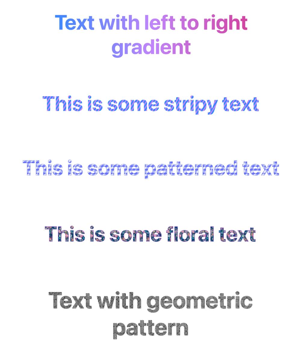
Some examples of what we can create are pictured below.
Transparent Text and background-clip
To create the effect we’re after, we first set the color of the element to transparent. In the code below, we’re styling an <h1> heading:
h1 {
  color: transparent;
}
Of course, just doing that means the text will be invisible, so that’s not enough on its own.
The next step is to apply background-clip: text, which will clip any background coloring or effect we place on the element just to the actual characters of the text, rather than filling its entire box:
h1 {
  color: transparent;
  background-clip: text;
}
Now we’re set up to work some magic. Our text is transparent, and any background effects we apply to it will be clipped to the text itself.
Setting a Background Gradient on Text
Let’s first try setting a gradient effect on our heading text:
h1 {
  color: transparent;
  background-clip: text;
  background-image: linear-gradient(to right, #218bff, #c084fc, #db2777);
}
Here, we’ve set a left-to-right gradient that will span the heading text. The Pen below shows the result.
See the Pen
Text with left to right gradient by SitePoint (@SitePoint)
on CodePen.
There are infinite variations we could try, such as different colors, changing the direction of the gradient, creating gradient patterns, and so on.
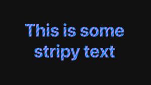
Let’s try another example, this time creating a striped pattern:
h1 {
  color: transparent;
  background-clip: text;
  background-image: repeating-linear-gradient(-57deg, #218bff, #218bff 3px, #c084fc 3px, #c084fc 6px);
}
The Pen below shows the result.
See the Pen
Stripy text by SitePoint (@SitePoint)
on CodePen.
Here’s another example, using a more elaborate pattern. I’ve also added text-stroke to give the letters slightly more definition.
See the Pen
Patterned text by SitePoint (@SitePoint)
on CodePen.
Check out our article CSS Gradients: A Syntax Crash Course to learn more practical examples of things we can do with CSS gradients.
Setting a Background Image on Text
Other than gradient effects, we can also use the background-image property to apply actual images to the text. This could be any image, but let’s try an image containing a repeating pattern. Here’s the image we’ll use.

We can apply the pattern image as a background like so:
h1 {
  color: transparent;
  background-clip: text;
  background-image: url(pattern.jpg);
  background-size: contain;
}
I’ve added background-size: contain to force the background image to fit nicely within the text. (You can read more about this and other sizing properties in How to Use CSS background-size and background-position. There are various sizing properties to help you do just about anything with background images!)
The result is shown in the Pen below.
See the Pen
Text with floral pattern by SitePoint (@SitePoint)
on CodePen.
Just for fun, here’s another example with a different background image. In this one, instead of text-stroke I’ve used filter: drop-shadow() to enhance the text.
See the Pen
Text with geometric pattern by SitePoint (@SitePoint)
on CodePen.
background-image vs background
You may have noticed that I’ve used the background-image property in the examples above rather than the background shorthand. Either works fine, but there’s one gotcha if you’re using background. You need to declare it first, before background-clip. Otherwise, the background property resets background-clip to its default of border-box, and the effect doesn’t work.
For example, this works:
color: transparent;
background: linear-gradient(to right, #3b82f6, #c084fc, #db2777);
background-clip: text;
This will fail:
color: transparent;
background-clip: text;
background: linear-gradient(to right, #3b82f6, #c084fc, #db2777);
Browser Support
Browser support for color: transparent and background-clip: text has been strong for a long time, but vendor prefixes are still needed in some browsers. You’ll notice in the Pens above that we’ve actually used the -webkit- vendor prefix for Edge and Chrome:
-webkit-background-clip: text; /* Edge, Chrome */
background-clip: text; /* Safari, FF */
If you view the demos in Edge and Chrome without the vendor prefix, the effect fails.
Accessibility Considerations
It’s always good to be mindful of what might happen if a CSS feature we’re using isn’t supported by any browsers. For example, if we set the color of text to transparent but a browser doesn’t support background-clip: text;, the user of that browser won’t be able to read our text. (The background will fill the entire text box, rather than be confined to the text characters.)
To guard against this, we could place our fancy effects within an @supports block that tests for support of background-clip:
@supports (background-clip: text) or (-webkit-background-clip: text) {
  h1 {
    /* styles here */
  }
}
For browsers that don’t support background-clip, we could either leave the default black color for the text or set another color.
Also remember that the effects we’ve played with here may make text harder to read, so be mindful of that and don’t go overboard — especially with background images. Also make sure that the text is clearly readable against any background colors on parent elements.
Conclusion
In this article, we’ve looked at two simple ways to enhance the appearance of text on a web page. We could apply such effects to all text on a page, but that would almost certainly be massive overkill and would probably annoy site visitors rather than impress them.
These are effects to be used in moderation and with discretion. Used wisely, this technique can be used to add a little bit of delight to your web pages.
 Ralph Mason
Ralph is a production manager at SitePoint and a freelance copyeditor, web designer and teacher at Page Affairs.