In this article, we’ll explore CSS filters and blending modes, which offer a range of creative possibilities to enhance the aesthetics of our web pages.
Understanding CSS Filters
CSS filters provide a way to apply visual effects to elements on a web page. These effects can range from simple adjustments like changing the brightness or contrast of an image to more complex transformations like blurring or adding a sepia tone.
Let’s delve into some commonly used CSS filters and explore how they can enhance the visual appeal of your web content.
1. Grayscale
The grayscale() filter transforms colors into shades of gray, giving your images a monochromatic and classic look. You can control the intensity of the effect by specifying a percentage:
<div class="image-container">
  <img src="image.jpg" alt="Grayscale Filtered Image">
</div>
.image-container {
  width: 300px;
  filter: grayscale(100%);
}

.image-container img {
  width: 100%;
}
By adding filter: grayscale() to the container <div>, we instruct the browser to apply a grayscale effect to all the content inside this container, including the image. As a result, the image displayed inside the container will appear in shades of gray instead of its original colors.
By setting the filter property to grayscale(100%), we indicate that we want to convert the image to grayscale with full intensity.
See the Pen
Grayscale Filter by SitePoint (@SitePoint)
on CodePen.
2. Blur
The blur() filter creates a soft, out-of-focus effect. This can be particularly useful for background images or elements that we want to de-emphasize:
.image-container {
  filter: blur(5px);
}
Here, we’re instructing the browser to apply the blur filter to all the content inside this container, including the image. As a result, the image displayed inside the container will appear with a soft, out-of-focus effect, as if it’s slightly blurred.
By setting blur(5px), we’re indicating that we want to apply a blur effect to the image with a blur radius of five pixels.
See the Pen
Blur Filter by SitePoint (@SitePoint)
on CodePen.
3. Contrast
The contrast() filter enhances or reduces the difference between the light and dark areas of an element, making it visually more striking:
.image-container {
  filter: contrast(150%);
}
Here, we’re instructing the browser to apply the contrast filter to all the content inside this container, including the image. As a result, the image displayed inside the container will have increased contrast between light and dark areas, making it visually more striking.
By setting it to contrast(150%), we’re indicating that we want to increase the contrast of the image by 150%.
See the Pen
Contrast Filter by SitePoint (@SitePoint)
on CodePen.
4. Brightness
The brightness() filter controls the overall brightness of an element. Increasing the brightness can make colors more vibrant, while decreasing it can create a subdued or darkened effect:
.image-container {
  filter: brightness(120%);
}
Here, the image inside the container will have its overall brightness adjusted.
By setting it to brightness(120%), we’re indicating that we want to increase the brightness of the image by 20%.
See the Pen
Brightness Filter by SitePoint (@SitePoint)
on CodePen.
5. Sepia
The sepia() filter imparts a warm, brownish tone to an element, evoking a nostalgic or vintage feel:
.image-container {
  filter: sepia(80%);
}
Here, the image will have a warm, brownish tone reminiscent of old photographs. Setting it to sepia(80%) indicates that we want to apply the sepia effect to the image with an intensity of 80%. Adjusting the percentage value allows us to control the strength of the sepia effect applied to the image.
See the Pen
Sepia Filter by SitePoint (@SitePoint)
on CodePen.
CSS filter combinations
One of the strengths of CSS filters lies in their combinability. We can apply multiple filters to achieve complex visual effects:
.image-container {
  filter: grayscale(30%) blur(3px) contrast(150%);
}
Here, we’re applying multiple filters to elements inside the container, achieving a composite visual effect. Multiple filters are separated by spaces within the filter property value. Each filter is applied in the order specified, from left to right:
- The
grayscale(30%)filter converts the colors of the element to shades of gray, with an intensity of 30%. - The
blur(3px)filter adds a blur effect to the element with a blur radius of three pixels. - The
contrast(150%)filter increases the contrast of the element by 150%.
By combining these filters, you can achieve complex visual effects that enhance the appearance of your web content. Adjusting the parameters of each filter allows you to fine-tune the overall effect to suit your design preferences.
In this example, the element will have a subtle grayscale effect, a slight blur, and increased contrast, resulting in a unique and artistic appearance.
See the Pen
Filter Combinations by SitePoint (@SitePoint)
on CodePen.
But wait, there’s more
There are more CSS filters that you can experiment with, including drop-shadow(), hue-rotate(), invert(), opacity() and saturate(). There’s also a backdrop-filter property that blends a partially see-through background with the background image behind it.
You can learn more about these features on MDN.
Harnessing the Power of CSS Blending Modes
CSS blending modes allow elements to interact with each other visually, creating effects that go beyond traditional stacking in the z-axis. Blending modes operate on the color values of overlapping elements, producing fascinating results. Let’s explore some commonly used blending modes and see how they can be implemented.
1. Multiply
The multiply blending mode combines the color values of overlapping elements by “multiplying” them. It creates a darker blend by multiplying the RGB (Red, Green, Blue) values of each pixel of the top layer with the corresponding pixel of the bottom layer. This results in a mix where the common areas become darker, and the unique colors of each layer remain visible:
.element {
  mix-blend-mode: multiply;
}
See the Pen
CSS Multiply by SitePoint (@SitePoint)
on CodePen.
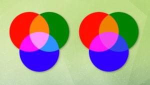
With mix-blend-mode: multiply; set on all circles, the overlapping areas of the circles will exhibit the result of the multiply blending mode, creating a darker blend where the circles intersect. The unique colors of each circle will still be visible, but the common areas will take on a darker hue due to the multiplication of color values.
2. Screen
The screen blending mode in CSS determines how the color of an element blends with the color of its underlying elements. It specifically lightens the colors of the top layer and produces a brighter blend.
Here’s how the screen blending mode works:
-
Color calculation:
- For each pixel in the top layer, the RGB (Red, Green, Blue) values are inverted.
- The inverted color values are then multiplied with the corresponding RGB values of the bottom layer.
-
Result:
- The result is a blend where the common areas of the layers become lighter, creating a brightened effect.
- The more saturated the color in the top layer, the more intense the effect.
.element {
  mix-blend-mode: screen;
}
See the Pen
CSS Screen Blend Mode by SitePoint (@SitePoint)
on CodePen.
3. Overlay
The overlay blending mode in CSS combines both the multiply and screen blending modes, resulting in a rich and contrasted visual effect. Here’s an explanation of how the overlay blending mode works:
-
Color calculation:
- If the bottom layer (B) color is lighter than 0.5, the result is calculated using the
2 * B * Tformula, where B is the bottom layer color and T is the top layer color. - If the bottom layer color is equal to or darker than 0.5, the result is calculated using the
1 - 2 * (1 - B) * (1 - T)formula.
- If the bottom layer (B) color is lighter than 0.5, the result is calculated using the
-
Result:
- The overlay blending mode combines the darkening effect of the
multiplymode for dark colors and the brightening effect of thescreenmode for light colors. - The result is a blend that enhances contrast and saturation. Dark areas become darker, and light areas become lighter, producing a visually striking effect.
- The overlay blending mode combines the darkening effect of the
.element {
  mix-blend-mode: overlay;
}
See the Pen
The Overlay CSS Blend Mode by SitePoint (@SitePoint)
on CodePen.
With the mix-blend-mode: overlay; property set on all circles, the overlapping areas of the circles will exhibit the result of the overlay blending mode. The overlay blending mode creates a mix of the multiply and screen blending modes, resulting in a rich and contrasted appearance. The common areas will show a combination of darkening and lightening effects, producing a visually interesting and vibrant blend. The unique colors of each circle will still be visible, but the common areas will take on a contrasted hue.
4. Difference
The difference blending mode calculates the absolute difference between the color values of the top and bottom layers for each pixel. It results in a high-contrast effect by emphasizing the color differences between the overlapping elements. Here’s how the difference blending mode works:
-
Color calculation:
- For each pixel in the top layer, the absolute difference between the RGB (Red, Green, Blue) values of the top and bottom layers is calculated.
- The result represents the color difference between the two layers.
-
Result:
- Areas where the colors are similar or identical will produce darker tones.
- Areas where the colors differ will produce brighter tones.
- If the colors are identical, the result will be black (RGB values of 0).
.element {
  mix-blend-mode: difference;
}
See the Pen
The Difference CSS Blend Mode by SitePoint (@SitePoint)
on CodePen.
The difference blending mode calculates the absolute difference between the color values of the top and bottom layers, resulting in a high-contrast effect. Common areas with similar colors appear dark, while areas with different colors will appear bright. This creates a visually striking and high-contrast effect where the circles overlap.
5. Exclusion
The exclusion blending mode produces an effect similar to the difference blending mode but tends to create softer and less contrasted results. It’s commonly used to blend the colors of overlapping elements in a way that both similar and different colors contribute to the final appearance. Here’s an explanation of how the exclusion blending mode works:
-
Color calculation:
- For each pixel in the top layer, the formula
B + T - 2 * B * Tis applied, where B is the color value of the bottom layer, and T is the color value of the top layer. - The result represents a combination of the differences between the color values of the two layers.
- For each pixel in the top layer, the formula
-
Result:
- Areas where the colors are similar or identical will have a darkened appearance.
- Areas where the colors differ will produce a blended and softened effect, rather than the stark contrast seen in the
differenceblending mode. - The effect tends to be more subtle and is often used to create a harmonious blend of colors.
.element {
  mix-blend-mode: exclusion;
}
See the Pen
The Exclusion CSS Blending Mode by SitePoint (@SitePoint)
on CodePen.
Further blending options
There are lots of other blend more options that we can expeiriment with, including darken, lighten, color-dodge, color-burn, hard-light, soft-light, hue, saturation, color, luminosity, plus-darker and plus-lighter.
You can learn more about how they work on MDN.
A Few Considerations
There will always be some end users for whom CSS filters and blend modes may cause difficulties. Let’s look at a few examples.
Browser support
Support CSS filters and blending modes is widespread, but to be absolutely sure your end users will get a satisfactory result, you might consider a fallback. For example:
/* Fallback styles for browsers that do not support filters */
@supports not (filter: grayscale(100%)) {
 .fallback-element {
   /* Fallback styles here */
 }
}
Accessibility
When working with filters and blending in design or development, it’s important to consider accessibility to ensure that your content is usable and understandable by a diverse audience, including people with disabilities. Here are some key considerations:
-
Color contrast. Ensure there is sufficient contrast between text and background colors, especially when applying filters or blending modes. Low contrast can make text difficult to read for users with visual impairments. Test your designs using tools that simulate different types of color blindness to ensure readability for users with color vision deficiencies.
-
Text legibility. Avoid using filters or blending modes that may reduce the legibility of text. For example, some blending modes may make text appear blurry or indistinct, making it challenging for users with visual impairments to read.
-
Alternative text. Provide alternative text for images and graphics that may be affected by filters or blending modes. Screen readers rely on alt text to describe the content to users who are visually impaired.
-
Animations and transitions. If filters or blending modes are applied to animated elements, ensure that the animations are not overly distracting or rapid, as this can be problematic for users with certain cognitive or neurological conditions.
-
Responsive design. Ensure that your design is responsive and works well across different devices and screen sizes. Filters or blending modes that work on larger screens may not be as effective or may cause issues on smaller screens.
-
Keyboard navigation. Ensure that all interactive elements remain accessible and usable through keyboard navigation. Users who rely on keyboard input or assistive technologies should be able to navigate and interact with your content seamlessly.
-
Testing with assistive technologies. Test your designs using various assistive technologies such as screen readers and voice recognition software to identify and address any issues that may arise due to filters or blending modes.
-
Progressive enhancement. Implement a design approach that follows the principle of progressive enhancement. Ensure that the core content and functionality are accessible even if filters or blending modes are not supported or disabled.
By keeping these considerations in mind, you can create designs that are not only visually appealing but also accessible to a wider audience, including individuals with disabilities.
Common Pitfalls in Using CSS Filters and Blending Modes
Here are some frequent errors developers may encounter and how to avoid them.
Mistake 1: Overusing filters
One common mistake is applying too many filters, resulting in a visually overwhelming or confusing layout. Overuse can make it challenging for users to focus on essential content and may lead to a poor user experience.
Example:
/* Avoid overusing filters */
.overused-element {
  filter: grayscale(50%) blur(5px) contrast(150%) brightness(120%) sepia(80%);
}
In this example, multiple filters are applied to the same element. While combining filters can create unique effects, it’s crucial to strike a balance and ensure that the overall design remains cohesive and user-friendly. Consider the visual hierarchy and prioritize clarity.
Mistake 2: Using filters on interactive elements
Applying filters to interactive elements, such as buttons or links, without considering user interactions, can lead to a less intuitive and confusing user experience.
Example:
/* Be cautious when applying filters to interactive elements */
.button-with-filter {
  filter: grayscale(50%);
  /* Other filters... */
}
Filters can alter the appearance of interactive elements, potentially affecting users’ understanding of their purpose. Ensure that filters do not compromise the clarity and usability of interactive elements.
Mistake 3: Disregarding performance impact
Applying complex filters or combinations of filters can have a performance impact, especially on older devices or browsers. Neglecting performance considerations may result in slow page loading times.
Example:
/* Be mindful of performance impact */
.performance-heavy-element {
  filter: blur(10px) contrast(200%);
}
Complex filters may require more computational resources, impacting the performance of your web page. Test the performance on various devices and optimize as needed, considering the trade-off between visual effects and page speed.
Conclusion
CSS filters and blending modes empower web developers to push the boundaries of creativity, allowing for the creation of visually captivating and dynamic user interfaces.
By understanding and combining these features, you can elevate the visual appeal of your web content, making it more engaging and memorable for users.
As you explore the creative power of CSS filters and blending, don’t hesitate to experiment with different combinations to discover the unique effects you can achieve.
Whether you’re building a portfolio, a blog, or an ecommerce site, incorporating these techniques can add that extra layer of visual sophistication that sets your website apart.
 Joan Ayebola
Joan is a frontend developer and technical writer who's deeply passionate about open-source technologies. With several years of experience in the industry, Joan has been involved in various projects, contributing code, and writing technical documentation to empower developers worldwide. Her expertise lies in crafting user-friendly interfaces, teaching and simplifying complex technical concepts. When not coding or writing, she enjoys crocheting, reading and listening to podcasts.