

Key Takeaways
- The CSS table property is a powerful tool that can solve several layout problems, and works in all modern browsers. It allows HTML elements to behave like table elements, providing a versatile solution for complex layouts and alignment issues.
- The CSS table property can be used to create equal height boxes, simple old-style layouts, and responsive layouts with content choreography. It is particularly useful in responsive designs, allowing elements to adjust their size and position based on the user’s screen size.
- While the CSS table property offers many benefits, it does have some limitations. It can be less flexible than other display properties for creating complex layouts and doesn’t work well with some CSS properties, such as ‘float’ and ‘position’. However, in many cases, the advantages of using the table property outweigh these drawbacks.
Right now, Flexbox is arguably THE hot new thing for layout building. Flexbox’s almost miraculous abilities to adapt to the available space has left many of us wide-eyed with possibility.
Nevertheless, it can’t solve all your layout problems, and moreover, it brings with it some compatibility issues with legacy browsers. There simply is no bulletproof ‘polyfill’ (fallback for older browsers) for Flexbox — currently I’m only aware of a polyfill for the 2009 version of IE: Flexie.
In many cases I’ve found simpler solutions using the often-ignored CSS table displays properties. These CSS properties are widely supported by all relevant browsers (note this excludes IE6 & 7), and can elegantly solve several major and small layout headaches.
In case you’re not 100% familiar with this technique, changing a DIVs display property can make it behave like a table or a table element.
Wait what? Tables for layout? Isn’t that bad?
Perhaps the hottest web design topics of the early 2000’s was the debate over using HTML table code as a layout tool. That was a hack and is still bad practice.
Instead here we’re using perfectly meaningful HTML (i.e. DIVs, SECTIONs, HEADERs, etc) and simply borrowing some useful table presentation know-how from CSS. This is precisely what CSS was designed to do, so don’t feel that this is a hack or patch. It’s not.
Using ‘display:table-cell’
In the sample below, clicking the top button you can change the display property of the three colored DIVs from block to table-cell:
See the Pen Display table #1 by Massimo Cassandro (@massimo-cassandro) on CodePen.
You can see how the DIVs can be horizontally arranged without requiring any float property, and that you can also access some typical table rules (just like vertical-align).
If you need some spacing, note that the classic CSS margin property doesn’t have any effect on table cells: instead use border-spacing instead (it must be applied to the container table element). You can find some commented lines within the Codepen, if you want to play with those rules.
This technique can be very useful to solve a lot of problems that prove difficult to crack other ways.
I’ve picked out three simple cases where the table display properties are really valuable.
But first let’s look at them:
| display property | renders as |
|---|---|
| table, inline-table | table |
| table-column | col |
| table-column-group | colgroup |
| table-row-group | tbody |
| table-header-group | thead |
| table-footer-group | tfoot |
| table-row | tr |
| table-cell | td |
| table-caption | caption |
For a really comprehensive guide to tables and CSS take a look at CSS Tricks: A Complete Guide to the Table Element.
Case 1. Equal height boxes
I think this is one of the most frequent issues I’ve deal with: there are some floated boxes with unknown content and you have to make all them with equal height.
I know, flexbox can easily solve this problem, but tables rules can do it too.
Simply apply the display: table (or table-row) property to the container and the display: table-cell property to inner boxes. Take care to remove any float property (otherwise the table-cell property doesn’t take effect).
HTML:
<div id="wrapper">

    <div id="div1"></div>

    <div id="div2"></div>

    <div id="div3"></div>

</div>
CSS:
#wrapper {

    display: table;

}

#wrapper div {

    display:table-cell;

}
See the Pen Equal height boxes by Massimo Cassandro (@massimo-cassandro) on CodePen.
Case 2. Simple old-style layout
This one is a more outdated example, but I think you might need to deal with it, as I did recently.
Some months ago I received a graphic layout very similar to the scheme below. It needed to be compatible with IE8, and I found that the best way was to use CSS table rules:
See the Pen table display #3: old-style layout by Massimo Cassandro (@massimo-cassandro) on CodePen.
Case 3. Responsive layout with content choreography
The previous example leads us to a new topic: is it possible to build a responsive layout with CSS table rules?
Not only is possible, but we can also perform some content choreography tasks.
We have already seen how changing the display property from block totable-cell of two divs can change their arrangement from vertical to horizontal.
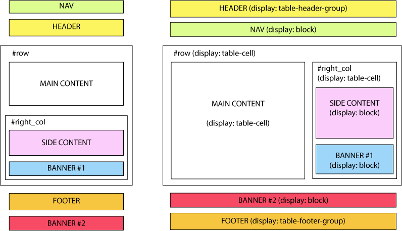
Add to this the fact that an element with the table-header-group property is brought to the top of a table layout. In the same way, table-footer-group elements are brought to the bottom and so on. This can be unexpectedly useful when reformatting responsive layouts.
In the pen below, the header element exchanges his position with the nav element on window resize, simply changing its display property to table-header-group.
HTML:
<div id="wrapper">

    <nav></nav>

    <header></header>

    <!-- rest of code -->

</div>
CSS:
#wrapper, header {

    display: block; /* we don't really need this rule, since it is the default */

}
@media (min-width: 48em) {

    #wrapper {

        display: table;

    }

    header {

        display: table-header-group;

    }

}
A similar behavior occurs for the footerand the #banner2 div.
Here is a scheme of the layout: on the left the default, mobile version, and on the right the desktop version:
And this is a running demo:
See the Pen `display: table` layout by Massimo Cassandro (@massimo-cassandro) on CodePen.
For more info about this argument, take also a look at:
Conclusion
CSS table display properties are an under-rated and valuable solution for both big and little layout challenges.
While I may not personally choose to use them to build complex layouts, they can certainly solve many difficult problems related to portions of the layout.
Frequently Asked Questions about CSS Table Property
What is the CSS table property and why is it important?
The CSS table property is a valuable tool in web design that allows developers to manipulate the display of HTML elements, making them behave like table elements. This property is important because it provides a way to create complex layouts and align elements in ways that would be difficult with traditional block or inline display properties. It’s particularly useful for creating responsive designs, as it allows elements to adjust their size and position based on the size of the user’s screen.
How does the CSS table property differ from HTML tables?
While both CSS table properties and HTML tables can be used to create tabular layouts, they serve different purposes. HTML tables are primarily used for presenting tabular data, while CSS table properties are used for controlling the layout and positioning of elements on the page. CSS table properties offer more flexibility and control over the design, and they are more suitable for creating responsive designs.
Can I use the CSS table property with other display properties?
Yes, the CSS table property can be used in conjunction with other display properties. For example, you can use it with the ‘inline-block’ property to create a layout where elements are displayed as inline elements, but have the properties of a block element. This can be useful for creating complex layouts where elements need to be positioned in specific ways.
What are the different values of the CSS table property?
The CSS table property can take several values, including ‘table’, ‘inline-table’, ‘table-row’, ‘table-cell’, ‘table-column’, ‘table-column-group’, ‘table-header-group’, ‘table-footer-group’, and ‘table-row-group’. Each of these values makes the element behave like the corresponding table element, allowing you to control the layout and positioning of elements in different ways.
How can I use the CSS table property to solve layout problems?
The CSS table property can be used to solve a variety of layout problems. For example, it can be used to vertically align elements, which is something that can be difficult to achieve with other display properties. It can also be used to create equal-height columns, which is a common challenge in web design. By making elements behave like table cells, you can ensure that they always have the same height, regardless of their content.
Are there any drawbacks to using the CSS table property?
While the CSS table property is a powerful tool, it does have some limitations. For example, it can be less flexible than other display properties when it comes to creating complex layouts. It also doesn’t work well with some CSS properties, such as ‘float’ and ‘position’. However, in many cases, the benefits of using the table property outweigh these drawbacks.
Is the CSS table property supported by all browsers?
Yes, the CSS table property is supported by all modern browsers, including Chrome, Firefox, Safari, and Edge. However, it may not be fully supported by older versions of these browsers, so it’s always a good idea to test your designs in multiple browsers to ensure they display correctly.
Can I use the CSS table property for responsive design?
Yes, the CSS table property is a great tool for creating responsive designs. By making elements behave like table cells, you can ensure that they adjust their size and position based on the size of the user’s screen. This can make your designs more flexible and user-friendly, especially on mobile devices.
How can I learn more about the CSS table property?
There are many resources available online for learning more about the CSS table property. Websites like Mozilla Developer Network, FreeCodeCamp, and W3Schools offer detailed guides and tutorials on how to use this property. You can also find many examples and demos on websites like CodePen and JSFiddle.
What are some common mistakes to avoid when using the CSS table property?
One common mistake is using the CSS table property for presenting tabular data, which is better suited to HTML tables. Another mistake is not testing your designs in multiple browsers, as the table property may not be fully supported by older versions. It’s also important to remember that the table property can’t be used with some CSS properties, such as ‘float’ and ‘position’, so you need to plan your layouts carefully.