
Just a few years ago if you used the font Proxima Nova on your website, other designers would marvel at how awesome your “typography” was.
It didn’t matter how you actually used the type on your site – just the fact that your site wasn’t using Arial would be enough to make it stand out from the crowd.
These days seemingly every new website takes advantage of nice web fonts such as Proxima Nova, Avenir or Open Sans. And that’s no longer enough to make your site remarkable. Sites need to be based on solid typographic principles and use type in new and interesting ways in order to truly be remarkable.
I’ve seen plenty of sites that use nice fonts but nonetheless still have bad typography. In this post I will show 10 examples of websites with remarkable typography – not just nice fonts, but nice typography.
1) Google for Entrepreneurs

There isn’t an easier way to combine typefaces than to go with a superfamily. Roboto and its slab serif family member, Roboto Slab, make a perfect font combo. Their letterforms harmonize perfectly while still maintaining a solid contrast between the sans-serif and slab serif styles.
It’s no surprise that Google chose to use the Roboto family for their Google for Entrepreneurs site as Google originally commissioned the Roboto family for use in their Android operating system.
2) Benoit Challand
As its name implies, Libre Baskerville is a free font. And for a free font it looks wonderful. Benoit Challand’s site shows off the finely balanced curves of Libre Baskerville by setting the type at a very large size. The ever popular Avenir, which was voted the #1 most favorite font of leading designers, balances out the design with its quiet and stately presence.
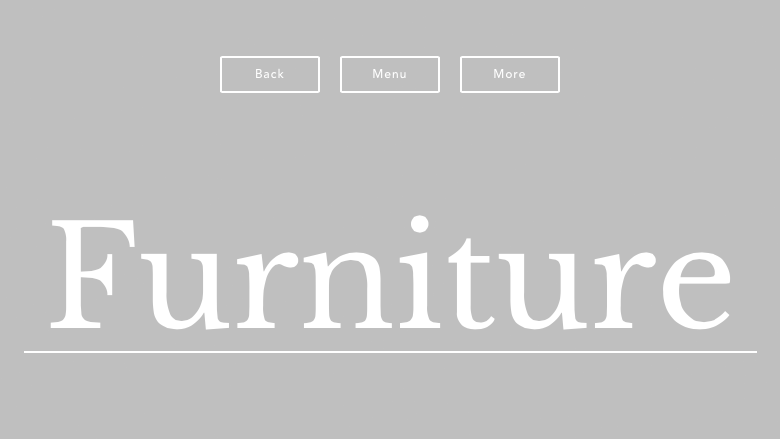
3) AKQA
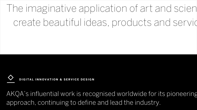
AKQA have always been known for their bold and engaging design work. However, their personal brand has always had a stark and unassuming look. Their new site keeps up with this tradition by sticking to a black and white color scheme and using a single typeface, Benton Sans.
The thin, delicate weight of Benton Sans is used at large sizes for headlines while the bold, sturdy weight is set in uppercase at small sizes using a slight amount of letterspacing to create a balanced type hierarchy.
4) b14
Proxima Nova is starting to get the reputation of being a bit played out and overused on the web. But don’t tell that to Danish agency b14. They managed to take a commonly used web font and do something new and exciting with it.
Type sizes range from gigantic to tiny and the numerous weights of Proxima Nova are used to full effect. This site proves that it’s always possible to do something bold and unique with your typography no matter what typeface you use.
5) 3FE Coffee
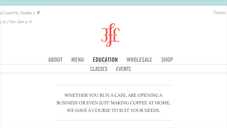
3FE Coffee use Trade Gothic set entirely in uppercase for their nav and headers. Trade Gothic, being a fairly condensed typeface, tends to work well for this type of use. Calluna, created by Dutch designer Jos Buivenga, is a beautiful serif typeface that contrasts nicely with the strong and silent Trade Gothic.
My only complaint is that some of the text set on top of the photos can be a bit difficult to read in some places, proving that legibility should still be the most important goal of typography.
6) CHGO DSGN
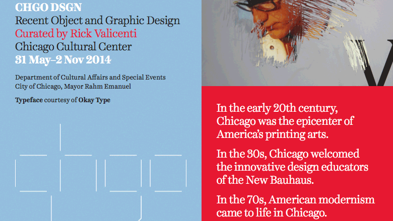
Harriet, designed by Jackson Cavanaugh of Okay Type, is one of my personal favorite serif typefaces. Okay Type is based in Chicago so it’s fitting that CHGO DSGN used a typeface designed in Chicago. Harriet Text, which is meant for reading, is used for the paragraphs of body copy and the display version, Harriet Display, is used at large sizes for the headings.
7) The Ernest Hemingway Collection
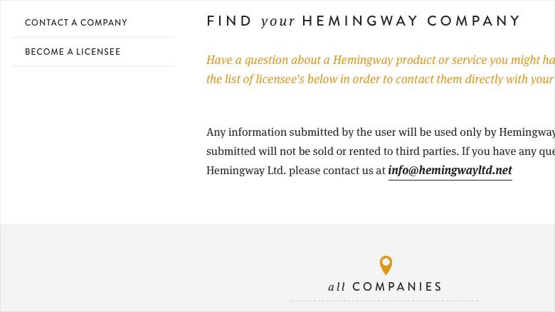
The Ernest Hemingway Collection website, designed by Nashville-based agency Brand Aid, perfectly captures the spirit of American icon Ernest Hemingway. Brandon Grotesque has a noble, classy feel and makes an excellent companion to the body font FF Meta Serif. Veneer, a distressed sans-serif, is used sparingly, almost more for texture than anything else.
8) The Great Discontent
The Great Discontent, a magazine that focuses on creativity, naturally has high standards when it comes to design and typography. And fortunately their new website delivers on all fronts.
Body type is set in Leitura News, a typeface specifically designed for editorial uses. Maison Neue, a contemporary grotesque from Milieu Grotesque, makes a beautiful combination. The pull quotes that break out from the grid are a nice typographic touch.
9) We Are Visual Animals
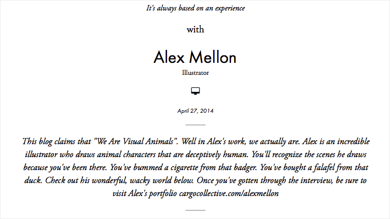
Futura and Garamond make a classic and timeless font combination. We Are Visual Animals is a website heavy with eye-catching visuals so the classic font combination offers a welcome respite.
10) Solo
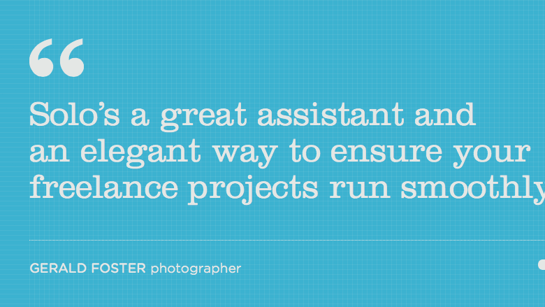
Clarendon makes for a great display face, however, since it lacks italics it isn’t the best choice for body copy. Solo make prominent use of Clarendon for headlines which gives their site a bold and distinctive identity. The ball terminals of Clarendon pair well with the smooth corners of Gotham Rounded used for body copy.
The above 10 websites show an astonishing variety of typographic layouts. Hopefully these examples will inspire you to do something truly remarkable with the typography in your next web design project.
Frequently Asked Questions on Remarkable Website Typography Designs
What is the importance of typography in web design?
Typography plays a crucial role in web design as it significantly impacts the user experience. It helps in setting the tone of the website, conveying the brand’s message, and enhancing readability. Good typography can guide the user’s attention and influence their perception of the brand. It also aids in creating a visual hierarchy, which helps users navigate the site more efficiently.
How can I choose the right font for my website?
Choosing the right font for your website involves considering factors such as the brand’s personality, target audience, and the content’s context. It’s essential to select a font that aligns with your brand’s identity and resonates with your audience. Also, ensure the font is legible and looks good on various screen sizes.
What is the role of color in typography?
Color in typography can significantly influence the user’s emotions and perceptions. It can highlight important information, create contrast, and guide the user’s eye movement. However, it’s crucial to maintain a balance and ensure the color doesn’t compromise the text’s readability.
How many fonts should I use on my website?
It’s generally recommended to use a maximum of two to three different fonts on a website. Using too many fonts can make the design look cluttered and confuse the user. It’s best to stick to one font for headings and another for body text to maintain consistency and readability.
What is responsive typography?
Responsive typography refers to the practice of adjusting the text size and layout based on the screen size to ensure optimal readability. It’s an essential aspect of responsive web design, as it ensures the text is legible and easy to read on all devices.
How can I create a visual hierarchy with typography?
Creating a visual hierarchy with typography involves using different font sizes, weights, and styles to distinguish between different elements on the page. For instance, headings should be larger and bolder than body text, and links or important information can be highlighted with a different color or style.
What is the impact of line spacing and letter spacing on readability?
Line spacing and letter spacing significantly impact readability. Adequate line spacing ensures the text is easy to read and doesn’t appear cluttered. Similarly, appropriate letter spacing can enhance legibility, especially for small font sizes or condensed fonts.
What are some common typography mistakes to avoid?
Some common typography mistakes to avoid include using too many fonts, not considering readability, ignoring the context of the content, and not creating a visual hierarchy. It’s also essential to avoid using low-contrast color combinations that can make the text hard to read.
How can I test the effectiveness of my typography?
You can test the effectiveness of your typography by conducting user testing and gathering feedback. This can help you understand if your typography is enhancing or hindering the user experience. You can also use analytics to see how users are interacting with your content.
What are some resources for typography inspiration?
There are numerous online resources for typography inspiration, such as Behance, Dribbble, and Pinterest. Websites like Awwwards and Typewolf also showcase excellent examples of typography in web design. Additionally, design blogs and magazines often feature articles on the latest typography trends and tips.
 Jeremiah Shoaf
Jeremiah Shoaf is a freelance designer from Colorado. His side projects include a web typography showcase and a site offering HTML5 templates and flat-file CMS themes.