Logo redesigns. They sometimes feel a little like squeezing toothpaste from one tube into another.
- It’s fiddly work.
- You’re battling not to lose valuable stuff in the process.
- Even if you nail it, people will mostly just notice ‘how clean it looks’.
With that in mind, we recently took on the task of updating the SitePoint logo. Here’s the back story.
The Background
The first SitePoint logo was created for the site launch in 2000. Although more than a placeholder, it’s main task was to take us beyond the launch of sitepoint.com V1.0 — to a time when we could then focus our full attention on a logo.
The logo you probably know best has been with us since early in 2002, and has graced all but the very first SitePoint book. In late 2001 we provided a color and style brief to a number local designers and asked for raw concepts we could work with. The current logo started as the seed of an idea provided to us by a local design agency. In time, we developed and honed that idea into the one you see today.
Obviously that was ten years ago now. It has served us very well, but it’s time for a refresh.
The Brief
Although nothing was ever totally ruled out, this was never likely to become a ‘tear-down-start again’ project. The SitePoint brand is known and widely liked, so there was no reason to leave that behind.
However we’ve got some new stuff bubbling behind the scenes at SitePoint and Mark (Co-founder) wanted our brand to be ready to reflect that fresh outlook (stay tuned later in the year for that).
Mark suggested we run the initial stages of the project on 99designs (our sister company), but our internal design team (who have a long history with the logo) were passionate about taking on the project. We ultimately convinced Mark to give us a shot at it before taking it to the masses, so we had to make the most of it and get it right
We settled on a few givens:
- Orange and blue were to remain, but with possible flexibility in the hue and shade
- The type was to be lowercase
- There is a strong likelihood the design will use some re-interpretation of the angled brackets
- The primary logo would be designed for a white background but needed to work on dark
The first round of concepts was all about generating lots of variation. In-house designers, Alex Walker and Harley Alexander were given a run at it, while three external designers were also contracted to each give their take.
The Process
Refreshing a logo is no easy task. Unless your brand has been fatally damaged, you will want people to be able to instantly recognize the old brand in the new one.

Clearly Starbucks have done a great job at pulling their identity through each redesign stage.

So, the question is: If you KNOW the new design probably won’t be radically different to the old one, surely it makes sense to start with the old design and just tweak it?
As practical as that sounds, no.
Here’s why: I think you can draw parallels between the design process and topiary (the art of trimming hedges into creative shapes). As a designer, your job is to grow as much raw, healthy hedge as you can. Later in the process it can be trimmed into shape.
Most client feedback — whether it’s a single person or a panel of stakeholders — is ‘reductive’ in nature. Like a good set of pruning shears, it tends to be better at cutting off the foliage that sticks out the most. In other words, stakeholders are better at telling you what they don’t want, than what they do.
And don’t get me wrong, that’s exactly the way it should be.
But it also means that if you begin with something that is quite close to the original logo, there’s almost nothing left to trim away. That can easily lead to a design impasse.
The takeaway is: Don’t be afraid to push the design boundaries early in the process. At worst, your craziest ideas will provide a nice counterpoint to your more conservative concepts. At best, it might just be a refined version of one of your crazy ideas that makes it through.
Round 1
There were about 30 concepts in first round. Here’s a cross-section.

What we learned:
- The traditional format of a logomark followed by a logotype wasn’t a given. Concepts either wrapping the text in tag-like devices or replacing the tittle in the ‘i’ were given more attention than expected.
- Lighter weight font treatments seemed to get a better response.
Round 2
For round 2, we cherry-picked some of the favored ideas from the first iteration and used them as the basis for some new designs.

Round 3
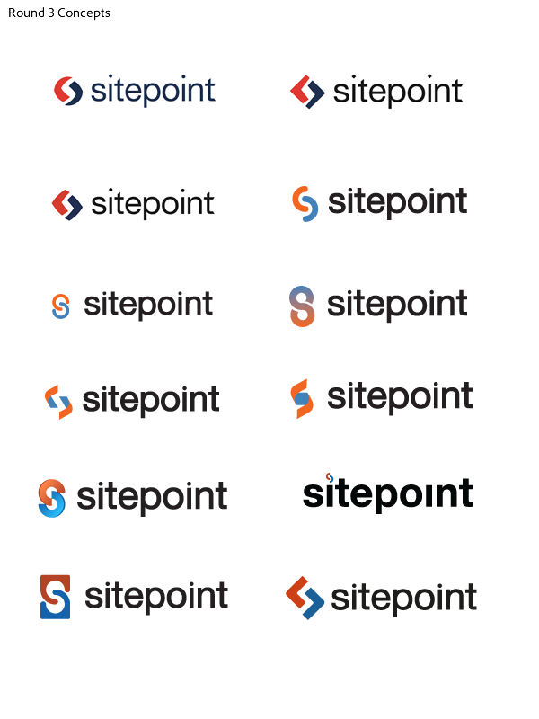
By this stage in the process, the general sentiment seemed to moving back towards the traditional logomark/logotype format. In particular, we seemed to be moving towards some variation using the orange and blue angled brackets set in front of a light-medium weight, lowercase typeface.
However this still left a lot to be determined:
- How heavy should the angle brackets be?
- Angled brackets are sharp and not necessarily friendly. Can we soften them without getting too cartoony or cuddly?
- The negative space between the brackets creates a notional ‘s’ shape. Can/Should we be trying to emphasize this?
- The brackets can fit together either as a balanced rectangle or a more jaunty off-center shape. Which works better for us?
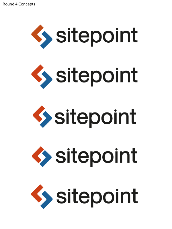
Round 4
At round 4 we felt like we’d done a complete loop — but that wasn’t a bad thing as long as we were walking in the right direction. We knew it was going to be two angle brackets, but it had to be a natural-feeling evolution of the original logo. It became very finnicky- the variations we were coming up with were only minimally different. The details, the tapering and how wide ‘this part’ was compared to ‘this part’, whilst maintaining a meaningful negative space, were all questions we kept asking ourselves. It was tough! But, eventually we came up with some approachable bracket devices that shared some shape characteristics with the original logo, albeit with a refreshed feel. This was a great example of designers bouncing off each other’s successful ideas.
Toying with different shapes, we even had several solid coloured brackets printed and cut out- so we could figure out the exact spacing and positioning. We stuck little variations of sitepoint logos on the wall in front of us, along with larger printed ones that we thought were close. After spending about half an hour pushing a pair of brackets millimetres in each direction, Mark finally put his finger on one configuration. “That one!”. We had the shape we needed.
We found taking the shape off the screen and quite literally into our hands was a really valuable step — we weren’t playing with something pristine and perfect, but it gave everyone the chance answer their own questions over the spacing and proportions. And in the end helped us to reach the final identity.

Consolidation
After finding the right shape, we spent some time printing out several different iterations on the oranges and blues, and comparing them. We were aiming for a middle ground between reliable/trustworthy and fun/friendly. Brighter blues and oranges came across too playful — we didn’t want candy brackets for a logo! The colours needed to be deep, represent trust, knowledge, and echo the original brand colours.
We eventually settled on a deep sky blue, and an ever so slightly muted orange. We did test the colors quite extensively before settling— we printed example book covers, mocked up our websites with it, and also just printed the colors as blocks. Eventually, after narrowing down to 3 oranges and 3 blues we took them upstairs to get final sign off. After letting Mark mull them over for a few days, and he came back to us with finals. At long last!

A final final final final development version was mocked up and printed three times — one for the office, one for Mark’s office, and one for a final signature (the official sign-off we’d been waiting for!). Since then, we’ve placed copies strategically around the office and monitored people’s first reactions. It’s been really useful to be able to live with a logo for a while before unleashing it on the world. Happily, the feedback has been almost all positive.
![]()
In the end it has been a long, but rewarding process. It was fascinating to watch the design go through a complete loop —hopefully adding 10-15 years of design fuel to the tank on the way.
What are your thoughts?
 Alex Walker
Alex has been doing cruel and unusual things to CSS since 2001. He is the lead front-end design and dev for SitePoint and one-time SitePoint's Design and UX editor with over 150+ newsletter written. Co-author of The Principles of Beautiful Web Design. Now Alex is involved in the planning, development, production, and marketing of a huge range of printed and online products and references. He has designed over 60+ of SitePoint's book covers.