Script typography is a two-edged sword. Used well, it can enhance and set apart product design, giving it an elegant, playful, or even mysterious look and feel. But, if used poorly, you end up with a sloppy mess of a product label. I can imagine some designers could get nervous when a client wants script fonts on their packaging because of how carefully these font faces have to be used. So I perused through thousands of products and identified four general categories for distinct uses of script fonts in designs. I’m sure you could break these out into more categories or sub-categories, but these broad concepts should still help you structure your designs considerably. In no particular order, these categories are:
- Title/Brand
- Sub-Title
- Copy
- Background
Title/Brand
In this category, the script font is either the main title of the brand or even the logo itself. It’s often the most prominent font on the label. At least that’s how I determined if it fit into this category. What I look for in this group is whether or not the script font is legible and communicates the brand well.Buzz
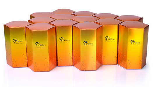 This Buzz packaging is brilliant. The “B” that looks like a honeycomb immediately catches the eye and the coloring of the packaging is stunning as well.
Péter Wetzer Wines
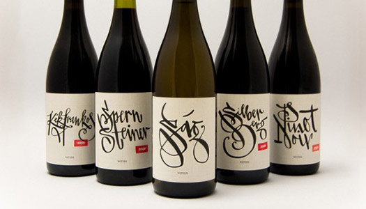 These fonts are difficult to read but fun and energetic. Notice how each is hand-drawn and stylized just for the particular type of wine.
Angioletta
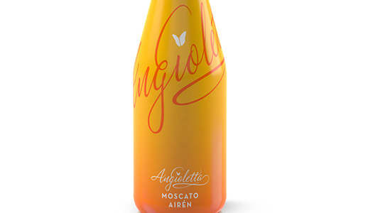 This beautiful packaging does a wonderful job of integrating the script font. I like how they used the font both in the large, wrap-around effect and near the bottom to reinforce the brand. Here, the size and color differences are what make it viable to use the same font with the same word twice on the same product packaging.
Lovely Cup of Tea
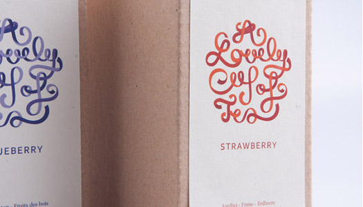 This lovely, swooping and ribbon-like font is barely legible, but it does a wonderful job of drawing the reader in. It’s almost a surprise when you realize it’s the brand and made me feel like I’d discovered something special that only the cleverest of folk might find.
Sub-Title
This category features script fonts that aren’t nearly as prominent as the previous category. Often, the scripts here help define the specific product, while other logo devices establish the brand.Tango
 You can see the clear pattern of the “Tango” brand, but the script fonts define the specific product. I like how this font sits on the label delicately between the foreground and the background — it’s not prominent but it doesn’t disappear either.
Beyond – Tahini
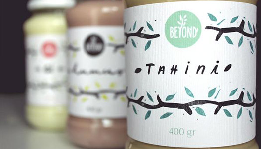 The Beyond logo is clear throughout the various labels, but the specific product is clearly set apart by the script font. It almost falls within the title category because the script is so prominent, but since it was not the brand, I felt that this fit better into the sub-title category, even though the brand title itself is a script font.
Kobrick Coffee
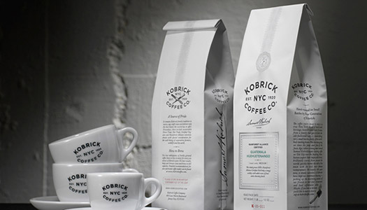 Here, the script is the signature of the owner of the company. I felt this was a useful application of script fonts, as it gave the packaging a personal touch, which is one of the many uses that scripts can do. It’s just one small part, but it has a big impact.
Williams Sonoma Pasta
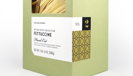 The “Hand-Cut” message is clear on all the various versions of this package line. It’s a clear “value statement” that the designer nailed by making a prominent, but not too prominent, sub-titled idea. It’s the only script on this package, which helps it stand out, but the size keeps it gracefully muted.
Copy
It’s not too often that you can find a lot of copy on packaging that is written in script fonts. And for good reason — too much script in one block of text can be difficult to read. But, sometimes it works wonders, and the following are great examples of copy with scripts that work.Goshen Coffee
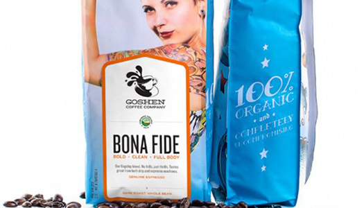 On the side of this package we see a nifty application of scripts. The “100% Organic” message sits nicely and neatly. Because it’s not a critical part of the package, the designer has more freedom to play and he or she took it advantage of this artistic license.
Color Mask
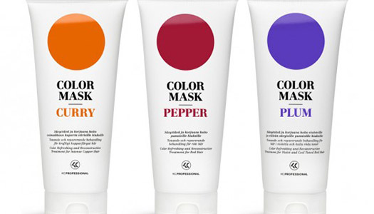 This one’s a bit tough to see, but the centered, script font is just right. It sets the details of the packaging apart in an elegant way. Not my favorite application, but it’s effective. I might have set some of this copy in a sans serif and put a key phrase or two into scripts just to break it up a bit. This could work well if the same font used in the title/sub-title were used in the copy to prevent using too many fonts.
Dallmayr
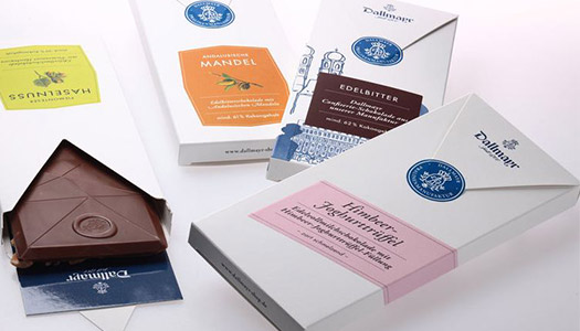 This script font works so well because it’s such a small amount of copy. That was my big takeaway, at least. When you have a small amount of copy that you want to make attractive — as long as it’s brand appropriate — try a script font. It gave this chocolate packaging a sweet touch.
Sweet Syrupy Talk
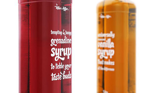 This wonderful font is used throughout the packaging in different sizes. It’s got a Coca Cola vibe to it, to be sure. But, it’s fun and fits the brand so well. Note how the only use of caps is in the logo up top.
Background
Sometimes you can use script fonts in the background of the design. This is tough to pull off without creating an overly-busy look, but it can be done.Tomoka
 Definitely one of the busiest, two-color designs ever, but it still works because the brand is so prominent and the scripts shift their shapes as they move.
Cervejaria Republica
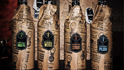 In this classic newspaper design, the fonts are all black on a brown background, while the logo and product name are offset with their own distinct label.
Evil Twin / Omnipollo Russian Roulette
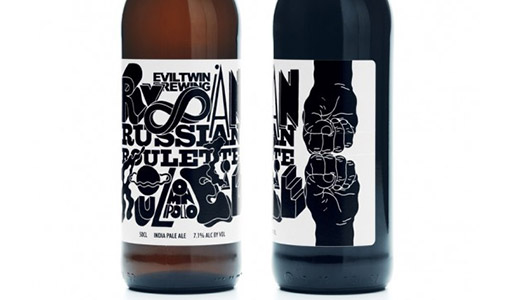 Also a very busy design. What might help this label a bit is to use different colors, but that may have not been an option. The application of layers is definitely interesting, but it’s tough to know what the brand is other than the fact that the brand and product are not script fonts themselves. Still, it is interesting to look at.
Jack Daniels
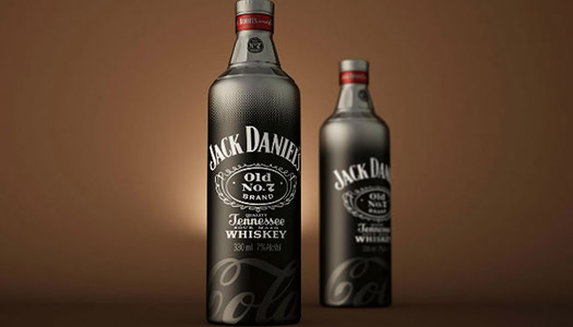 I saved this one for last because I thought this was a brilliant application of a script font. The Coca Cola brand is evoked through the subtle application of the script at the bottom of the label. It’s flawless and stunning. I immediately knew this was a Jack and Coke mix before my brain had time to actually analyze the text seriously.
Do you have any favorites? Let me know if any of these struck you as awe-inspiring!
Frequently Asked Questions about Script Typography in Product Design
What is script typography and why is it important in product design?
Script typography refers to the use of fonts that appear handwritten or calligraphic. These fonts are often used to convey a sense of elegance, creativity, or personal touch. In product design, script typography plays a crucial role in establishing the product’s identity and communicating its unique selling points to the target audience. It helps to create an emotional connection with the audience, making the product more appealing and memorable.
How can I choose the right script font for my product design?
Choosing the right script font for your product design involves considering several factors. First, you need to understand your brand’s personality and the message you want to convey. Different script fonts can evoke different emotions – some may be more formal and elegant, while others may be more playful and casual. You should also consider readability, especially if the font will be used in important areas like the product name or key information. Lastly, it’s important to test the font in different sizes and contexts to ensure it works well in all scenarios.
Can I use multiple script fonts in one design?
While it’s possible to use multiple script fonts in one design, it’s generally not recommended as it can make the design look cluttered and confusing. If you want to use multiple fonts, it’s better to pair a script font with a simpler, more readable font. This can create a nice contrast and make your design more visually interesting.
Where can I find script fonts for my product design?
There are many online resources where you can find script fonts for your product design. Websites like MyFonts, 1001 Fonts, and Creative Market offer a wide range of script fonts, both free and paid. Google Fonts also offers a selection of free script fonts that you can use for both personal and commercial projects.
What are some examples of successful use of script typography in product design?
Our article features several beautiful examples of script typography in product design. These include the elegant script font used in the logo for the wine brand “Chateau Marmont”, the playful and casual script font used in the packaging for the ice cream brand “Halo Top”, and the bold and dynamic script font used in the branding for the coffee brand “Starbucks”.
How can I incorporate script typography into my product design?
Incorporating script typography into your product design involves more than just choosing a font. You need to consider how the font will be used in the overall design, including its size, color, placement, and how it interacts with other elements in the design. It’s also important to consider the context in which the product will be used and how the script typography can enhance the user’s experience.
Are there any rules or guidelines for using script typography in product design?
While there are no hard and fast rules for using script typography in product design, there are some general guidelines that can help. These include ensuring the font is readable, especially at smaller sizes, not using too many different fonts in one design, and making sure the font aligns with the brand’s personality and the product’s purpose.
Can script typography be used in digital product design?
Yes, script typography can be used in digital product design. However, it’s important to ensure that the font is web-friendly and displays correctly on different devices and screen sizes. It’s also important to consider readability, especially since script fonts can sometimes be difficult to read on smaller screens.
What are some common mistakes to avoid when using script typography in product design?
Some common mistakes to avoid when using script typography in product design include choosing a font that’s difficult to read, using too many different fonts in one design, not considering the context in which the product will be used, and not testing the font in different sizes and scenarios.
How can I learn more about script typography in product design?
There are many resources available for learning more about script typography in product design. Online platforms like SitePoint, MyFonts, and Creative Market offer articles, tutorials, and resources on the topic. You can also find books on typography and product design at your local library or bookstore.
 Tara Hornor
Tara Hornor has a degree in English and has found her niche writing about marketing, advertising, branding, graphic design, and desktop publishing. She is a Senior Editor for Creative Content Experts, a company that specializes in guest blogging and building backlinks. In addition to her writing career, Tara also enjoys spending time with her husband and two children.