The internet is a powerful medium and your website, if done well, can be your most powerful tool for capitalizing on it.
As designers, business owners and others who constantly use the internet to attract clients, it is important that your website is not only useful and accessible, but makes a lasting impression.
Very often a simple message can maximize your chances of being scouted by prospective clients and employers.
Sometimes the seemingly endless potential can seem like a daunting task. Often designers feel the pressure to showcase all their tricks on one website — which ends up yielding a cluttered and unattractive mess.
You don’t need to include everything but the kitchen sink within your design. A great way to avoid a distracting and unappealing website is to simply simplify it.
Today’s article features three easy but effective ways to trim the fat off of your website.
Step 1: Establish Your Focus
This sounds so obvious, but it’s surprisingly easy to get drawn into emphasizing secondary elements.
It is imperative that when you are approaching any form of design project that you isolate and establish yourself a main focus.
In other words, you need to find the main element of your piece to devote your time around. The point of finding this focus or focal point is so that you already know what it is that you need to accomplish.
Think about strategies and tactics in this instance.
In most design oriented projects and especially for a website, you don’t just go rushing head first without some type of plan or production sheet. Your established focus is meant to keep you and your design grounded.
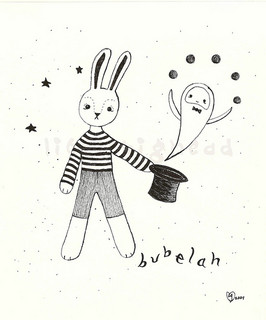
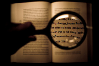
Photography provides a great example to illustrate this.
Photography is all about focusing or not focusing on certain aspects that are in the frame. When setting up their shot most photographers have a clear idea what it is that they want to “showcase”.
Knowing what you want to shoot or at least where you want to shoot allows you to figure out a focus. In fashion photography the focus generally goes towards the item being promoted despite models being used. Food photography is showcasing the food.
The same goes for websites. A well thought out website has a focus in order to draw in the eye and lead it to where it needs to be because despite the human brain being able to process multiple things at once it is much easier to take in just one thing.
I have already touched on the fact that a clear focus will help you know what to do but it also keeps your design clean. Too often a designers want to go big on everything which can be the downfall of their design.
Remember that your elements should never compete against each other. Creating some form of production list or diagram that will allow you to figure out your focus may be necessary when you are uncertain to which path to take.
When you have a focus make sure to ask yourself why, what and who. Why is this the focus, what is its purpose and who will see it. Once your focus is established you can design around it and make better color, typography and image choices.
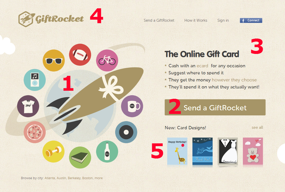
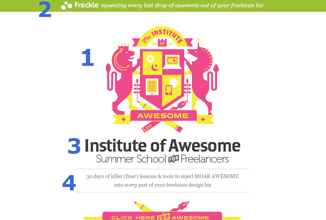
Look at the two images below and see if you can figure out the main focus for each site.

Step 2: Cut Down Elements
It isn’t always wise to “go big or go home”.
Too many elements whether big or small — even elements that are valuable in their own right — can ruin your design, by fracturing viewing attention and decreasing readability.
If you want the benefits of a simpler and more-effective site, then reducing the number of content is a must.
It is also the single quickest solution when you are in need of a quick fix, that you can later tighten up. Minimalistic design has been popular over the years, but this doesn’t mean you have to make your site minimal, just more balanced.
The number of elements that are on your website can usually be determined by your main focus. As you can see this is why the focus is so important.
The history of search engines provide a lesson here.
Back in the late 90’s, search engines had established a ‘format’.
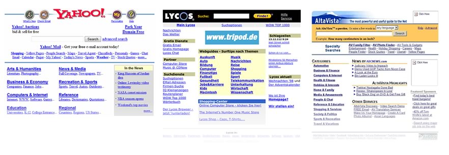
Alongside their search box, they would present categories, headlines, news links, email, stocks, celebrity quotes, sports results, advertising and more.
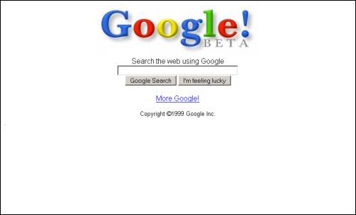
Google’s earliest iterations drastically reduced onscreen elements — a logo, a search box and a few links. Although it looked comparatively child-like next to the incumbents, users clearly responded well to an interface they could use and understand effortlessly.
Although it was certainly no oil painting to look at, I think a lot of Google’s early success can be put down to not accepting the conventional wisdom on ‘what a search engine looked like‘, and cutting their product back to the bone.
We all know how that worked out.
Start with a list
When it comes to decluttering, it pays to apply some method. Make note of all page elements, and then categorize them into either the “stay” or “go” pile.
You might find yourself having to rework your design a few times. That’s ok. Almost all good sites must go through this process.
So, what constitutes a page element that might need to be culled?
In short, everything.
All of your images, text, colors and anything else should be subject to being removed at any time. The number of colors in your palette, the quantity and size of images and typography as well as how much written content you have on a single page should be constantly reviewed with a view to either reducing or removing it.
Nothing should be sacred, and try to be especially skeptical towards the pieces of your design that you love the most. It’s hard to sacrifice your babies, but be brave.
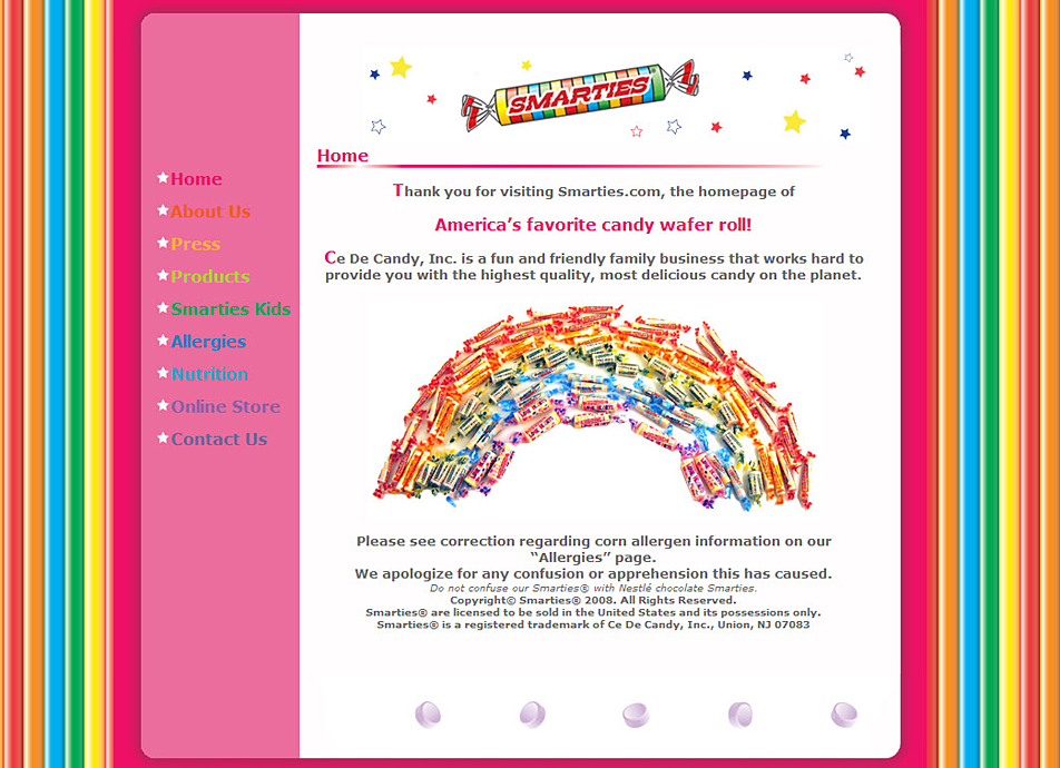
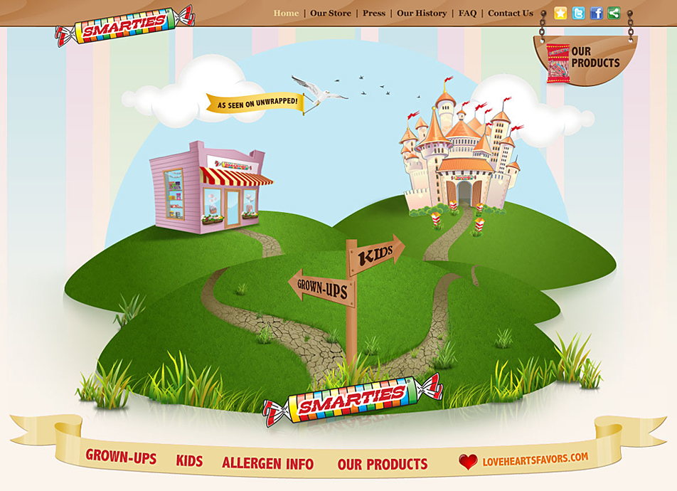
Cutting down and prioritizing elements can lead you to an overhaul such as the one Blue Fountain Media took on for the Smarties website redesigned.
Create a Clear Hierarchy
Last but certainly not least in your quest to simplify your website, you need to address your designs visual hierarchy. The alignment and proximity of your design is one of the most important aspects that you need to always keep in consideration.
As I have already touched on, humans have the capability to process a lot of information at any given time but it is best when dealing with your web visitors to not overstimulate them.
Like a seasoned tour guide, a well-designed hierarchy can effortlessly guide the visitor’s eye from section to section without a break within the flow.
Paying close attention to the scale of your objects can benefit your visual hierarchy if you make sure that you apply proper balance and alignment between your elements. Like elements should generally be grouped together to help offset any stand alone image or item.
Differentiation can be easily achieved with the use of color, whether contrasting or complimentary and of course proper spacing. This adds legibility and helps give everything it’s own space and distinction.
Intelligent use of negative space can help your focal points stand out whether it is your text content or image content. Good hierarchy is all about organizing your content in a way that is visually pleasing to the eye and leaves no room for disruption.
Remember that your focal point should be placed in a manner that automatically attracts the eye.
In most cases this element needs to be larger than the subsequent elements. Often you will see the focal point placed centrally but this isn’t always necessary.
Hierarchies don’t need to be linear, but they must be both well-considered and seamless.
Get creative with your design when it comes to your placement. Keep your design principles in mind though but also know that sometimes your design can benefit from breaking a few rules.
Visual hierarchies vary widely from site to site. In the two examples below, I’ve sketched out the page pecking-order of two different sites.
Conclusion
Design isn’t all about laying everything you have on the table. Often it’s the things you choose to leave off of design that elevates a design above the crowd.
Good website design should use as many elements as are needed to accomplish your design goals.
Remember those three steps when working on your project: establish your focus, reduce onscreen elements and establish a crystal clear hierarchy.
 Gabrielle Gosha
Gabrielle is a creative type who specializes in graphic design, animation and photography.


