Every time one web design trend dies out, it seems a tour bus of new trends appears on the horizon. It’s also perfectly natural to want to mimic those trends as if they were the latest, cool, new rock band whose ‘look’ you absolutely must copy. Deep down we all want to be rockstars, right?
But like great music, good web design shouldn’t be all about flashy tricks and visual theatrics. It must actually perform well.
Let’s take a look at five trendy web components that have been hyped up way too much by hipster designers.
1. The Carousel
Carousels have been losing traction for a while now – certainly the traditional concept of a carousel anyway.

Today we tend to view them in the format of “homepage sliders”, which solve some of the user experience flaws that smaller, content-based carousels have. More space means bigger tap targets, and the larger overall frame means that we don’t need super-fancy transitions to steal focus.
So what exactly is wrong with carousels?
Despite the fact that we’ve adapted and improved carousels over time, the fact remains that we usually have little control of how we navigate carousels.
Sometimes we’ve finished reading a slide long before it’s ready to move on. Other times we’re still reading a slide as it’s ripped away from us. And our readiness may vary day-to-day or even hour-to-hour as we tire. Unfortunately, there simply isn’t one correct timing for all people every day.
Alternative Idea: Complex Grids
Scrolling has become a dominant feature of website navigation, especially on mobile where to click/tap interactions aren’t as reliable. Grids allow the user to scroll and scan through content quickly while being subjected to a mixture of text and images. Our brains tend to feel more familiar with this type of concept because we navigate our social media feeds in the same way.
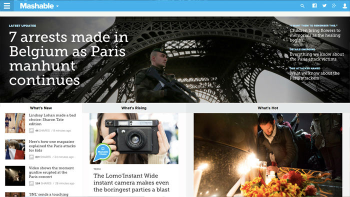
A fantastic example is the Mashable website although it’s not uncommon these days to see big fashion brands like JD Sports and H&M ditching the carousels too.
2. The Scrolljacker
In my view, scrolljacking is one of the more unpleasant experiences a user can be made to deal with. Make no mistake, when used to intensify a scroll-based animation of some sort it can create a beautiful user-controlled story. However, there are cases where the user doesn’t actually feel like he or she is scrolling.
World of Swiss is one of those examples, especially as the website offers a normal click-based navigation that the average user would understand.

For those that don’t know, ‘scrolljacking’ is a web design technique that overrides the default behaviour of user scrolling, causing the screen to scroll faster, slower or even sideways. It’s not a common website feature so it’s reasonable to assume that a significant percentage of users will be confused when scrolling behaviour is not as expected.
Sure, it might be a “cool effect” but it serves no actual value.
Alternative Idea: Leave Scroll the Hell Alone
Just leave it alone. Scrolling is as easy as it always has been!
3. The Immersive 3D Experience
Immersive web design is the act of manipulating the human senses and altering the mental state of the user. It’s about impressing the user in such a surreal way that they become engaged in the experience, first physically through user interactions and then mentally because of how the mesmerising experience unfolds in terms of storytelling, ambiance, 3D wonderment and animations.
Immersive web design is often used to show off expensive luxury consumer items such as clothes and cars, but it’s also very common in the film and entertainment industry too.
Here’s a perfect example of some of the downsides.
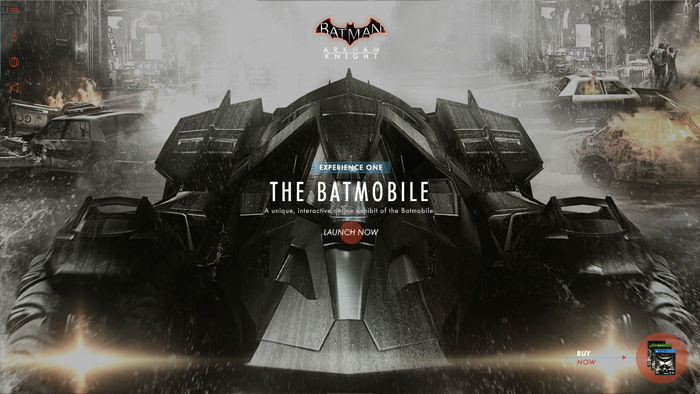
Batman: Arkham Knight offers a rather disappointing experience by screwing with the default scroll behaviour, locking the carousel to the user, using cryptic icons, mildly illegible text and obscure buttons; all for the sake of barraging the user with flashy visuals.
Immersive web design blurs the lines between components and slideshows, where it might seem more applicable to simply call it an “experience” – like an interactive story of sorts.
While this can be a beautiful (and converting) experience, implementing such high-end effects without vigorous testing can be a recipe for disaster.
Most people have years of hard-earned experience with traditional website memes, so if it doesn’t look and act like a website, then you’re likely losing visitors to competitors that chose to build something more instantly recognizable.
Alternative Idea: Build the Best of Both Worlds
I would recommend something modestly immersive with a clear fall-back that relies on simple clicks and scrolls to navigate– perhaps like the World of Swiss example I showed you before.
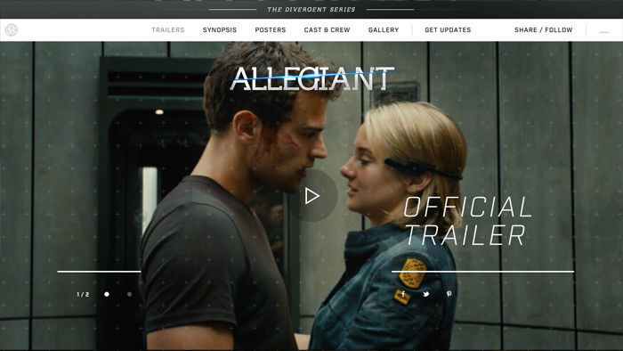
Insurgent does it much better because the interactions are automatic to the user and the default behaviours have not been thrown out. If none of this fanciness is for you, the menu is always fixed to the top of the webpage and you can navigate in the way that you’re used to.
4. The “Hello, Click Me, Click Me! Modal
Why on earth would we want to subscribe to a newsletter after spending only seconds on a website? We haven’t seen the content yet, we don’t know if it’s valuable or not and we don’t know if we’d be willing to subscribe, like or follow in order to read more content as it’s added.
Even if the modal fades, slides, bounces, flips and rotates all at once, users are not impressed.
Alternative Idea: Mid-Scroll CTA’s
I first encountered this idea on InVision App’s blog: mid-scroll call-to-action’s. Basically, this works by having a component fixed to the top and/or bottom of the webpage, but it only appears after scrolling down.
InVision App has been swapping out different types of CTA’s in these sections to test which has the better conversion rate – at the moment there is a link-based call-to-action in the bottom-right corner but a couple of weeks ago this was a subscribe form.
Scroll-based call-to-action’s are much more effective than unsolicited popup modals because the user has had time to digest the content; he or she can make an informed decision as to whether they’d like to subscribe/follow/convert and the website can swap out sub-components depending on where the user is. For example, InVision only includes share buttons on articles.
5. The Hidden Mobile Navigation
It seems that we’ve moved steadily away from dropdown boxes on mobile devices and that’s fantastic – they were too big, too invasive and hard to escape from once opened.
And so the hamburger icon came into existence. Whether you agree with its use or not, there’s no denying that it’s become quite recognisable. It’s here to stay.
But is it the best option? Off-canvas solutions are larger and less invasive, and that’s brilliant, but there’s a saying that’s always stuck with me: “out of sight, out of mind”. Also, it takes a click to open the menu before the user can even begin searching for something new, so that’s another obstacle right there.
Here’s an example of an off-canvas navigation by Panagiotis Tsamoudakis.
It looks amazing, but it’s actually quite inaccessible unless you have stretchy fingers and the ability to open it with your mind (when scrolled down). Also, it couldn’t be used for menu’s with a huge amount of links – I’d estimate 15 would be close to the maximum.
So what do you choose, more space or more obstacles?
Alternative Idea: Combine Off-Canvas with Contextual Menu’s
Actually, there is no right or wrong, but there is such thing as relevant and irrelevant suggestions. A contextual menu displays items according to where you are in the website, meaning that you can still implement that sleek off-canvas menu and link to things that the user might not necessarily need at-hand.
What defines something as relevant or irrelevant largely depends on how users typically search for things. Do they click? Search? Sort? Let’s take a look at Facebook’s Android application.
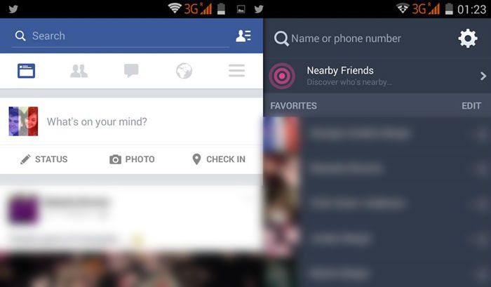
In the contextual menu, there are five clickable icons. Four of these icons are very specific and users tend to click on them several times a day.
Everything else can be accessed from the final icon – the hamburger icon. It appears on the right-hand side so that we don’t have to stretch out to reach it, and the lengthy friends list actually appears in a completely different menu; the ultra-trendy off-canvas menu. Facebook has even adapted the hamburger icon’s design so you can tell the difference.
Facebook’s example tells us that while hidden-navigation looks wonderful, it can’t be used as a way of lazily linking to everything at once. In smaller websites, mobile or not, you should consider avoiding off-canvas navigation altogether.
Conclusion
Just because we can design and code all the things, it doesn’t mean that we should. Although it can be quite exciting to try out new trends, a reasonable amount of thinking, testing and debating needs to happen before you decide to implement it.
Here are three things to ask yourself before building a component:
- Is this a necessary component?
- What is the best way to access this component?
- When should this component be accessed?
Frequently Asked Questions (FAQs) about Useless Web Components
What are some examples of useless web components?
Useless web components are elements on a website that do not contribute to its functionality or user experience. Examples include unnecessary animations, excessive pop-ups, auto-playing videos, and complex navigation menus. These components often distract users from the main content and can slow down the website’s loading time.
Why should I avoid using useless web components?
Useless web components can negatively impact your website’s performance and user experience. They can slow down your website, confuse your visitors, and even drive them away. It’s important to keep your website clean, simple, and user-friendly to ensure a positive user experience.
How can I identify useless web components on my website?
To identify useless web components, you can conduct a website audit. Look for elements that do not contribute to the website’s functionality or user experience. These could be unnecessary animations, excessive pop-ups, auto-playing videos, or complex navigation menus. If removing these elements does not negatively impact the user experience, they are likely useless components.
What are some alternatives to using useless web components?
Instead of using useless web components, focus on elements that enhance the user experience. These could include clear navigation menus, relevant content, fast loading times, and responsive design. It’s also important to ensure your website is accessible to all users, including those with disabilities.
How can I improve my website’s performance?
To improve your website’s performance, start by removing any useless web components. Then, optimize your images and other media files to reduce their size and improve loading times. Use a content delivery network (CDN) to deliver your content faster to users around the world. Also, consider using a website caching solution to further improve loading times.
How can I make my website more user-friendly?
To make your website more user-friendly, ensure it is easy to navigate, with clear menus and links. Make sure your content is relevant and easy to understand. Use a responsive design to ensure your website looks good on all devices. Also, consider adding features like a search bar and contact form to make it easier for users to find what they’re looking for and get in touch with you.
What is the impact of useless web components on SEO?
Useless web components can negatively impact your website’s SEO. They can slow down your website, which can hurt your search engine rankings. They can also create a poor user experience, which can increase your bounce rate and decrease your conversion rate. Both of these factors can hurt your SEO.
How can I ensure my website is accessible to all users?
To ensure your website is accessible, use alt text for images, use clear and simple language, ensure your website is navigable with a keyboard, and use a color scheme that is easy to read for people with color blindness. Also, consider using an accessibility plugin or tool to identify and fix any accessibility issues.
What are some common mistakes to avoid when designing a website?
Some common mistakes to avoid when designing a website include using too many fonts or colors, not using a responsive design, not optimizing images and other media files, using complex navigation menus, and not making your website accessible to all users.
How can I learn more about web design and development?
There are many resources available online to learn about web design and development. Websites like SitePoint, Codecademy, and Udemy offer tutorials and courses on a variety of topics. You can also find many free resources on websites like YouTube and GitHub.
 Daniel Schwarz
Previously, design blog editor at Toptal and SitePoint. Now Daniel advocates for better UX design alongside industry leaders such as Adobe, InVision, Marvel, Wix, Net Magazine, LogRocket, CSS-Tricks, and more.