Getting to Know CSS3 Selectors: Other Pseudo-Classes
In the first of this two-part series, I covered the new CSS3 structural pseudo-classes, which target elements according to their position in the document tree or their relation to other elements. In this article, I’ll review the remaining pseudo-classes introduced in CSS3: the state-based, target, and negation pseudo-classes.
Key Takeaways
- CSS3 introduces state-based pseudo-classes that target elements according to their state, such as whether an element is active or focused. These include :disabled, :enabled and :checked for form elements.
- The :target pseudo-class selects an element with an id that is linked to by using a fragment identifier, useful for linking to specific sections of a document.
- The negation pseudo-class, :not(x), targets elements that are not matched by the selector (x) specified within parentheses, allowing for more specific styling options.
- While CSS3 pseudo-classes offer more specific targeting options, their use is largely dependent on the project at hand. They can be particularly useful when access to markup is limited or in unique situations.
UI Element State Pseudo-Classes
While structural pseudo-classes rely on an element’s relative position, state-based pseudo-classes target elements according to their state, such as whether an element is active or focused. You should already be familiar with the idea of state pseudo-classes (like :link, :visited, :hover and :active), which were introduced in CSS1 for anchor (<a>) elements.
In CSS2.1, the :focus pseudo-class was introduced, and it expanded state-based selectors beyond hyperlinks to form elements like input and textarea. CSS3 brings three more pseudo-classes you can use to target UI states for form elements: :disabled, :enabled and :checked.
Syntax Review
The syntax for all pseudo-classes is simple. Each pseudo-class name begins with a colon:
:pseudo-class {}
Your selector can include just the pseudo-class, like the preceding example, which will target all relevant elements, or you can be more specific by appending the pseudo-class to an element (e), class or id selector, like this:
e:pseudo-class {}

    .class:pseudo-class {}

#id:pseudo-class {}
With the state-based pseudo-classes, the browser applies the selector only when the specified state is true in the UI. In the following example, the styles specified will render on the screen only when the user hovers over the link. All other link states won’t render these styles.
a:hover {

    background-color: #ccc;

    text-decoration: none;

}
:disabled
The :disabled pseudo-class targets input elements that have the disabled attribute, which makes the input element unclickable and unusable:
<input type="text" name="name" disabled />
This example uses the Boolean disabled attribute in HTML5, but you can also declare this attribute in previous versions of HTML:
<input type="text" name="name" disabled="disabled" />
For both approaches, most browsers use a default presentation for disabled inputs, where the field border is slightly grayed out compared with the enabled input, as shown below.

However, you can use the :disabled pseudo-class to override this default style and obtain the results shown here.
input:disabled {

    background-color: #ccc;

    border: 0;

    padding: 3px 2px;

}
You can also achieve this effect with an attribute selector if you aren’t using the Boolean disabled attribute:
input[disabled="disabled"] {

    background-color: #ccc;

    border: 0;

    padding: 3px 2px;

}
Which selector you use ultimately depends on your project.
:enabled
The :enabled pseudo-class targets the default, enabled state of inputs:
input:enabled {

    background-color: rgb(255, 255, 255);

    border: 1px solid rgb(125,104,99);

}
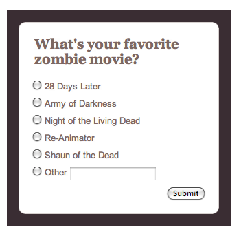
Because the default state of form elements is enabled, I’m not sure when I would need to use this selector. An element selector would work just as well, and maybe better, depending on the project. But for purposes of demonstration, consider a short form with radio buttons that includes an Other option that lets users enter their own value in a text input. The HTML for this form is shown below, and below that is the form.
<form>

    <legend>What's your favorite zombie movie?</legend>

    <input type="radio" name="FavMovie" id="28Days" />

    <label for="28Days">28 Days Later</label>

    <input type="radio" name="FavMovie" id="Army" />

    <label for="Army">Army of Darkness</label>

    <input type="radio" name="FavMovie" id="Night" />

    <label for="Night">Night of the Living Dead</label>

    <input type="radio" name="FavMovie" id="Reanim" />

    <label for="Reanim">Re-Animator</label>

    <input type="radio" name="FavMovie" id="Shaun" />

    <label for="Shaun">Shaun of the Dead</label>

    <input type="radio" name="FavMovie" id="Other" />

    <label for="Other">Other</label>

    <input type="text" id="OtherEntry" disabled />

    <input type="submit" />

</form>
In the HTML, the text input for the Other option is set to disabled, and I’ve left the default browser styling in place. But when a user selects the Other radio button, I want to enable the disabled input. The disabled attribute can be removed with a little JavaScript, and the style can change slightly, as shown here, to help notify the user that the input field can accept entry. The form now appears as it’s shown further down.
input:enabled {

    background-color: rgb(255, 255, 204);

}
:checked
The :checked pseudo-class targets radio and checkbox inputs that are selected. This allows you to style elements that are preselected by the developer via the checked attribute or selected by the user in the UI. The :checked pseudo-class might be useful in a matrix or long list of radio buttons (or checkboxes) in which a user could have difficulty determining which option is selected. For the sake of brevity, let’s look at how :checked can be applied to a simple opt-out form on which a radio button is preselected (see Figure 6).
The HTML for this example includes a radio button with the Boolean checked attribute:
<form>

    <legend>Do you want text notifications of the zombie apocalypse?</legend>

    <input type="radio" name="notify" id="yes" checked /><label for="yes">Yes</label>

    <input type="radio" name="notify" id="no" /><label for="no">No</label>

    <input type="submit" />

</form>
And here’s the CSS to target the selected radio button:
input:checked {

    border: 1px solid rgb(255, 0, 0);

}
Given that other selectors can be used with these pseudo-classes, I could be even more specific by combining :checked with an attribute selector:
input[type="radio"]:checked {

    border: 1px solid rgb(255, 0, 0);

}
Unfortunately, most browsers restrict styling of radio and checkbox inputs. In these cases, the styles specified with the :checked selector simply won’t display. Of the browsers I use, only Opera/OS X delivered the results shown, and frankly, it’s just ugly and would probably confuse the user. However, you could use the :checked pseudo-class along with the adjacent sibling combinator to style the label text for a checked radio button. Here’s the CSS. You can see the results below.
input:checked + label {

    background-color: rgb(255, 255, 204);

    color: rgb(255, 0, 0);

}
The :target Pseudo-Class
CSS3 also includes a few new pseudo-classes that aren’t structural or state-based. The :target pseudo-class selects an element with an id that is linked to by using a fragment identifier. Fragment identifiers appear at the end of a URL, indicated with a hash mark (#) followed by an anchor (<a>) name or element id.
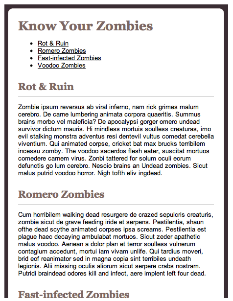
For example, in a long article I might want to include a table of contents that links to the article’s major sections. To set this up, I need to assign ids to serve as the fragment identifiers for the content I want to target (in this case, headings):
<h2 id="rotnruin">Rot & Ruin</h2>
<p>Zombie ipsum reversus ab viral inferno, nam rick grimes malum cerebro. De carne lumbering animata corpora quaeritis. Summus brains morbo vel maleficia? De apocalypsi gorger omero undead survivor dictum mauris...</p>
<h2 id="romero">Romero Zombies</h2>
<p>Cum horribilem walking dead resurgere de crazed sepulcris creaturis, zombie sicut de grave feeding iride et serpens. Pestilentia, shaun ofthe dead scythe ...<p>Then I need to link to these ids:
<ul>
<li><a href="#rotnruin">Rot & Ruin</a></li>
<li><a href="#romero">Romero Zombies</a></li>
...
</ul>
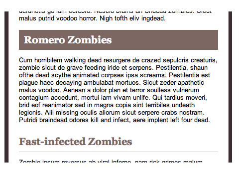
After I have the HTML structure in place, I can style the h2 elements to have a different appearance when a user jumps to a section via the table of content links. Here’s the CSS, with the results shown below.
h2:target {

    background: rgb(125,104,99);

    border: 0;

    color: rgb(255, 255, 255);

    padding-left: 10px;

}
The Negation Pseudo-Class
Referred to as the negation pseudo-class, :not(x) targets elements that are not matched by the selector (x) specified within parentheses. The syntax for :not(x) allows virtually all types of selectors to be specified, from simple element, id or class selectors to combinators and other pseudo-classes.
As examples, you could specify styles for all links that aren’t children of a section element, for all paragraphs that don’t have a assigned or for input elements that aren’t submit buttons:
:not(section) a {}

p:not(.intro) {}

input:not([type="submit"]) {}
Why use Pseudo-Classes?
It’s easy to look at these pseudo-classes (and those covered in Part 1) and wonder why you would use them in favor of the (arguably) more straightforward selectors. The answer is tied to the project you are working on.
Sometimes, a CMS will limit access to markup, which means you can’t add ids or classes. The same is true for some legacy systems. And sometimes unique situations come up where these pseudo-classes make sense.
The goal of understanding these selectors, at least for me, isn’t to pick one and use it exclusively. Instead, it’s about building an arsenal of options you can use for any situation or project.
Browser Support and Processing
As I detailed in Part 1, all modern browsers, including Internet Explorer 10 and 9, support CSS3 pseudo-classes. If you are targeting an older browser version that offers limited or buggy CSS3 selector support, you will need to use a polyfill like Selectivizr. It’s also worth mentioning that browser processing of CSS3 selectors is comparatively less efficient than that for other selectors. Again, what you use should always come down to your project. If you need help evaluating the performance of your selectors, check out CSS Lint and the CSS Test Creator.
Additional Resources
This two-part series covers the basics of CSS3 pseudo-classes, but there’s much more you can experiment with. I recommend the following online resources to give you more ideas about what’s possible:
- Work Backwards to Understand CSS Structural Pseudo Classes
- CSS3 Pseudo-Classes and HTML5 Forms
- On :target
- Element Filtering Using CSS3 Negation Pseudo-Class
- Negative Proximity
Also, I very highly recommend Zoe Gillenwater’s Stunning CSS3. In this book, you get lots of practical examples of pseudo-classes, along with a ton of other fantastic CSS3 information and resources.
See also SitePoint’s CSS Reference and CSS books.
Frequently Asked Questions about CSS3 Selectors and Other Pseudo-Classes
What are CSS3 selectors and how do they work?
CSS3 selectors are powerful tools in web design that allow developers to select and manipulate HTML elements based on their attributes, states, or positions in the document tree. They work by matching patterns of elements in the HTML structure. For example, the class selector (.) selects elements based on their class attribute, while the id selector (#) selects elements based on their id attribute.
What are pseudo-classes in CSS3?
Pseudo-classes are keywords added to selectors that specify a special state of the selected elements. For instance, :hover is a pseudo-class that selects an element when the user’s pointer is over it. Other common pseudo-classes include :active, :visited, and :focus, each specifying different states of an element.
How do I use the :not pseudo-class in CSS3?
The :not pseudo-class in CSS3 is a negation pseudo-class. It selects all elements except those that match the specified selector. For example, :not(p) will select all elements that are not paragraphs. It’s a powerful tool for excluding certain elements from a general style rule.
What is the difference between pseudo-classes and pseudo-elements in CSS3?
While both pseudo-classes and pseudo-elements are used to apply styles to HTML elements, they serve different purposes. Pseudo-classes select elements based on their state or position in the document tree, while pseudo-elements allow you to style specific parts of an element, such as the first letter or line of a block of text.
How can I combine multiple CSS3 selectors?
You can combine multiple CSS3 selectors to create more specific rules. For example, you can combine a class selector and a pseudo-class to style elements of a certain class when they’re in a certain state. The rule .example:hover would apply to any element with the class “example” when it’s being hovered over.
What are attribute selectors in CSS3 and how do they work?
Attribute selectors in CSS3 select elements based on their attributes and attribute values. For example, the selector [type=”text”] would select all input elements with a type attribute of “text”. You can also use operators like ^= (starts with), $= (ends with), and *= (contains) to match parts of attribute values.
How can I use the :nth-child pseudo-class in CSS3?
The :nth-child pseudo-class in CSS3 selects elements based on their position in a group of siblings. For example, :nth-child(2) would select the second child of every group of siblings. You can also use keywords like “even” and “odd”, or formulas like 2n+1 to select multiple elements.
What is the purpose of the :root pseudo-class in CSS3?
The :root pseudo-class in CSS3 selects the root element of a document. In HTML, the root element is always the html element. This pseudo-class is often used to define global style variables, as any property set on :root will apply to the entire document.
Can I use pseudo-classes with pseudo-elements in CSS3?
Yes, you can combine pseudo-classes with pseudo-elements in CSS3. For example, the rule ::first-letter:hover would apply to the first letter of an element when it’s being hovered over. This allows you to create very specific style rules.
Are there any browser compatibility issues with CSS3 selectors and pseudo-classes?
While most modern browsers support CSS3 selectors and pseudo-classes, there can be some compatibility issues with older browsers. It’s always a good idea to check the compatibility of specific selectors and pseudo-classes on a site like Can I Use before using them in your code.
Emily Lewis is a freelance web designer of the standardista variety, which means she gets geeky about things like semantic markup and CSS, usability and accessibility. She writes about web design on her blog and is the author of Microformats Made Simple and a contributing author for the HTML5 Cookbook.


