Sometimes the best way to do great design is to NOT be a designer. Fresh eyes. Fewer rules.

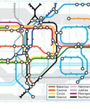
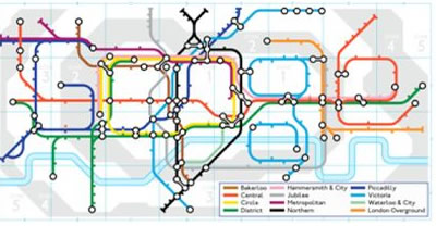
This is one of the most famous pieces of graphic design from the last century. It’s the London Tube Map designed by Henry (often referred to as ‘Harry’) Beck in 1931.
It’s remarkable for a lot of reasons.
Firstly, Henry was never trained as a designer. He was employed as a technical draftsman by the railways, and only took to composing his map as a personal project. His managers didn’t like it initially.
Secondly, it’s remarkable for how crisp and modern it still looks today. Created at a time when most homes don’t even own a radio yet, Beck’s map looks positively computer-generated.
Each line runs either parallel to the page edges, or at precisely 45 degrees to them. Stations are evenly spaced and all bends and forks are geometrically perfect.
Of course, the real-world rail system it records was nothing like this. Railways lines are built whereever it is cheapest and most practicall for humans to put them.

Earlier maps blended road and city information with accurate track and station renderings. They look like a knot of colorful, fighting spiders.
Henry’s new map actually transmitted much less information than the Tube maps that preceded his. Surely it’s be better to have more information, right?
Accuracy isn’t always your friend
For the previous 500 years, mapmaking had been obsessed with fidelity. With good reason too! The more accurately you could reflect true positions and distances, the more likely your ship, crew and cargo would make it home safely.
But railways maps have a different purpose. There are more knowns. Trains rarely get lost en route and you can’t easily change lines or hop off between stations. Most stations are underground so landmarks are non-existent.
Beck realized passengers mostly needed to know where stations were in relation to each other. His map is a blend of the simple structures we like in lists, and some of the useful spatial information we like in maps.
In our world of web analytics and endless oceans of data, it’s really easy to become obsessed with numbers and detail. If a little data is good, a lot of data must be better, right?
Beck’s design genius wasn’t what he illustrated. It was what he chose to cut out. He removed a lot of perfectly valid information, and he made the map less accurate than it was — but in the process created a much more successful design.
That should be an important idea to us.
Beck certainly wasn’t the first to simplify a railway map, but it was his design that influenced designers up to this day.It was a roaring success from the start and Henry continued producing it till the 1960’s.
Tubular Tributes
Although a somewhat radical design at the time, today Henry’s map is one of the most loved design tropes — continually referenced in design to this day.
Some of my favorites include:
- Samuel Arbesman created a brilliant tube Milky Way map .
- Dorian Lynskey made a map of rock/pop bands and genres.
- Mark Lorch merged the map with the periodic table, coming up with The Underground Map of the Elements .
- And finally, Google produced this brilliant tribute doodle in 2013 — the 150th anniversary of the London underground.
If you’re so inspired, you can even generate your own tube-style map at beno.org.uk .
Republished from the SitePoint Design Newsletter
 Alex Walker
Alex has been doing cruel and unusual things to CSS since 2001. He is the lead front-end design and dev for SitePoint and one-time SitePoint's Design and UX editor with over 150+ newsletter written. Co-author of The Principles of Beautiful Web Design. Now Alex is involved in the planning, development, production, and marketing of a huge range of printed and online products and references. He has designed over 60+ of SitePoint's book covers.