‘Less is more’ is arguably the most often quoted rule in the history of design.
Designers from Christian Dior (fashion) to Saul Bass (graphic design) to Ludwig Mies van der Rohe (furniture) have thrived on the principle. It’s an idea that even applies to cartographers.
‘Less is more’ in Mapmaking
Going back in history, mapmaking was much more of an interpretative skill, than an exercise in pure geography and geometry. Early mapmakers were almost ‘parchment alchemists’, collecting existing maps, sea charts, captain’s journals, logbooks, traditions, word of mouth, legend and hearsay, and blending it all together into a brand new creation.
And without satellites and GPS to disprove them, a flawed map could still remain the best available resource on an area for centuries to come.
The mythical ‘Mountains of Kong‘ appeared on maps for a hundred years simply because no-one had yet located the mouth of the Niger River, and it was assumed a mighty mountain range must be diverting it inland.
But what about those ‘white spaces’? The uncharted areas? The unknown?
As humans, we really prefer not to admit when we don’t know something, and those white spaces seem to be broadcasting our ignorance. You can understand why mapmakers often felt compelled to fill-in those gaps.
Sometimes that may just involve using a very large text label — a huge ‘A…..F…..R…..I…..C…..A‘ might carve its way majestically through the interior of a continent.
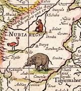
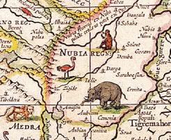
Other times the cartographer may fill-in the empty spaces with lavish illustrations — perhaps drawn from stories they’d heard from travellers of crocodiles or monsters or exotically-robed natives.
This is precisely what happened with early european maps of Africa. For hundreds of years african maps were cluttered with animals, rivers and mighty mountain ranges — even though almost nothing was definitively known of these areas.
This all changed with a single map.
In 1780, a frenchman named Jean-Baptiste Louis Clouet, produced a new map that included only scientifically surveyed data.
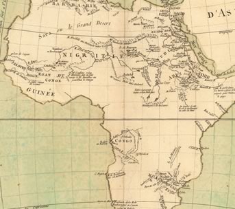
It’s clearly a very different-looking map. Following the ‘less is more’ edict, Clouet swept away the clutter and guesswork of all previous maps — and in the process had a big impact in europe.
And Everyone Lived Happily Ever After?..
Unfortunately, not really. This was a case where truth and accuracy didn’t necessarily help to produce a happy story.
Clouet’s map — with all its wide, empty expanses — fundamentally changed the way european nations looked at Africa. It showed exactly what was up for grabs for a colonizing power.
Over the next century, Great Britain, France, Germany, Belgium, Italy, Portugal and Spain all laid claim to huge swathes of the continent. The effects of this are still keenly felt to this day.
Clouet didn’t know it at the time, but his elegant map became a ‘for sale’ sign.
Perhaps this a case where less ended up being less.
Republished from the SitePoint Design Newsletter
 Alex Walker
Alex has been doing cruel and unusual things to CSS since 2001. He is the lead front-end design and dev for SitePoint and one-time SitePoint's Design and UX editor with over 150+ newsletter written. Co-author of The Principles of Beautiful Web Design. Now Alex is involved in the planning, development, production, and marketing of a huge range of printed and online products and references. He has designed over 60+ of SitePoint's book covers.