- Form elements are derived from native operating system widgets, which makes them particularly difficult to style.
- Forms are often critical to the function of a web site — they’re most often employed as search boxes, inquiry forms, or shopping cart checkouts — and need to function as smoothly as possible in order to meet user expectations.
Accessible Form Markup
Before we can begin to look at form layout, we need to craft some really solid markup that will provide us with a framework to which we can add some style. Forms represent the one area of your web site where you absolutely must commit time and energy to ensure user accessibility. Even though forms represent some of the most complex interactions that can occur on a web page, in many cases these interactions are only represented visually — via the proximity of a form element to itslabel, or grouping by borders and background colors. Users of assistive technology such as screen readers may not be able to see these visual clues, so it’s vital that you support these users by ensuring accessibility. The key concept behind providing an accessible form is to have descriptive labeling of all its sections and input elements.
In particular, this means the proper usage of two elements: label and legend.
There’s also an improperly held belief that the only way you can guarantee that a form displays properly is by using tables. All of the code reproduced here for forms is standards-based, semantic markup, so you’ve got no excuse for relying on tables now!
Labeling Form Elements
No matter how you style a form element and its label, it generally conforms to a certain pattern:
- the form element itself
- a text label for the element
- a connection between the element and its textual description
 Figure 1: Visual connections in forms (See larger image in new window.)
When accommodating users of assistive technology in the creation of your forms, there’s one main question to consider. How can a user who’s unable to see a web page create the connection between a form element and its text label, without the visual cues of proximity or grouping?
The answer is the
Figure 1: Visual connections in forms (See larger image in new window.)
When accommodating users of assistive technology in the creation of your forms, there’s one main question to consider. How can a user who’s unable to see a web page create the connection between a form element and its text label, without the visual cues of proximity or grouping?
The answer is the label element. label is a special element applied to a form element to allow its textual description to be semantically linked to the element itself, so any assistive technology such as a screenreader can read out that text when it encounters its partner form element.
In order to use a label, wrap the textual description in a pair of label tags, then add a for attribute to the label. The value of the for attribute should be the id of the form element with which you want to create a connection:
<label for="firstName">First name</label>
<input id="firstName" name="firstName" type="text" />firstName field, it’ll also read out the text “First name” to the user, so he or she will know what to type into that field. The label doesn’t have to be near the form element and neither of them have to be in any particular order — as long as the label‘s for attribute contains a valid reference, the relationship will be understood. However, having the label right before the form element in the source order generally makes the most semantic sense.
A label should be applied to any form element that doesn’t automatically include descriptive text, such as:
Submit buttons and submit images don’t require label elements, because their descriptions are contained, respectively, in their value and alt attributes.
Of course, you can easily style the text inside the label using CSS, so you can format the label text in your forms in the same way as if you were using a span, p, or div, but using a label has the benefit of being much more accessible than any of those elements.
Grouping Related Elements
legend goes hand in hand with fieldset. In fact, the only element of which a legend can be a child is a fieldset. A fieldset groups a series of related form elements. For instance, “street address,” “suburb,” “state,” and “zip code” could all be grouped under “postal address.” You could create a fieldset that groups all of those elements, and give it an appropriate legend to describe that group:
<form action="example.php">
<fieldset>
<legend>Postal Address</legend>
<label for="street">Street address</label>
<input id="street" name="street" type="text" />
<label for=" suburb">Suburb</label>
<input id="suburb" name="suburb" type="text" />
<label for="state">State</label>
<input id="state" name="state" type="text" />
<label for="postcode">Postcode</label>
<input id="postcode" name="postcode" type="text" />
</fieldset>
</form>legend is associated with all those form elements inside the fieldset, when a person using a screenreader focuses on one of the form elements, the screenreader will also read out the legend text: “Postal Address; Suburb.”
The benefit of the screenreader specifying both legend and fieldset becomes apparent when you have two groups of elements that are very similar, except for their group type:
<form action="example.php">
<fieldset>
<legend>Postal Address</legend>
<label for="street">Street address</label>
<input id="street" name="street" type="text" />
<label for=" suburb">Suburb</label>
<input id="suburb" name="suburb" type="text" />
<label for="state">State</label>
<input id="state" name="state" type="text" />
<label for="postcode">Postcode</label>
<input id="postcode" name="postcode" type="text" />
</fieldset>
<fieldset>
<legend>Delivery Address</legend>
<label for="deliveryStreet">Street address</label>
<input id="deliveryStreet" name="deliveryStreet"
type="text" />
<label for="deliverySuburb">Suburb</label>
<input id="deliverySuburb" name="deliverySuburb"
type="text" />
<label for="deliveryState">State</label>
<input id="deliveryState" name="deliveryState"
type="text" />
<label for="deliveryPostcode">Postcode</label>
<input id="deliveryPostcode" name="deliveryPostcode"
type="text" />
</fieldset>
</form>fieldset‘s legend elements in place it’s quite easy to determine visually which fields fall under which group, even on an unstyled form.
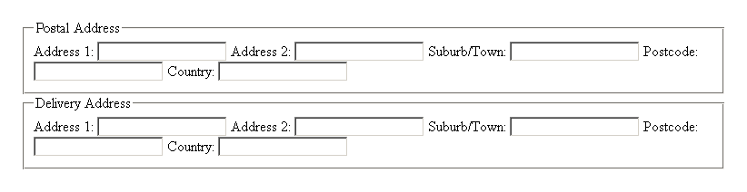
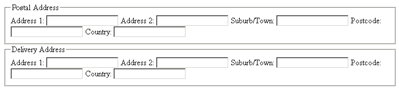 Figure 2: Unstyled form using
 fieldset and legend elements for grouping (See larger image in new window.)
But, you ask, couldn’t the same visual effect be achieved using h1 elements instead of legend elements?
Yes. However, the point of using legend is that without proper semantic grouping and labeling, a screenreader user would become confused as to why he or she was required to enter “Address 1” twice. With the legend included, the user will know that the second “Address 1” actually belongs to another group — the group for the delivery address.
So, by combining label and legend, we give visually impaired users the ability to navigate and fill in our forms much more easily. By using this combination as the basic structure for your forms, you’ll ensure that not only will they look fantastic, but they’ll be accessible as well!
Form Layout
There are several different ways in which you can lay out a form. The method you choose depends upon how long the form is, its purpose, how often it will be used by each person who has to fill it out, and, of course, the general aesthetics of the web page. It’s generally considered most efficient to have one form element per line, with the lines stacked sequentially one on top of the other, as most Western-language web pages are designed to scroll vertically rather than horizontally. This allows users to follow the path to completion easily and focus their attention on entering one piece of data at a time. For each form element in a left-to-right reading system, it’s logical to position the correspondinglabel in one of three ways:
- directly above the form element
- in a separate left column, left-aligned
- in a separate left column, right-aligned
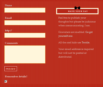 Figure 3: Labels positioned above form elements
Labels that are positioned in a column to the left of the elements look much more organized and neat, but the way in which the text in those labels is aligned also affects the usability of the form.
Right-aligning the text creates a much stronger grouping between the label and the element. However, the ragged left edge of the labels can make the form look messy and reduces the ability of users to scan the labels by themselves, as Luke Wroblewski argues in his article on the subject. In a left-aligned column, the labels instantly become easier to scan, but their grouping with the associated form elements becomes weaker. Users have to spend a little more time correlating the labels with their elements, resulting in slower form completion. An example of left-aligned labels can be seen in Figure 4.
Figure 3: Labels positioned above form elements
Labels that are positioned in a column to the left of the elements look much more organized and neat, but the way in which the text in those labels is aligned also affects the usability of the form.
Right-aligning the text creates a much stronger grouping between the label and the element. However, the ragged left edge of the labels can make the form look messy and reduces the ability of users to scan the labels by themselves, as Luke Wroblewski argues in his article on the subject. In a left-aligned column, the labels instantly become easier to scan, but their grouping with the associated form elements becomes weaker. Users have to spend a little more time correlating the labels with their elements, resulting in slower form completion. An example of left-aligned labels can be seen in Figure 4.
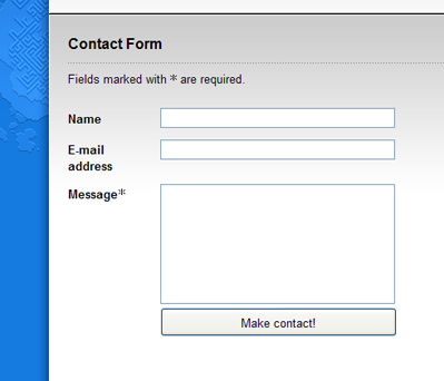 Figure 4: Labels positioned in a column and aligned left — The Man in Blue
The right-aligned column layout shown in Figure 5 allows for quicker association between label and element, so again it’s more appropriate for forms that will be visited repeatedly by the user. Both layouts have the advantage of occupying a minimal amount of vertical space.
Figure 4: Labels positioned in a column and aligned left — The Man in Blue
The right-aligned column layout shown in Figure 5 allows for quicker association between label and element, so again it’s more appropriate for forms that will be visited repeatedly by the user. Both layouts have the advantage of occupying a minimal amount of vertical space.
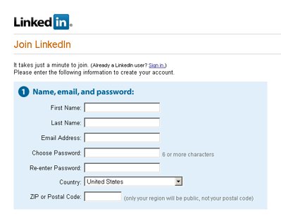 Figure 5: Labels positioned in a column and aligned right — LinkedIn
Frequently Asked Questions (FAQs) on Fancy Form Design with CSS
How can I make my CSS form responsive?
Making your CSS form responsive means it will adapt to different screen sizes, providing an optimal viewing experience for users on various devices. To achieve this, you can use media queries in your CSS. Media queries allow you to apply different styles for different devices based on their screen size. For instance, you can set a maximum width for form elements and use percentages instead of fixed widths to make them flexible. Also, consider using CSS Grid or Flexbox for layout as they provide more flexibility and control over your form elements.
How can I style common form elements with CSS?
CSS provides a wide range of properties that you can use to style common form elements. For instance, you can use the ‘background-color’ property to change the background color of an input field, the ‘border’ property to add a border around it, and the ‘color’ property to change the text color. You can also use the ‘padding’ and ‘margin’ properties to adjust the spacing around and within the form elements. Additionally, you can use the ‘font-size’ and ‘font-family’ properties to change the font size and type.
What are some design principles I should consider when creating CSS forms?
When designing CSS forms, it’s important to prioritize usability and accessibility. Ensure your form is easy to navigate and understand. Use clear labels for form fields and provide helpful error messages. Also, consider the visual hierarchy of your form. The most important elements should be more prominent. Use color, size, and spacing to differentiate between different elements and guide users through the form. Lastly, ensure your form is responsive so it looks good on all devices.
How can I create a fancy form design with CSS?
Creating a fancy form design with CSS involves using various CSS properties to style your form elements. You can use the ‘border-radius’ property to create rounded corners, the ‘box-shadow’ property to add shadows, and the ‘transition’ property to add smooth transitions. You can also use gradients for backgrounds and use custom fonts for text. Additionally, you can use pseudo-classes like ‘:hover’ and ‘:focus’ to change the style of an element when it’s hovered over or focused.
How can I use CSS to style form buttons?
You can use CSS to style form buttons in various ways. For instance, you can change the background color, border, and text color of a button using the ‘background-color’, ‘border’, and ‘color’ properties respectively. You can also add a hover effect using the ‘:hover’ pseudo-class. Additionally, you can use the ‘padding’ property to adjust the size of the button, and the ‘font-size’ property to adjust the size of the button text.
How can I create a multi-step form with CSS?
Creating a multi-step form with CSS involves hiding and showing different sections of the form based on the user’s progress. You can use the ‘display’ property to hide and show form sections. You can also use CSS transitions to smoothly transition between different steps. Additionally, you can use JavaScript or jQuery to handle the logic of moving between steps and validating user input.
How can I create a form with inline fields using CSS?
To create a form with inline fields, you can use the ‘display’ property with the value ‘inline-block’ or ‘flex’. This will make the form fields appear next to each other instead of on separate lines. You can also use the ‘margin’ and ‘padding’ properties to adjust the spacing between the fields.
How can I create a form with validation using CSS?
CSS provides pseudo-classes like ‘:valid’ and ‘:invalid’ that you can use to style form fields based on their validity. For instance, you can change the border color of an input field to green when it’s valid and to red when it’s invalid. However, keep in mind that CSS can only provide visual feedback. You’ll need to use JavaScript or a server-side language for actual form validation.
How can I create a form with custom checkboxes and radio buttons using CSS?
To create a form with custom checkboxes and radio buttons, you can hide the default checkboxes and radio buttons using the ‘appearance’ property with the value ‘none’, and then create your own custom checkboxes and radio buttons using CSS. You can use the ‘:checked’ pseudo-class to style the checkboxes and radio buttons when they’re checked.
How can I create a form with a progress bar using CSS?
To create a form with a progress bar, you can use the ‘width’ property to adjust the width of the progress bar based on the user’s progress. You can also use the ‘background-color’ property to change the color of the progress bar. Additionally, you can use CSS transitions to smoothly animate the progress bar as the user progresses through the form.
 Cameron Adams
Cameron has been adding to the Internet for over seven years and now runs his own design and development business: www.themaninblue.com. He likes to combine the aesthetic with the technological on his Weblog, which contains equal parts of JavaScript, design and CSS.


