Continuing on from the previous article in this series on color, The Psychology of Color, let’s take a closer look at color temperature, chromatic values, saturation, and the basic theory behind how colors are produced, both in print and on the web.
Color Temperature
One attribute that exists across the entire spectrum is the notion of color temperature. Which color faucet gives you hot water? What color do you associate with ice? Why? The answers are obvious, and are enforced by both culture and nature. Warm colors are the colors from red to yellow, including orange, pink, brown, and burgundy. Due to their association with the sun and fire, warm colors represent both heat and motion. When placed near a cool color, a warm color will tend to pop out and dominate dominate.
 Cool colors are the colors from green to blue, and can include some shades of violet. Violet is the intermediary between red and blue, so a cooler violet is, as you probably guessed, one that’s closer to blue, while a reddish violet can feel warm. Cool colors are calming, and can reduce tension. In a design, cool colors tend to recede, making them great for backgrounds and larger elements on a page, since they won’t overpower your content.
Chromatic Value
 The measure of the lightness or darkness of a color is known as its chromatic value. Adding white to a color creates a tint of that color. Likewise, a shade is produced by adding black to a given color. Figure 1, “Chromatic value” to the left illustrates this distinction.
As with colors themselves, the chromatic value of colors you’re using can impact upon the psychological connection users will have to the content. One use of chromatic value might be to accent the time of day that customers associate with a company or organization. If you were designing a website that’s all about nightlife or concerts, for instance, you’d probably want to go with dark shades and limit your use of light tints. Tints tend to be associated with daylight, springtime, and childhood. Think: sunrise, baby clothes, and Care Bears. These light pastel colors can be used in professional, sophisticated, grown-up ways, too, as anyone who’s ever spent time in a hospital can attest. This is because tints are soothing colors that provide personality to sterile environments without startling the ill or making babies cry. Color designers are generally uninspired by colors such as “Hospital Green,” but if you’re working on a website for a day spa, tints would be a great foundation for your color palette.
The measure of the lightness or darkness of a color is known as its chromatic value. Adding white to a color creates a tint of that color. Likewise, a shade is produced by adding black to a given color. Figure 1, “Chromatic value” to the left illustrates this distinction.
As with colors themselves, the chromatic value of colors you’re using can impact upon the psychological connection users will have to the content. One use of chromatic value might be to accent the time of day that customers associate with a company or organization. If you were designing a website that’s all about nightlife or concerts, for instance, you’d probably want to go with dark shades and limit your use of light tints. Tints tend to be associated with daylight, springtime, and childhood. Think: sunrise, baby clothes, and Care Bears. These light pastel colors can be used in professional, sophisticated, grown-up ways, too, as anyone who’s ever spent time in a hospital can attest. This is because tints are soothing colors that provide personality to sterile environments without startling the ill or making babies cry. Color designers are generally uninspired by colors such as “Hospital Green,” but if you’re working on a website for a day spa, tints would be a great foundation for your color palette.
Saturation
The saturation or intensity of a color is described as the strength or purity of that color. It’s obvious that intense, vivid colors stand out. Even though cool colors tend to recede, a vivid blue will draw more attention to itself than a dull orange. When we add gray (black and white) to a color, it becomes dull and muted. Like an office with beige walls, or an overcast winter morning, these colors are less exciting or appealing as bright, vivid colors. On the bright side—no pun intended—dull colors help to reduce tension, giving compositions a meditative, dreamy mood The relationship between value and saturation is illustrated in Figure 2, “Value and saturation chart”.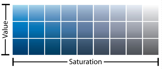 Fig. 2, “Value and saturation chart”
The Color Wheel
To take our foundational knowledge of color any further, we’ll need to gain a grounding in some of the more technical concepts associated with the subject, such as how colors are formed and how they can be categorized. The colors displayed on your computer screen (that is, the colors we’ll be using in our website designs) are based on an additive color model. In an additive color model, colors are displayed in percentages of red, green, and blue (RGB) light. If we turn all three of these colors on full blast, we’ll have white light. If we turn red and green all the way up, but switch off blue, we have yellow. If you’ve ever owned a color printer, you might be familiar with the acronym CMYK (cyan, magenta, yellow, and black). Your ink-jet printer, laser printer, and industrial four-color printing press all create images using cyan, magenta, yellow, and black inks or toners. This process uses a subtractive color model; by combining colors in this color model, we come close to achieving a grayish black. There’s no way of producing black combining just cyan, magenta, and yellow. This is why they’re always supplemented with black—the K in CMYK. Take a look at Figure 3, “RGB additive color model (left) and the CMYK subtractive color model (right)” for a better idea of how additive and subtractive color models work.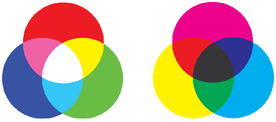 Fig. 3, RGB additive color model (left) and the CMYK subtractive color model (right)
Regardless of whether you’re designing for print or the Web, the lessons of traditional color theory are key to helping us classify colors and group them together. Recorded studies of color classification date back to the third century BC and the works of Aristotle. Since then, many other great artists and philosophers have contributed to our knowledge of how colors work, including Isaac Newton, Johann Wolfgang von Goethe, and Johannes Itten. The works of these individuals, in the 17th, 18th, and 19th centuries respectively, provide the foundations on which much of our understanding of color lies. All three theorists explained colors in relation to a color wheel, using red, yellow, and blue as the primary colors. The color wheel is a simple but effective diagram developed to present the concepts and terminology of color theory. The traditional artists’ wheel is a circle divided into 12 slices, as Figure 4, “The traditional red, yellow, and blue artists’ color wheel” indicates. Each slice is either a primary color, a secondary color, or a tertiary color.
Fig. 3, RGB additive color model (left) and the CMYK subtractive color model (right)
Regardless of whether you’re designing for print or the Web, the lessons of traditional color theory are key to helping us classify colors and group them together. Recorded studies of color classification date back to the third century BC and the works of Aristotle. Since then, many other great artists and philosophers have contributed to our knowledge of how colors work, including Isaac Newton, Johann Wolfgang von Goethe, and Johannes Itten. The works of these individuals, in the 17th, 18th, and 19th centuries respectively, provide the foundations on which much of our understanding of color lies. All three theorists explained colors in relation to a color wheel, using red, yellow, and blue as the primary colors. The color wheel is a simple but effective diagram developed to present the concepts and terminology of color theory. The traditional artists’ wheel is a circle divided into 12 slices, as Figure 4, “The traditional red, yellow, and blue artists’ color wheel” indicates. Each slice is either a primary color, a secondary color, or a tertiary color.
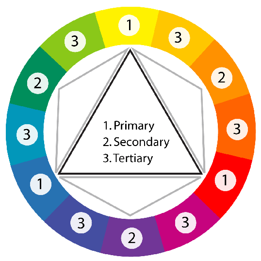 Fig. 4, The traditional red, yellow, and blue artists’ color wheel
Primary colors
The primary colors of the traditional color wheel are red, yellow, and blue. These hues form an equilateral triangle on the color wheel, and commencing from a primary color, every fourth color represents another primary color.Secondary colors
By mixing two primary colors, we create secondary colors, indicated here by the small gray triangles. The secondary colors are orange, green, and purple.Tertiary colors
There’s a total of six tertiary colors: vermilion (red-orange), marigold (yellow-orange), chartreuse (yellow-green), aquamarine (blue-green), violet (blue-purple), and magenta (red-purple). As you might already have guessed, mixing a primary color with an adjacent secondary color forms the tertiary colors.The Principles of Beautiful Web Design This article is from Jason Beaird’s The Principles of Beautiful Web Design book (second edition is out now!). Be sure to lookout for further articles from the book here on Design Festival.
Frequently Asked Questions about Color Theory
What is the difference between chromatic and achromatic colors?
Chromatic colors are those that have a hue, which means they are colors like red, blue, green, and anything in between. They are often vibrant and full of color. On the other hand, achromatic colors are those without a hue, such as black, white, and various shades of gray. They are often used to create contrast or balance in a design.
How does color theory apply to digital design?
Color theory is crucial in digital design as it helps in creating a visual structure in design projects. Understanding color theory can help designers choose colors that evoke certain emotions or reactions, create harmony and balance, and enhance the overall aesthetic of a design.
What is the significance of the color wheel in color theory?
The color wheel is a fundamental tool in color theory that helps designers understand the relationship between different colors. It visually illustrates how colors are related to each other, how they can be combined, and how they can be used to create different moods or reactions.
How do I choose a color scheme for my design project?
Choosing a color scheme involves understanding the message or emotion you want to convey, the target audience, and the overall aesthetic you want to achieve. You can use the color wheel to help you choose complementary, analogous, or triadic color schemes, depending on your design goals.
What is the role of color psychology in color theory?
Color psychology studies how colors can influence our emotions and behaviors. In color theory, understanding color psychology can help designers choose colors that evoke certain feelings or reactions. For example, red can evoke feelings of passion and energy, while blue can evoke feelings of calm and trust.
How do I use color theory to enhance the readability of my design?
Using contrasting colors can help enhance readability. For example, using a dark color against a light background can make text easier to read. Also, understanding how different colors can affect mood and perception can help you choose colors that make your design more engaging and effective.
What is the difference between warm and cool colors?
Warm colors, such as red, orange, and yellow, are often associated with energy, brightness, and action. Cool colors, such as blue, green, and purple, are often associated with calm, relaxation, and peace. Understanding the difference can help you choose the right colors for your design.
How do I use color theory to create a mood in my design?
Colors can evoke different emotions and reactions. For example, red can evoke feelings of passion and energy, while blue can evoke feelings of calm and trust. By understanding these associations, you can choose colors that help create the mood you want in your design.
What is the role of saturation and value in color theory?
Saturation refers to the intensity or purity of a color. A highly saturated color is bright and vibrant, while a less saturated color is more muted and gray. Value refers to the lightness or darkness of a color. Understanding saturation and value can help you create depth and contrast in your design.
How do I use color theory to create harmony in my design?
Harmony in design is achieved when all elements work together to create a balanced, cohesive look. In color theory, you can create harmony by using colors that are close together on the color wheel, using a monochromatic color scheme, or using complementary colors to create contrast.
 Jason Beaird
Jason Beaird is a designer and front-end developer with over ten years of experience working on a wide range of award-winning web projects. With a background in graphic design and a passion for web standards, he’s always looking for accessible ways to make the Web a more beautiful place. When he’s not pushing pixels in Photoshop or tinkering with markup, Jason loves sharing his passion for the Web with others.