Advertising is a pivotal part of getting your goods and services sold as a business or company. Lots of websites offer ad space on their sites, but advertising costs are proportional with advertising sizes. It’s fairly easy for a designer to assemble an effective advertisement if it’s large and prominent, but truly talented designers can make a big impact with even the smallest ad sizes.
If you haven’t read Anum’s Build a Persuasive, Pretty 125×125 Advertisement in Photoshop then you should check it out. He provides insight on what it takes to create a successful 125×125 advertisement, and he walks you through the process of creating your own.
With that being said, below you can find 20 creative, compelling 125×125 ads that will surely give you an understanding of what your competition looks like. These designs vary in their fonts, mascots, colors, and textures. So if you’re looking for a diverse sampling of successful ad designs or inspiration for your next or first 125×125 advertisements, look below.
Mailchimp’s 125×125 ad has a great look to it. Not only does it feature bright bold colors, but it also has the site’s mascot, making the ad automatically recognizable.
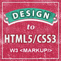
W3’s ad borrows from the site’s pink aesthetic choice, as well as its use of texture. The words are written in a nice bold font that enhances readability.
Using a gorgeous, high-quality photo for a site that capitalizes on selling high-quality images is a smart move for Shutterstock. The bluish/purplish tones stand out.
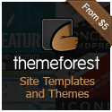
Themeforest’s ad is really memorable for some reason. The rich browns really do give it a sophisticated look.
Like Shutterstock, Fotolia uses a photo in their ad, but it spices things up by using graphic designs to give you an example of what their images can be used for.
Though it may be a bit hard to read some of the text, the vintage styled ad catches the eye nevertheless.
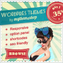
Perhaps a little bit risqué, but Vector Stock’s ad really does grab your attention with the solid contrasting colors coupled with a feminine pose.
Simple and effective, this ad doesn’t try to dazzle you; it just plainly tells you what they offer, and that’s the beauty of it.
This ad offers all types of fun with a cute little hand-drawn bird to boot. Just like the Mailchimp advertisement, Perch uses their little bird to act as a mascot for their ad.
Kendo UI, like a few of the ads already listed above, uses the design of the actual website to create its ad by following the color scheme and using the mascot, which is of course a kendoka.
The colors really do work for this particular ad. Everything is perfectly balanced, making the ad readable and cluster-free.
Elegant Themes uses the idea of elegance perfectly, not only with their site layout but within their advertisement layout as well. The look is really sleek and sophisticated.
Trying to advertise in a small space can be daunting, but this advertisement does it while adding a logo type image and a clear offer.
The chalkboard look is creative, along with the matching chalk font. Coupling this design with the site’s simple mathematical formula displayed, the ad works effectively.
The purple galaxy backdrop is a really nice touch, and it really makes the words stand out along with the yellow accent in the top-right corner.
You don’t always have to have a full image on your ad. CushyCMS’s ad showcases half of a chair that grabs your attention thanks to its bright green color.
The use of the dotted lines on the circle emphasize the idea that you are creating with Shopify. It’s a subtle but thoughtful addition.
18. PS Defaults

The PS Defaults ad plays it safe but still remains creative, as it is a 3D image instead of your standard flat advertisement.
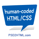
Like the PS Defaults advertisement, the ad for PSD2HTML uses an unconventional method, as it doesn’t have a border and uses a drop shadow which makes it stand out among other ads.
Just like their website and the elements within it, Ultimate Designer Toolkit’s ad is sleek with its glossy look and pop of prismatic color in the middle.
Conclusion
Naturally, there are hundreds of other possible design options when creating your ad. I hope you’ve gained some inspiration and insight. If you have your own 125×125 advertisements, please feel free to share a link.
 Gabrielle Gosha
Gabrielle is a creative type who specializes in graphic design, animation and photography.
