Diligent designers stay up to date with the latest in web design and development. Staying on the cutting edge of the web can give you an advantage in your web design business and can even make your design work substantially easier and better. Most web designers know and use CSS to create beautiful websites that are browser-friendly and consistent across all platforms. Having said that, there are some CSS3 properties that aren’t used as often as you would expect. Despite their rarity, they are extremely useful.
Multiple Backgrounds
Many designers don’t realize that you can implement multiple backgrounds into your website designs. This could have many creative and practical uses. Imagine using this with absolute positioning to align certain elements to different sides or corners. This could turn into an interesting design technique if used properly.
To implement multiple backgrounds, you need to define them in the body tag and separate them with commas. Specify the background selector and then point to the URL (usually in your images folder). I find that it is easier and less confusing to specify the orientation of each image if you do it directly after each image. Once you specify the repeat style, place a comma and then list the next URL. You can follow the same formula for the other images, and when you are done, end the statement with a semicolon just as you would for any other CSS style declaration.
body {
background:url(images/saver.png) left top no-repeat, url(images/anchor.png) right top no-repeat, url(images/dock.jpg) center top no-repeat;
background-size: auto, auto, cover;
}
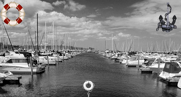
The result is that the two images (the life preserver and the anchor) are placed in the top-right and the top-left of the browser. The last image in the sequence is placed on the bottom. I used the background-size property to show you how you can combine multiple backgrounds with other properties. You just have to remember to declare the size for each item. The anchor and life preserver are set to auto. The third image (the dock) is set to cover. With it being the last image, it will be on the bottom and fill the browser window. The other two images will stay the size they are intended to be and remain in the position that we specified.
Transitions
One of the biggest outcries with the decline of Flash is the lack of animation or transitional properties in CSS. Well, this ends up changing in CSS3. Now, you can have smooth transitions between the different states of your elements. You can animate things such as box and text shadows, positioning, color changes, and more.
#main {
width: 300px;
padding: 5px ;
background-color: #F00;
border-radius: 7px;
-webkit-transition: background-color 5s;
-moz-transition: background-color 5s;
-o-transition: background-color 5s;
-ms-transition: background-color 5s;
transition: background-color 5s;
}

#main:hover {
background-color: #06C;
}
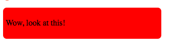

The result is that the background color starts out as red, which is what we specify as being the normal state of the main div. When we set the hover state to blue, we tell the background color to transition from red to blue over a period of 5 seconds. This creates a fade effect, and in the middle of the transition, the box will appear to be purple. CSS creates a surprisingly smooth transition from red to blue without any reliance on plugins or JavaScript. You can apply transitional effects to a lot of different properties, such as rotate, margin, and much more. This is essentially the foundation for cross-browser animation. The only thing to remember is that you set the transition in the original state, and not the hover state, which can be confusing to some people
RGBa
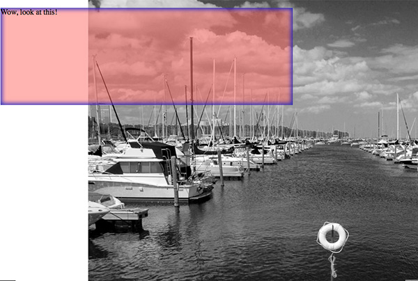
RGBa is a way of defining the color of an object. Some prefer hex values, but the advantage of using the RGBa method is the ability to take advantage of the last element of the equation, which is the a, which stands for alpha transparency. This allows you to define transparent colors, which enables you to add an extra element to your design, creating a section that is partially transparent.
RGBa is easy to control. R, G, and B are the red green and blue values, just like any standard RGB color in Photoshop. To control the alpha, or transparency of the color, you can use a value anywhere from .1 for 10% to 1, which is 100%. The formatting for using RGBa in CSS is shown below:
background: rgba( 250,100,100, .5);
The box below is a mix of all three colors, which makes the result red/pink, and the .5 value at the end sets the transparency to 50%. You can see that the box is transparent, because you can see the image bleeding through. This will create some interesting effects.

Inner Shadow
Inner shadow isn’t really the name of the CSS style, but if you are familiar with the term in Photoshop, it’s the same effect. You use box-shadow to define the parameters of the shadow, but if you specify the shadow to be inset, then the shadow pops to the inside of the element. I like using this for a drop down or a navigation menu. It is a way that I can add depth and dimension to a menu selection without having to use those pesky, complicated gradients. CSS3 gradients can be difficult because of all of the fallbacks and prefixes that you have to declare. in the example below, I added an inset box shadow to our transparent div from the previous example.
-webkit-box-shadow: inset 0px 0px 8px 4px rgba(0, 0, 200, .7);
box-shadow: inset 0px 0px 8px 4px rgba(0, 0, 200, .7);
The result is a blue inset shadow on the transparent div. If you want realistic shadows on your divs, use a lower transparency, such as .3 for 30% and set the color to grey, which is an equal value for all three colors, or black, which will create a more defined shadow.
Transform
Transform can be an extremely useful property, because you can create some unconventional shapes and effects, such as mirror-imaging. You can break the mold of boxes, whether they are rounded or squared. This also allows you to add dimension to your work, because you can transform objects in perspective using the right parameters in CSS3. In the example below, I am rotating the div by 45°. This is excellent if you want to turn a div sideways or rotate it slightly. Keep in mind you will have to specify the prefixes for each browser type.
transform: rotate(45deg);
-ms-transform: rotate(45deg); /* IE 9 */
-webkit-transform: rotate(45deg); /* Safari and Chrome */
-o-transform: rotate(45deg); /* Opera */
-moz-transform: rotate(45deg); /* Firefox */
}

I added the rotation to the transparent div (after removing the box-shadow). The result is that the rectangle was rotated 45°. This is a nice effect, but notice that the words “wow, look at this!” have been rotated off of the screen. You will want to keep this in mind when transforming your elements in CSS3. You might rotate or skew something to the point where the text within is either unreadable, or travels out of the viewing area.
Conclusion
Adding more capabilities to your arsenal will allow you to create more dynamic and interesting websites. They will break the mold and make visitors want to come visit and share with others. Adding a little interactivity goes a long way. Animating different properties will add an element of surprise and delight. just remember not to overuse transitions, because too much may be overwhelming.
What do you think about these CSS3 properties? Do you already use them in your website designs? Is there another underutilized CSS3 property that you think should be on the list? Share your thoughts in the comments section below.
 James George
James George is a professional web developer and graphic designer. James is an expert in design, and a professional web developer, with a special interest in WordPress. Founder of Design Crawl, James has been a professional designer since 2005.