7 Tips for Writing Clear, Human-friendly Microcopy


Words matter — and not just in books. They help you navigate a physical environment or a digital product. This article explores the words and text used in digital environments.
User experience (UX) writing has become an essential part of product development. Some UX writers promote the content-first approach. Your microcopy dictates your design, rather than the design-first approach.
UX writing focuses on creating clear, human, and enjoyable microcopy. For many tech startups, UX writing is strongly intertwined with their design process. Bad microcopy can have a substantial impact on a product’s sales.
A single, poorly chosen word can induce fear or confusion in users. In other words, a single word can lead to successful product signup or yet another cart abandonment.
This article explores seven quirky tips to enhance your UX writing. But before we start, let’s briefly define the relationship between UX writing and microcopy.
Key Takeaways
- UX writing and microcopy are closely connected; they focus on creating clear, human, and enjoyable text used in digital environments to guide the user, remove confusion, and provide clear directions.
- To enhance UX writing, a brand personality is necessary. It should sound human and represent the brand’s voice in a way that engages the right people and makes the brand easily recognizable.
- Good microcopy can reduce fear or confusion. It should be designed to preempt users’ questions and make them feel confident when navigating the interface. The principle of “Less is more” is widely used among UX writers to keep the text as concise as possible.
- Unfriendly or vague error messages should be avoided. Instead, offer advice, show how to solve a problem, or direct users to a help page. Also, turning negative actions into positive ones can enhance the user experience.
How are UX Writing and Microcopy Connected?
There are different types of writing. Copywriting, for example, focuses on creating content to market a product. UX writing, however, focuses on the content embedded in products.
To give you an example of UX writing, think of the text on buttons, labels for webforms, or any little textual guidance or clues when using a product. Here, the main goal of content (or text) is to guide the user, remove confusion, and provide clear directions.
So, what’s the link now between UX writing and microcopy? Microcopy refers to the copy for the user interface. As mentioned above, it involves buttons, input labels, and app instructions, among other things.
UX writing has become an increasingly important aspect of product development. Great microcopy can increase sales, improve user satisfaction, and lower the barrier to engaging users.
Let’s now take a look at seven UX writing tips …
Tip 1: A Brand Personality Makes Your UX Writing Sparkle
Everyone can write words on paper. But can these words engage the right people? It’s crucial to understand that words have different meanings for different people. For instance, word-jokes can make your brand stand out, but they can also confuse users.
It’s important to identify your brand personality. A brand voice is a verbal translation of your brand personality. It determines how your brand sounds and makes it easy to recognize.
Remember how we mentioned that your microcopy should sound human? Let’s compare two microcopy examples for a failed login attempt using an incorrect password.
Example 1:
Wrong password. Try again or click “Forgot password” to reset it.
Example 2:
Oops! It looks as if you may have forgotten your password. Click here to reset it.
Now imagine you meet this interface in person. Which message sounds more human? The second example does sound more human.
Let’s look at how Oatly, a trendy oat milk brand, handles their cookie consent popup.
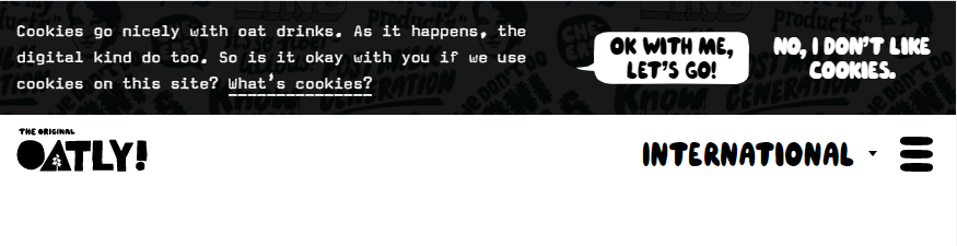
Their cookie consent popup represents their brand personality. Oatly cares about users’ privacy and cares about the climate. Their brand’s voice is playful and friendly. Even often neglected web elements like a cookie consent popup can carry your brand’s voice.
If you struggle to define your brand personality, take a look at the example of brand personality bias below to help you define the right tone.
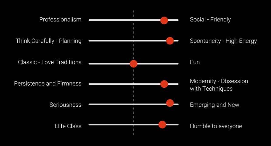
Source: Ahmed Magdi on behance.net – UX writing case study
Tip 2: Design to Reduce Fear or Confusion
The Internet can be a scary and confusing place. Good microcopy can take away some of those negative feelings. In the introduction, we discussed how a single, poorly chosen word could cause feelings of fear or confusion.
Here are some very straightforward examples that can still spark emotions in users:
- A company asks for your phone number via their web form. Does that mean they’ll pester you with annoying calls?
- An online service wants you to pay for your monthly subscription. How secure is the payment connection?
- You’re signing up for an online streaming service. Can you opt out at any time, or is there a notice period?

Even an elementary “location” field without supporting microcopy text on Airbnb’s website can confuse a reader.
- Do you want my current location?
- Do you want my preferred destination?
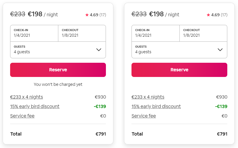
Here, the microcopy message under the “Reserve” button explains what will happen when you click this button. Without this message, many users might feel some level of fear or confusion about what will happen next.
For instance, I like reviewing my Airbnb order once more before committing to a reservation. Without a microcopy message, I’m not sure if I’m committing to a reservation or if I’ll have the chance to review the order once more.
Fear is often a driven motivator to not complete an action.
You might be surprised how even the smallest web element like a button can induce fear or confusion. Design an interface with this in mind. Try to read your users’ minds and preempt their questions. Fear is often the reason why users don’t complete an action. Removing fear and confusion helps users feel more confident when navigating your interface.
Tip 3: Less is More
Architect Ludwig Mies van der Rohe popularized the “Less is more” principle. This principle became wildly popular among UX writers. Only use words that are necessary to the content and function of your website. Omit words that don’t contribute to the content or function of your website.
Here’s a fun example by Twitter user @tolusaba, product designer at Brass Business Banking. Let’s compare the checkout page before and after the product audit.
Before, we find a lot of text that distracts the user from its core task — that of clicking the “Pay now” button. On top of that, the design implements a question–answer format that has no function on a checkout page — even though this type of content might work well for a FAQ page.
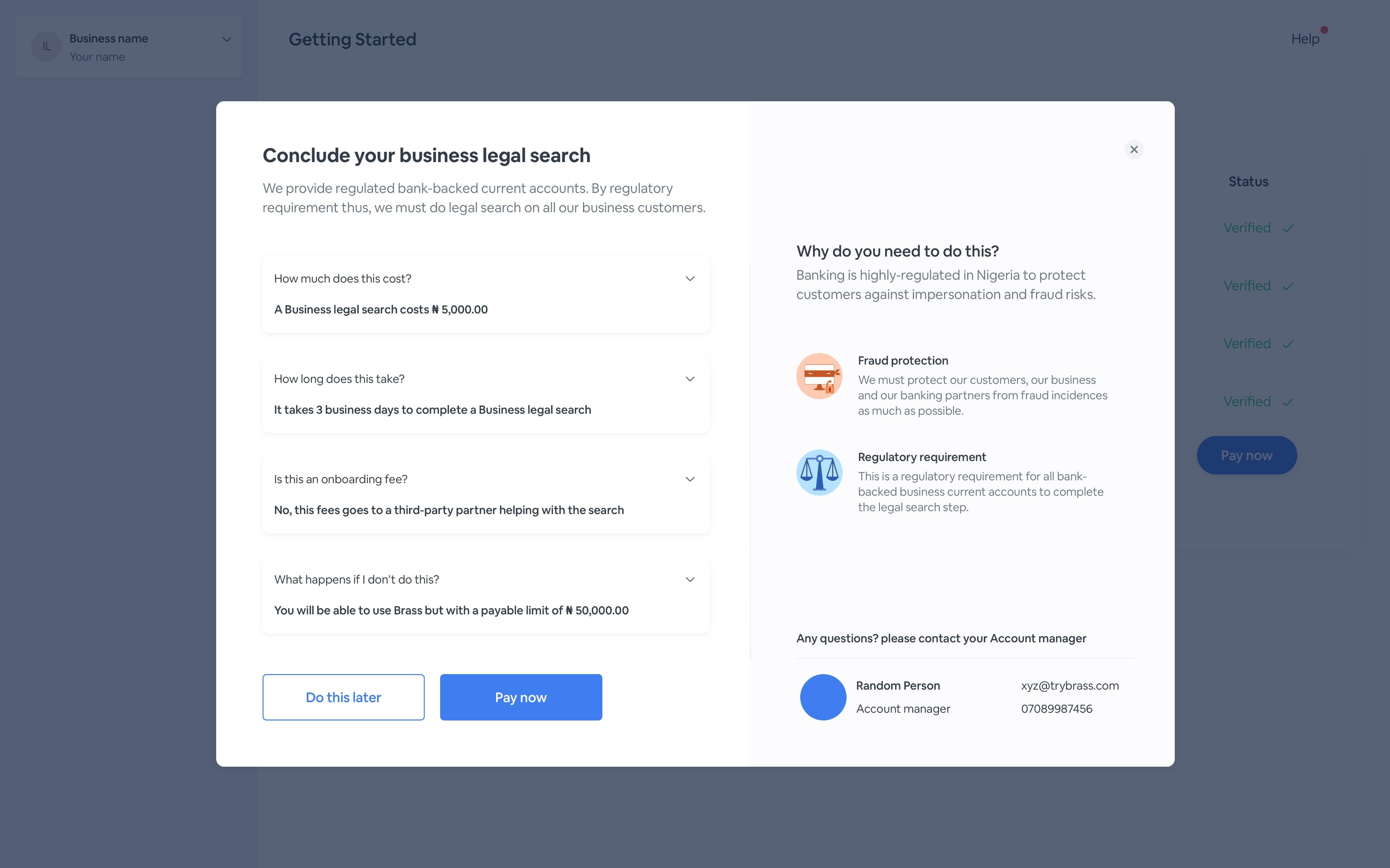
After the product audit, they grouped the most essential information chronologically.
Both pages provide the same information, but the redesigned page presents the same information using fewer words.
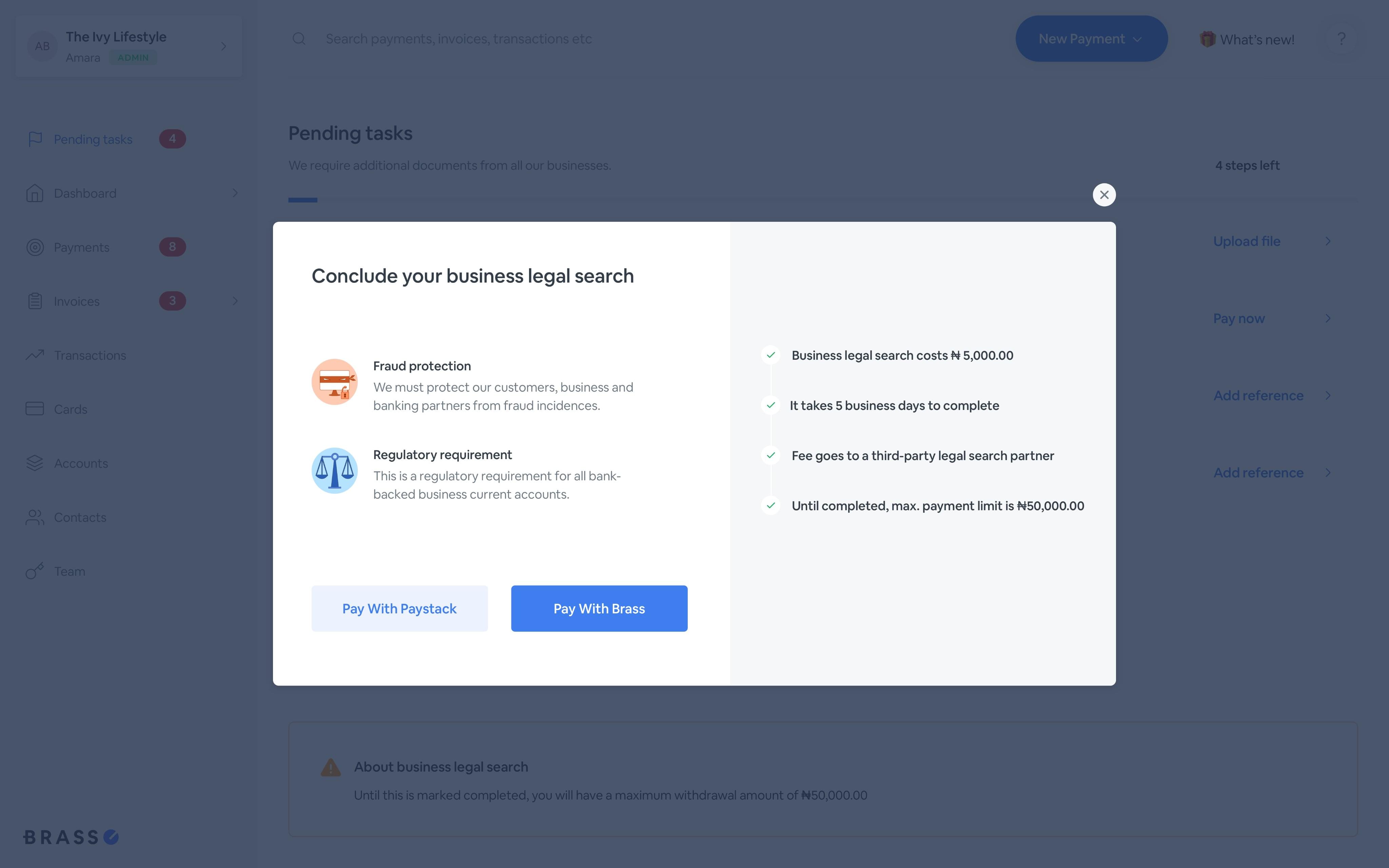
The key takeaway here is to keep your text as concise as possible but watch out to provide sufficient information not to induce fear or confusion. More information demands more mental processing time from a user.
When you present a user with a new page, we want to keep the time needed to understand that page as low as possible. Adding too much information will distract the user, reducing their ability to make decisions or further interact.
Tip 4: Each Brand Should Add Transparency to its Brand Voice
In Tip 2, we showed you why it matters to create a design that removes fear or confusion. Now, let’s discuss why transparency is a key ingredient for any brand voice.
As mentioned before, too minimal microcopy might be a source of confusion for users. Let’s take a look at Netflix’s onboarding example. The current page is as pictured below.
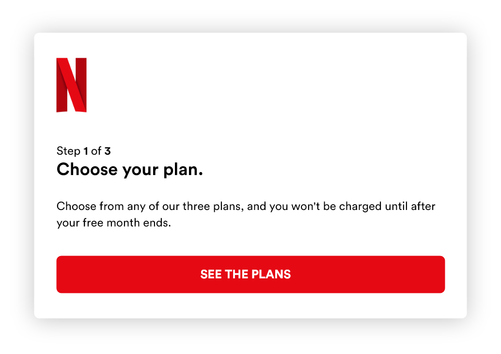
Imagine if there weren’t a microcopy message telling the user what will happen after their free month ends. First of all, this message removes confusion. But it also contributes to being transparent as a brand. You don’t want to trick your users into accidentally paying an extra month because they forgot to cancel their plan or are not aware of a one-month notice period.
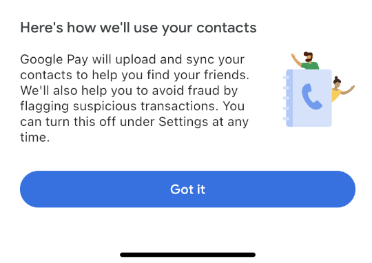
The same is true for apps that require specific user permissions. Google tells you exactly why they want information about your contacts.
Tip 5: Avoid Vague and Unfriendly Error Messages
Ugh: unfriendly or vague error messages. We see them everywhere!
- Something wasn’t right
- Form submission failed!
- Invalid fields
- Something has gone wrong
- You have 3 errors
All the above examples tell me that something is wrong, in a rather unfriendly manner, and they fail to tell me what I can do to solve the issue. Everyone makes mistakes, so treat users nicely when they mess up. Offer them advice, show them how to solve a problem, or send them to a help page to understand the problem better.
Vague and ambiguous error messages cause major drop-off. You don’t want to attempt submitting a form over and over, not knowing what you’re doing wrong. On top of that, the words used in the above example are unfriendly and don’t include a brand voice.
Tip 6: Prefer Questions over Commands
Consider the following two options for engaging the user.
Option 1:
Pick a book
Option 2:
What do you want to read next?
The question “What do you want to read next?” offers a more human touch that would work nicely on Amazon’s Kindle.
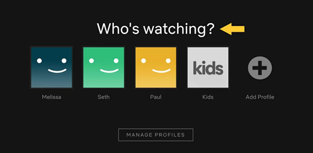
Here’s another example — one that was faced by Netflix. How do you prompt a user to log on to their own user account?
Option 1:
Select a profile
Option 2:
Who’s watching?
As you’ll know if you’re a Netflix user, they chose the second option. It’s more human-friendly, which is the goal of a UX writer. It’s much more effective to ask a question than to tell users what to do.
Tip 7: Turn Negative Actions into Positive Ones!
Let’s compare two options for communicating a flight cancellation.
Option 1:
Your flight has been canceled.
Option 2:
Sorry, but due to bad weather, we’ve had to cancel your flight. You can book a new flight without any extra cost, even if the flight is more expensive.
The second option adds a solution to turn the negative event into a positive experience. The user can directly book a new flight without any extra costs. On top of that, by starting with an apology, we make the user less annoyed.
As a flight operator, it happens that flights get canceled. Don’t leave your passengers in the cold. Try to help them and offer them an instant solution. The number-one priority for this passenger is finding another flight home.
Negative experiences are part of the user experience. They key takeaway here is that, if they occur, you should try to make them as positive as possible. If you can’t offer a solution, try to explain to the user what happened. This explanation will leave the user with a slightly better experience than a cold message that tells them the bad news.
Bad UX Writing Can Break Your Product
I’s not an exaggeration that bad UX writing can break your product. Many startups underestimate the power of UX writing. Bad UX writing is often the cause of high cart abandonment rates or failed product signups. Accordingly, thoughtful, well-written microcopy can save a company a lot of money.
On top of that, UX writing should also focus on web accessibility. Focus on content structure; consider readability, using simple language; and provide visual clues. Mailchimp has a great style guide about writing for accessibility. Products that offer solutions for web-accessible UX writing include:
- aCe: offers a free web accessibility tester to check for compliance
- PayPal’s AAT: helps you with automated accessibility testing for content (alternative: Google Lighthouse)
- Hemingway App: helps you calculating the readability score
Do you want to try a brief microcopy audit? Get started with defining your brand personality and brand voice. When that’s done, it’s time to audit web forms and look for potential sources of confusion or fear. Try to read the user’s mind when navigating your interface.
I know it’s not easy, as you’re probably overly familiarized with the interface. Therefore, user research is a great way to learn more about the human mind when interacting with a new interface.
Do you have questions? Hit me up on Twitter @michiel_mulders!
Frequently Asked Questions about Microcopy
What is the role of microcopy in UX design?
Microcopy plays a crucial role in enhancing the user experience (UX) design. It guides users through a website or app, providing instructions, offering feedback, and even injecting personality into the interface. Microcopy can make or break the user experience, as it can either help users understand how to use a product or leave them confused and frustrated. It’s the small bits of text that instruct, guide, or inform users, like button labels, form field instructions, error messages, and more.
How can I write effective microcopy?
Writing effective microcopy requires a deep understanding of your users, their goals, and the context in which they’re using your product. It should be clear, concise, and useful. Use simple language and avoid jargon. Make sure your microcopy is consistent with your brand voice and tone. Test your microcopy with real users to ensure it’s effective and make adjustments based on their feedback.
What are some common mistakes in microcopy?
Common mistakes in microcopy include being too vague, using jargon or technical terms, being inconsistent with brand voice, and not providing enough context or guidance for users. Another common mistake is not testing microcopy with real users. Even the best-written microcopy can fail if it doesn’t resonate with your users or help them achieve their goals.
How does microcopy impact conversions?
Microcopy can significantly impact conversions by guiding users towards taking the desired action, such as signing up for a newsletter, making a purchase, or downloading an app. It can reassure users, address their concerns, and motivate them to take action. For example, a well-crafted error message can turn a frustrating experience into a positive one, keeping users engaged and moving forward.
Can you give examples of good microcopy?
Good microcopy is clear, concise, and user-focused. For example, instead of a generic “Submit” button, a button that says “Get Your Free Quote” is more specific and compelling. Another example is a form field label that says “Email Address” instead of just “Email”, which can be confusing for some users.
How can I test the effectiveness of my microcopy?
You can test the effectiveness of your microcopy through user testing, A/B testing, and analytics. User testing involves observing real users as they interact with your product, while A/B testing involves comparing two versions of your microcopy to see which performs better. Analytics can provide insights into how users are interacting with your product and where they may be encountering issues.
What is the difference between microcopy and copywriting?
While both microcopy and copywriting involve writing for a product or service, they serve different purposes. Copywriting is typically focused on promoting a product or service and persuading users to take a specific action. Microcopy, on the other hand, is focused on guiding users through a product or service, providing instructions, and enhancing the user experience.
How can microcopy improve user engagement?
Microcopy can improve user engagement by making a product or service easier to use and more enjoyable. It can guide users, provide feedback, and even inject personality into the interface, making the user experience more engaging and enjoyable.
Can microcopy be humorous or should it always be serious?
The tone of your microcopy should align with your brand voice and the context in which it’s used. In some cases, a humorous or playful tone can make your product more enjoyable and memorable. However, in other cases, a more serious tone may be appropriate. Always consider your audience and the context when deciding on the tone of your microcopy.
How often should I update my microcopy?
There’s no set rule for how often you should update your microcopy. It should be an ongoing process of testing, learning, and iterating based on user feedback and performance data. If your microcopy isn’t helping users achieve their goals or if it’s causing confusion, it’s time to revisit and revise it.
Fullstack Blockchain Developer at TheLedger.be with a passion for the crypto atmosphere.