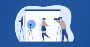
Web Accessibility has become an important consideration for many Web designers of late. Government-affiliated sites in the US must now conform to Section 508 accessibility guidelines, while the W3C has produced its own set of guidelines for all Web designers. But on top of these technical standards, there are plenty of other things that can be done to make a site more usable for the disabled, as outlined in the Nielsen Norman Group’s recent report: Beyond ALT Text: Making the Web Easy to Use for Users With Disabilities.
If you use Macromedia Dreamweaver/UltraDev 4.x or MX for your Web design work, LIFT – Nielsen Norman Group edition (LIFT – NN/g) is a powerful tool that bundles both standards and all the recommendations from the Nielsen Norman Group report into an automated tool that will blend right into your workflow.
A Dreamweaver extension, LIFT – NN/g adds a palette of dockable windows to the program. These windows let you check your work for accessibility problems in one of two ways:
- Evaluate: this mode lets you run a check of one or more pages (or your entire site), and correct any problems in a handy wizard that offers to explain each usability problem in detail if you need it to.
- Monitor: this works just like the Evaluate mode, but it monitors your work in real time instead of checking it all at once. Problems are pointed out to you as you make them in an unobtrusive list, which gives you the same wizard interface to fix them at your convenience.
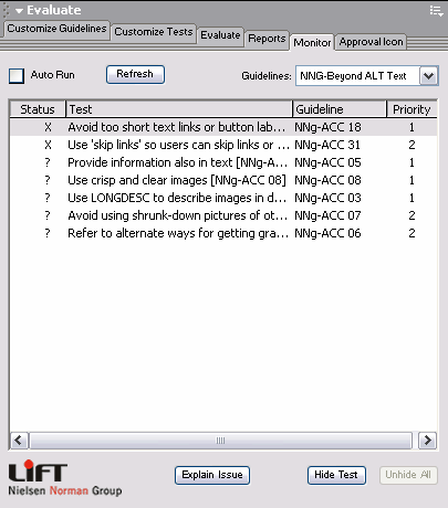
The set of guidelines that LIFT – NN/g checks is completely configurable. You can selectively enable and disable individual guidelines, select sets of guidelines (W3C, 508, usability, etc.), or create your own custom sets. Custom sets of guidelines can be saved and copied to other computers, which makes LIFT – NN/g ideal for coordinating accessibility guidelines between members of a design team.
Unlike other tools of this type that can be tedious and inflexible, I found LIFT NN/g meshed really well with my workflow. Don’t ask me how, but LIFT – NN/g is able to suggest appropriate corrections for accessibility problems based on context. For instance, it’s able to tell when an image tag is a spacer image and instead of prompting for a description of the image, it offers to insert an empty alt attribute (alt="").

Convenient features like an alt attribute editor, which gives you a unified interface to edit all the alt attributes in your document or site from a single window, and a report generator, which can output accessibility reports in HTML or XML, are just icing on the cake. If you use Dreamweaver and accessibility is a concern for you, LIFT – NN/g is a must-have.
About the only complaint I have about the software is its inflexible interface. Each of the panels has fixed sized contents. For example, the “Monitor” tab above can be made smaller or larger, but the list of issues and the positions of the buttons remain fixed; therefore, making it any smaller causes the interface to become unusable and making it any bigger only wastes space on your screen. Spot the irony. These sizing issues may be a limitation of the JavaScript Extension technology that was used to create LIFT – NN/g, but in any case they are more than a little distracting.
LIFT – NN/g is available now for US$549 from UsableNet’s Web site. LIFT for Macromedia Dreamweaver (which checks W3C and Section 508 accessibility only, and lacks a few of the more advanced wizards of LIFT – NN/g) is available for US$299. LIFT for Microsoft Frontpage is also available for US$299.
I recently had the opportunity to speak with Jakob Nielsen of the Nielsen Norman Group in an interview, and made a point of asking him a few questions about LIFT – NN/g. Read on to find out what he had to say…
Jakob Nielsen and LIFT – NN/g
SP: Why are Websites today “three times harder to use for users with disabilities than for other users,” despite new laws and standards? Why is accessibility not always a priority?
JN: Websites were even worse in the past, so there has already been some small progress. I don’t have an exact number, but there were many Websites that were infinitely harder to use for users with disabilities because they could not use them at all. For example, sites that were all-graphic and had no ALT text.
In old times (say, five years ago) there were a lot of design projects that didn’t care about accessibility at all. Most project managers assumed that blind people couldn’t use the Web anyway, and therefore couldn’t use the specific Website that was being developed. We have now eradicated this misunderstanding, and most Internet managers do know that they have to care about users with disabilities.
In most projects, accessibility has fairly low priority because project managers under-estimate the number of people who are impacted by design problems. They think that they’re just losing a handful of customers, where in fact they may be turning away millions of customers, especially among senior citizens who constitute a big and rich group that’s getting more and more active online every day. It’s very hard for people on a design team to truly internalize the fact that many other people interact with their Website very differently than they do themselves.
Projects always have limited resources, and with fairly low priority on accessibility, not much gets done. There are two ways of resolving this conflict:
- raise the priority of this issue. Increase awareness of the number of users with accessibility problems who are impacted by poor usability, and
- reduce the amount of resources required to produce better designs for these users.
I take the first approach with my articles and speeches and the other approach with this new software.
SP: How will the software help remedy this imbalance and fix Websites that discriminate against users with disabilities?
JN: We have accepted that Web designers are humans too, with human fallibilities. They don’t have perfect memories any more than users do. So instead of relying on the designer to remember every single guideline at every single step of the site’s development, we’ve offloaded the memory burden onto the computer (which is of course very good at staying alert and continually checking for a lot of details without getting tired).
The new software basically makes it easier to be a Web designer and to remember the guidelines for users with disabilities. The software can also make it easier to comply with the guidelines, by offering automated fixes for some of the problems, which again lowers the barrier to doing right.
SP: Why does this product focus on usability (not just accessibility)? Why is a user-centered design important?
JN: Technical accessibility is not enough to make a Website easy to use. This can be seen from the simple fact that people with no disabilities still have a hard time using many Websites.
The real question is whether users can get what they want from a Website in a reasonable amount of time, and whether the visit is pleasant for them. If you have to sit and listen through endless drivel before you get what you want, then it may be possible to use the site, but it’s surely not usable. Also, because Websites are navigation designs, there’s a big risk that, if the auditory user experience is too difficult, the user will follow the wrong links and get lost.
Traditional accessibility assumes that the user has perfect memory, superior intelligence, and nothing better to do that to devote all these mental resources to puzzling out the Website: just make all the information accessible and the user will solve the problem. Not so. Users with disabilities are humans and need easy and simple user interfaces just like anybody else.
SP: What are some benefits of automated software that includes usability guidelines? How will this change the way that designers and developers work?
JN: The main benefit is that the computer doesn’t get tired: thus it will check every design detail for every single guideline, all the time. Also, the software provides a link from any occurrence of a potential usability problem to relevant research material that explains why it’s an issue, and what questions to consider when deciding whether to keep or fix the questionable design element. This is much faster than having to look up the answer in a book, and in fact it’s a great example of the original promise of hypertext.
The main change is that designers and developers will gain an increased awareness of the usability principles because they’ll be reminded of them on a just-in-time basis. It’s much more motivating to read research results when they relate directly to your own work, than when they are part of a thick document though which you have to wade to find what you want.
SP: What sort of research and user-testing was conducted for this product?
JN: We took a different approach than most other accessibility projects — we based our guidelines on the direct observation of a wide range of users interacting with a wide range of Websites. This means that we looked at what real people did with real sites, and identified where they had the biggest problems or the greatest successes.
We also tested in both the United States and Japan to get an international perspective. We included users who were blind, had low vision, and had motor skill challenges.
For this project, we didn’t test users with hearing difficulties because sound is currently not very important to the ability to use Websites. If you’re deaf, you’ll miss some videos that have not been close-captioned, and adding captions would be a good thing to do for a video-rich site. But the vast majority of sites will work perfectly well for users with hearing difficulties. Maybe in the future this will be different, and we’ll have to add more guidelines on how to handle audio.
SP: What will it take to bring big improvements in usability? Could sites like Google have an even greater impact than laws in building accessible sites?
JN: Google has great impact in two ways. First, it is proof by example that simplicity can win and that users will love a site that’s fast and easy. Second, because Google places the highest priority on the best sites, it will tend to steer users mostly to sites with reasonable usability. Google certainly doesn’t make usability the only criterion for placement on the search list, but usable sites do tend to score well in the Google ratings.
Still, to really get big improvements in usability, we need to go beyond Google and convince company executives that it’s to their own benefit to give higher priority to user needs in the design process and less priority to satisfying their own whims. You’re not designing for yourself, you are designing for the customers. This sounds like an obvious point and yet most Websites still don’t make user needs the driving force for their design.
I’d like to thank Mr. Nielsen for taking the time to answer these questions about LIFT – NN/g. If you’re interested in his thoughts on other aspects of Web usability, check out tomorrow’s interview!
 Kevin Yank
Kevin Yank is an accomplished web developer, speaker, trainer and author of Build Your Own Database Driven Website Using PHP & MySQL and Co-Author of Simply JavaScript and Everything You Know About CSS is Wrong! Kevin loves to share his wealth of knowledge and it didn't stop at books, he's also the course instructor to 3 online courses in web development. Currently Kevin is the Director of Front End Engineering at Culture Amp.