I’m not too sure how I stumbled into this one. But something led me to this tweet:
Has anyone done this directional lighting cursor interaction with CSS? pic.twitter.com/zLL7Sk6kW5
— Jed Bridges (@JedBridges) July 1, 2020
And, to me, that’s a challenge.
The button design is neat. But I didn’t want to do a direct copy. Instead, we decided to make a “Twitter” button. The idea is that we create an almost transparent button with a social icon on it. And then that social icon casts a shadow below. Moving our mouse across the button shines a light over it. Pressing the button pushes it onto the surface. Here’s the final result:
Directional Lighting 3D CSS Twitter Button 🐦
— Jhey 🐻🛠 (@jh3yy) January 30, 2021
👉 https://t.co/qpfzEwUMey via @CodePen pic.twitter.com/zWfwtPaixo
In this article, we’re going to look at how you can make it too. The cool thing is, you can swap the icon out to whatever you want.
The Markup
My first-take approach for creating something like this is to scaffold the markup. Upon first inspection, we’ll need to duplicate the social icon used. And a neat way to do this is to use Pug and leverage mixins:
mixin icon()
  svg.button__icon(role='img' xmlns='http://www.w3.org/2000/svg' viewbox='0 0 24 24')
    title Twitter icon
    path(d='M23.953 4.57a10 10 0 01-2.825.775 4.958 4.958 0 002.163-2.723c-.951.555-2.005.959-3.127 1.184a4.92 4.92 0 00-8.384 4.482C7.69 8.095 4.067 6.13 1.64 3.162a4.822 4.822 0 00-.666 2.475c0 1.71.87 3.213 2.188 4.096a4.904 4.904 0 01-2.228-.616v.06a4.923 4.923 0 003.946 4.827 4.996 4.996 0 01-2.212.085 4.936 4.936 0 004.604 3.417 9.867 9.867 0 01-6.102 2.105c-.39 0-.779-.023-1.17-.067a13.995 13.995 0 007.557 2.209c9.053 0 13.998-7.496 13.998-13.985 0-.21 0-.42-.015-.63A9.935 9.935 0 0024 4.59z')
Here, we’ve created a mixin for rendering an SVG of the Twitter icon. This would render the Twitter icon if we invoke it like so:
+icon()
Doing that will give us a big Twitter icon.
See the Pen 1. Render An Icon by SitePoint (@SitePoint) on CodePen.
Because social icon sets tend to use the same “0 0 24 24” viewBox, we could make the title and path arguments:
mixin icon(title, path)
  svg.button__icon(role='img' xmlns='http://www.w3.org/2000/svg' viewbox='0 0 24 24')
    title= title
    path(d=path)
Then our Twitter icon becomes
+icon('Twitter Icon', 'M23.953 4.57a10 10 0 01-2.825.775 4.958 4.958 0 002.163-2.723c-.951.555-2.005.959-3.127 1.184a4.92 4.92 0 00-8.384 4.482C7.69 8.095 4.067 6.13 1.64 3.162a4.822 4.822 0 00-.666 2.475c0 1.71.87 3.213 2.188 4.096a4.904 4.904 0 01-2.228-.616v.06a4.923 4.923 0 003.946 4.827 4.996 4.996 0 01-2.212.085 4.936 4.936 0 004.604 3.417 9.867 9.867 0 01-6.102 2.105c-.39 0-.779-.023-1.17-.067a13.995 13.995 0 007.557 2.209c9.053 0 13.998-7.496 13.998-13.985 0-.21 0-.42-.015-.63A9.935 9.935 0 0024 4.59z')
But, we could pass it a key — and then have the paths stored in an object if we have many icons we wanted to use or repeat:
mixin icon(key)
  -
    const PATH_MAP = {
      Twitter: "M23.953 4.57a10 10 0 01-2.825.775 4.958 4.958 0 002.163-2.723c-.951.555-2.005.959-3.127 1.184a4.92 4.92 0 00-8.384 4.482C7.69 8.095 4.067 6.13 1.64 3.162a4.822 4.822 0 00-.666 2.475c0 1.71.87 3.213 2.188 4.096a4.904 4.904 0 01-2.228-.616v.06a4.923 4.923 0 003.946 4.827 4.996 4.996 0 01-2.212.085 4.936 4.936 0 004.604 3.417 9.867 9.867 0 01-6.102 2.105c-.39 0-.779-.023-1.17-.067a13.995 13.995 0 007.557 2.209c9.053 0 13.998-7.496 13.998-13.985 0-.21 0-.42-.015-.63A9.935 9.935 0 0024 4.59z"
    }
  svg.button__icon(role='img' xmlns='http://www.w3.org/2000/svg' viewbox='0 0 24 24')
    title= `${key} Icon`
    path(d=PATH_MAP[key])

+icon('Twitter')
This can be a neat way to create an icon mixin to reuse. It’s a little overkill for our example, but worth noting.
Now, we need some markup for our button.
.scene
  button.button
    span.button__shadow
      +icon('Twitter')
    span.button__content
      +icon('Twitter')
      span.button__shine
It’s always good to be mindful of accessibility. We can check what our button gives off by checking the Accessibility panel in your browser’s developer tools.
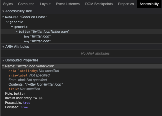
It might be a good idea to put a span in for our button text and hide the icons with aria-hidden. We can hide the span text too whilst making it available to screen readers:
.scene
  button.button
    span.button__shadow
      +icon('Twitter')
    span.button__content
      span.button__text Twitter
      +icon('Twitter')
      span.button__shine
We’ve got different options for applying those aria-hidden attributes. The one we’ll use is changing the mixin code to apply aria-hidden:
mixin icon(key)
  -
    const PATH_MAP = {
      Twitter: "...path code"
    }
  svg.button__icon(role='img' aria-hidden="true" xmlns='http://www.w3.org/2000/svg' viewbox='0 0 24 24')
    title= `${key} Icon`
    path(d=PATH_MAP[key])
Another neat way with Pug is to pass through all attributes to a mixin. This is useful in scenarios where we only want to pass some attributes through:
mixin icon(key)
  -
    const PATH_MAP = {
      Twitter: "...path code"
    }
  svg.button__icon(role='img' xmlns='http://www.w3.org/2000/svg' viewbox='0 0 24 24')&attributes(attributes)
    title= `${key} Icon`
    path(d=PATH_MAP[key])
If we check the Accessibility panel again, our button only reads “Twitter”. And that’s what we want!
The Styles
Here’s the part you came for — how we style the thing. To start, we’ve dropped this in:
* {
  transform-style: preserve-3d;
}
That allows us to create the 3D transforms we need for our button. Try switching that off in the final demo and you’ll see that everything breaks.
Let’s hide the span text from our eyes. We can do this in many ways. One recommended way to hide an element from our eyes, but not those of the screenreader, is to use these styles:
.button__text {
  position: absolute;
  width: 1px;
  height: 1px;
  padding: 0;
  margin: -1px;
  overflow: hidden;
  clip: rect(0, 0, 0, 0);
  white-space: nowrap;
  border-width: 0;
}
Before we start working on our button, we’re going to tilt the scene. We can do this using a transform. Here we chain the transform to get it into the position we want. I spent a bit of time tinkering with values here on live stream to get it close to the original:
.scene {
  height: var(--size);
  position: relative;
  width: var(--size);
  transform: rotateX(-40deg) rotateY(18deg) rotateX(90deg);
}
You’ll notice a size variable there too. We’re going to drive certain things for our button with CSS variables. This will make it handy for tinkering with values and the effect. Usually, we’d put these under the scope they’re required in. But, for demos like this, putting them under the :root at the top of our file makes it easier for us to play with.
:root {
  --blur: 8px;
  --shine-blur: calc(var(--blur) * 4);
  --size: 25vmin;
  --transition: 0.1s;
  --depth: 3vmin;
  --icon-size: 75%;
  --radius: 24%;
  --shine: rgba(255,255,255,0.85);
  --button-bg: rgba(0,0,0,0.025);
  --shadow-bg: rgba(0,0,0,0.115);
  --shadow-icon: rgba(0,0,0,0.35);
  --bg: #e8f4fd;
}
These are the variables we’re working with, and they’ll make sense as we build up our button.
The Button
Let’s move on to the button! The button element is going to fill the scene element. We could have applied the sizing and transforms directly on the button. But if we were to introduce other buttons and elements, we’d have to transform and size them all. This is something to be mindful of with CSS in general. Try to make your container elements dictate the layout:
.button {
  appearance: none;
  background: none;
  border: 0;
  cursor: pointer;
  height: 100%;
  outline: transparent;
  position: absolute;
  width: 100%;
}
Here we strip the button styles. And that gives us this.
See the Pen 9. Strip Button Styles by SitePoint (@SitePoint) on CodePen.
Next, we need to create a common starting point for the button content and the shadow. We can do this by giving each element absolute positioning. The content will have a 3D translate based on the depth variable we defined before:
.button__content,
.button__shadow {
  border-radius: var(--radius);
  display: grid;
  height: 100%;
  place-items: center;
  position: absolute;
  width: 100%;
}
.button__content {
  transform: translate3d(0, 0, var(--depth));
}
Note how we’re also making use of the --radius variable too.
See the Pen 10. Give The Button Depth by SitePoint (@SitePoint) on CodePen.
It’s hard to distinguish between the two icons at this stage. And now’s a good time to style them. We can apply some basic icon styling and use a scoped fill for each SVG icon:
.button__content {
  --fill: var(--icon-fill);
}
.button__shadow {
  --fill: var(--shadow-fill);
}

.button__icon {
  height: var(--icon-size);
  fill: var(--fill);
  width: var(--icon-size);
}
It’s getting there! The icons aren’t the same size at the moment, though. We’ll get to that.
See the Pen 11. Apply Scoped Fill by SitePoint (@SitePoint) on CodePen.
Let’s get the button press in place. This part is really quick to integrate:
.button__content {
  transition: transform var(--transition);
}
.button:active {
  --depth: 0;
}
That’s it! Using scoped CSS variables, we’re saying remove the z-axis translation on :active. Adding the transition to the transform stops it from being so instant.
See the Pen 12. Press on :active by SitePoint (@SitePoint) on CodePen.
All that’s left to do is style the button layers and the shine. Let’s start with the shadow:
.button__shadow {
  background: var(--bg-shadow);
  filter: blur(var(--blur));
  transition: filter var(--transition);
}
.button:active {
  --blur: 0;
}
Another scoped style here. We’re saying that when we press the button, the shadow is no longer blurred. And to blur the shadow, we use the CSS filter property with a blur filter — the value of which we defined in our CSS variables. Have a play with the --blur variable and see what happens.
See the Pen 13. Reduce Blur on Hover by SitePoint (@SitePoint) on CodePen.
For the content layer, we’re going to use a background color and then apply a backdrop filter. Much like filter, backdrop-filter is a way for us to apply visual effects to elements. A common use case currently is to use blur for “Glassmorphism”:
.button__content {
  backdrop-filter: blur(calc(var(--blur) * 0.25));
  background: var(--button-bg);
  overflow: hidden;
  transition: transform var(--transition), backdrop-filter var(--transition);
}
We use the value of --blur and apply a transition for backdrop-filter. Because of the way we scoped our --blur variable on :active, we get the transition almost for free. Why the overflow: hidden? We’re anticipating that shine element that will move around the button. We don’t want it wandering off outside, though.
See the Pen 14. Styling Content Layer by SitePoint (@SitePoint) on CodePen.
And now, the last piece of the puzzle— that light shine. This is what’s been causing the icons to be a different size. Because it has no styles, it’s affecting the layout. Let’s give it some styles:
.button__shine {
  --shine-size: calc(var(--size) * 0.5);
  background: var(--shine);
  border-radius: 50%;
  height: var(--shine-size);
  filter: blur(var(--shine-blur)) brightness(1.25);
  position: absolute;
  transform: translate3d(0, 0, 1vmin);
  width: var(--shine-size);
}
That absolute positioning will sort out the icon sizing. Applying a border radius will make the spotlight round. And we use filter again to give the blurry spot light effect. You’ll notice we’ve chained a brightness filter on the end there to brighten things up a bit after they’re blurred.
See the Pen 15. Styling Shine by SitePoint (@SitePoint) on CodePen.
Using the 3D translation ensures that the shine sits above the button, which it would do. This way, there’s no chance of it getting cut by z-fighting with other elements.
That’s all we need for the styles for now. Now it’s time for some scripts.
Script
We’re going to use GreenSock here for convenience. They have some neat utilities for what we want. But, we could achieve the same result with vanilla JavaScript. Because we’re using scripts with type “module”, we can take advantage of SkyPack.
import gsap from 'https://cdn.skypack.dev/gsap'
And now we’re ready to start tinkering. We want our button to respond to pointer movement. The first thing we want is to translate the shine as if it follows our pointer. The second is to shift the button depending on where our pointer is.
Let’s grab the elements we need and set up some basic event listeners on the document:
import gsap from 'https://cdn.skypack.dev/gsap'

const BUTTON = document.querySelector('.button')
const CONTENT = document.querySelector('.button__content')
const SHINE = document.querySelector('.button__shine')

const UPDATE = ({x, y}) => console.info({x, y})

document.addEventListener('pointermove', UPDATE)
document.addEventListener('pointerdown', UPDATE)
Try moving your pointer around in this demo to see the valuables we get returned for x and y:
See the Pen 16. Grabbing Elements and Creating Event Listeners by SitePoint (@SitePoint) on CodePen.
This is the trickiest bit. We need some math to work out the shine position. We’re going to translate the shine after its initial reset. We need to first update the shine styles to accommodate this. We’re using the scoped CSS variables --x and --y. We give them a fallback of -150 so they’ll be out of shot when the demo loads:
.button__shine {
  top: 0;
  left: 0;
  transform: translate3d(-50%, -50%, 1vmin) translate(calc(var(--x, -150) * 1%), calc(var(--y, -150) * 1%));
}
Then, in our update function we calculate the new position for the shine. We’re basing this on a percentage of the button size. We can calculate this by subtracting the button position from our pointer position. Then we divide that by the position. To finish, multiply by 200 to get a percentage:
const BOUNDS = CONTENT.getBoundingClientRect()
const POS_X = ((x - BOUNDS.x) / BOUNDS.width) * 200
const POS_Y = ((y - BOUNDS.y) / BOUNDS.height) * 200
For example, POS_X:
- Grab pointer position x.
- Subtract button position x.
- Divide by button width.
- Multiply by 200.
We multiply by 200 because the shine is half the size of the button. This particular part is tricky because we’re trying to track the pointer and map it into 3D space.
To apply that to the button, we can set those CSS variables using gsap.set. That’s a GSAP method that works as a zero second tween. It’s particularly useful for setting values on elements:
gsap.set(SHINE, {
  '--x': POS_X,
  '--y': POS_Y
})
But, if we want to take it one step further, we can use a quickSetter from GSAP, which would be better for performance in real-world scenarios where we’re making lots of updates:
const xySet = gsap.quickSetter(SHINE, 'css')
// Then to update the values
xySet({
  '--x': POS_X,
  '--y': POS_Y
})
That makes our update function look something like this:
const UPDATE = ({x, y}) => {
  const BOUNDS = CONTENT.getBoundingClientRect()
  const POS_X = ((x - BOUNDS.x) / BOUNDS.width) * 200
  const POS_Y = ((y - BOUNDS.y) / BOUNDS.height) * 200
  xySet({
    '--x': POS_X,
    '--y': POS_Y
  })
}
The accuracy of following the pointer would need more calculations to be precise. Have a play with this demo where the overflow on the button is visible and the shine is more prominent. You can see how the shine element loses its tracking.
See the Pen 17. Translating the Shine Playground by SitePoint (@SitePoint) on CodePen.
This demo puts everything where it should be.
See the Pen 18. Translating the Shine by SitePoint (@SitePoint) on CodePen.
Last feature. Let’s shift the button for an added touch. Here, we’re going to base the shift of the button on pointer position. But, we’re going to limit its movement. To do this, we can use another GSAP utility. We’re going to use mapRange. This allows us to map one set of values to another. We can then pass a value in and get a mapped value back out.
First, we’ll define a limit for movement. This will be a percentage of the button size:
const LIMIT = 10
Now, in our update function we can calculate the percentage of shift. We do this by mapping the window width against the limit. And we input our pointer position to get the mapped percentage back:
const xPercent = gsap.utils.mapRange(
  0,
  window.innerWidth,
  -LIMIT,
  LIMIT,
  x
)
In this block we’re mapping the range of 0 to window.innerWidth against -10 to 10. Passing pointer position x will give us a value between -10 and 10. And then we can apply that percentage shift to our button. We do the same for vertical shift and this gives us an update function like the following:
const buttonSet = gsap.quickSetter(BUTTON, 'css')
const xySet = gsap.quickSetter(SHINE, 'css')
const LIMIT = 10

const UPDATE = ({x, y}) => {
  const BOUNDS = CONTENT.getBoundingClientRect()
  const POS_X = ((x - BOUNDS.x) / BOUNDS.width) * 200
  const POS_Y = ((y - BOUNDS.y) / BOUNDS.height) * 200
  xySet({
    '--x': POS_X,
    '--y': POS_Y
  })
  const xPercent = gsap.utils.mapRange(
    0,
    window.innerWidth,
    -LIMIT,
    LIMIT,
    x
  )
  const yPercent = gsap.utils.mapRange(
    0,
    window.innerHeight,
    -LIMIT,
    LIMIT,
    y
  )
  buttonSet({
    xPercent,
    yPercent,
  })
}
That’s it!
That’s how you create a directional lit 3D button with CSS and a little scripting. The cool thing is that we can make changes with relative ease.
For the final demo, I’ve added some extra details and changed the icon. You might recognize it.
See the Pen 20. SitePoint Button by SitePoint (@SitePoint) on CodePen.
As always, thanks for reading. Wanna see more? Come find me on Twitter or check out the the live stream!
Frequently Asked Questions about Creating Directionally Lit 3D Buttons with CSS
How can I create a 3D button using CSS that changes when clicked?
Creating a 3D button that changes when clicked involves using the :active pseudo-class in CSS. This pseudo-class is used to style an element when it’s being activated by the user. For instance, you can change the color, size, or position of the button when it’s clicked. Here’s a simple example:.button:active {
background-color: #3e8e41;
box-shadow: 0 5px #666;
transform: translateY(4px);}
In this example, the button’s background color changes to a different shade of green when clicked. The box-shadow property adds a shadow effect, and the transform property moves the button down slightly.
How can I add a hover effect to my 3D button?
Adding a hover effect to your 3D button can be achieved using the :hover pseudo-class in CSS. This pseudo-class is used to style an element when the mouse pointer is over it. You can change the color, size, or add a shadow to the button when it’s hovered over. Here’s a simple example:.button:hover {
background-color: #3e8e41;
box-shadow: 0 5px #666;}
In this example, the button’s background color changes to a different shade of green when hovered over, and a shadow effect is added.
How can I make my 3D button responsive?
Making your 3D button responsive involves using media queries in CSS. Media queries allow you to apply different styles for different devices or screen sizes. For instance, you can change the size or position of the button depending on the screen size. Here’s a simple example:@media screen and (max-width: 600px) {
.button {
width: 100%;
padding: 20px;
}}
In this example, the button’s width is set to 100% and the padding is increased when the screen size is 600px or less.
How can I add a transition effect to my 3D button?
Adding a transition effect to your 3D button can be achieved using the transition property in CSS. This property allows you to specify the speed of the effect. For instance, you can make the color change or the shadow appear gradually. Here’s a simple example:.button {
transition: background-color 0.5s ease, box-shadow 0.5s ease;}
In this example, the background color and the shadow change gradually over a period of 0.5 seconds.
How can I create a 3D button with rounded corners?
Creating a 3D button with rounded corners involves using the border-radius property in CSS. This property allows you to add rounded borders to an element. For instance, you can make the button’s corners round. Here’s a simple example:.button {
border-radius: 12px;}
In this example, the button’s corners are rounded with a radius of 12px.
How can I create a 3D button with a gradient background?
Creating a 3D button with a gradient background involves using the linear-gradient function in CSS. This function allows you to create a gradient that transitions between two or more colors. Here’s a simple example:.button {
background: linear-gradient(to right, #ff7f00, #ff5500);}
In this example, the button’s background transitions from a light orange color to a darker orange color.
How can I create a 3D button with a shadow effect?
Creating a 3D button with a shadow effect involves using the box-shadow property in CSS. This property allows you to add a shadow to an element. For instance, you can add a shadow to the button to make it look 3D. Here’s a simple example:.button {
box-shadow: 0 5px 15px rgba(0,0,0,0.3);}
In this example, the button has a shadow that’s 5px below the button and has a blur radius of 15px. The color of the shadow is a semi-transparent black.
How can I create a 3D button with a border?
Creating a 3D button with a border involves using the border property in CSS. This property allows you to add a border to an element. For instance, you can add a border to the button to make it stand out. Here’s a simple example:.button {
border: 2px solid #ff5500;}
In this example, the button has a 2px solid border with a color of orange.
How can I create a 3D button with text inside?
Creating a 3D button with text inside involves using the text properties in CSS. These properties allow you to style the text inside an element. For instance, you can change the color, size, or font of the text inside the button. Here’s a simple example:.button {
color: #fff;
font-size: 20px;
font-family: Arial, sans-serif;}
In this example, the text inside the button is white, has a size of 20px, and uses the Arial font.
How can I create a 3D button that’s compatible with all browsers?
Creating a 3D button that’s compatible with all browsers involves using vendor prefixes in CSS. These prefixes allow you to use new CSS features before they’re fully supported in all browsers. For instance, you can use the -webkit- prefix for Chrome and Safari, the -moz- prefix for Firefox, and the -ms- prefix for Internet Explorer. Here’s a simple example:.button {
-webkit-transition: background-color 0.5s ease, box-shadow 0.5s ease;
-moz-transition: background-color 0.5s ease, box-shadow 0.5s ease;
-ms-transition: background-color 0.5s ease, box-shadow 0.5s ease;
transition: background-color 0.5s ease, box-shadow 0.5s ease;}
In this example, the transition effect is compatible with Chrome, Safari, Firefox, and Internet Explorer.
 Jhey Tompkins
Jhey makes awesome things for awesome people! He’s a web developer with almost 10 years of experience. Working with and for names such as Eurostar, Uber, NearForm, Barclaycard, ATG, O2, and M&C Saatchi. Jhey thrives on bringing ideas to life. He takes pride in crafting innovative solutions with polished user experiences. This whilst possessing a keen eye for design, accessibility, and well-structured code. He’s a CodePen advocate and shares attention-catching demos over on Twitter.