It’s probably not a huge surprise for you to find out that car companies like BMW employ elite teams of sound engineers in their automotive design divisions – after all, cars are noisy machines.
What might be more surprising is that these teams often spend more of their time ‘tuning’ the sounds the car makes, than they do muffling or dampening them.
For instance, though the ‘car door closing sound’ is just an accidental side-effect of sealing the vehicle, manufacturers go to incredible lengths to engineer what they call the ‘the perfect car door closing sound‘. They adjust the materials, fillers, joints and hollow spaces to create just the right ‘note’.
Similarly, wipers, window motors, and seat controls all play their parts in this mini automotive symphony.
And as designers, we get that, right? It’s a UX thing. It’s not just about the outcome of closing the door. It’s about how the process feels. For BMW, that is a ‘kaTHUNK!’ that feels safe, reliable and luxurious. Micro-interactions in web design cover similar territory.
What are micro-interactions?
Micro-interactions are subtle “moments” centered around accomplishing a single task, such as hitting the submit button on a form with the intention of logging in or favoriting a tweet with the intention of social engagement.
“Micro-interactions” might be a newish term – micro-interactions can be found literally everywhere from flipping on a light switch, turning up the volume on a speaker), but the one thing they all have in common is that they accomplish a specific task.

Some tasks require a series of interactions, such as filling out form fields, selecting options, and so on. If an interaction involves the action of submitting data in a web form, then the micro-interaction is the specific action of hitting the submit button.
Micro-Interactions != Animations
Micro-interactions are about much more than animations. You also have to consider the obviousness of the interactive target and the language used in the response; the user experience should be more of a concern than the visual aesthetics, although animation can contribute heavily to the user experience if used correctly.
“Because they look cool” is the absolute worst reason for using animations in web design, especially if the sole reason for creating a micro-interaction is so show off an effect.
Since the birth of HTML5 and CSS3, the web has been taking advantage of these native animations and transitions, however, many designers are still using them to add fancy effects to their web designs without ever really considering how it affects the users’ experience. Let’s discuss when to use micro-interactions and how we can offer an optimal user experience for them.
When to Use Micro-Interactions
If an image (for example) doesn’t do anything useful when clicked/hovered/tapped (i.e. it’s not linked to another webpage and it can’t be zoomed or anything), then nothing more needs to be done to it — no animations, no fancy hover effects, nothing.
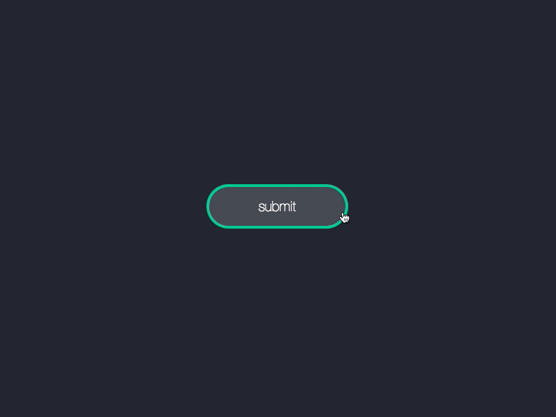
It’s a static element and anything “more” will lead the user to believe otherwise (confusion = bad user experience). Now let’s consider the submit button again; this needs to be a micro-interaction because we need to visually communicate that…
- the button can be interacted with now, or
- the button can be interacted with soon, or
- the button is being interacted with already
…in order to guide the user towards submitting the form.
Micro-Interactions Are Like Conversations
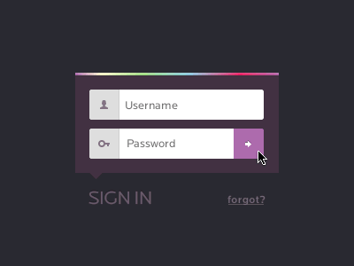
Micro-interactions begin with the trigger, which by default is a click or a tap on the users’ behalf — this is your communication to the interface. After that, the website or app listens to your request and decides whether or not it can complete the action according to the rules and then lets you know what it ultimately decided. In the case of a login form, the rules would consist of the credentials being correct.
If everything is a-okay, then we move into the feedback stage, and this is where the user interface communicates its decision back to you. If your request is sound, then you should receive a confirmation saying so; if not, then we move into the loop stage — this is where the user interface explains what went wrong and how you can re-trigger the micro-interaction.
In order to offer an optimal user experience during a micro-interaction, the user interface needs to maintain a clear, intuitive communication with the user at all times.
Designing the Target/Trigger
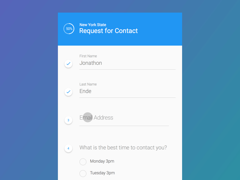
First of all, interactive elements need to look like they can be interacted with. If links aren’t underlined, for example, they can be confused with ordinary text, or if an input field looks too minimal, the user might not know it’s an input field. It’s lovely to see designers driving their craft to the very edge, but user experience needs to trump visual aesthetics every time.
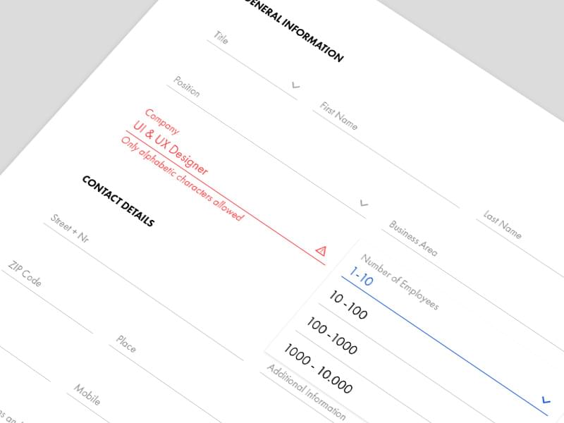
Interactive targets may even sometimes require hints, such as labels next to form fields and front-end validation so the user instantly knows if they’ve done it right — this help to reduce the users’ chances of form errors and being looped back.
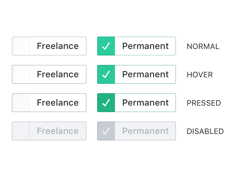
Another example might be disabling or graying-out certain targets so users’ know they can’t be interacted with yet.
How Rules Help to Articulate a Contextual Response
So your trigger looks like a trigger and it’s been triggered…awesome! Now the user interface needs to respond with something informative. In web forms this can be quite complex as there are typically numerous conditions that need to be met before the data can be sent, however even in simpler requests (such as clicking a link to a “404 Not Found” webpage) things can still go wrong, and when they do, the interface needs to explain what happened and try to help you move forward in any scenario.
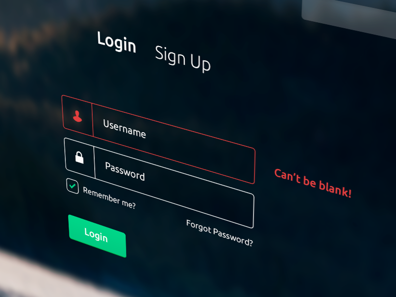
Helpful — explains the issue and uses red to emphasize it.
Not helpful — vague error message and unclear button.
Helpful — offers alternative user flows.
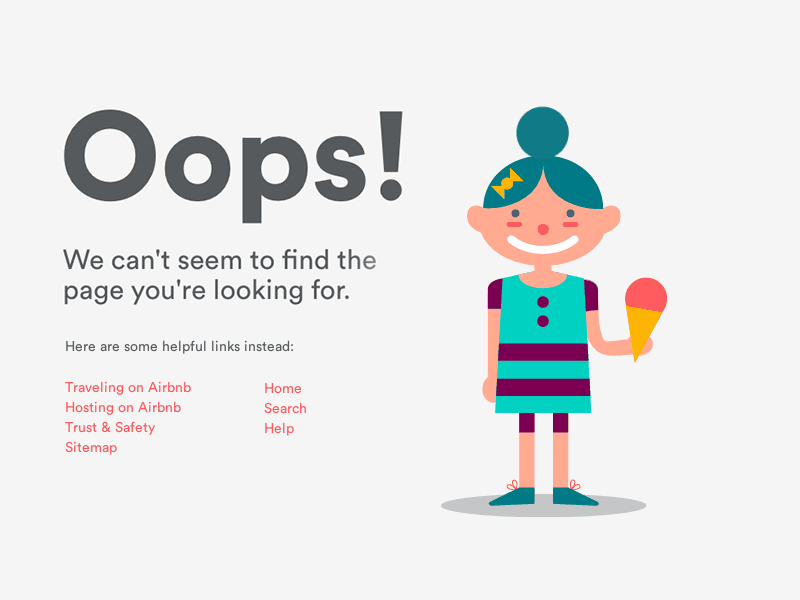
Not helpful — offers a dead-end.

In the case of forms, a bad error code would be “Error #8418764: your request could not be completed”, whereas “You must agree to the terms of service” is much better because it tells the user exactly how to correct their mistake. By anticipating where users might go wrong you can design interfaces that are not only more helpful but can appeal to the user on a more human level.
Responding With Helpful Feedback
Communicating feedback is a lot like designing triggers as a lot of the same design concepts apply: green means “acceptable” or “go” or “completed”, red means “not acceptable” or “stop” or “error”, so these concepts need to be combined with a contextual response in order to design clear, humanlike responses.
Speaking of humanlike, we need to discuss animations once more and how they aid the user experience when used correctly. When displaying a response to a micro-interaction, may that be a dialogue, a visual change, whatever, animation can help the user notice it. When something happens on the screen in an instant, the human brain can completely miss it, so subtle transitions can introduce visual cues in a way that our eyes will see.
Movement should always be fast enough that it doesn’t cause the user to wait too long, but slow enough that the transition can be registered in our brain. Animation can redirect our line of sight to somewhere else on the screen, such as an input field with an invalid value, or a fixed-header that appears after a certain amount of scrolling. Without a subtle transition, the responses to these micro-interactions can go unnoticed.

Keep the User Informed When Waiting
Occasionally a request can take some time, and so the user needs to stay informed during this time as well. Otherwise, the user will start to wonder if something is wrong and possibly quit the micro-interaction of their own accord (this happens a lot on payment forms because the website has to wait for a response from the merchant before it can deliver its own response!).
We can keep the user informed with loading spinners and progress bars, which again can be animated to further clarify that the website or app is doing something behind the scenes.

Conclusion
If there’s anything to be learned from micro-interactions, it’s that users are very high-maintenance. We’re impatient, we become frustrated easily, and if something isn’t immediately obvious we’re happy to switch to another competitor in an instant!
A bad user experience can make all the difference, so next time you’re designing a website or an app, remember to stand in the users’ shoes for a second. Empathy is a human emotion; this means that it’s the key to designing user interfaces that are both helpful and humanlike. Interfaces that are designed to function in a natural way are better understood by users.
Frequently Asked Questions on Micro-Interactions in UX Design
What are some examples of micro-interactions in everyday digital products?
Micro-interactions are subtle design elements that facilitate user engagement in digital products. They are often so seamlessly integrated that users may not consciously notice them. Examples include the ‘like’ button on social media platforms, the subtle animation that occurs when you refresh your email inbox, or the visual feedback you get when you enter your password incorrectly. These small design elements enhance the overall user experience by making digital interactions feel more human and intuitive.
How do micro-interactions contribute to the overall user experience?
Micro-interactions play a crucial role in enhancing the user experience. They provide immediate feedback, guide users through a process, help users visualize the results of their actions, and make the interaction more engaging and enjoyable. By making digital interactions feel more human and intuitive, micro-interactions can significantly improve the overall user experience.
When should I use micro-interactions in my design?
Micro-interactions should be used whenever you want to guide users through a process, provide feedback, or enhance the overall user experience. They are particularly useful in situations where immediate feedback is necessary, such as form validation, or where they can make a process more engaging, such as a loading animation.
How can I design effective micro-interactions?
Designing effective micro-interactions requires a deep understanding of the user’s needs and expectations. They should be intuitive, provide clear feedback, and enhance the overall user experience. It’s also important to keep them simple and consistent with the overall design of the product.
Can micro-interactions be used in mobile app design?
Yes, micro-interactions can be effectively used in mobile app design. They can help make the app more engaging and intuitive, and provide valuable feedback to the user. Examples include the ‘pull to refresh’ interaction in many social media apps, or the subtle animations that occur when you switch between tabs.
What are some common mistakes to avoid when designing micro-interactions?
Some common mistakes to avoid when designing micro-interactions include making them too complex, not providing clear feedback, and not aligning them with the overall design of the product. It’s also important to avoid overusing micro-interactions, as this can make the product feel cluttered and confusing.
How can I test the effectiveness of my micro-interactions?
The effectiveness of micro-interactions can be tested through user testing and feedback. This can involve observing users as they interact with the product, asking for their feedback, or using analytics to track how users interact with the product.
Can micro-interactions improve the accessibility of my product?
Yes, when designed correctly, micro-interactions can significantly improve the accessibility of your product. They can provide valuable feedback, guide users through a process, and make the product more intuitive and easy to use.
How can micro-interactions enhance the visual design of my product?
Micro-interactions can enhance the visual design of your product by adding a layer of interactivity and engagement. They can make the product feel more dynamic and alive, and can help guide the user’s attention to important elements.
Are there any tools or resources available to help me design micro-interactions?
Yes, there are many tools and resources available to help you design micro-interactions. These include design software like Adobe XD or Sketch, online tutorials and courses, and design communities where you can share your work and get feedback.
 Daniel Schwarz
Previously, design blog editor at Toptal and SitePoint. Now Daniel advocates for better UX design alongside industry leaders such as Adobe, InVision, Marvel, Wix, Net Magazine, LogRocket, CSS-Tricks, and more.