When you start a design project – what do you aim for? What principles do you go by? I’m quite curious to know what goes on in your head.
Over the last few weeks, I’ve seen dozens of new business owners launch their website. This was in an online business course that I was part of. Some of these sites were done by the owners themselves, and a larger number done by professionals who charged a bomb.
However, what stood out was the common thread running through those sites. These businesses were all focused on, or at least trying to focus on, their end user. They wanted to please, to provide value, and ultimately seduce potential customers. They put in the research and came up with visually appealing websites, which they thought would provide a great user experience.
Then they waited with bated breath for the subscribers, and the sales.
And kept waiting.
While their marketing efforts kept the traffic coming in, viewers were just not signing up, or buying. It was heart breaking.
No matter how beautiful your design, or how great your user experience, if visitors don’t sign up, or buy, you might as well not have a website at all. A site that dies with happy users but no revenue, still dies.
Of course, if you’re lavishly funded by VCs and not required to turn a profit in the short term, you can afford to focus entirely on UX and leave revenue to work itself out later (shout out to Twitter).
But the reality is that most of us don’t have that luxury.
What if, instead of relying on a digital marketer to come in later and fix this situation, we started weaving in the elements of conversions into our designs? Along with the visual appeal and user experience, perhaps it’s time designers shifted focus – or at least became conscious of – Conversion Centric Design (CCD).
With Conversion Centric Design the focus is on creating experiences that drive visitors towards a specific business goal. Persuasive design and psychology principles are used to actively drive visitors into the sales funnel – rather than just creating a pretty site and hoping people sign up.
Conversion Centric Design has so far, been the domain of internet marketers, looking to increase conversions on landing pages and sales pages. But there’s no reason the same principles can’t be used while designing the entire website.
Let me walk you through some of the design elements of conversion centric design that you can easily incorporate in your designs. And while we’re at it, let’s take a look at some examples as well.
Design Elements
1. Encapsulation
Encapsulation is a technique where you create a frame around a feature or focus area, to ‘hijack’ your visitors gaze. By doing this, you can subtly ensure that certain pieces of information are highlighted and get the attention they deserve. Encapsulation can be done using images, graphics, or just simple frames around the element you want to highlight.
It works particularly well with Call-To-Actions of all types, as well as testimonials, or data points that you want to share on your site.
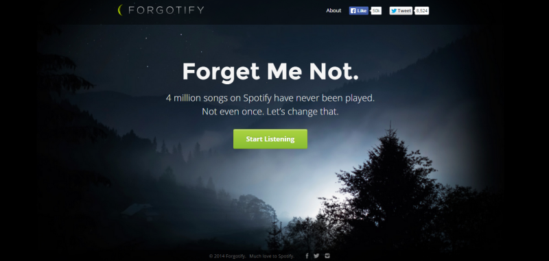
For example, take a look at Forgotify’s home page. The simple play of light in the background frames their CTA in an almost mesmerizing manner.
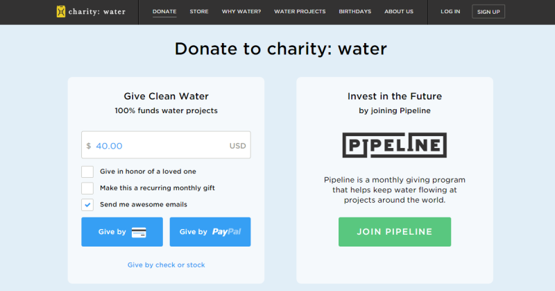
CharityWater also uses encapsulation in a more subtle way. The slightly paler background color on their CTA versus the rest of the page, helps frame the CTA clearly and draw visitors to it.
2. Contrast and Color
Color and contrast have long been used in design aesthetics to evoke certain emotions. This is about using color contrast to subtly nudge and persuade viewers into taking a desired action.
That action could be anything – signing up, buying, or even just clicking through to the next page. Notice how Forgotify’s simple “Start Listening” in green pops out against the dark background. You just have to click it.
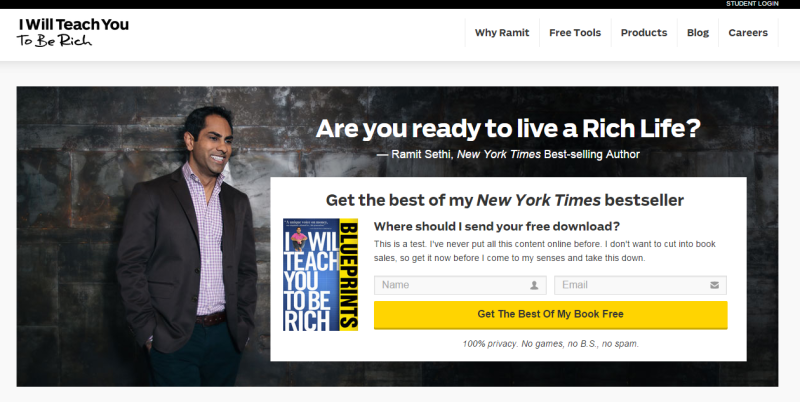
As another example, take a look at the IWT page – there’s no chance visitors can miss that bright yellow CTA.
In contrast, take Threadless. They just got the color contrast part all wrong! Multiple blue images and graphics completely drown out the small blue “Shop Now” button. Can you find it in the image? Instead, the colorful planets and the red half of the capsule jostle for the viewers attention.

A smart move is using buttons or contrasts that also generate the desired psychological impact.
3. Directional Cues
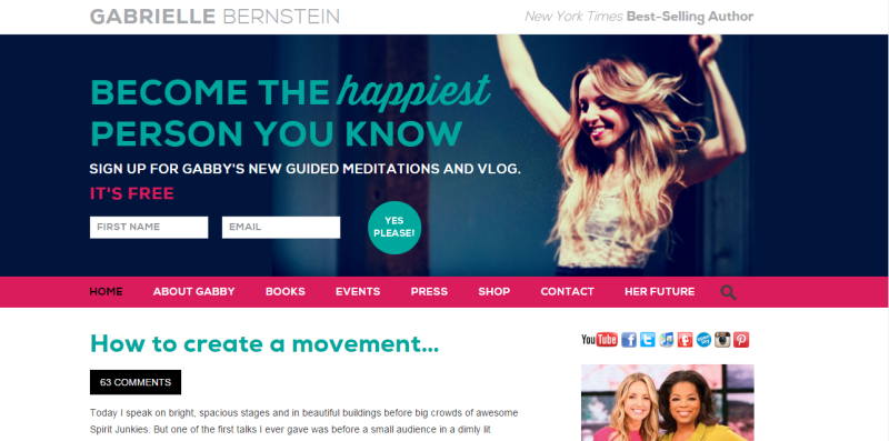
Directional Cues are visual indicators, subtle or otherwise, that you use to draw attention to your focal point. Subtle inclusions include using a scenery that has a salient pointer or picture of a person looking at the desired focal point. Using arrows, is a clear, unambiguous way to draw attention. In the screenshot below, follow Gabrielle Bernstein’s line of sight – it leads directly to the optin on her homepage. It’s the perfect header image – leading directly to sign ups for her newsletter.
4. White Spaces
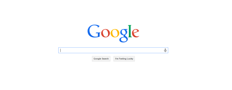
Remember the trend when everyone tried to use up every possible pixel of the page’s real estate? Google’s simple home page was considered revolutionary in those days. They wanted their home page to do just one thing – help people search the internet.
Just one box. Nothing else on the page. No menu. No About page. Nothing else. That simple text box right in the middle of a blank page has helped Google make billions. Do I need to say any more about the power of white spaces in conversion design?
Psychology Elements
5. Urgency and Scarcity
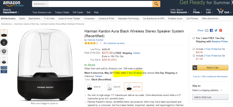
Decision Theory shows people are more averse to losing something or missing out on it, as compared to acquiring something. It’s called Loss Aversion and has been widely used to prompt visitors to signing up or purchasing something from the website. Amazon uses this technique extensively creating a sense of urgency with their “Want it tomorrow? Order within X hours, Y minutes”.
Back on the IWT website, Ramit Sethi doesn’t use a definite timeline. Instead he creates that sense of urgency by saying “get it now before I change my mind and take this down”. Great example of how simple copy writing can be used to create scarcity.
6. Try before you buy
Another widely used conversion technique is the “Try Before You Buy”. Street vendors and shops have been using this technique for centuries, but it’s only now catching up in the online world.
As humans, we hate uncertainty – it’s in our DNA. Especially the uncertainty that comes from impersonal online interactions. When buying a book, or shoes, or clothes or software online, the customer can’t pick it up, try it out, feel it, smell it. Offering visitors a free sampling of your software, preview of your book, or a free consultation session serves to give them a taste of what to expect.
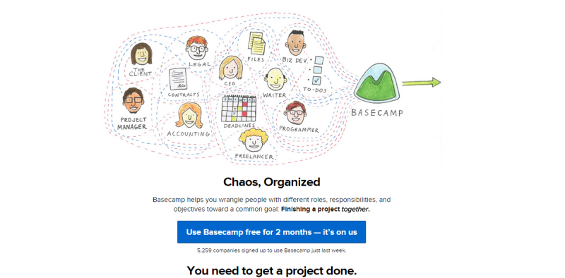
Basecamp has one of the most generous trial offers – for a whole two months. Take a look back at the screenshot of the IWT page – Ramit Sethi offers a free download of the best content from his bestselling book. This gives visitors a safe, risk-free, way to experience the product/book with ample time to make a decision to buy the product.
7. Social Proof
People like to belong. They like to be part of a group and will often conform to group decisions and choices, even if they there is an element of doubt.
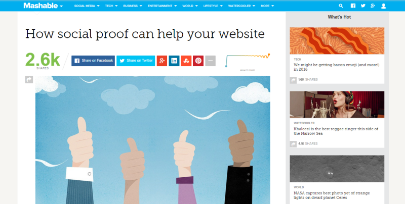
Social proof can be in many forms – endorsements, case studies, reviews, user generated content and even just numbers (of how many people like/use/shared) your content. That’s why many websites today display testimonials and shares up front. Mashable for example, goes a step further to display the ‘velocity’ of their shares – the rate at which people around the globe are sharing their content.
Of course, make sure you’re using it right. Highlighting that you have 0 shares, or using the wrong kind of testimonials, can actually backfire.
Summary
I hope this short walk through the design and psychology elements of conversion centric design helped pique your interest. You can get a better understanding of conversion centric design with this free eBook from Unbounce. It all comes down to focusing your design efforts toward specific business results,instead of just putting together a visually appealing site.
Would love to hear your take on this. Do you incorporate conversion principles into their design process? Or do you believe marketing is best left to the internet marketers?
Share your thoughts with us in the comments below.
 Richa Jain
Once upon a time, Richa was a savvy techie & manager, in the semiconductor software industry. After her miraculous escape and recovery, she now works from her garden, creating websites, writing about technology, business & entrepreneurship; and helping others escape the cubicle lifestyle.