 As part of our Ultimate 80s Movie Poster contest, Graphic Stock is sponsoring a design series on SitePoint. The topics discussed in this article, as well as these articles – Photoshop editing and 80s font selection – can be used to help you win the contest. Sign up for a Graphic Stock trial and get ready for your chance to win the $5000 first prize.
Post-millennial designers are standing on the shoulders of giants: Saul Bass, Henri Matisse, and whoever designed the poster for Pretty Woman, to name just a few.
Because recognizing these roots is crucial for success — and for winning our 1980s movie poster design contest — we’ve put together a visual mix-tape inspired by theartwork of theater lobbies circa 1980-1989.
As part of our Ultimate 80s Movie Poster contest, Graphic Stock is sponsoring a design series on SitePoint. The topics discussed in this article, as well as these articles – Photoshop editing and 80s font selection – can be used to help you win the contest. Sign up for a Graphic Stock trial and get ready for your chance to win the $5000 first prize.
Post-millennial designers are standing on the shoulders of giants: Saul Bass, Henri Matisse, and whoever designed the poster for Pretty Woman, to name just a few.
Because recognizing these roots is crucial for success — and for winning our 1980s movie poster design contest — we’ve put together a visual mix-tape inspired by theartwork of theater lobbies circa 1980-1989.
It’s a Nice Day for a White Background
The traditional background for film posters in the 1970s was either white or off-white, and while that trend saw a steep decline throughout the next decade, it by no means disappeared. The original posters for Fast Times at Ridgemont High (1982) and Full Metal Jacket (1987) fit right in with that of Super Fly (1972) in confirmation that white borders and central composition were still very present throughout even the late eighties, if no longer the dominant theme.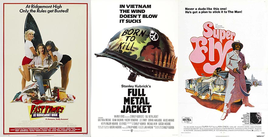
Back in Black
More and more, the decade that brought us John Rambo, John McClane, and John Connor went full bleed—and not just in terms of heroic violence. Backgrounds saw a shift from high-key to low-key—and artwork got the same treatment by way of heavy shading reminiscent of chiaroscuro. Matthew Broderick’s face is fully illuminated in the artwork for Ferris Bueller’s Day Off (1986), but all but hidden in the poster for War Games (1983).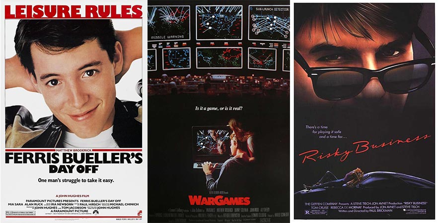 Subject matter clearly factors into this, as War Games is certainly a darker film; however, movie posters as a whole got a darker treatment in the eighties, a trend that has largely carried through to present day.
So Bright, You Gotta Wear Shades (and Black Leather Gloves)
Darkness aside, thesethirty-year-old posters are a long way from “modern.” Black might still be en vogue today, but that’s less true for dark sunglasses and fingerless gloves—two relics of eighties fashion (and poster)design. You’d think sunglasses would be distracting for an action hero, for whom obstructed vision might mean the difference between life and death. We don’t see KatnissEverdeen wearing sunglasses in The Hunger Games artwork—or even the vampires from Twilight, who are particularly photosensitive—but that might be different had these films been produced three decades ago.
Fashion design and graphic design continually feed one another, which is why posters from the 1980s leaned particularly heavy on elements like dark sunglasses, leather jackets, and fingerless gloves.
Here are some laser-related assets you can use in your own designs:
- Laser lights
- Red virtual laser floor background
- Blue virtual laser floor background
- Green virtual laser floor background
- Violet virtual laser floor background
- Blue laser digital wall background
- Violet laser light grid background
- Blue laser light grid background
- Green laser light grid background
- Red laser light grid background
Pretty in Pink
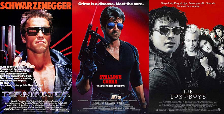
Pinks and purples weren’t just “pretty” in the 1980s;they were dominant throughout several genres, including sci-fi and action. Look closely, and you’ll find them in the metallic font of The Terminator (1984) and the backdrop for Stallone’s Cobra (1986). Meanwhile, purple is every bit as present in artwork for the sci-fi-action film RoboCop (1987) as in that of dramas like The Breakfast Club (1985) and romances like Cocktail (1988).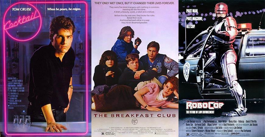 Today, pinks and purples are back to being typecast as soft and feminine, but they were definitely mainstream in the 1980s and widely used across genres.
Some examples of pink and purple assets you can use:
Today, pinks and purples are back to being typecast as soft and feminine, but they were definitely mainstream in the 1980s and widely used across genres.
Some examples of pink and purple assets you can use:
- Bubbles on a pink wine background
- Vintage pink backdrop
- Pink glitter paper texture
- Glowing lights background
- Abstract pink background
- Romantic pink and white decorative pattern
- Violet LED dots abstract background
- Another Violet LED dots abstract background
- Pink and black striped pattern
- Pink background
- Romantic pink wooden boards texture
- Black polka dots pattern
- Shiny pink texture
- Pink bokeh texture
- Pink grunge texture
- Pink network stage background
- Pink spotlight abstract background
- Clouds on pink sky
- Pink vintage dots texture
- Retro pink bokeh background
- Purple nature bubbles
- Aurora purple background
Blinding Audiences with Science
The eighties were also the era of digital, and movie posters were prime real estate for imagery of computers, pixelated computer graphics, lasers, and wild electricity. Films like War Games (1983)presented organic opportunities for this, while other films went with more conceptual uses, particularly through title fonts. The designers behind the artwork for Weird Science (1985), 48 Hrs. (1982), and E.T. (1982) all used typography to add a digital or technological feel to the titles.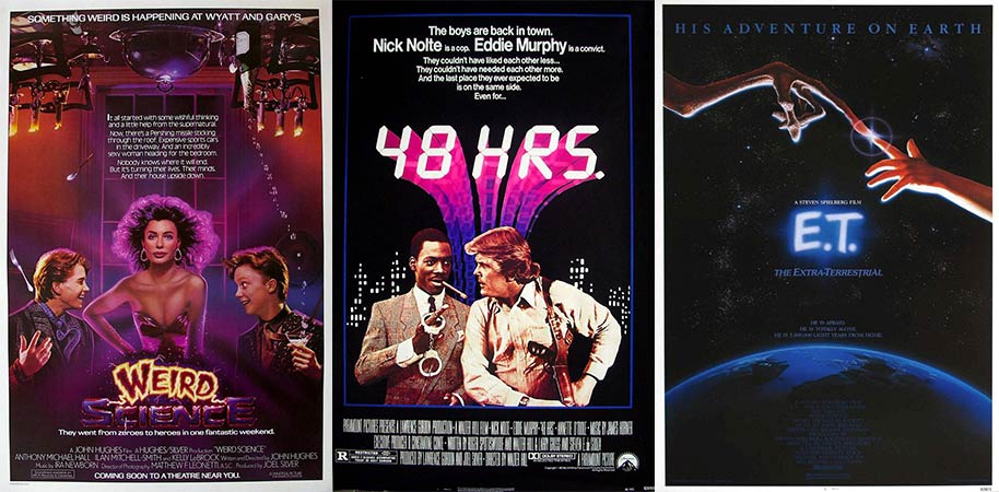 Here are some examples of technological and scientific assets you:
- Dynamic light
- Dynamic blue light
- Plasma globe
- Fiber optics
- More fiber optics
- Tech background
- High-tech background
- Mainboard
- Vector circuit board
- Green tech background
- Flame style fractal
- Fire fractal
- Powerful processor
- Even more fiber optics
Frequently Asked Questions about 1980s Movie Posters
What makes 1980s movie posters unique?
The 1980s was a golden era for movie posters. The uniqueness of these posters lies in their vibrant color schemes, bold typography, and the use of hand-drawn illustrations. Unlike today’s digital designs, 1980s movie posters were often painted by artists who captured the essence of the film in a single image. These posters were not just promotional materials, but works of art in their own right, often becoming as iconic as the movies they represented.
Why are 1980s movie posters so popular among collectors?
Collectors value 1980s movie posters for their artistic merit, nostalgia, and the cultural significance of the films they represent. The hand-drawn and painted designs are considered more authentic and personal than modern digital designs. Additionally, these posters often feature iconic imagery from beloved films, making them a popular choice for fans and collectors alike.
How can I identify an original 1980s movie poster?
Identifying an original 1980s movie poster can be challenging due to the abundance of reproductions. However, there are a few key things to look for. Original posters from this era are typically larger, often measuring 27″ x 41″. They may also have a NSS (National Screen Service) number printed on them. The paper quality and printing techniques used can also provide clues. If in doubt, it’s best to consult an expert or reputable dealer.
Where can I buy 1980s movie posters?
There are many places to buy 1980s movie posters, including online marketplaces like eBay and Amazon, specialized poster shops, and auction houses. It’s important to do your research and ensure you’re buying from a reputable source to avoid counterfeit or reproduction posters.
How can I preserve and display my 1980s movie poster?
To preserve your 1980s movie poster, it’s recommended to keep it out of direct sunlight and away from moisture. Framing the poster can help protect it from damage. When choosing a frame, opt for UV-protective glass or acrylic to prevent fading. Acid-free backing and matting can also help preserve the poster’s condition.
What are some of the most iconic 1980s movie posters?
Some of the most iconic 1980s movie posters include “Star Wars: The Empire Strikes Back”, “Indiana Jones: Raiders of the Lost Ark”, “E.T. the Extra-Terrestrial”, and “Back to the Future”. These posters are renowned for their striking imagery and creative designs.
Who were some of the notable artists who designed 1980s movie posters?
Some notable artists who designed 1980s movie posters include Drew Struzan, known for his work on the “Star Wars” and “Indiana Jones” franchises, and John Alvin, who created the iconic poster for “E.T. the Extra-Terrestrial”. Their hand-drawn designs have become synonymous with the era.
How much are 1980s movie posters worth?
The value of a 1980s movie poster can vary greatly depending on factors such as the film it represents, its condition, and its rarity. Some posters can sell for hundreds or even thousands of dollars. It’s recommended to have a poster appraised by a professional to determine its value.
Are there any books or resources about 1980s movie posters?
There are several books and online resources dedicated to the art of movie posters, including those from the 1980s. Some recommended titles include “The Art of the Modern Movie Poster” and “Movie Posters: 75 Years of Academy Award Winners”. Online, websites like IMP Awards and Movie Poster Database offer extensive galleries and information.
How did 1980s movie posters influence modern poster design?
The bold, artistic designs of 1980s movie posters have had a lasting impact on modern poster design. Today, many designers look to the 1980s for inspiration, incorporating hand-drawn elements, vibrant colors, and bold typography into their work. The influence of this era can be seen in the resurgence of illustrated movie posters in recent years.
 Matt Siegel
Matt Siegel writes about design and media for GraphicStock.com, a subscription-based provider of royalty-free graphics with an unlimited download model.


