In this quick tip, we’ll look at how to use the subgrid feature of CSS Grid to align the content of boxes that sit side by side.
Note: before delving into subgrid, it’s important to understand the basics of Grid layout. If you’re new to Grid, or you need a refresher, check out our beginner’s guide to CSS Grid.
The Problem
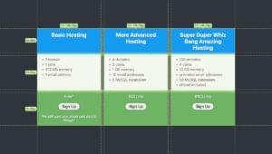
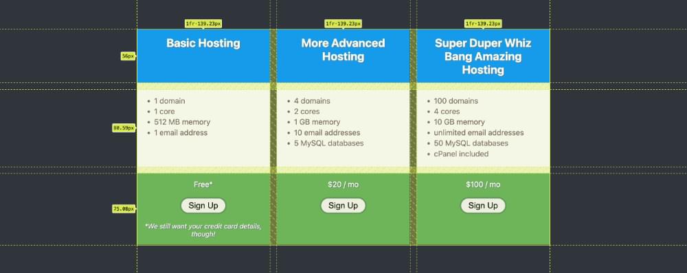
The image below shows three boxes in a row. They have different amounts of content, but they’re all the same height thanks to Grid layout.

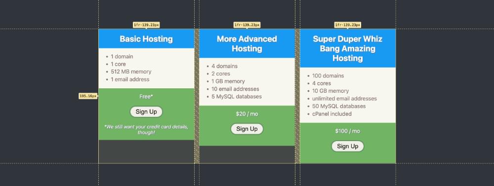
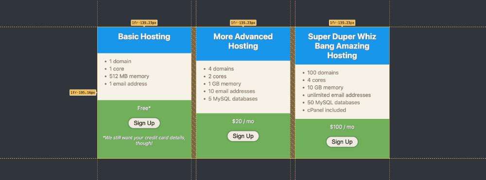
However, the components within each box don’t align with each other, which doesn’t look so nice, and there’s nothing Grid can do about that. As far as Grid is concerned, there’s just one row of boxes, and it doesn’t offer a way to align the content they contain into rows. But by using subgrid, we can get the result shown below.

Let’s dive into how to use Grid and subgrid to get this result.
Step 1: Setup
Here’s the basic HTML for our demo:
<article>
  <section></section>
  <section></section>
  <section></section>
</article>
We have and <article> wrapper containing three <section> elements. The <article> has the following CSS:
article {
  display: grid;
  grid-template-columns: 1fr 1fr 1fr;
}
This CSS causes the <section> elements to be arranged in three columns.
See the Pen
Aligning column content with sub grid: 1 by SitePoint (@SitePoint)
on CodePen.
Each <section> contains an <h1>, a <ul> and a <div>:
<section>
  <h1></h1>
  <ul></ul>
  <div></div>
</section>
At this stage, each column in the grid is actually the same height, but not each column is full of content, as shown below.
There’s a different amount of content in each column, so they don’t appear to be the same height.
Step 2: Setting display: grid on the sections
We can only use the subgrid value on an element that’s set to display: grid. As we want to use subgrid to align the content of our <section> elements, we therefore need to set them to display: grid first:
section {
  display: grid;
}
The content now fills each of our columns, as shown in the inspector.
Here’s our updated demo.
See the Pen
Aligning column content with sub grid: 2 by SitePoint (@SitePoint)
on CodePen.
Note: the content is stretched to full height because the default setting for columns is align-content: stretch. (That’s not important for this demo, but worth noting anyway!)
Step 3: Using subgrid to Align Content
The final step is to get the three elements in each column to align in rows. Firstly, we set the grid-template-rows property to subgrid:
section {
  display: grid;
  grid-template-rows: subgrid;
}
This produces the result pictured below.
Oops! What’s gone wrong here? We can only see the last element of each column.
The problem is that our <article> element only has one row, so the elements within each section are stacked on top on one another within that one row.
The final step we need to take is to tell the subgrid content to span three rows:
section {
  display: grid;
  grid-template-rows: subgrid;
  grid-row: span 3;
}
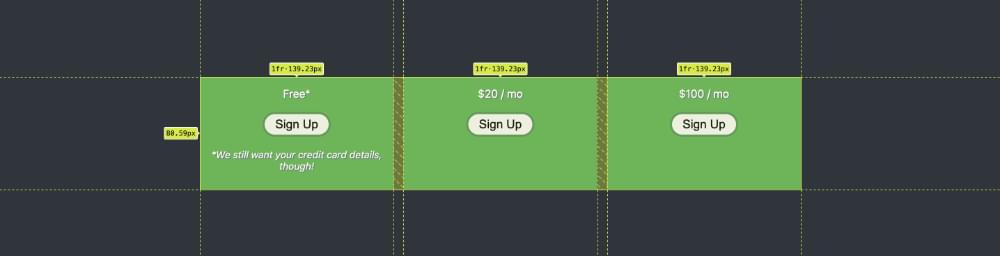
Our content now spans three rows of the subgrid, as shown below.

But look, there are gaps between each row! That’s because subgrid inherits the gap setting of its parent grid. We can change that by setting a different gap value. If we apply gap: 0 to our <section> elements, we get the final result we’re seeking.
Here’s our completed demo.
See the Pen
Aligning column content with sub grid: 3 by SitePoint (@SitePoint)
on CodePen.
As a side note, an alternative to grid-row: span 3 would be grid-row: 1 / 3.
Browser Support
Since late 2023, subgrid has worked across all major browsers, as explained on the caniuse site. So it’s definitely viable to start using subgrid now.
For browsers that support Grid but not subgrid, you’ll probably get an acceptable result. Our original demo above was quite acceptable, even though it looks nicer to have the content aligned horizontally.
For browsers that don’t support Grid layout at all, users should get perfectly usable content all in a single column.
Conclusion
The subgrid value can be set for grid-template-columns and/or grid-template-rows, allowing subgrid content to align with the columns and rows of parent grids. As you can see, subgrid is quite easy to use but is a powerful and much-needed addition to Grid layouts.
To learn more about all the things you can do with subgrid, check out the following resources:
- the
subgridreference on MDN - the
subgriddemos on the Grid by Example site - Rachel Andrew explaining uses for
subgridon YouTube
 Ralph Mason
Ralph is a production manager at SitePoint and a freelance copyeditor, web designer and teacher at Page Affairs.