Nowadays using icon fonts is quite popular and useful. All major front-end frameworks (such as Bootstrap, Foundation, Semantic UI, UIkit, and Pure) use some sort of icon font. And this is not without reason. Using an icon font brings several important benefits.
- All icons are loaded in a single file, reducing the number of server requests.
- All icons can be styled easily with CSS, thus no need to use an image editor.
- All icons look crisp and sharp on all kinds of displays and resolutions.
In this tutorial, I’ll show you how to create your own custom icon font and then how to use it to build a small CSS icon library. Basically, it will be similar to icon components from other popular front-end frameworks, but with some significant advantages that you’ll see in the next section.
Why Do I Need to Create a Custom Icon Library?
So, why you would want to create your own icon library instead of using already built solutions such as FontAwesome? The simple answer is: You hold full control from the very beginning and implement only the features that meet your specific requirements and needs. Therefore, nothing superfluous!
Now let’s get more detailed about the advantages. You may need a custom icon library because:
- It can include only the icons you want and need.
- It can combine icons from different icon sets (IcoMoon App has plenty of them).
- It can be easily customized (you can add/remove icons as you wish).
- It’s completely portable and self-contained.
- The CSS and font files will be much smaller in size.
As you can see there are many reasons to create your own icon library. So, let’s do it.
Create a Custom Font with IcoMoon App
We’ll call our project Pixie. So the first thing we need to do is create a new project folder and name it Pixie.
Now it’s time to create our custom icon font which, thankfully, for a tool like IcoMoon App, is just a piece of cake. The only thing we need to do is select the icons we want and download the font that’s built.
Let’s say that we plan to create an HTML editor for which we’ll need icons about text editing, and so on. If we use a regular icon font with these icons we’ll also get a whole bunch of icons we don’t need. Fortunately, in our custom font we’ll put only the icons necessary for our project.
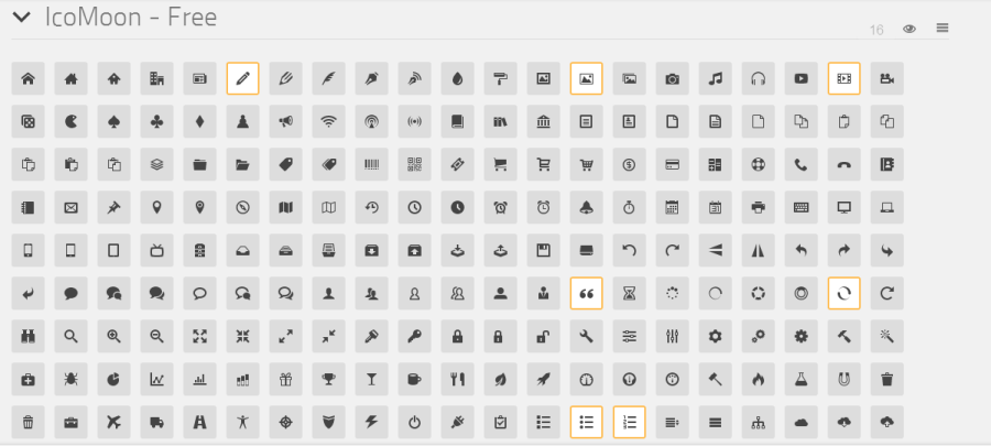
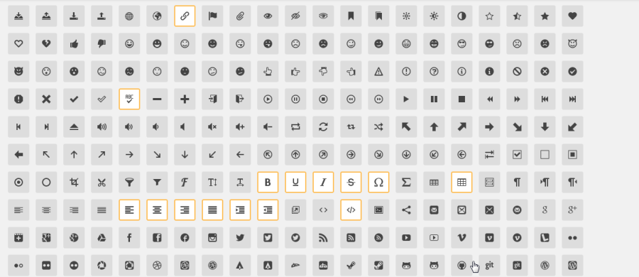
Go ahead and open IcoMoon App. From the IcoMoon icon set select the following 22 icons, highlighted in the two images below:
When these are selected, click the “Font” button, and then click the “Download” button. After the icomoon.zip file is downloaded, navigate to it and double-click to open it. What we need to get from here is the fonts folder. So grab it and extract it into the project folder.
Now we’re ready to move on to the next step.
Build the Library with Less
So far we have our brand new icon font created and it’s time to build the CSS library. For that purpose we’ll use Less.
I’ve broken down the code we need to write into sections that we’ll populate one by one moving from top to bottom. We’ll start by declaring some variables we’ll need later. In the project folder, create a file pixie.less, and put the following code at the beginning of the file.
// Variables
//===========

@icon-font-path:                "fonts/";
@icon-font-name:                "icomoon";

@font-size-big:                 2em;
@font-size-medium:              1.5em;
@font-size-small:               0.75em;
@icon-vertical-align:           -15%;

@color-success:                 green;
@color-info:                    blue;
@color-warning:                 orange;
@color-danger:                  red;

@linkbutton-color:              #444;
@linkbutton-background-color:   #eee;
Next, below the above code, put the following Less mixins:
// Mixins
//========

.border-radius(@radius) {
  -webkit-border-radius: @radius;
          border-radius: @radius;
}

.box-shadow(@h: 0em; @v: 0em; @blur: 0em; @spread: 0.1em; @inset: inset) {
  -webkit-box-shadow: @arguments;
          box-shadow: @arguments;
}

.rotate(@angle) {
  -webkit-transform: rotate(@angle);
      -ms-transform: rotate(@angle);
          transform: rotate(@angle);
}

.scale(@x;@y) {
  -webkit-transform: scale(@x,@y);
      -ms-transform: scale(@x,@y);
          transform: scale(@x,@y);
}

.animation(@name; @duration: 2s; @iteration: infinite; @timing: linear) {
  -webkit-animation: @arguments;
          animation: @arguments;
}

.keyframes(@prefix) when (@prefix = webkit) {
  from { -webkit-transform: rotate(0deg); }
  to { -webkit-transform: rotate(359deg); }
}

.keyframes(@prefix) when (@prefix = none) {
  from { transform: rotate(0deg); }
  to { transform: rotate(359deg); }
}

.keyframes(@prefix) {

}
Our prep work is done. Now let’s continue with the real part of our library. We need to add a reference to our newly created font. We do that by using CSS’s @font-face rule, using the most bullet-proof method.
/* Font Declaration
====================*/

@font-face {
    font-family: 'Pixie';
    src: url('@{icon-font-path}@{icon-font-name}.eot');
    src: url('@{icon-font-path}@{icon-font-name}.eot?#iefix') format('embedded-opentype'),
         url('@{icon-font-path}@{icon-font-name}.woff') format('woff'),
         url('@{icon-font-path}@{icon-font-name}.ttf') format('truetype'),
         url('@{icon-font-path}@{icon-font-name}.svg#icomoon') format('svg');
}
In the above code we name our font “Pixie” and include references to the font files inside the “fonts” folder. For that purpose we use the first two variables.
In the next piece of code we define the prototype for our icons. For every class declaration starting with “pixie icon-” we set the following attributes.
/* Icon Prototype
==================*/

[class^='pixie icon-'] {
    font-family: 'Pixie';
    font-style:   normal;
    font-weight:  normal;
    font-variant: normal;
    line-height:  1;

    display: inline-block;

    padding: 0.3em 0.3em;
    margin: 0em 0.1em;

    -webkit-font-smoothing: antialiased;
    -moz-osx-font-smoothing: grayscale;
}
Here we include the declared above font and set some typographic properties. It’s important to set the display property to inline-block in order to render the icons correctly. We also adjust the padding and margin properties a bit to add some space. Finally, we add the last two lines for better font rendering across browsers and devices.
Every icon in our font has a unique identifier hat we’ll need to use if we want one of them to appear. In the next snippet we map the icon classes to the icon identifiers.
/* Icon Mapping
================*/

.pixie.icon-pencil                     {&:before{content: "\e603";}}
.pixie.icon-image                      {&:before{content: "\e60d";}}
.pixie.icon-film                       {&:before{content: "\e613";}}
.pixie.icon-quotes                     {&:before{content: "\e676";}}
.pixie.icon-spinner                    {&:before{content: "\e67c";}}
.pixie.icon-list                       {&:before{content: "\e6b5";}}
.pixie.icon-numbered-list              {&:before{content: "\e6b6";}}
.pixie.icon-link                       {&:before{content: "\e6c3";}}
.pixie.icon-spell-check                {&:before{content: "\e700";}}
.pixie.icon-bold                       {&:before{content: "\e744";}}
.pixie.icon-underline                  {&:before{content: "\e745";}}
.pixie.icon-italic                     {&:before{content: "\e746";}}
.pixie.icon-strikethrough              {&:before{content: "\e747";}}
.pixie.icon-omega                      {&:before{content: "\e748";}}
.pixie.icon-table                      {&:before{content: "\e74b";}}
.pixie.icon-paragraph-left             {&:before{content: "\e754";}}
.pixie.icon-paragraph-center           {&:before{content: "\e755";}}
.pixie.icon-paragraph-right            {&:before{content: "\e756";}}
.pixie.icon-paragraph-justify          {&:before{content: "\e757";}}
.pixie.icon-indent-increase            {&:before{content: "\e758";}}
.pixie.icon-indent-decrease            {&:before{content: "\e759";}}
.pixie.icon-code                       {&:before{content: "\e75c";}}
Sometimes we may need to use an icon as a link or button. So we add code that makes an icon appear like a circular button when it’s wrapped with <a></a> tag, as shown below:
/* Icon Link Button
====================*/

a>.pixie.linkbutton {
  background-color: @linkbutton-background-color;
             color: @linkbutton-color;

  .border-radius(100%);
  -webkit-box-shadow: none;
          box-shadow: none;
}

a>.pixie.linkbutton:hover {
  background-color: darken(@linkbutton-background-color, 5%);
}
To lend variety to the icons, we’ll create two more ways to display them. The first type adds a circle around the icon, and the second adds a square.
/* Icon Types
==============*/

.pixie.circular {
  .border-radius(100%);
  .box-shadow();
}

.pixie.square {
  .box-shadow();
}
To make the icons really useful we need to add some size variations.
/* Icon Sizes
==============*/

.pixie.big {
  font-size: @font-size-big;
  vertical-align: @icon-vertical-align;
}

.pixie.medium {
  font-size: @font-size-medium;
  vertical-align: @icon-vertical-align;
}

.pixie.small {
  font-size: @font-size-small;
}
To break the monotony, we’ll add to the icons’ ability to be displayed in multiple colors.
/* Icon Colors
===============*/

.success {
    color: @color-success;
}

.info {
    color: @color-info;
}

.warning {
    color: @color-warning;
}

.danger {
    color: @color-danger;
}
Some icons need to be flipped to fit more closely our visual requirements. We add this feature in the following code:
/* Icon Flipping
=================*/

.pixie.flipped-h {
  .scale(-1, 1);
}
.pixie.flipped-v {
  .scale(1, -1);
}
If we need four arrows we usually will select all four from the icon set. A better option would be to choose only one and then rotate it. That way only one icon can play the role of the four, which will reduce the file size of the font. We’ll make this behavior possible by adding the following code:
/* Icon Rotating
=================*/

.pixie.rotated-right {
  .rotate(90deg);
}

.pixie.rotated-down {
  .rotate(180deg);
}

.pixie.rotated-left {
  .rotate(-90deg);
}
Finally, we’ll add code that forces an icon to spin. This is useful when you want to show progress.
/* Icon Spin
=============*/

.pixie.spin {
  .animation(spin);
}

@-webkit-keyframes spin {
  .keyframes(webkit);
}

@keyframes spin {
  .keyframes(none);
}
Now it’s time to compile our .less file to .css. The fastest way to do it — if you’ve never worked with the Less language — is using an online compiler such as WinLess. Just copy the whole content of pixie.less and paste it in the left pane of the compiler. Then in the right pane you’ll see the compiled CSS code. Copy the compiled code and paste it into a new file called pixie.css and place it into the project folder. That’s it.
Of course, you can also use an app like Prepros to compile your .less files.
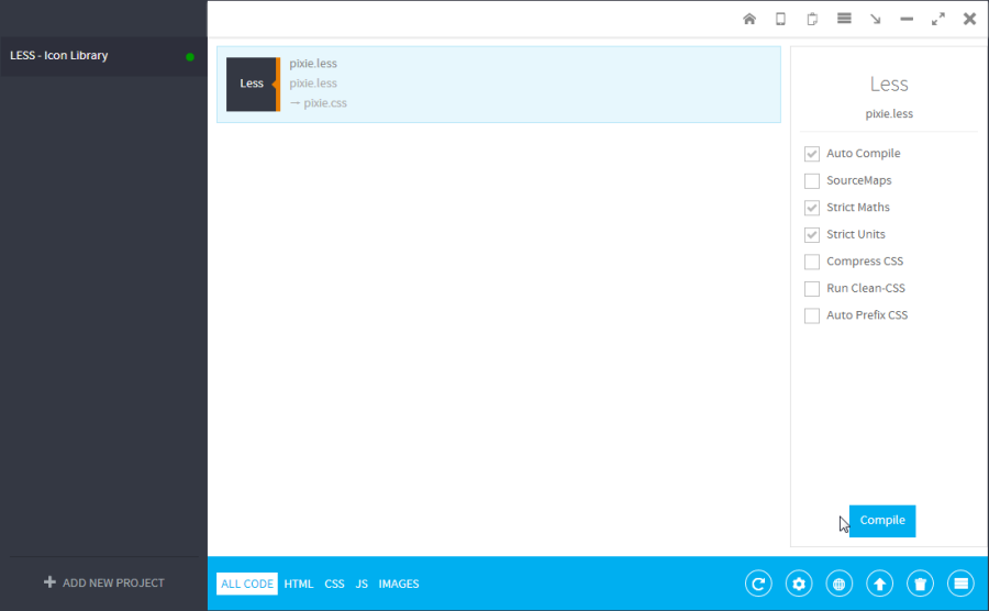
If you work regularly with Less, or if you intend to do so, this is the better variant. For more information about Prepros you can see this tutorial on SitePoint.
Usage Examples
Phew. At last the hard work is done. Now it’s time to test our work.
In the project folder, create a new HTML file called pixie.html and put the following markup inside it:
<!DOCTYPE HTML>
<html>
<head>
    <meta charset="utf-8" />
    <title>Pixie</title>
    <link rel="stylesheet" type="text/css" href="pixie.css">
</head>

<body>

<p><a href="#"><i class="pixie icon-link big linkbutton"></i></a></p>
<p><i class="pixie icon-code circular medium"></i><i class="pixie icon-spell-check square medium"></i></p>
<p><i class="pixie icon-film small"></i><i class="pixie icon-film"></i><i class="pixie icon-film medium"></i><i class="pixie icon-film big"></i></p>
<p><i class="pixie icon-bold success"></i><i class="pixie icon-underline info"></i><i class="pixie icon-italic warning"></i><i class="pixie icon-strikethrough danger"></i></p>
<p><i class="pixie icon-image"></i><i class="pixie icon-image flipped-h"></i>A mirror effect</p>
<p><i class="pixie icon-quotes small"></i>Life's Good<i class="pixie icon-quotes small rotated-down"></i></p>
<p><i class="pixie icon-spinner spin"></i>Loading...</p>

</body>
</html>
When you open it in your browser you should see the following:
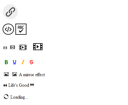
No images used; just fonts built from IcoMoon. As you can see, the icons look and behave pretty well. So, congratulations! You’ve just created and successfully tested a brand new CSS icon library.
NOTE: If you have any problems with your pixie.less file — or any other — you can download a working version of the library (with all files included) here.
Summary
In the beginning of this tutorial we saw that one of the advantages of having a custom library is that you end up with much smaller files. Let’s make a quick experiment to prove it. Open IcoMoon App again and this time select all icons from the IcoMoon icon set. Then download the font and again extract the fonts folder whenever you wish. Now check the size of that folder and compare it to the size of the same named folder in our Pixie project. With all icons from the IcoMoon set, the size is 507 KB, while with only the icons we need for our project the size is approximately 19 KB. The net result is that we’ve saved 488 KB!
I hope that this small project was interesting for you and you learned some useful things. It’s always fun and enjoyable to create something valuable from scratch. By investing some small amount of time to build this CSS icon library we gained a quite useful product, which we can use over and over again.
Frequently Asked Questions (FAQs) about Creating Custom Icon Fonts with IcoMoon and LESS
How can I create my own custom icon font using IcoMoon?
Creating your own custom icon font using IcoMoon is a straightforward process. First, you need to select the icons you want to include in your font from the IcoMoon library. You can also upload your own SVG files. Once you’ve selected your icons, click on the ‘Generate Font’ button. This will take you to a page where you can download your font. The downloaded package will include a demo.html file, which shows you how to use your custom font.
What is LESS and how does it work with IcoMoon?
LESS is a dynamic preprocessor style sheet language that can be compiled into Cascading Style Sheets (CSS) and run on the client side or server side. It extends the capability of CSS with variables, mixins, operations, and functions. When working with IcoMoon, LESS can be used to create a style sheet for your custom icon font. This allows you to easily change the size, color, and other properties of your icons.
Can I use IcoMoon to create a font from my own SVG files?
Yes, you can use IcoMoon to create a font from your own SVG files. Simply upload your SVG files to IcoMoon, select them, and then generate your font. This allows you to create a truly custom icon font that matches your specific needs.
How can I use my custom icon font in my website?
To use your custom icon font in your website, you need to include the font files and the CSS file in your project. Then, you can use the CSS classes provided by IcoMoon to display your icons. You can also use LESS to customize the appearance of your icons.
What are the benefits of using a custom icon font over traditional image icons?
Custom icon fonts have several advantages over traditional image icons. They are vector-based, which means they can be scaled without losing quality. They can also be styled with CSS, allowing you to easily change their color, size, and other properties. Additionally, icon fonts are typically smaller in file size than image icons, which can improve your website’s load time.
Can I use IcoMoon with other preprocessor style sheet languages like SASS?
Yes, you can use IcoMoon with other preprocessor style sheet languages like SASS. The process is similar to using LESS. You simply need to create a style sheet for your custom icon font using your preferred language.
How can I add more icons to my custom icon font after it’s been created?
To add more icons to your custom icon font after it’s been created, you need to go back to IcoMoon and select the additional icons you want to include. Then, generate a new font that includes the original icons and the new ones. Replace the old font files and CSS file in your project with the new ones.
Can I use my custom icon font in commercial projects?
Yes, you can use your custom icon font in commercial projects. However, you should check the license of each icon you include in your font to make sure commercial use is allowed.
How can I change the color of my icons?
You can change the color of your icons using CSS or LESS. Simply apply the color property to the CSS class of the icon you want to change.
Can I use IcoMoon to create a font from other file types besides SVG?
Currently, IcoMoon only supports SVG files for creating custom icon fonts. SVG files are vector-based, which makes them ideal for this purpose. However, you can convert other file types to SVG using various online tools or graphic design software.
 Ivaylo Gerchev
I am a web developer/designer from Bulgaria. My favorite web technologies include SVG, HTML, CSS, Tailwind, JavaScript, Node, Vue, and React. When I'm not programming the Web, I love to program my own reality ;)