You’ve seen it before: you designed a beautiful layout and someone walks into your office with a print off and you cringe at the site of your hard work horrifically misrepresented by the printer. Printed versions of a web design are rarely what you’d expect. They take some additional tweaking and some staging. But, an understanding of how to set up a print view so that content comes out as expected is not too tough once you get the hang of it. In this article, I’ll show you how to set up a stylesheet just for printing off your content on a website. I’ll be using a WordPress site as a starting point, because it’s such a popular framework, but this will work for any site so long as you apply the same principles.
Quick note: there’s no easy way to make web to print perfect. You have to jump in there and work through each element you want to tailor. I start by going to a page and printing it to see what I’m starting with. Then, I break each element or structural section down by what I need and what needs to change. It takes time, but it’s worth it.
Do You Need a Print Version?
The first thing I ask myself before building out a printed version of a site is whether or not I even need one. The meticulous designer in me tends to kick in and I lean towards “yes” in most cases. But, often there’s just not a need for a print stylesheet, depending on the nature and purpose of your website. Also, when people print a page off your site, what is their goal? Often, they just want your content in hand and that’s all — they don’t want all the graphics, pretty layouts, headers, sidebars, and the like. (And, they may not want to use their expensive ink on nonessential elements.) So, consider what is actually needed.Print Considerations
I always convert my text to black so that the printer understands that no shading is necessary (which is a big ink saver). I also change over from font sizes in pixels to points. If you’re trying to match font sizes, this can be a bit of a challenge, but here’s a slick chart to help you convert quickly from px to pt assuming you have a base font size of 16px:- Pixels => Points
- 6px => 5pt
- 7px => 5pt
- 8px => 6pt
- 9px => 7pt
- 10px => 8pt
- 11px => 8pt
- 12px => 9pt
- 13px => 10pt
- 14px => 11pt
- 15px => 11pt
- 16px => 12pt
- 17px => 13pt
- 18px => 14pt
- 19px => 14pt
- 20px => 15pt
- 21px => 16pt
- 22px => 17pt
- 23px => 17pt
- 24px => 18pt
Targeting Your Content
WordPress typically has a built-in structure that looks like this:- header
- content
- comments
- sidebar
- footer
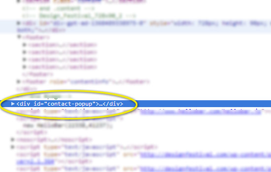 We can now target this element with the following CSS:
[sourcecode language=”css”]
#contact-popup {display:none;}
[/sourcecode]
We can now target this element with the following CSS:
[sourcecode language=”css”]
#contact-popup {display:none;}
[/sourcecode]
Page Breaks
Printers break your content up into pages, assuming you have more than one page to print. You can tell the browser to avoid page breaks at certain points. You can read all about page breaks in CSS at the W3.org page. In short, your options are as follows:- page-break-before: always | avoid — always/avoid page breaks before the item
- page-break-after: always | avoid — always/avoid page breaks after the item
- page-break-inside: always | avoid — always/avoid page breaks in the middle of the item
Sample Case
Now that we have a blank slate, let’s start adding the structural pieces that we actually want to display when printed. The content section is an obvious candidate, so let’s add it back in and convert the paragraph font size to points: [sourcecode language=”css”] @media print { #content p { font-size:11pt; color: black; } #content img { display:block; page-break-after: avoid; page-break-inside: avoid; } #content ul, li { display:block; page-break-inside:avoid; } #header {display:none;} #comments {display:none;} #sidebar {display:none;} #footer {display:none;} .site-description {display:none;} .site-title {display:none;} } [/sourcecode] I removed the display:none; content CSS and converted our paragraph text from 14px to 11pt. You can go through each element of your page and customize each just for printing with this methodology.Wrap Up
Going from web to print can be frustrating, but the @media print media query allows us to get very targeted with how what elements get printed and how they get printed. There’s no real shortcut. If you need your site to look good in print, you’re likely going to have to create a separate CSS definition on a per element level until it’s perfect. Are print stylesheets part of your standard design process, or do you consider them an extra, nice-to-have addition to a thoroughly-designed website?Frequently Asked Questions about Creating a Customized Print Stylesheet
What is the importance of creating a print stylesheet?
A print stylesheet is crucial for providing a printer-friendly version of your webpage. It allows you to control how the page looks when printed, removing unnecessary elements like navigation menus, background colors, and advertisements. This not only saves ink but also ensures that the printed version focuses on the essential content, making it easier to read and understand.
How can I hide certain elements when printing a webpage?
You can hide specific elements when printing a webpage by using the ‘display: none’ property in your print stylesheet. For instance, if you want to hide the navigation menu, you would target the element that contains the menu and set its display property to none. This will ensure that the element is not printed.
Can I change the font size and color in the print version of a webpage?
Yes, you can change the font size and color in the print version of a webpage. You can do this by targeting the body element in your print stylesheet and setting the desired font size and color. This can be useful if you want to ensure that the printed version of your webpage is easy to read.
How can I create a separate print stylesheet?
You can create a separate print stylesheet by using the ‘media’ attribute in the link element that references your stylesheet. The media attribute should be set to ‘print’, indicating that the stylesheet should be used when printing the webpage. This allows you to have one stylesheet for the screen display and another for the print version.
Can I control the page breaks in the print version of a webpage?
Yes, you can control the page breaks in the print version of a webpage. You can do this by using the ‘page-break-before’ and ‘page-break-after’ properties in your print stylesheet. These properties allow you to specify where page breaks should occur, helping to prevent awkward breaks in the middle of your content.
How can I test my print stylesheet?
You can test your print stylesheet by using the print preview feature in your web browser. This will show you how your webpage will look when printed, allowing you to make any necessary adjustments to your print stylesheet.
Can I include headers and footers in the print version of a webpage?
Yes, you can include headers and footers in the print version of a webpage. You can do this by using the ‘position: fixed’ property in your print stylesheet. This will ensure that the headers and footers appear on every printed page.
How can I change the layout of a webpage for printing?
You can change the layout of a webpage for printing by using the ‘float’ property in your print stylesheet. This allows you to control the positioning of elements on the page, ensuring that they are arranged in a way that makes sense when printed.
Can I control the margins and padding in the print version of a webpage?
Yes, you can control the margins and padding in the print version of a webpage. You can do this by using the ‘margin’ and ‘padding’ properties in your print stylesheet. This allows you to ensure that your content is properly spaced and easy to read when printed.
Can I use images in the print version of a webpage?
Yes, you can use images in the print version of a webpage. However, you should be mindful of how they will look when printed. You may want to remove background images and ensure that any important images are clear and easy to see in black and white. You can control the display of images using the ‘display’ property in your print stylesheet.
 Justyn Hornor
When he's not being a complete goofball, “they” drag Justyn into the office where he pretends to be a Senior Editor and Content Engineer at Creative Content Experts — a content marketing firm out of NW Arkansas. He has 10+ years’ experience in technical writing and geek-related fields. He loves WordPress, coffee, and peanut butter a little too much.