Chances are, if you’ve never hit a 404 page, you’ve probably never used the internet.
The concept is simple: If a client computer requests a URL that the server can’t resolve, the server responds with the ‘404 Not Found’ response – or in other words “Yes, I’m here, but I can’t find the item you requested”.
While the 404 was born as a simple necessity of the HTTP protocol, a lot of user experience design and even a certain subculture has grown up around it.
There are some rules which should be followed to create a perfect 404 error page:
Design
The error page design should not distract user from the website’s sole motive of user engagement. Most people consider it as the most annoying page (broken). It should be designed first and foremost to help you visitors, and in the process avoid them switching to another website.
As a secondary goal, the 404 can also provide a opportunity to build your brand while making a positive, and hopefully lasting impression on your users. As a general rule, it’s often the people that have an initially negative experience (for instance, getting lost), but that are then helped that can become your biggest cheerleaders.
The usage of colors, image scale should be appropriate to avoid that annoyed feeling of visiting broken links/error page. As we all know, well-designed web pages build brands.
Social media links
Providing social media links on the 404 page is a great way to both solve a users problem and to gather more users at the same time. The website’s official Facebook, Twitter, Pinterest, StumbleUpon, Tumblr, and other page links can be provided for social media engagements.
This also introduces the possibility of crowd sourced user support. Often – especially overnight – a lost or disoriented user can be helped by other users even before the official social channel operators have had time to respond.
Principal Links
Every user should know some important links of the website that helps in more users engagement.
However, this is NOT a time for presenting your entire sitemap. If the user is lost, don’t make them filter through dozens of links to find what they’re looking for. Keep the presented options to 6 or 7 at most.
In most situation these might include, but aren’t limited to:
- Home
- Recent Posts
- Search
- About
- Contact
This is certainly an opportunity to prioritize (and even pre-fill) your site search function. On smaller sites, where the majority of incoming traffic goes to two or three popular posts, it may be worth linking those post on your 404 page.
Provide a Online Contact Form
User can also be given some directions by providing an inline contact form. The form should be provided to enter the details of what they were searching for and what they found while searching (broken link, error page etc.) the error page.
Live chat help is also a worthwhile consideration– particularly if lost users feeds strongly into lost sales on your site.
This can help the visitors in finding what they want and what we missed. Remember to keep the form simple which can easily allow vistors to send message.
Audio/Video/Flowchart Humor
An auto-play Audio/Video can also be provided on an error page which guides further or which describes the organization. Humor as part of an explanation can also be taken into consideration for the same with some amusing animation.
This is a opportunity to possibly surprise, delight and entertain a user at a time when they aren’t expecting it – while also solving their problems.
Below, I am listing some of my favourite 404 error page designs running around the web. Just check them and make your website’s error page fantastic with some creative and informative designs.
Some are really interesting as they give useful information and links which makes them exceptionally great. You can also point the ones which really needs improvement in terms of design or information.
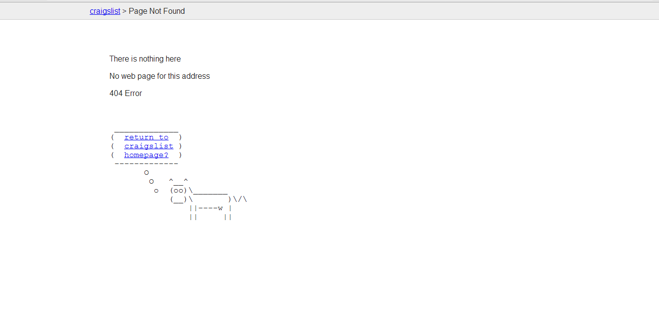
craigslist
Craigslist provides a simple error page with homepage link and some basic design.
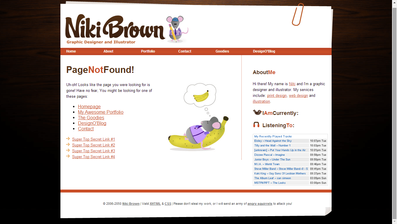
Niki Brown
Some important links are provided on this page with a new concept of giving secret links which redirects to some good music. This can help users in visiting the page for some more time.
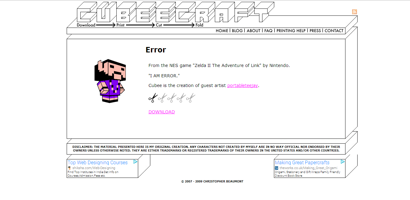
cubeecraft
Here, download image link is given which shows an excellent formulation of design. The same is done in a way which reflects the main motive of the website i.e toy and models.
Project-euh
This provides with an animated link, it is a unique way to represent 404 page through which every design part redirecting to another interactive link which includes games, interactive text and mouse cursor effects, sound effects etc.
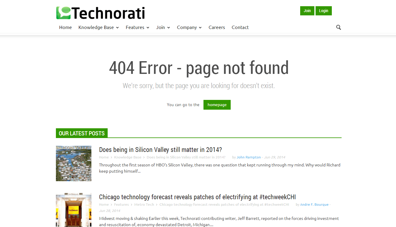
Technorati
Simple error page with feed for latest posts, this can help in engaging users to focus on some other related posts.
Acme
This is another way of representing a 404 page which looks different from other, but they surely missed many things.
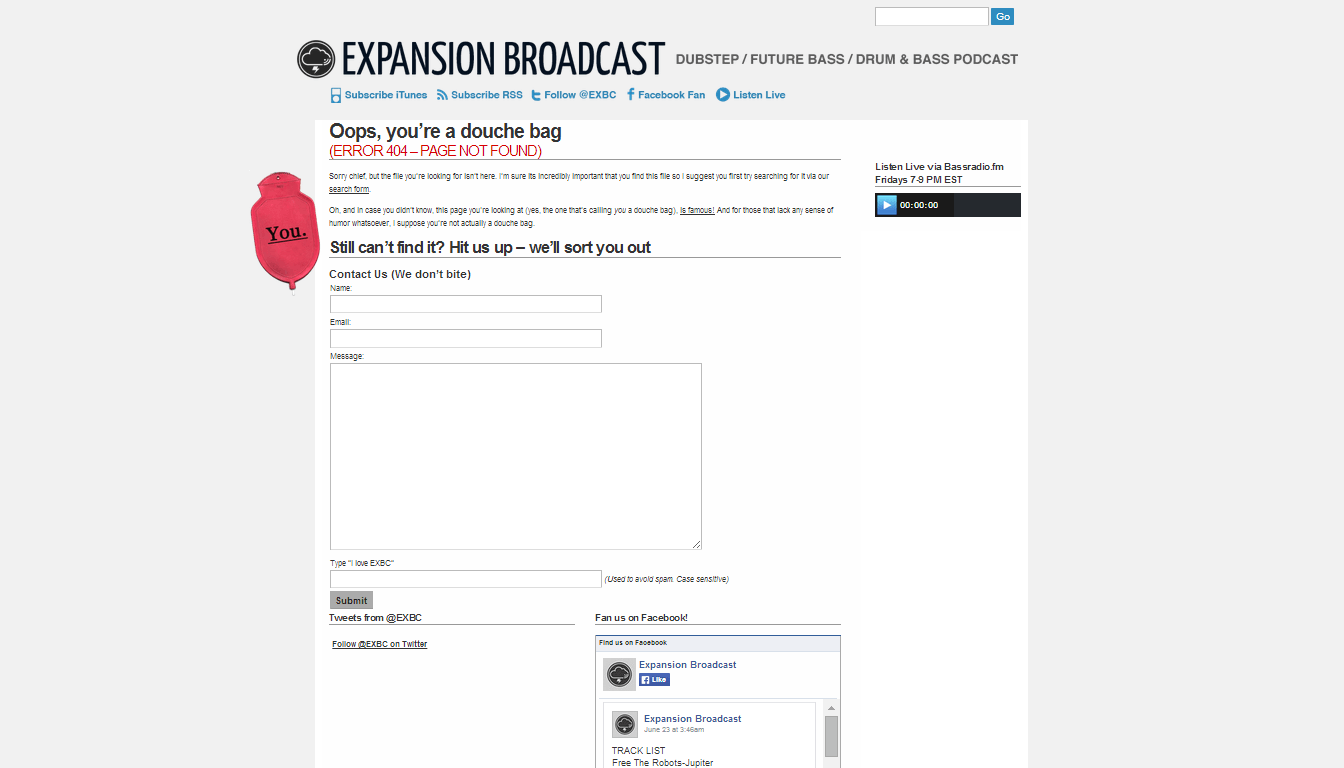
Expansion Broadcast
Fill the form given on this error page, if you didn’t found what you were searching for. This is an excellent way of interacting with the visitor which can also further help in gaining some social presence by Twitter and Facebook feeds.
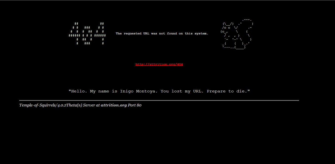
Attrition
Simple design with simple messages stating some useful information/error messages about the page requested.
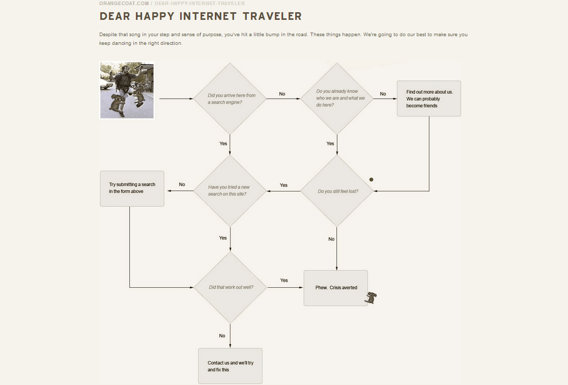
Orange Coat
Another excellent way of representation by a flowchat which guides visitors for the next immediate step.
Disney
A visitor reaching this page can find some good information with important FAQs, feedback, download links etc.

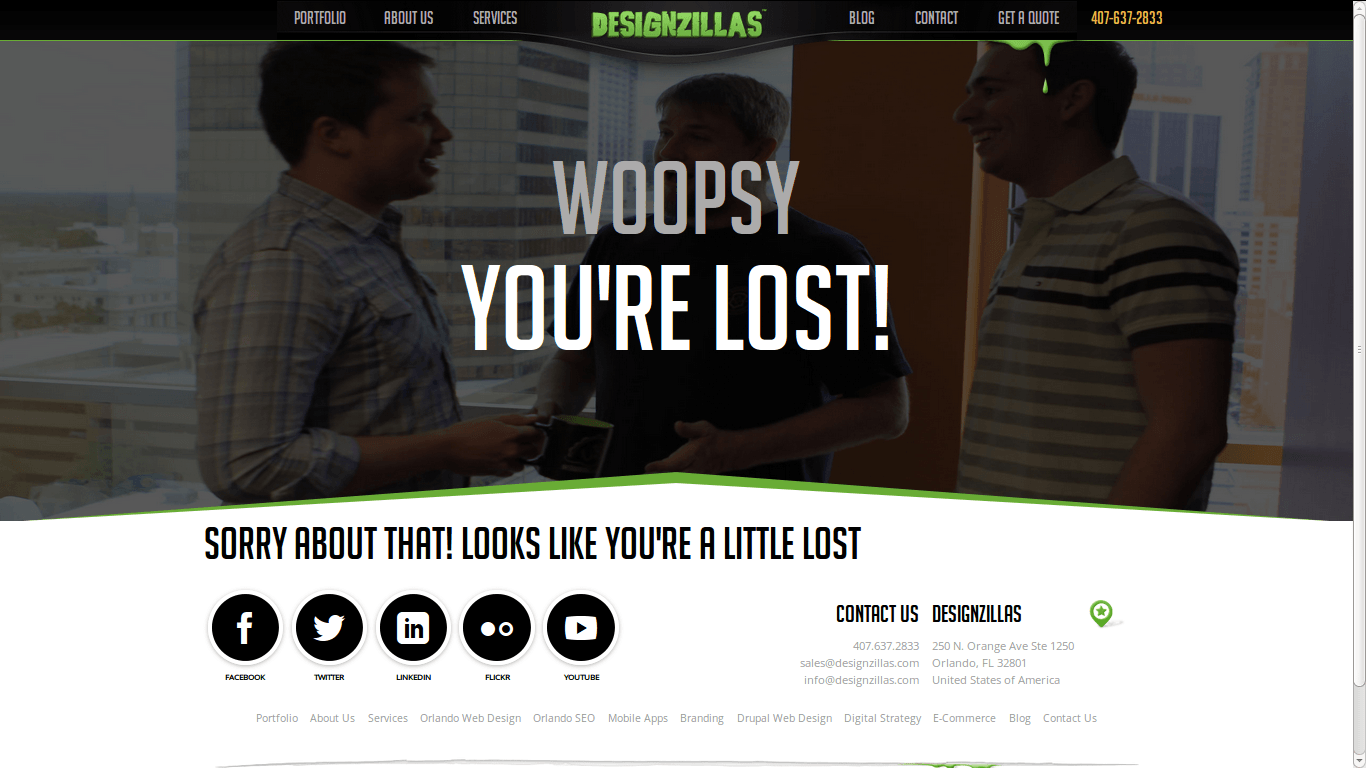
Design Zillas
Great way of representing 404 page with some good design, official social media links, and contact information.
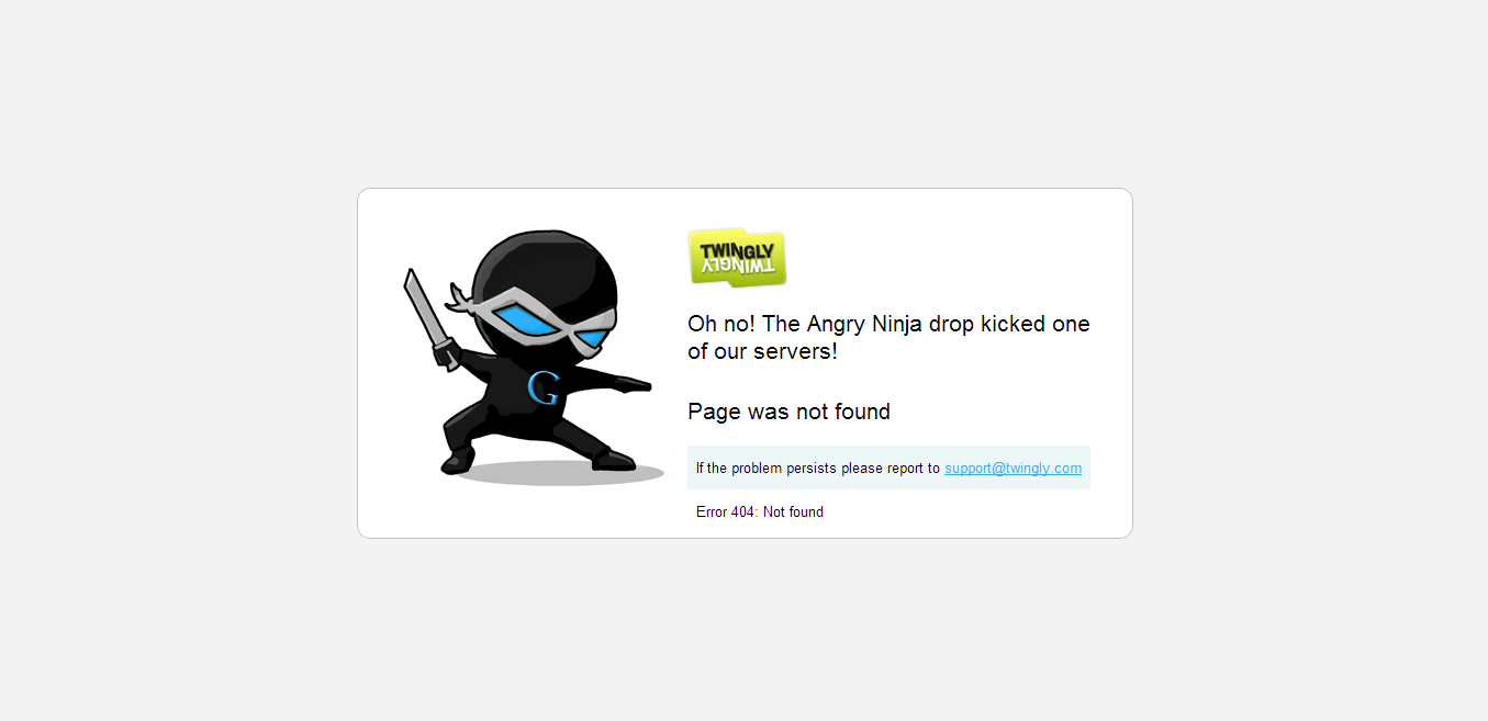
Twingly
They’ve shown a familiar character “Ninja” to convey their message and emailid. The design looks good here.
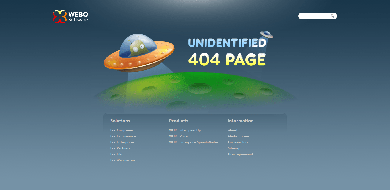
webo group
Simple 404 error page design.
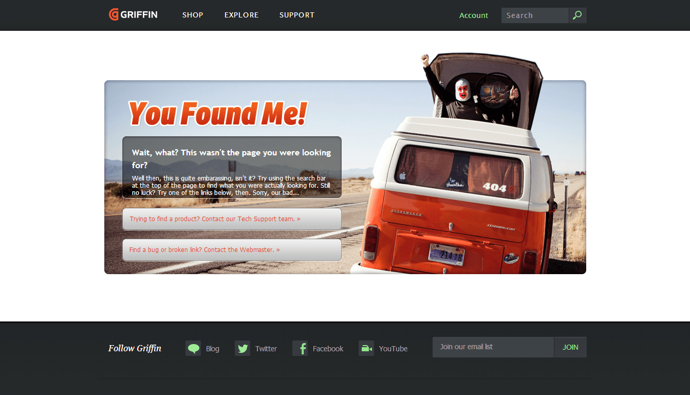
Griffin Technology
Another basic design with links to contact the Webmaster and support team.
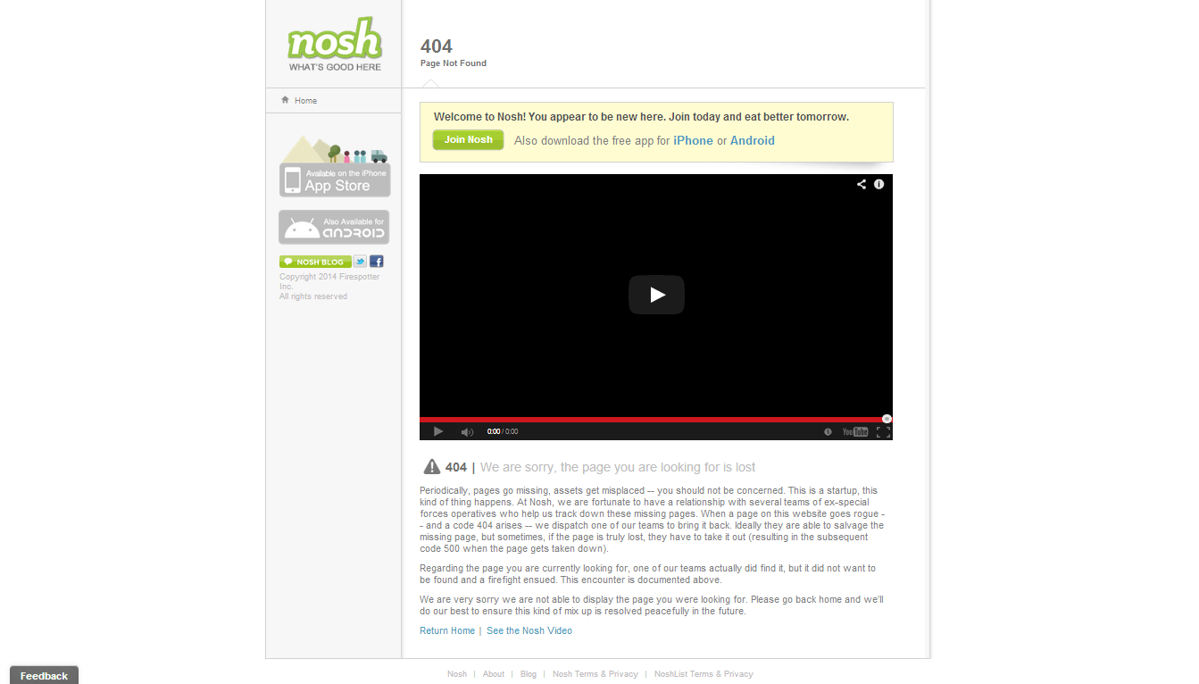
nosh
Another error page with some unique thoughts with video provided as a way to stop users from leaving the website. Gosh, the video doesn’t exist, is it a way to show their humor side or they really missed it? Some important information and links like downloading free app for iPhone or Android, signing up is also provided on the website.
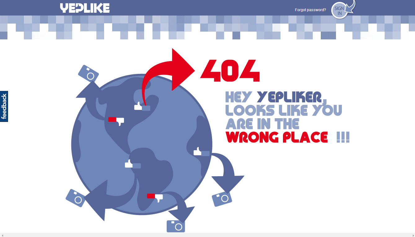
YepLike
It is certainly an amazing design if compared with some other ones.
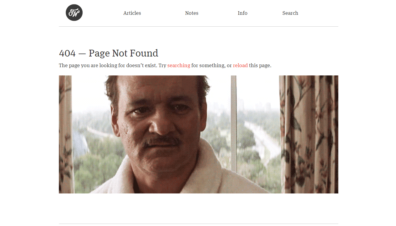
TrentWalten
This error page isn’t good in terms of information, but the way they’ve represented the random images is excellent.
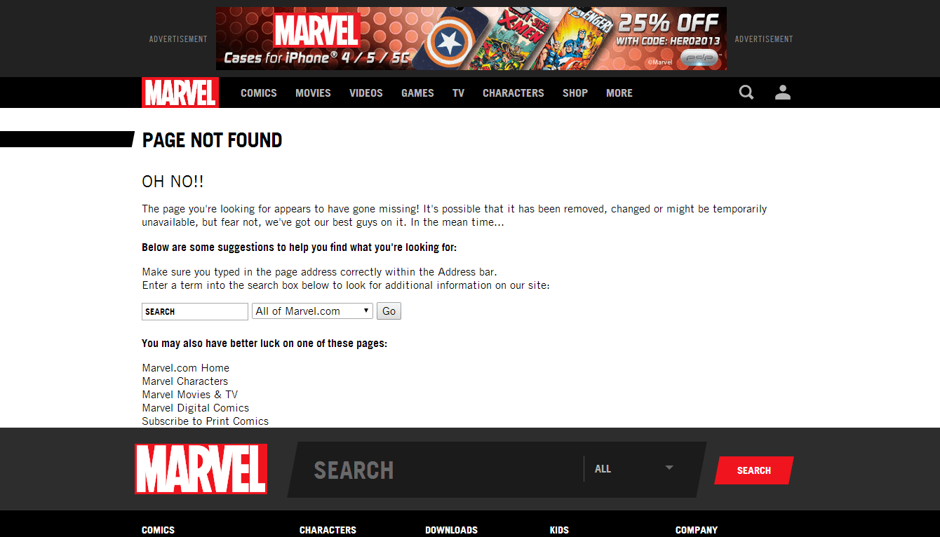
Marvel
They’ve provided an Advanced Search option which will help in deeper search for your query. Some important links are also provided for visitors at one place.
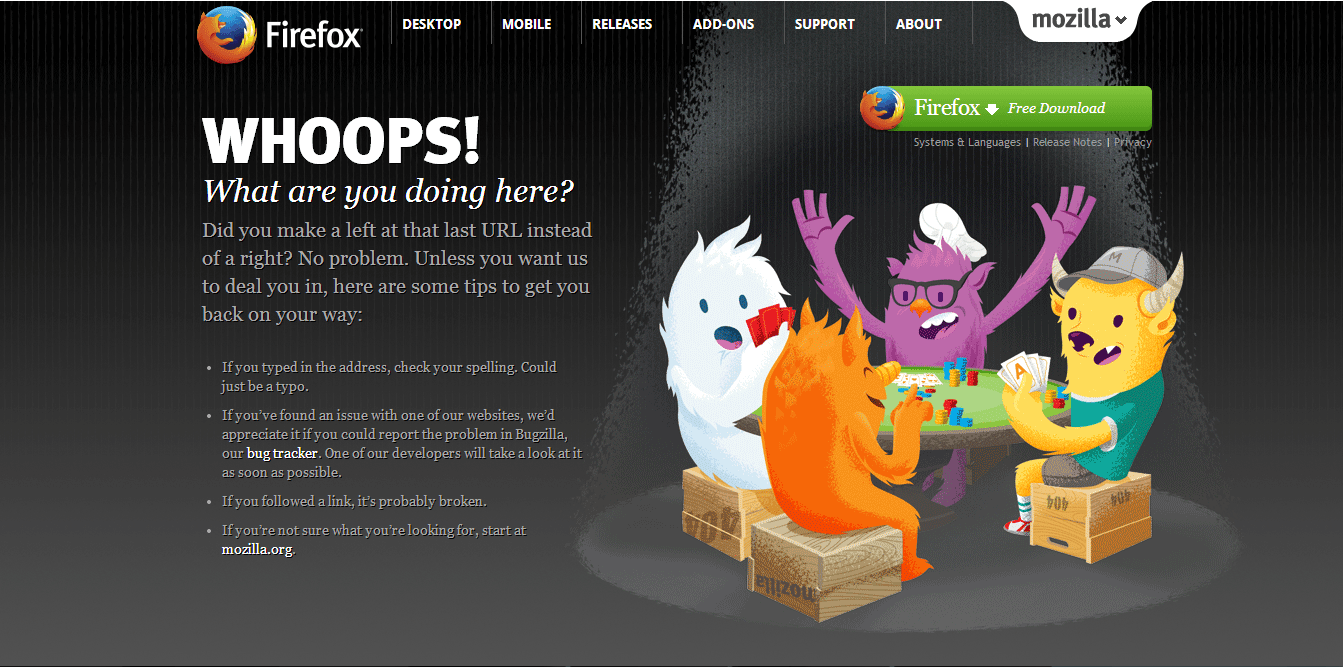
Mozilla
Mozilla error page have provided some tips for visitors with homepage and bug tracker link.
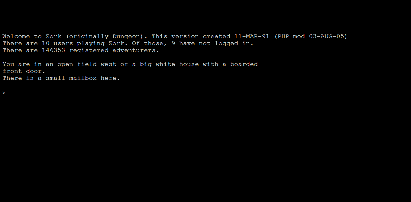
THCNET
Ok. The truth is the 404 page on THCNET doesn’t really help you find whatver you were looking for on THCNET before you hit the 404. Instead they present you with a live, playable version of the ancient (early 1980’s) text adventure game Zork. Try going north (‘n’) and climb the tree to see it in action.
For me, at least, this is probably more compelling than whatever I was originally looking.
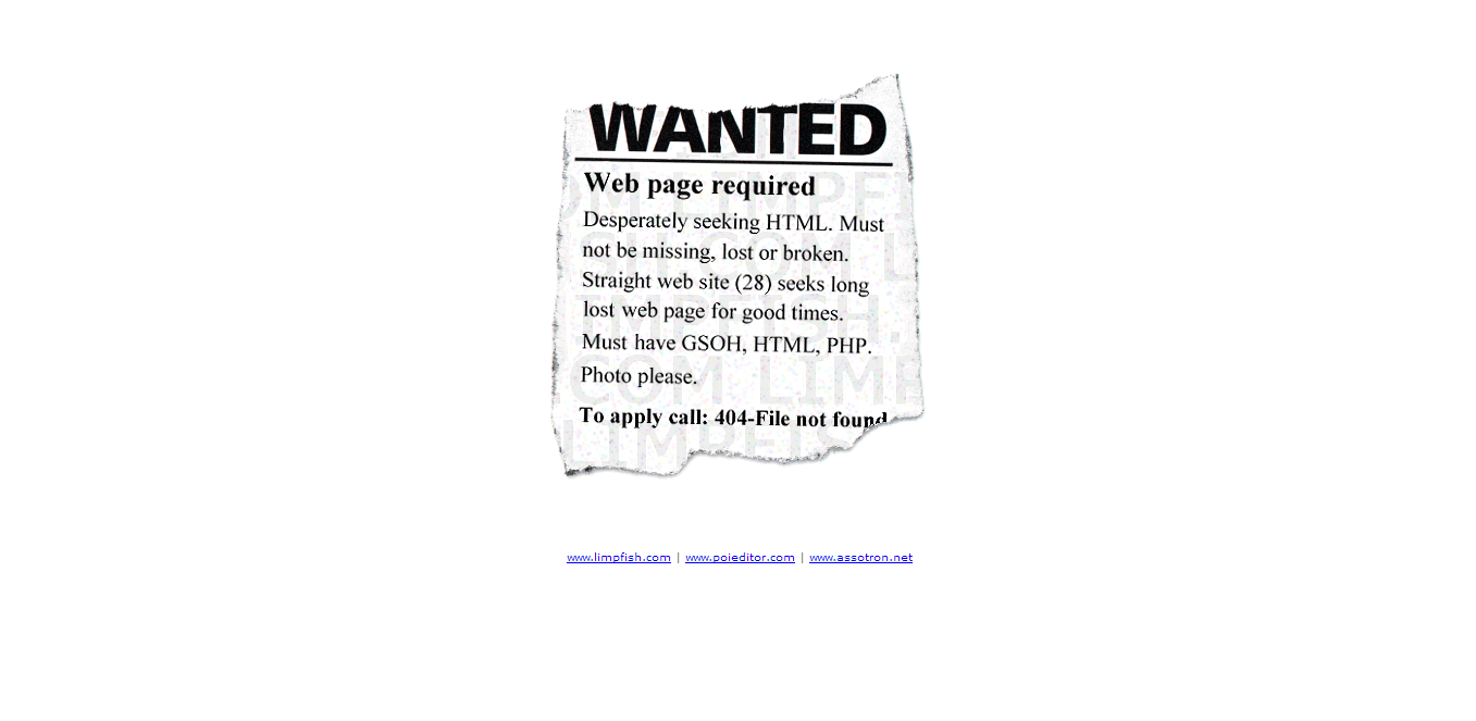
Limpfish
Limpfish design is very simple with some space for humor in their content which redirects to homepage after clicking. But, they surely missed some important and social media links.
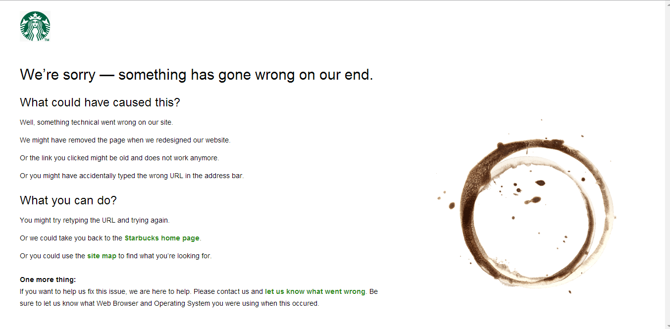
Starbucks
Their error page allows users to read information with some links – homepage, sitemap, and feedback page. The page looks good with the concise text and basic design.
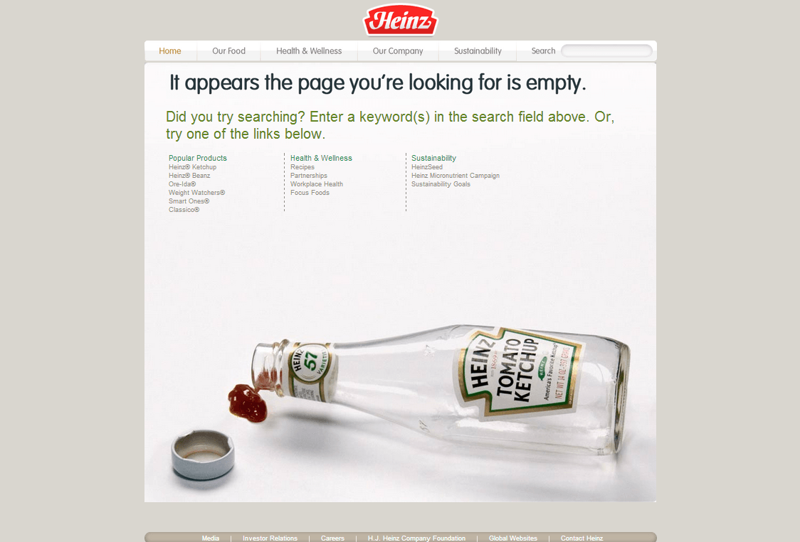
Heinz
Heinz have kept it simple by providing popular product and some other important links on their 404 page. They’ve also designed it simply by placing their product’s image quite well.
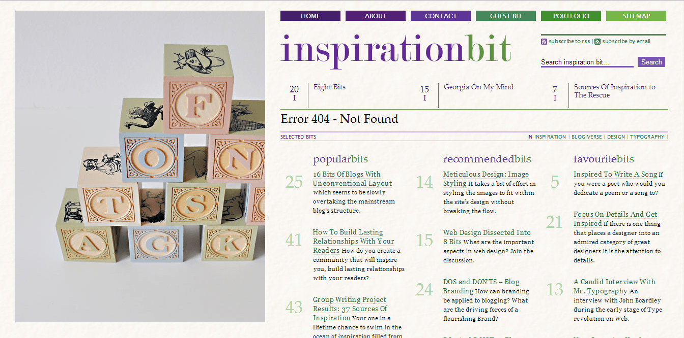
Inspiration Bit
They’ve shown some intelligence in their 404 error page by providing popular, recommended, favourite bits. The visitor will at least click on any of these links even if the search query was different before. You might also notice that these links are provided on every page with social media icons.
Realmac Software
I bet, you can’t stop laughing after reaching this page. They’ve also provided with some important links for their official twitter, flickr and vimeo accounts.
Home Star Runner
Get ready to listen for some sound. This 404 page is designed to show what the website wants to convey – simple cartoon design and some text with humor.
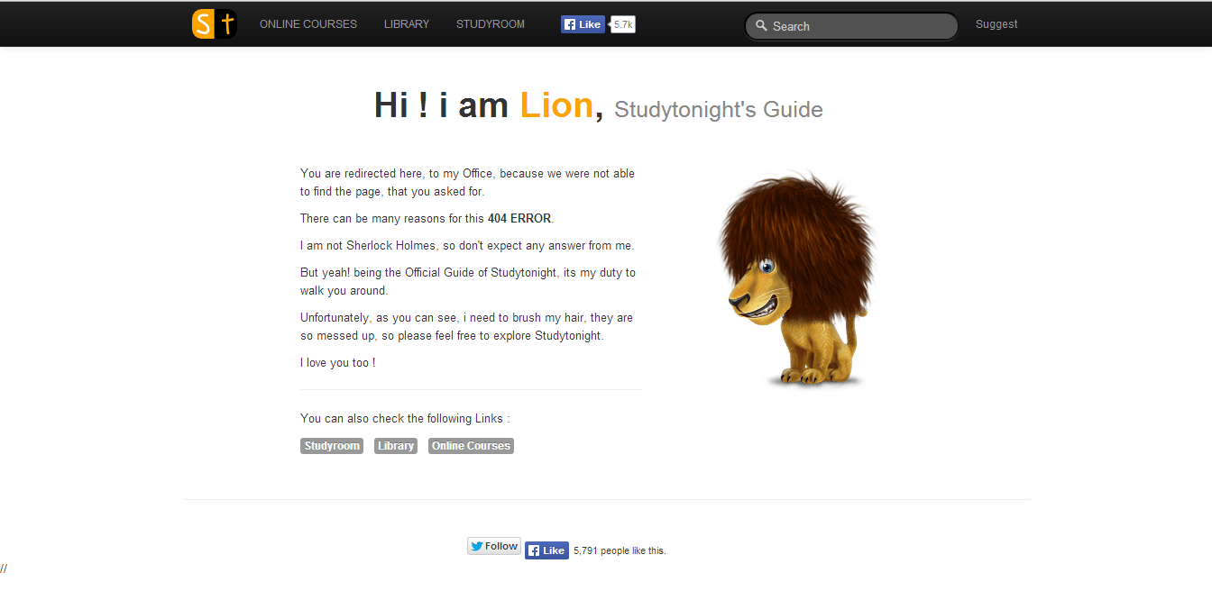
StudyTonight
Studytonight demonstrates an excellent way to engage users by using a character with an exeptionally well written text. Some principal links are also given.
Any Others?
I liked the nickybrown, nosh, and project-euh 404 page, what about you?
If you’ve seen any other design or created one for your own website that you believe deserves a mention, please mention it in the comment section.
 Amit Diwan
Amit Diwan is a founder at Studyopedia, who has taught more than a million engineers and professionals on the following technologies: Python, Java, Android, WordPress, Drupal, Magento, JavaScript, jQuery, HTML5, Bootstrap 4, etc.