Logos are essential when it comes to developing your brand, but that doesn’t mean your logo should be overdeveloped. Many well-known brands have surprisingly simple logos that serve their purpose well; customers recognize and remember these ubiquitous logos in part due to their simplicity. The lesson to learn is that your logo does not have to be comprised of multiple elements or unnecessary complexity — simplistic logos can be just as intricate ones.
The tutorial that you will find below is an exercise in creating a logo using just three shapes or less. By the end of the tutorial, I hope to illustrate that just because your logo is simple doesn’t mean it’s ineffective or underdeveloped. In fact, simple logos can outperform much more sophisticated competition. Power up Photoshop and let’s get started with creating our logo.
Concept
Conceptualizing your logo is often the hardest part of the design process. Typically, you will have already created a few thumbnails to determine what you want your logo to look like. In this case, I already have an idea of what I want to accomplish, so will be forgoing the sketching, but make sure you have an idea for your logo in mind. For this particular tutorial, I plan to create a simple orb-inspired logo for a fictional energy company that has a focuses on eco-friendly energy called BeauEnergie. The idea is simple, but it is the effects that are going to make this logo stand out.
Step 1: Create a New File
First, begin by opening up Photoshop and creating a new file. When the dialogue menu opens, give the canvas the dimensions of 800px by 500px, then press “OK” for the canvas to be created.

Step 2: Build Background Color
Create a new layer and name this layer “BKG”. Change the foreground color to #c4c4c4 and make sure that the background color is set to the default #ffffff (white). You will need this for the next step. With your foreground selected, fill in your canvas.

Step 3: Add A Gradient
We need to add a gradient to our BKG layer. To achieve this, you will need to double-click on the layer to get to the “Blending Options” menu, or you can simply right-click and go to “Blending Options.” Check the “Gradient Overlay” box and make sure the gradient colors are reflecting the colors of #c4c4c4 and #ffffff. Change the layer mode to “Overlay” and press “OK.”

Step 4: Build A Blue Ellipse
To begin our logo, we will create a new layer. You can name this something like “Blue Ellipse” or “First Shape”. Just name it something easily identifiable. Next, change your foreground color to #25d1fc. Select the Ellipse Tool (U) and draw a fairly large circle in the middle off your canvas.

Step 5: Blue Ellipse Warp
Next, we will distort the shape of our blue ellipse. To accomplish this, go to “Edit” > “Transform” > “Warp” and then manipulate the points by dragging the center down, the left points up, and the right points down so that you have something that resembles the image below. Don’t forget to press Enter to commit the changes to the shape.

Step 6: Layer Opacity
Our logo is going to be featuring some transparent qualities, so we will go ahead and change the layer mode to “Color Burn.”

Step 7: Blue Ellipse Gradients and Glows
To add effects to our blue ellipse, you need to access the “Blending Options” menu by either double-clicking the layer or right-clicking and going to “Blending Options.” The first effect we will be adding is “Inner Glow.” Check the box and change the color to #5aeeff. Change the rest of the settings to match what’s shown in the image below.

Next, check the box for “Gradient Overlay” and make sure the gradient reflects the ellipse’s color. Change the other settings so that they match the settings shown below.

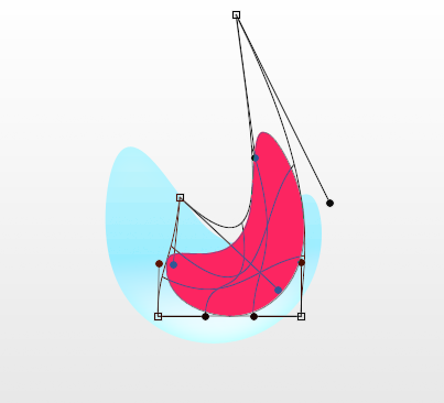
Step 8: Pink Ellipse
Change your foreground color to #fc2561 and create another ellipse with the Ellipse Tool; it will be smaller than the blue ellipse. Make sure that our new ellipse is above the blue ellipse layer.

Step 9: Pink Ellipse Warp
Just like before, you want to distort the shape of the pink ellipse, but give it an almost crescent-like shape.
Step 10: Layer Opacity
Instead of changing the layer opacity of the pink ellipse to “Color Burn,” we will change it to “Multiply” and leave the opacity at 100%.

Step 11: Pink Ellipse Gradients and Glows
We need to add effects to our pink ellipse as well, so open up the “Blending Options” menu. We will add “Inner Glow” first. Check the box and change the color to # 8de6ff. Change the rest of the settings to match the image below.

Check the “Gradient Overlay” box and make sure the gradient reflects the ellipse’s color. Change the other settings so that they reflect the following values

Step 12: Yellow Ellipse
Now, set your foreground color to #f3de00, and once again you will need to create another ellipse; this one will be smaller than the first two and placed under the blue ellipse layer.
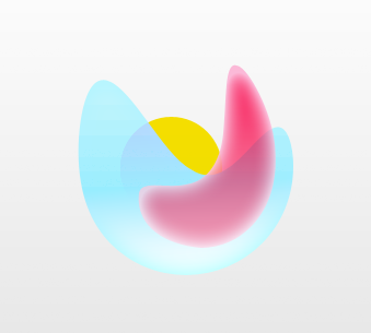
Step 13: Yellow Ellipse Warp
Warp the ellipse by dragging the top outermost points upward to give it an almost pointy top. Press Enter to commit the changes to the yellow shape.

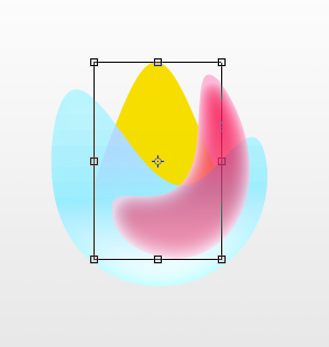
Step 14: Resize
Use the Transform Tool or press Ctrl + “T” on your keyboard to resize the newly-warped yellow ellipse. Make sure you press Enter once you are satisfied with the new size.
Step 15: Layer Opacity
Change the layer mode of the yellow ellipse to “Darken.”

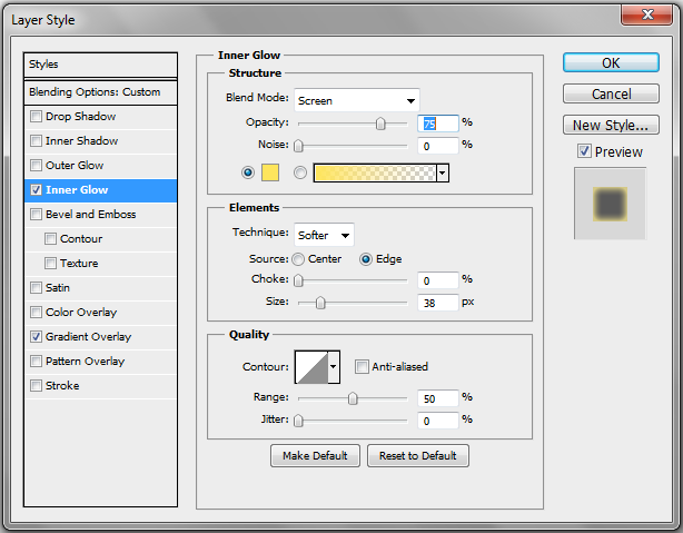
Step 16: Yellow Ellipse Gradients and Glows
Just like in the previous steps, you need to add an “Inner Glow” and “Gradient” to your ellipse. Check the “Inner Glow” box and change the color to #fee55c. Change the settings to match.
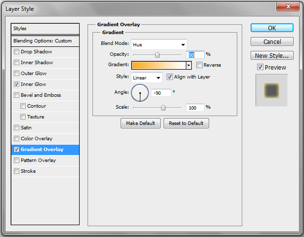
Check the box for “Gradient Overlay” and match the settings shown in the below image.
Step 17: Shadow
Create a new layer under all three colored ellipses and draw an ellipse with the Circular Marquee Tool. This will be where our shadow will go.
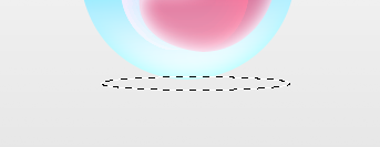
Make sure that the foreground color is #898989, lower the layer opacity to 51%, and change the layer mode to “Hard Light”. Apply Gaussian Blur at 5px.

Finish
Finish up the logo by adding your chosen company name and any other finishing touches that you want to add.
![]()
Conclusion
Simple logos can be just as distinctive, effective, and memorable as complicated ones. With a little practice and planning you can easily create your own logo in three shapes or less, just as I have done. Some design improvements come from the careful triage of elements, not the addition of new ones.
 Gabrielle Gosha
Gabrielle is a creative type who specializes in graphic design, animation and photography.