5 Digital Nomad Lessons from Jacob Laukaitis


Just a couple of decades ago, a job used to mean so much more than a source of income. Since few jobs could be done effectively without physical presence in the workplace, having a job meant living somewhere nearby. Since offices usually have working schedules (the “eight-to-five”), a job used to define one’s schedule as well. Our friends were mostly our colleagues, just because we spent so much time in a room with them.
But then the Internet revolution happened. Paperwork was no longer on paper — it was on a cloud server. Drawings were no longer born on canvas — they were made with Photoshop. We started having team meetings via Skype calls and began to manage our projects via Trello.
Nostalgic, change-resistant folks will tell you that they miss the good ol’ smell of paper, but you shouldn’t really listen to them, since they’re missing the point. And the point is: you sacrifice the smell of your desk for the smell of a rainforest somewhere in Taiwan, where you spontaneously decided to stay and work for a couple of weeks.
Yes, I’m talking about digital nomads. It’s truly hard to think of another group of people who make better use of what the world has to offer today. Digital nomads have it all: freedom to travel wherever they want, whenever they want; a good, stable income; a flexible work schedule. Of course, it takes work to set everything up, but it’s possible for almost anyone.
Today, I had the pleasure of talking to a purebred digital nomad, Jacob Laukaitis. Just 22 years old, he is a co-founder of ChameleonJohn.com, a fast-growing online coupons website operating in the United States, who has been to 45+ countries over the last three years while running his business online.
We discussed traveling and working, and Jacob shared some of the major realizations that he had during his travels. Here they are:
1. The world is a much safer, more civilized place than it is portrayed to be.
In movies, any place that’s not in the US or Western Europe is probably going to be painted somewhat negatively. If it’s Asia, the main accents will probably be obsession with tradition, lack of technology, and unsanitary food.
If the action takes place in South America or Eastern Europe, the place will probably look poor and devastated from criminal activity, war, and/or oppression.
In the reality of globalization, people live pretty similarly across much of the globe. Sure, there are cultural differences, like jokes, manners and clothes. The buildings might look different. But you’ll find familiar brands or similar products even in the farthest corners of Earth. You’ll find pre-paid phones, hostels, taxis, supermarkets, drugstores, Wi-Fi and Western Union outposts in major cities all around the globe.
2. Experiencing things yourself can be extremely fulfilling and useful.
Not seeing someone else do it, not hearing about it, not reading comments. Doing all the stuff yourself.
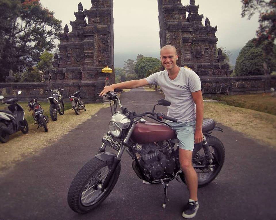
Take motorbiking, for example. Inconvenient, dangerous, expensive, impractical due to weather — those are the main reasons people don’t buy motorbikes.
But in Asia, you can rent a bike for as low as $5/day, make an epic trip across the mountains for two weeks, and come back a happier person.
Or there’s surfing. We all know that it should feel awesome, but have you ever tried watching the sunrise on a board, still catching your breath, with the wind caressing your back and your legs in the chill of the ocean? The smell, the sound…
But it’s not all just for pleasure. While traveling, you meet people, you see how they live, you learn how they think. Those experiences offer invaluable lessons that you couldn’t get any other way.
3. Traveling does not have to cost a fortune.
It’s an out-of-date concept that traveling has to be expensive. Of course, if you approach traveling as a tourist, meaning you go to a travel agency, book one of the five-star hotels they offer you, pay an extra dollar for a premium seat on a plane, eat in touristy restaurants and buy souvenirs from experienced vendors, you’ll end up paying a fortune.
This sort of travel works very well for vacations, when all you want to do is relax comfortably for a couple of weeks, and don’t mind paying extra for it. But if you intend to live and travel for more than a month, you’ll need to adopt a more sustainable mindset — which usually means simply staying out of tourist locations, where the prices are set much higher.
As far as actual prices are concerned, you can live comfortably for as low as $1000 per month in countries like Thailand (not Bangkok, though). This means living in a 3-star hotel, eating in restaurants, and having money for leisure.
The last thing to consider are the tickets, but with a little creativity and flexibility, you can get very cheap flight tickets, too. The only thing that matters is the ability to work remotely.
4. Loneliness is just a product of the wrong attitude.
Once financial requirements are taken care of, people often get scared by the social element of constantly traveling — or, rather, the lack of a social element.
Aspiring travelers are afraid to lose their current friends and are afraid that they won’t make new ones. From Jacob’s first-hand experience, it’s all up to you. Making new connections is a very important part of long-term travel. Not only do we need to socialize (including more than day-to-day small-talk), if you’re not making local friends along the way, you’re missing out on a huge chunk of traveling experience.
When you make connections with people from different cultures, you learn about their way of life, their people’s problems, their opinions on those problems. It’s also very important to be proactive about socializing: start conversations, post on Facebook travel groups, and ask questions, or you’ll be pretty sad and lonely very soon.
As for old friends, there’s nothing to worry about, says Jacob. His true friends are happy for him and are very supportive, and they find a way to keep their connection strong.
5. Traveling is not just about freedom.
It’s also about finding the right opportunities to commit. While staying in one place for a few weeks, you’re essentially evaluating how well you like living there.
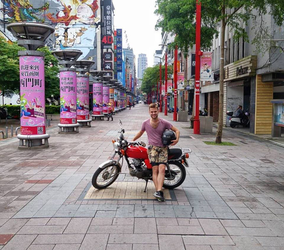
Having been raised in the post-Soviet environment of Eastern Europe, Jacob fell in love with multiple Asian cities. He loved the way of life in Bali, the parks of Tokyo and the people of Taipei. When asked which city would he choose if he had to settle down for good, Jacob replied that it would definitely be one of these three.
When we travel constantly, we lose our fear of living somewhere other than our hometown. You might come to the conclusion that your hometown is where you want to settle down, but it will be a rational decision, not influenced by the fear of the unknown.
It’s not necessarily the locations themselves that can lure us in. You might meet someone, and be able to move to another country with them. You might get a business opportunity or a job in a different country, and move without thinking too much.
Once again, it’s not just about freedom. It’s also about the freedom to discover worthy opportunities to settle.

The world is slowly ditching the office work paradigm. Every day, millions of digital nomads are living lives our parents couldn’t even dream of. And, as we can conclude from Jacob’s thoughts, traveling and working at the same time isn’t that hard to achieve, but it is definitely worth it.
Frequently Asked Questions (FAQs) about Digital Nomad Lifestyle
What are the key lessons Jacob Laukaitis learned from being a digital nomad?
Jacob Laukaitis, a successful digital nomad, has learned several key lessons from his lifestyle. Firstly, he discovered the importance of discipline and self-motivation. Without a traditional office environment, it’s up to you to manage your time and stay productive. Secondly, he learned to embrace uncertainty. As a digital nomad, you often don’t know where you’ll be in a few months, and that’s part of the adventure. Lastly, he realized the value of experiences over possessions. Living out of a backpack teaches you to prioritize experiences over material things.
How does Jacob Laukaitis manage his work-life balance?
Jacob manages his work-life balance by setting clear boundaries between his work and personal life. He schedules his work hours and sticks to them, ensuring he has time to explore and enjoy his surroundings. He also makes sure to take regular breaks to avoid burnout.
What are the challenges of being a digital nomad?
Being a digital nomad comes with its own set of challenges. These include finding reliable Wi-Fi, dealing with time zone differences when working with clients or colleagues, and managing feelings of loneliness or isolation. It’s also important to stay disciplined and motivated without the structure of a traditional office environment.
How does Jacob Laukaitis handle the uncertainty of the digital nomad lifestyle?
Jacob embraces the uncertainty of the digital nomad lifestyle. He sees it as part of the adventure and an opportunity for personal growth. He also plans ahead and stays flexible, allowing him to adapt to unexpected situations.
What advice does Jacob Laukaitis have for aspiring digital nomads?
Jacob advises aspiring digital nomads to start small. Try working remotely for a few days a week before fully committing to the lifestyle. He also recommends researching and planning ahead, especially when it comes to visas and accommodation. Lastly, he emphasizes the importance of staying disciplined and motivated.
How does Jacob Laukaitis stay connected with friends and family while traveling?
Jacob stays connected with friends and family through social media and video calls. He also makes an effort to visit his loved ones whenever he’s back in his home country.
How does Jacob Laukaitis handle healthcare while traveling?
Jacob ensures he has comprehensive travel insurance that covers healthcare. He also takes care of his health by eating well, exercising regularly, and getting enough sleep.
How does Jacob Laukaitis manage his finances while traveling?
Jacob manages his finances by budgeting carefully and tracking his expenses. He also uses online banking and digital payment methods for convenience.
What tools does Jacob Laukaitis use to stay productive while working remotely?
Jacob uses a variety of tools to stay productive, including project management apps, communication tools, and time tracking software. He also uses noise-cancelling headphones to help him focus.
How does Jacob Laukaitis handle language barriers while traveling?
Jacob handles language barriers by learning a few basic phrases in the local language. He also uses translation apps and relies on English, which is widely spoken in many parts of the world.
Tomas Slimas has recently sold his $3M dropshipping business and now helps store owners automate their dropshipping stores at Oberlo.