Have your pages got rhythm?
In a presentation for SXSW back in 2007, Richard Rutter and Mark Boulton explained the importance of ensuring that the text on your page maintains a “vertical rhythm”.
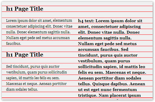
If you haven’t explored this concept yet, allow me to explain: if you were to overlay your text with equidistant horizontal lines (as if your page was a lined notebook from high school) then those lines should land perfectly between each of the lines of text on the page, regardless of whether the text is a heading, a regular paragraph, a sidebar … whatever. When this occurs, your page is said to have vertical rhythm — the text is easier to read than text that doesn’t line up, as it feels more cohesive and less disjointed.
 It’s an easy way to bring some unity to your design without having to think too hard. The math involved is not difficult, but it can become confusing given that CSS allows us to use so many different units. Here are the steps that I use:
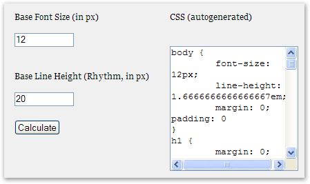
- Decide upon a base font size to use for the main body (paragraph) text. I find it easiest to think in pixels at this point, but convert to ems later so that IE 6 users can still resize their text.
- Decide upon the leading (
line-height, in CSS parlance) that this text should have. A good choice is often 1.5 × base font size, but you’re advised to tweak this manually until it looks right to you. - Apply a
line-heightto the other text on your page so that the same rhythm as your paragraph text is maintained. The value to use for theline-heightdepends on thefont-sizefor the text, but can be calculated using the simple formula line-height (in ems) = base line-height / font-size. - Adjust the margins of your headings, paragraphs and other elements so that the page’s vertical rhythm is maintained. Often this is as simple as applying a lower margin equal to the
line-heightthat you’ve set for that element, but it depends on whether you have other margins or padding set. Boy, a Firefox extension to overlay equidistant horizontal lines over one’s page sure would come in handy for this step …
font-size:
body {
  font-size: 12px;
  line-height: 1.5em; /* equal to 18px */
  margin: 0;
  padding: 0;
}p, ul, blockquote, pre, td, th, label {
margin: 0;
font-size: 1em;
line-height: 1.5em;
margin-bottom: 1.5em;
}line-height of the headings would need to equal 18 ÷ 20 (or 1.5 ÷ 1.67) = 0.9em.
h1 {
  margin: 0;
  font-size: 1.67em;  /* equal to 20px */
  line-height: 0.9em; /* equal to ~11px */
  margin-bottom: 0.9em;
} Of course, you might want to manually adjust the values that are generated (no doubt some readers will take issue with the concept of having a
 font-size or line-height containing 16 decimal places, for example), but this is certainly another useful tool to add to the designer’s arsenal.
Nice going, Geoffrey!
Frequently Asked Questions about Baseline Rhythm in Typography
What is the baseline in typography?
The baseline in typography refers to the invisible line on which all characters sit. It’s the reference point that typographers use to ensure consistency and alignment in their work. The baseline is crucial in maintaining the visual harmony of a text, making it easier to read and more aesthetically pleasing.
How does baseline rhythm affect the readability of a text?
Baseline rhythm plays a significant role in the readability of a text. It ensures that the lines of text are evenly spaced, creating a smooth flow that guides the reader’s eye from one line to the next. Disruptions in the baseline rhythm can make a text difficult to read and visually unappealing.
What is the difference between the baseline and the x-height?
The baseline is the line on which all characters sit, while the x-height refers to the height of lowercase letters excluding ascenders and descenders. The x-height is measured from the baseline, making these two elements closely related in typography.
How can I maintain a consistent baseline rhythm in my design?
Maintaining a consistent baseline rhythm involves careful selection of font size, line height, and margin spacing. Using a baseline grid can be helpful in ensuring consistency. This tool allows you to align text and other elements to a set of horizontal lines spaced at regular intervals.
What is a baseline grid and how do I use it?
A baseline grid is a tool used in typography to ensure consistent alignment of text. It consists of horizontal lines spaced at regular intervals, which correspond to the chosen line height. To use a baseline grid, simply align the baseline of each line of text with the grid lines.
How does baseline rhythm relate to vertical rhythm?
Baseline rhythm is a component of vertical rhythm, which refers to the vertical spacing and arrangement of elements on a page. A consistent baseline rhythm contributes to a harmonious vertical rhythm, making the design more balanced and easier to read.
What factors can disrupt the baseline rhythm?
Several factors can disrupt the baseline rhythm, including inconsistent font sizes, line heights, and margin spacing. Additionally, elements like images, tables, and forms that are not properly aligned with the baseline can disrupt the rhythm.
How does baseline rhythm affect web design?
In web design, baseline rhythm is crucial in creating a visually pleasing and easy-to-read layout. It helps to guide the placement and spacing of text and other elements, contributing to a balanced and harmonious design.
Can I use different baseline rhythms in a single design?
While it’s possible to use different baseline rhythms in a single design, it’s generally not recommended as it can disrupt the visual harmony and readability of the text. Consistency is key in maintaining an effective baseline rhythm.
How can I adjust the baseline rhythm in my design?
Adjusting the baseline rhythm involves changing the font size, line height, and margin spacing. Using a baseline grid can be helpful in making these adjustments. Remember, the goal is to create a smooth, consistent flow of text that is easy to read and visually appealing.
 Matthew Magain
Matthew Magain is a UX designer with over 15 years of experience creating exceptional digital experiences for companies such as IBM, Australia Post, and sitepoint.com. He is currently the Chief Doodler at Sketch Group, Co-founder of UX Mastery, and recently co-authored Everyday UX, an inspiring collection of interviews with some of the best UX Designers in the world. Matthew is also the creator of Charlie Weatherburn and the Flying Machine.