Returning to our design case study, when we left off with Southern Savers in Part I, team Squared Eye was making great progress on the redesign. They went through a discovery phase of becoming familiar with the site, its users, and how Jenny manages the content. They attended a couponing workshop, performed some usability testing, and even did a bit of sticky-note information architecture before planning some layout concepts in Omnigraffle. Now it’s time to bring a little color to the project.
To do that, Matthew Smith of Squared Eye pulled in co-working partner and branding specialist Andrew Ramos to create a visual brand identity and begin work on the printed assets for Southern Savers. “From the outset,” said Matthew, “we all realized Southern Savers could use a rebranding. It lacked a clear visual identity, but the concept and business was extremely strong, so we had a lot to work with.” To start the branding process, they needed to know what colors would work best for the design. Along with asking Jenny directly for colors she liked, Andrew put together a mood board for the project.
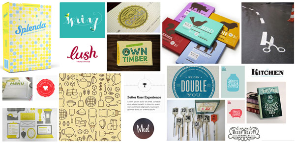
If you’ve ever watched television shows about interior or landscape design, you’ve probably seen designers present a board to their clients with fabric samples, furniture pictures, and paint colors. These presentations help designers gauge the client’s reactions about design decisions before putting a lot of work into creating fancier, more time-consuming visuals. The process works just as well in the world of web design. The figure below shows some of the imagery Andrew included in the mood boards he created for Southern Savers.
 A mood board of beautiful Southern imagery
As you look through the elements of the image above, you’ll notice that there are a wide variety of colors, textures, and typography. Andrew’s inspiration, and the concept that ties all of these thumbnails together, is the keyword “Southern.” A few of the images Jenny liked best are shown below.
 Jenny’s top picks: Jules Verne covers, antique register pieces, and colorful animals
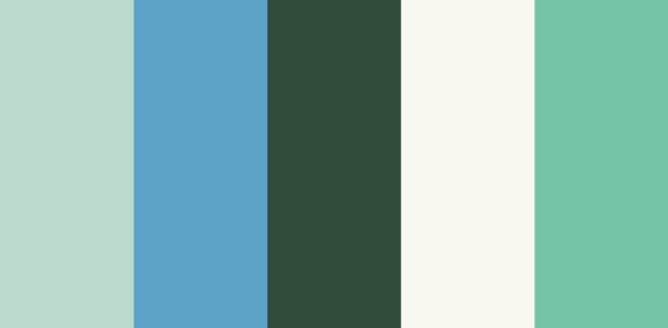
While Jenny didn’t pick these images specifically for the colors, you’ll notice a common theme that runs through all three—teal! Whether she knew it or not, Jenny provided a foundation for her site’s color scheme with her mood board picks. Another color that’s present in all three of these images is red-orange. As you know from the section called “The Scheme of Things” we covered earlier, this would have made for a beautiful complementary color scheme, but Andrew and the Squared Eye team instead opted to build a complementary palette based on Jenny’s love for teal. They pulled some of the greens from the 20,000 Leagues Under the Sea cover she picked, which play double duty, reminding visitors of the money they can save on the site. They then paired those greens with some creamy yellows, and added a bright blue from the opposite side of this analogous color block to use as an accent color. The final color scheme below is fun, casual, and friendly.
 The new Southern Savers color scheme
When I asked Jenny her thoughts on the color choices, she explained that despite a large percentage of her visitors being female, she wanted to avoid the site looking too girly. “I want everybody to feel comfortable using the site,” she said. From an emotional standpoint, this color foundation was an obvious choice. “Blues and greens generally evoke a sense of calm and casualness,” said Andrew. “This is obviously very appropriate for approaching … Southern Savers, where people may think it’s going to be complicated based on their past couponing fiascoes.” This exercise gave Andrew the color inspiration he needed to move on with his branding work. It also added depth to what the Squared Eye team knew about the project. In fact, depth is exactly what we’ll be exploring next. No, I won’t be reading from 20,000 Leagues Under the Sea; instead we’re going to talk about texture.
This is the second in a five-part case study drawn from SitePoint’s The Principles of Beautiful Web Design, 2nd edition. The book covers all the principles of graphic design as they pertain to the Web, and it’s presented in a way that’s easy for non-designers to digest.
Check out the other parts in this series:
Jason Beaird is a designer and front-end developer with over ten years of experience working on a wide range of award-winning web projects. With a background in graphic design and a passion for web standards, he’s always looking for accessible ways to make the Web a more beautiful place. When he’s not pushing pixels in Photoshop or tinkering with markup, Jason loves sharing his passion for the Web with others.


