Back when we were looking at layout blocks done with pencil and paper, I explained that the outer rectangle we were designing within was the containing block. In print design, the containing block is a physical object like a business card or a billboard. On the Web, our container is the browser window. Should the design fill the browser window, or should it have a set width? This decision is one that has plagued web designers for hundreds, if not thousands of years—all the way back to the days when we used tables and spacer.gif files to lay out web page content. Okay, maybe not thousands of years ago, but this is a long-standing debate nonetheless.
Fixed Width
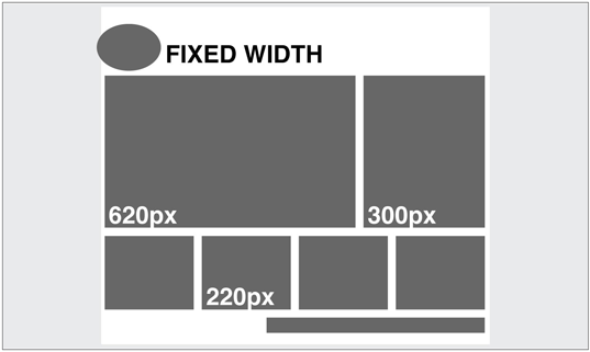
If you’ve started your layout with the 960 Grid System that I talked about earlier, chances are you’re working toward a fixed-width layout. These designs are wrapped with adiv that’s given a pixel-based width (say, 960 pixels), and centered within the body tag using margin: 0 auto;. If the browser window is wider than 960 pixels, you’ll see the body element’s background to the left and right of the container; and if it’s narrower, you’ll have a horizontal scrollbar. Fixed-width layouts are easier to design for—and maintain—because you’re essentially building exactly what you design in Photoshop or your design program of choice. The graphic below shows a similar layout structure as fixed and as fluid in the same width of browser space:
Fluid Width
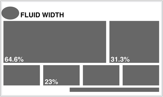
A fluid or liquid layout is designed with percentage-based widths, so that the container stretches when you resize the browser window. These take more thought to plan, as you have to foresee problems that might occur at every possible width. Sometimes pixel-width columns are mixed with percentage-based columns in a fluid layout, but the idea is to show the user as much horizontal content as will fit on their screen. Typically, fluid layouts take advantage of themin-width and max-width properties of CSS, ensuring the container doesn’t become ridiculously narrow or wide.
One reason some designers reject fluid layouts is because they think it impedes them using a grid to create their designs. There are several resources available for designing fluid layouts on a grid, including a fluid adaptation of the 960 Grid System. Ultimately, though, the decision to use one type of layout over the other should really be determined by the target audience, and the accessibility goals of each individual website. The pros and cons of each layout type are fairly well-defined, as the table below outlines:
| Pros | Cons | |
|---|---|---|
| Fixed width |
|
|
| Liquid width |
|
|
An Alternative: Responsive Layouts
It’s been said that for every rule, there’s an exception. That’s usually true in the web world, and designers have come up with many variants and hybrids of fixed-width and fluid-width layout structures. I’ve seen articles recently that list up to ten different layout types. For the purpose of this chapter, however, most of those could be categorized as either fixed or fluid. On A List Apart article, though, introduced a novel layout type that I think we’ll be seeing a lot more of. The article was titled “Responsive Web Design” and it was written by Ethan Marcotte. Rather than repeat the entire article here, I highly recommend that you check it out. If I had to name this layout technique myself, I would call it the Omnipotent Mercury Morphing Methodology, but that’s probably why I didn’t come up with it. The idea is that as the mobile market makes browser window widths more and more inconsistent, the need for our layouts to be fluid and adapt to different widths is increasingly vital. The technique takes advantage of some fancy fluid scaling and CSS3 media queries to completely change the layout as it hits certain width thresholds. The graphic below shows screenshots of Ethan’s example at three different browser widths. Ethan’s responsive web design (or Omnipotent Mercury Morphing Methodology) is a great solution to a problem we’ve yet to discuss: screen resolutions, which we’ll look at next.
The Principles of Beautiful Web Design
This article is from Jason Beaird’s The Principles of Beautiful Web Design book (the second edition of which is out now). This is the eleventh part of the first chapter.Frequently Asked Questions (FAQs) about Resizing: Fixed, Fluid, or Responsive Layouts
What is the main difference between fixed, fluid, and responsive layouts?
Fixed layouts have a set width in pixels. This means the layout doesn’t change size with the browser window, it remains fixed. Fluid layouts, on the other hand, use percentages for widths. As a result, columns are relative to one another and the browser window, allowing the layout to “flow” and adjust based on the window size. Responsive layouts combine the best of both fixed and fluid layouts. They use CSS media queries to change styles based on the target device’s width, providing an optimal viewing experience across a wide range of devices.
How does a fluid layout benefit the user experience?
Fluid layouts offer a more flexible user experience. They adjust to the size of the user’s screen, providing a consistent experience across different devices. This means that whether a user is viewing your site on a desktop, tablet, or mobile device, they’ll have a seamless experience because the layout adjusts to their screen size.
When should I use a fixed layout?
Fixed layouts are best used when you want to maintain control over the exact appearance of your site, regardless of the device or screen size. They’re often used for sites that require precise control over layout and design, such as portfolios or sites with complex graphic designs.
What are the drawbacks of using a fixed layout?
The main drawback of a fixed layout is that it doesn’t adjust to the user’s screen size. This can lead to issues with usability and accessibility, particularly on smaller screens. Users may need to scroll horizontally to view all content, which can be frustrating and lead to a poor user experience.
How does a responsive layout work?
Responsive layouts use CSS media queries to adjust the layout based on the size of the user’s screen. This means the layout will “respond” to changes in the browser window size by adjusting the layout, font sizes, images, and other elements to fit the screen.
What are the benefits of using a responsive layout?
Responsive layouts provide an optimal viewing experience across a wide range of devices. They ensure that your site looks and functions well on all devices, from desktops to tablets to mobile phones. This can lead to increased user engagement and satisfaction.
Are there any drawbacks to using a responsive layout?
While responsive layouts offer many benefits, they can be more complex to design and build. They require a good understanding of CSS and design principles to ensure the layout works well at all screen sizes. Additionally, because they adjust to fit the screen, they may not look exactly as you intended on all devices.
Can I switch from a fixed layout to a responsive layout?
Yes, it’s possible to switch from a fixed layout to a responsive layout. However, it will require some work to adjust your CSS and possibly your HTML. You’ll need to add media queries to your CSS to control how your site looks at different screen sizes.
How can I decide which layout is best for my site?
The best layout for your site depends on your specific needs and goals. Consider your audience, the devices they’re likely to use, and the type of content you’re presenting. If you want precise control over your design, a fixed layout may be best. If you want your site to be accessible on a variety of devices, a fluid or responsive layout may be a better choice.
What tools can I use to create a responsive layout?
There are many tools available to help you create a responsive layout. CSS frameworks like Bootstrap or Foundation provide pre-written CSS that you can use to create a responsive layout. There are also online tools and templates that can help you get started.
 Jason Beaird
Jason Beaird is a designer and front-end developer with over ten years of experience working on a wide range of award-winning web projects. With a background in graphic design and a passion for web standards, he’s always looking for accessible ways to make the Web a more beautiful place. When he’s not pushing pixels in Photoshop or tinkering with markup, Jason loves sharing his passion for the Web with others.