Let’s face it, we have all been victims of an impractical or just plain unresponsive checkout system while trying to finish an online purchase.
Most websites are built with the intention to convert the visitors into customers but there is no way that can happen when a poor checkout design is implemented. Potential customers are looking for a quick and satisfying online experience which means you need to make sure that happens. Truth be told there have been a few times where I personally didn’t buy an item just because what should have been a simple checkout turned into an unnecessary interrogation with no navigation or step indicators. To prevent a fleeing potential customer it is imperative to review not only your overall e-commerce design but your ecommerce checkout flow. Today’s article will feature the basic fundamentals of an ecommerce checkout design including your cart graphics and your overall flow that will hopefully convert your ecommerce store into a profitable one.1. Keep the Cart Simple
The shopping cart is the first visual indicator to potential customers that your site provides a good or service that can be purchased online.
Though a seemingly simple attribute the design of your shopping cart should match the website. Getting appropriate graphics is essential to help the process of conversion.
There are various representations of the famed shopping cart which includes standard shopping trolley, the basket and of course shopping bag for you to choose from. You can even settle for text if you like.
Whichever design you choose you must make sure that it is visibly accessible.
In other words, it needs to be located in an area where visitors will notice it within five seconds or less. You will often find shopping carts are located in the top right corner.
Keep in mind that your shopping cart also needs to be a reasonable size, not too big and not too small. Remember that your cart design doesn’t need to be fancy, just visible.
Other than the basic graphic for your cart you will want to make sure that it updates in real time.
Whenever a customer adds an item the basket should automatically display the new addition.
Make sure this confirmation is clearly displayed. No one should have to look around to see if their item has been successfully added to their cart.
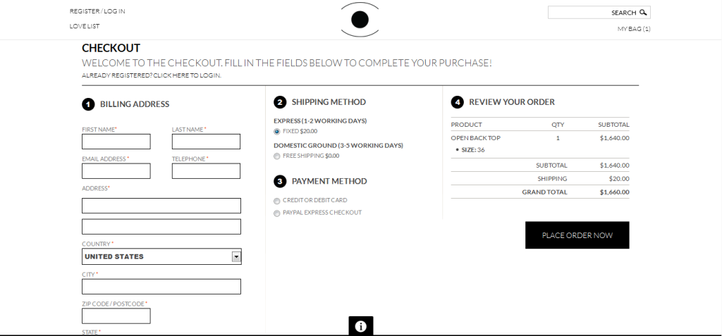
2. Display the Cart Details
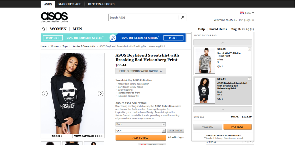
When it comes to purchases a lot of it has to do with the information that is displayed. This includes product details, photos and videos. In fact 92.6% of shoppers base their purchasing decisions on the visuals that are associated with a particular product.
What does this tell us?
It simply tells us the great importance of the visual elements chosen. The photos which you use can either lead to a sell or a passover.
More often than not a potential buyer will likely add an item to their cart if multiple images of the product are included.
Videos are also helpful to push for a sell but you must make sure that the video is straight to the point as to not to lose the viewer’s attention.
Other than photos and videos you need to make sure that your items feature important information like titles and product summaries.
Customers want to know what exactly it is they are buying.
This is a factor that can help instill trust. Along with product summaries you should be sure to include options if applicable which may include color, size and other customizations.
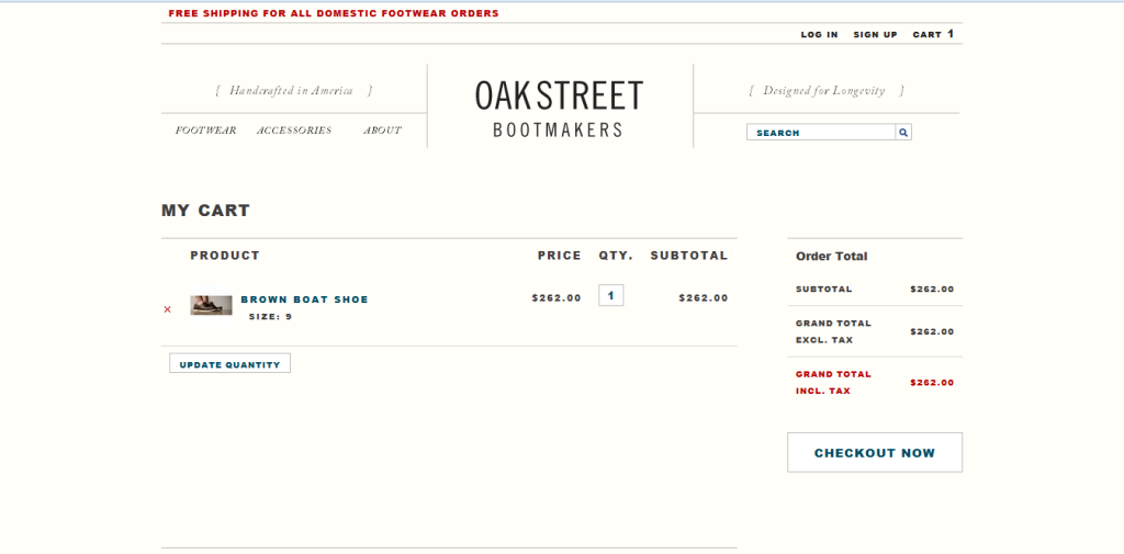
Within your checkout design there should also be a section to change quantity and remove items should the customer change their mind.
Above all else when it comes to making sure details are displayed you will definitely want to include the price of the item, available shipping and the final price (including tax) before they actually checkout.
You don’t want to surprise the customer with hidden prices and fees. This is a sure way to have them abandon their carts and your site.
3. Give Those Options
People like having options. They enjoy having the power to customize and control their purchases so you should make sure such control is given.
Cart abandonment can also be brought about with the lack of options your site allows. These options can be seemingly basic but to a customer they can make a world of difference.
Such options you may want to consider is the ability for customers to save their items for later.
Sometimes a person is in the middle of shopping but all of sudden realizes they can’t purchase the item at that point in time but still intend to buy what’s in their cart when time permits.
Allowing them to save these items for later ups the chances of them returning to complete their purchase.
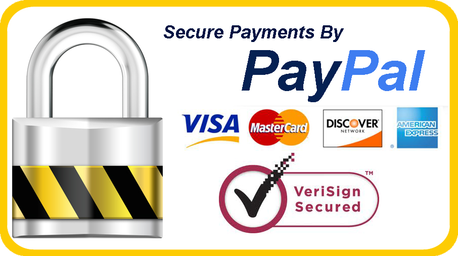
Along with allowing customers to save their carts you need to make your online store as friendly as possible by offering various forms of payment methods.
Lack of payment options can really take a toll on your business if you’re not careful. By assuming that everyone uses only one form of payment e.g. credit cards you consequently alienate those who do not use credit cards.
Offering multiple payment methods will be just as helpful to you as it will be to the customer. Remember to display the payment options on your page where visitors can clearly see it before they begin shopping.
While you are trying to make checking out a better experience for your customers you should also give them the option on whether to create an account or not.
Too many times sites force buyers to register before they can complete their purchase. This is aggravating on many levels as most of us want to “get in and get out”.
Many of us already have enough accounts that we need both hands and maybe a foot to count them on.
The last thing we want is to have to create another account with another password when all we desire is a quick purchase. Not to mention customers associate registering to receiving unwanted e-mails.
To most buyers a forced registration is just another roadblock in the process of their purchase.
Giving a customer an option to checkout as a guest can actually lead to more purchases in the future believe it or not.
4. Instill Trust
The first thing most buyers wonder when going to a site where they are able to make a purchase is “is this site safe”.
With technologies advancement has come the risk of your information falling into the wrong hands so it is understandable for customers to be a bit nervous.
There are various methods however to quell these worries such as by using trust indicators. The most obvious method is to provide a message that your site is indeed secure.
Add visual clues like a lock symbol as well as any third-party seals of approval on your site and not just on the checkout page either. Also include a link to your privacy policy to fortify your assurance that your site is safe.
Allowing for product reviews is also a great way to instill trust with your customers.
Giving them the ability to leave testimonials about your business is a great idea too. This doesn’t just help you as a business but it helps potential buyers as well. Buyers will often research a website they have never used if they plan on making a purchase from said site. The mere act of allowing buyers to rate and comment on a product means that you trust them and value their opinion about their product.
Make sure that your customer service information is easily accessible as well. By having this information ready you are letting customers know that you are available and aren’t some mysterious entity. Giving a working number and an e-mail for them to reach you for questions or concerns is a perfect way to further establish trust.
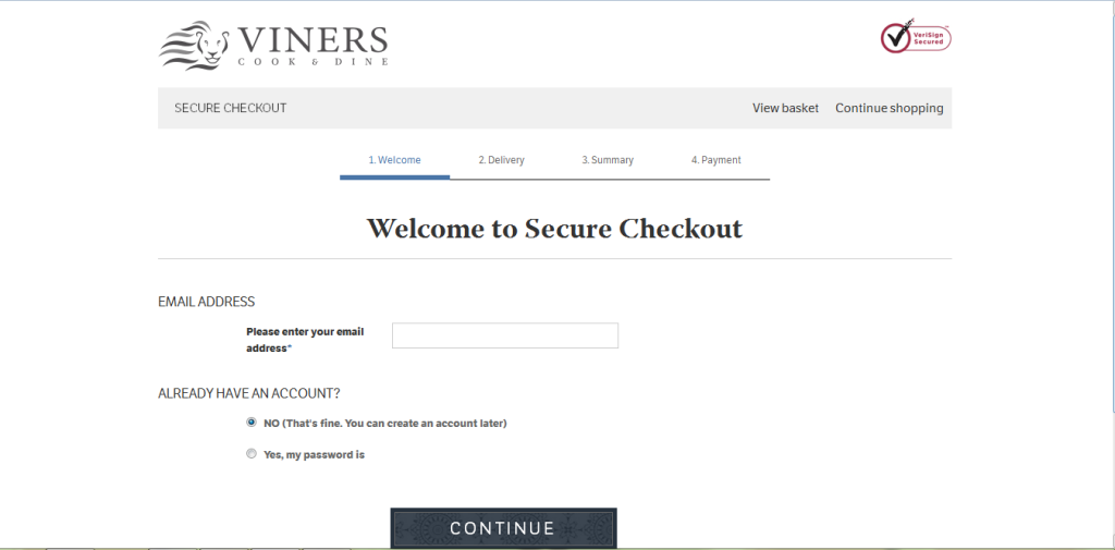
5. Keep the Process Linear
A linear checkout means a logical flow but this can be interrupted by sites that require you to make an account prior to completing your purchase.
Often times these steps within steps will direct you from your account creation to a previous step within the checkout process.
This creates confusion for the buyer as they are typically sent to a page they have seen before. This leaves the buyer confused and assuming that there was either an error within the checkout system or that they simply did something wrong.
By avoiding these steps you can keep your checkout linear.
Providing a progress indicator that leads the customer step by step will also be beneficial.
Labeling the steps and indicating exactly where the customer is with their checkout via colors and highlights will give them an idea what will be required of them next.
If your site must have a multi-step process use the progress indicator to inform the customer which step they are at and how many more steps are left until they have completed their purchase.
6. Uncomplicate Your Forms
Any forms used on your checkout page should be free of ambiguity and they should not be overly complexed. Though making a purchase online customers do not want to have provide too much information and forms should take this into account.
While some information must be asked in order to finish an order its illogical hierarchy can have customers once more abandoning their planned purchase.
While there are many steps and considerations that need to be made when creating a checkout form there are some basic implementations that need to always be put into practice.
Any and all form fields need descriptions and if applicable an explanation.
This can be easily done by providing a clickable question mark at the end of each field which can be accessed for a detailed explanation. This is a must for required fields or it can prevent confused customers from finishing.
Whether the title field is ambiguous or not it is smart to add an explanation link to each to avoid assumptions.
Other than making sure your forms have the right titles and descriptions you need to also make sure the form fields show up in a logical manner. You wouldn’t have the credit card information appear at the top of the form before everything else would you? Of course not.
Keep everything consistent and logical by having contact information appear first, followed by shipping information and then billing information. This is a standard setup that most buyers are familiar with.
Also make sure that your form can readily and visually indicate errors before users can move on to complete their purchase.
Conclusion
While there are certainly a lot more guidelines than the six above it should be noted that the above fundamentals will definitely push your checkout design in the right direction.
Remember to constantly test your checkout’s efficiency to spot bugs in the system as well as analyze customer cart abandonment if you have the ability to do so.
Frequently Asked Questions on Ecommerce Checkout Design Fundamentals
What are some key elements to consider when designing an ecommerce checkout page?
The design of an ecommerce checkout page plays a crucial role in the customer’s shopping experience. Key elements to consider include simplicity, security, and convenience. The checkout process should be straightforward and easy to navigate. It should also provide clear information about the products, prices, and shipping costs. Security is another important aspect. Customers need to feel confident that their personal and financial information is safe. This can be achieved by using secure payment gateways and displaying security badges. Lastly, the checkout page should offer multiple payment options and allow customers to make purchases without creating an account.
How can I reduce cart abandonment on my ecommerce checkout page?
Cart abandonment is a common issue in ecommerce. To reduce it, ensure that your checkout process is quick and easy. Avoid hidden costs and provide clear information about shipping and handling fees. Offering guest checkout options and multiple payment methods can also help. Additionally, reassure customers about the security of their data and consider offering incentives like free shipping or discounts to encourage completion of the purchase.
What are some best practices for mobile checkout design?
With the increasing use of mobile devices for online shopping, it’s essential to optimize your checkout page for mobile users. This includes using a responsive design that adapts to different screen sizes, simplifying the checkout process by minimizing the number of steps and fields, using large, easy-to-click buttons, and ensuring that the text is readable on small screens. Also, consider integrating mobile payment options like Apple Pay or Google Wallet for added convenience.
How can I use A/B testing to improve my ecommerce checkout page?
A/B testing involves creating two versions of your checkout page and comparing their performance to see which one performs better. This can help you identify elements that are working well and those that need improvement. You can test different aspects such as the layout, color scheme, call-to-action buttons, and form fields. Remember to test one element at a time to accurately determine its impact.
What role does user feedback play in improving the checkout process?
User feedback is invaluable in improving the checkout process. It provides insights into what customers like or dislike about your checkout page, helping you identify areas for improvement. You can gather feedback through surveys, user testing, or by analyzing customer behavior data. Implementing changes based on user feedback can enhance the user experience and increase conversion rates.
How can I make my checkout page more user-friendly?
Making your checkout page user-friendly involves simplifying the process, providing clear instructions, and minimizing distractions. Use a clean, minimalist design with easy-to-read fonts and colors. Ensure that form fields are clearly labeled and only ask for necessary information. Also, provide a progress indicator to let customers know how many steps are left in the checkout process.
How important is the speed of my ecommerce checkout page?
The speed of your checkout page is crucial. Slow loading times can frustrate customers and lead to cart abandonment. To improve page speed, optimize your images, use a reliable hosting provider, and minimize the use of heavy scripts and plugins. Regularly test your page speed and make necessary adjustments to ensure a smooth and fast checkout experience.
How can I build trust on my ecommerce checkout page?
Building trust on your checkout page involves providing clear and transparent information, displaying security badges, and offering excellent customer service. Make sure your return and refund policies are easy to find and understand. Also, provide multiple ways for customers to contact you in case they have questions or issues.
What are some common mistakes to avoid when designing an ecommerce checkout page?
Common mistakes to avoid include a complicated checkout process, hidden costs, requiring account creation to make a purchase, and poor mobile optimization. Also, avoid using distracting elements like pop-ups or excessive promotional content. Ensure that your checkout page is user-friendly, transparent, and optimized for all devices.
How can I measure the success of my ecommerce checkout page?
You can measure the success of your checkout page by tracking key metrics such as conversion rate, cart abandonment rate, average order value, and customer satisfaction. Use analytics tools to monitor these metrics and make data-driven decisions to improve your checkout process. Regularly reviewing and analyzing these metrics can help you identify trends, spot issues, and gauge the effectiveness of your checkout page.
 Gabrielle Gosha
Gabrielle is a creative type who specializes in graphic design, animation and photography.