It’s 2014: Everyone you know has a web-ready phone, and it seems like every second person you talk to dreams of creating their own chart-topping, million-selling app. This has lead to a truly crazy proliferation of apps available across the various, different online stores.
On October 2013, Apple announced their millionth app in the App Store. Google’s Play store had already passed that number in June. Even the late-blooming Windows Phone Store was closing in on 200,000 apps in November.It almost goes without saying that obtaining a simple, eye-catching app icon is ‘table stakes’ for anyone hoping to compete in such a hyper-competitive jungle.
So, in this tutorial, I’ll show you how to create an elegant calculator app icon, using the powers of Adobe Photoshop.
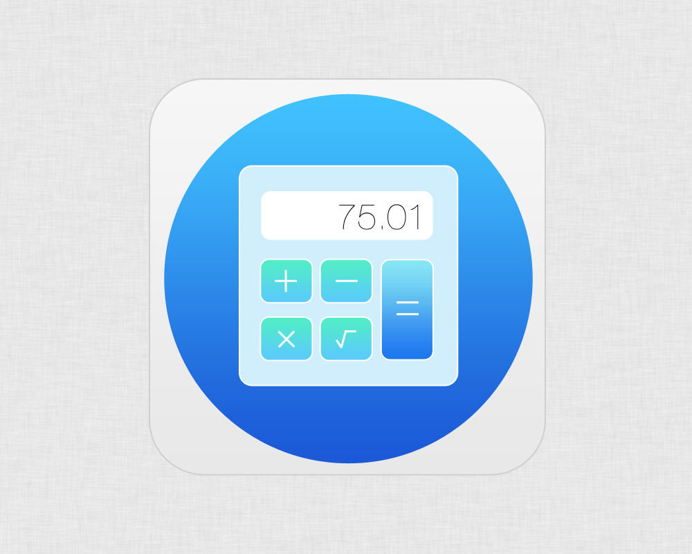
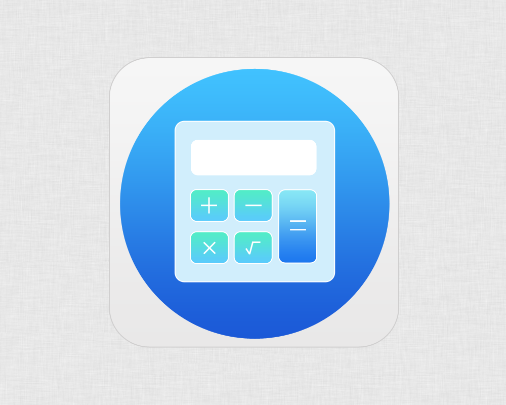
Here’s a peek at what we’re aiming to make:
The first thing you have to do is to create a new document, you can do this just by pressing ‘Ctrl + N’. Give the canvas the dimensions of 1000 x 800 pixels. You are free to insert any background you want, in this case I chose a flat metal pattern.
STEP 2
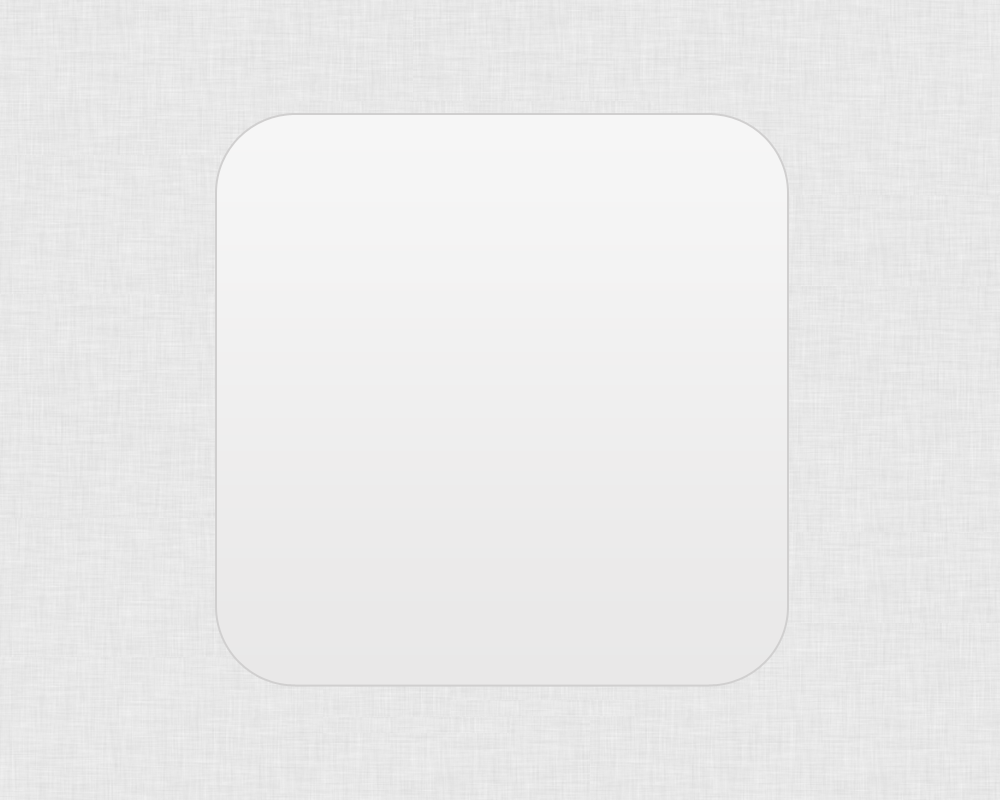
Create a new layer, and, after selecting the ‘Rounded Rectangle Tool’ with the radius set to 40 pixels, draw a square. As usual, this is easier if you hold the ‘Shift’ button stretching out your rectangle.
It’s time to add some style, so double-click on the layer to open the ‘Layer Style’ panel.
Go to ‘Stroke’ and insert the following values:
- Size: 2
- Position: Outside
- Blend Mode: Normal
- Opacity: 100%
- Color: #d0cfcf
Move to ‘Gradient Overlay’:
- Blend Mode: Normal
- Opacity: 100%
- Gradient: #e9e8e8 to #f6f6f6
- Style: Linear
- Angle: 90°
- Scale: 100%
STEP 3
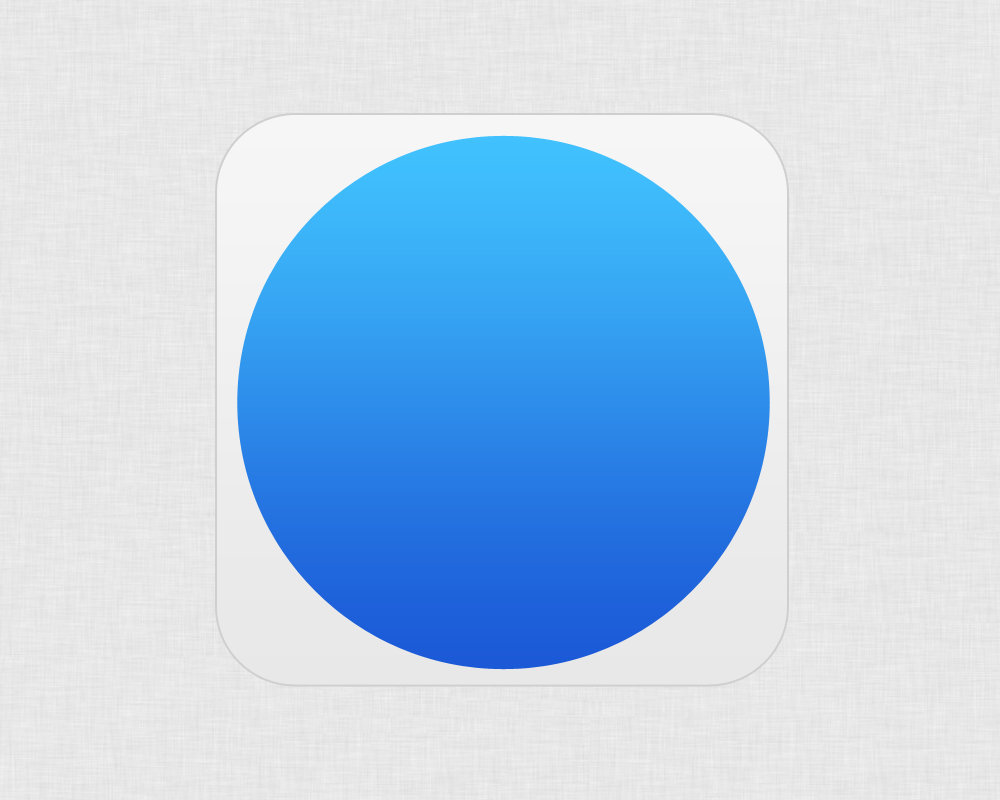
We are now going to create the blue main circle. Pick the ‘Elliptical Tool’ up and draw a circle inside the rounded rectangle. Once again, I suggest holding down the ‘Shift’ button to maintain a perfect circle.
The color you use it’s not important since we are going to fill it with a gradient. Open the ‘Layer Style’ panel and go to ‘Gradient Overlay’.
- List item
- Blend Mode: Normal
- Opacity: 100%
- Gradient: # 1b59d7to # 41c2fe
- Style: Linear
- Angle: 90°
- Scale: 100%
You should be seeing something like this:
STEP 4
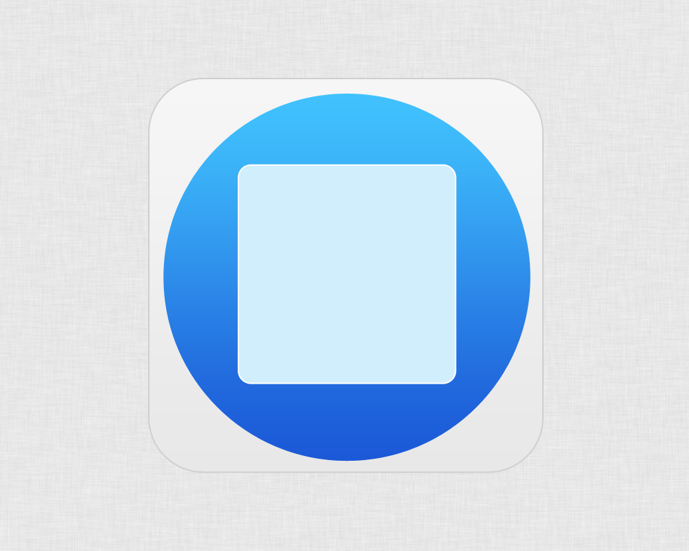
Let’s create the inner rounded rectangle — the calculator body. To draw the shape, you’ll do exactly what we did in step 2, with one difference. Instead of adding a gradient, we’ll fill the shape with just one color: #d1eefc.
Open the ‘Stroke’ panel and punch in the following parameters:
- Size: 2
- Position: Outside
- Blend Mode: Normal
- Opacity: 100%
- Color: #ffffff
STEP 5
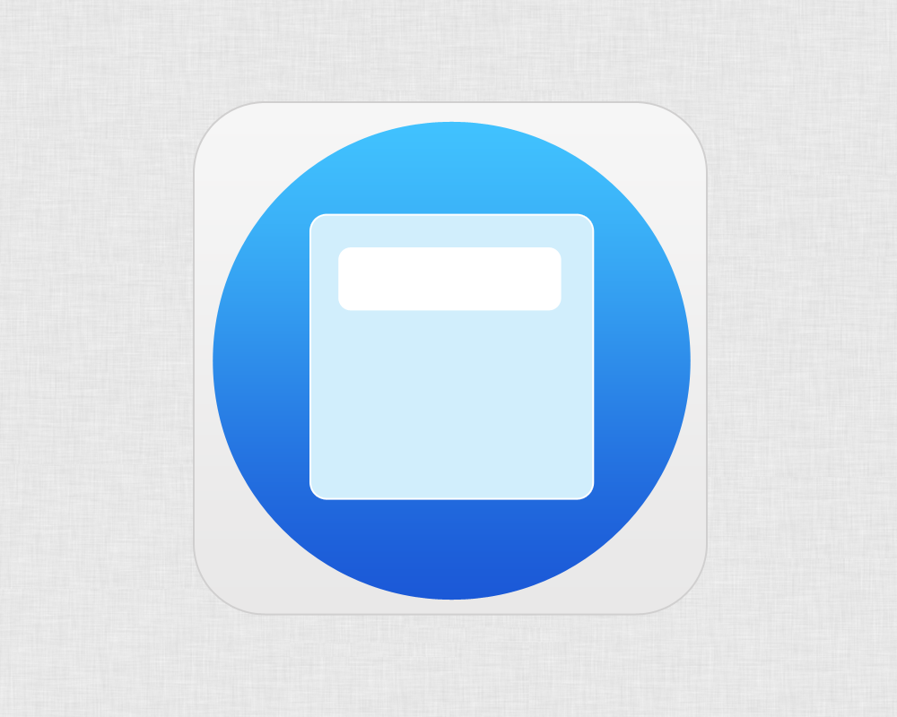
Every calculator needs a screen, and ours’ is no exception. Anyway, this is an easy step.
Simply draw a rounded rectangle using the ‘Rounded Rectangle Tool’. This time it’s better to set the corner radius to around 10 pixels.
I filled the shape with a classic ‘white’ (#ffffff), but a light-grey would be fine too. Your call.
STEP 6
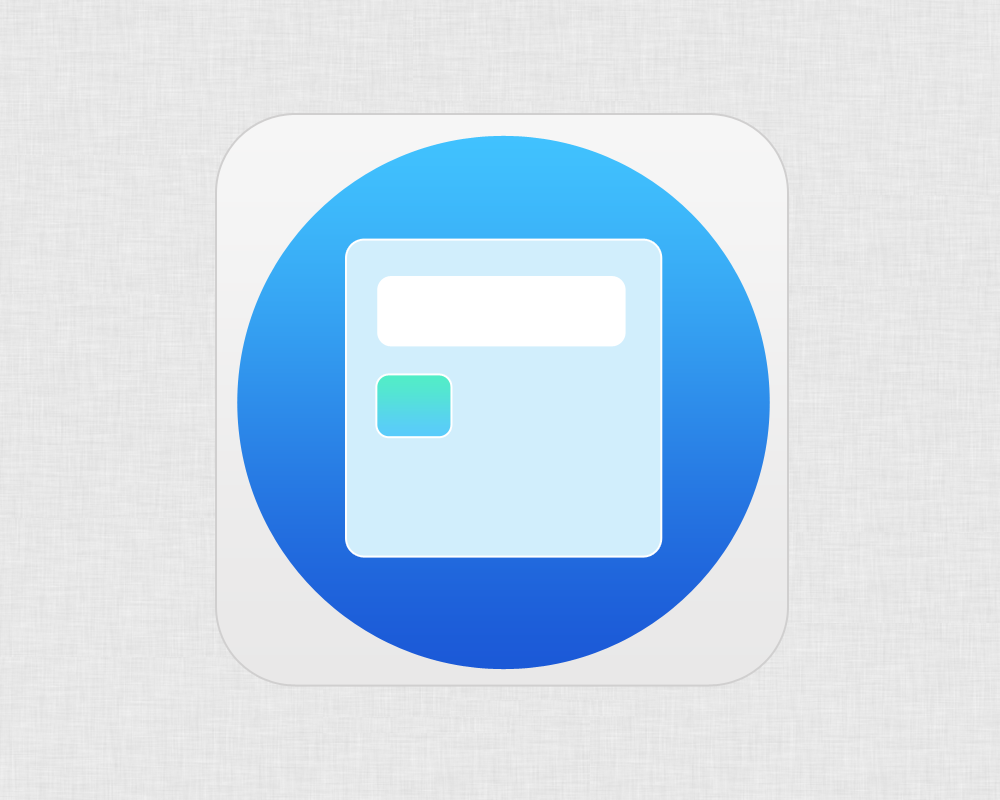
In this step, we’ll make the smaller buttons.
Once more we’ll use the ‘Rounded Shape Tool’ with a 10 pixels radius.
You’ll have to draw a small rounded shape, you can create either a square or a rectangle, as you prefer.
Then open the ‘Gradient Overlay’ panel and insert these values:
- Blend Mode: Normal
- Opacity: 100%
- Gradient: # 5acbfb to # 52edc7
- Style: Linear
- Angle: 90°
- Scale: 100%
As of the stroke, use white or a light color and set the size to 2 pixels.
So now we’ve created one of the four buttons. If everything worked out ok you should get a result similar to this one.
STEP 7
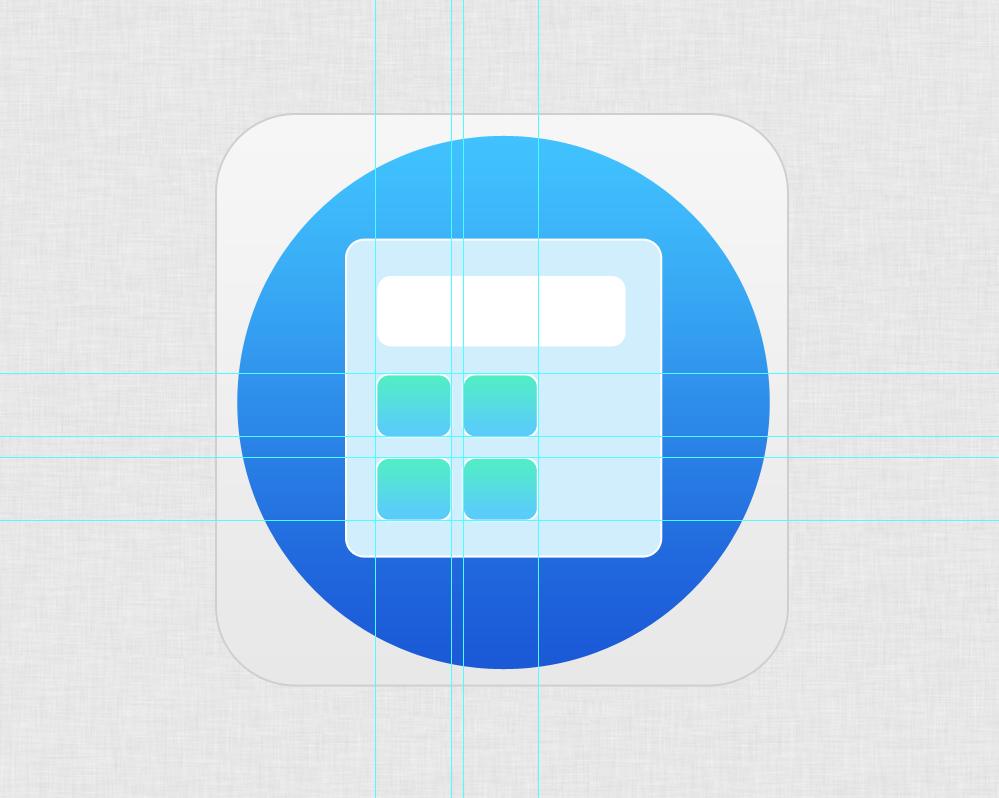
You should now proceed with the creation of the other buttons.
Don’t worry, you don’t have to repeat the previous step three times, you can easily duplicate the button level and place the shapes in the most suitable positions. I suggest you using the guidelines in order to get a symmetric result.
STEP 8
The key with the ‘equal sign’ can be created as the previous ones. Of course it’s a bit bigger, I made it twice higher than the other buttons.
The color is different too, indeed the gradient goes from #1d77ef to #87e7f5.

STEP 9
We have almost finished the work. We only have to add some details to make the calculator looks more real.
For example, it’s possible to add some math signs on the buttons: you can easily find many ready-made symbols on the web.
Differently, I decided to create my own signs. In this case you have to select the ‘Line Tool’ and set the thickness to 2 pixels. The color I used is white, #ffffff, but I suggest you using the same color of the buttons stroke.
STEP 10
This is the very last step of this Photoshop tutorial. It’s time to add some numbers on the screen.
So, pick the ‘Horizontal Text Tool’ up and write some digits. The font I used Is ‘Helvetica Neue UltraLight’ , while the color is a common black, #000000.

And that’s it!
I hope you enjoyed it and got a great result along the way.
Frequently Asked Questions about Designing a Flat Calculator App Icon in Photoshop
What are the basic tools in Photoshop that I need to use to design a flat calculator app icon?
To design a flat calculator app icon in Photoshop, you will need to use several basic tools. The Rectangle Tool is essential for creating the basic shape of the calculator. The Rounded Rectangle Tool can be used to create the buttons of the calculator. The Text Tool is used to add numbers and symbols on the buttons. The Gradient Tool can be used to add depth and dimension to the flat design. Lastly, the Layer Styles feature is used to add effects such as drop shadows, strokes, and gradients to enhance the overall look of the icon.
How can I create a realistic shadow effect in Photoshop?
Creating a realistic shadow effect in Photoshop can be achieved by using the Drop Shadow feature found in the Layer Styles. You can adjust the opacity, distance, spread, and size of the shadow to create a realistic effect. It’s important to consider the light source in your design to ensure the shadow is consistent and realistic.
How can I ensure my flat calculator app icon design is consistent with my overall app design?
Consistency in design is key in creating a cohesive user experience. You can ensure this by using a consistent color scheme, typography, and design elements throughout your app and icon design. Using the Eyedropper Tool in Photoshop can help you match the exact colors used in your app design.
How can I export my flat calculator app icon design in different sizes for various devices?
Photoshop allows you to export your design in various sizes using the Export As feature. You can specify the sizes you need for different devices. It’s important to consider the requirements of different app stores as they may have specific size and format requirements.
How can I create a 3D effect in my flat calculator app icon design?
Even though the design is flat, you can create a 3D effect by using gradients and shadows. The Gradient Tool in Photoshop allows you to add a gradient effect to your design, giving it depth and dimension. Adding a drop shadow can also enhance the 3D effect.
How can I add text to my calculator buttons in Photoshop?
Adding text to your calculator buttons can be done using the Text Tool in Photoshop. You can choose the font, size, and color of the text. It’s important to ensure the text is clear and legible, even at smaller sizes.
How can I create a rounded rectangle in Photoshop?
Creating a rounded rectangle in Photoshop can be done using the Rounded Rectangle Tool. You can adjust the radius of the corners to create the desired roundness.
How can I use layer styles in Photoshop to enhance my flat calculator app icon design?
Layer styles in Photoshop allow you to add effects to your design such as drop shadows, strokes, and gradients. You can apply these effects to a layer and adjust the settings to achieve the desired look.
How can I use the gradient tool in Photoshop to add depth to my flat calculator app icon design?
The Gradient Tool in Photoshop allows you to add a gradient effect to your design. You can choose the colors and direction of the gradient. This can add depth and dimension to your flat design.
How can I ensure my flat calculator app icon design is visually appealing and stands out?
Creating a visually appealing and standout design involves a combination of factors. A unique and recognizable shape, a consistent and appealing color scheme, clear and legible text, and effective use of effects such as gradients and shadows can all contribute to a standout design. It’s also important to consider the context in which the icon will be seen, such as on different devices and alongside other app icons.
 Simone Sala
Simone is a graphic designer who loves technology, design and who is always looking for new trends and innovative concepts. He also likes to give tips and to share his knowledge with other tech-lovers.