refresh for Mobile developers—it’s now CTRL+S, pick up your phone or tablet PC, and hit reload.
jQuery Mobile blends the cross-browser and cross-platform support we know and love from jQuery with the power, flexibility, and design we turn to UI for—it’s a plugin, but not only does it extend jQuery, it extends the places where you can rely on jQuery. You can select, bind, animate, and chain as you’d expect from a plugin, but you can also tap and swipe, use more CSS3 than ever before, and, most importantly, use your mastery of jQuery to make that next must-have application.
You’re able to focus on your application’s goal and let Mobile help you out without getting in the way—include two files, à la jQuery UI, and you’re away!
<link rel=stylesheet href="https://code.jquery.com/mobile/1.0/

➥jquery.mobile-1.0.min.css">

...

<script src="https://code.jquery.com/mobile/1.0/

➥jquery.mobile-1.0.min.js"></script>
Looks familiar! Like you’re accustomed to, you can use jQuery’s own CDN to deliver your files as we’ve done here, or you can grab the files yourself and include them locally. Using jQuery’s CDN, your minified and zipped files come in at 7kB and 24kB respectively—easily small enough to be useful on a mobile network. And you’ve got a host of platform options to access those mobile networks with. As it says on the jQuery Mobile website, “Mobile has broad support for the vast majority of all modern desktop, smartphone, tablet, and e-reader platforms.” And this is no small claim: jQuery Mobile’s graded browser support matrix sees it catering to an impressive two dozen target platforms. This is not bad if you consider that some of the competitor products officially support only one.
Four Grades of Support
There are too many platforms for us to duplicate the full list of the graded support matrix, but you can find them all on the jQuery Mobile site. Instead, let’s take a look at the coverage levels you can expect for each grade:- A-grade: full, enhanced experience with Ajax-based animated page transitions
- B-grade: enhanced experience without Ajax navigation features
- C-grade: basic, non-enhanced HTML experience that is still functional
- Not Officially Supported: might work, but hasn’t been thoroughly tested or debugged
Playing Your Trump
By now we know our client nearly as well as we know jQuery and jQuery UI, so it’s a safe bet for us that a mobile application with a social aspect is on the cards. Let’s up the ante and deal with their next request by creating a mobile-based card game. We’ll implement jQuery Mobile by making Pop Trumps: The Jemimas, the world’s first card game that combines the thrill of trumping your friends with the face of the newest rock star to hit the charts, as seen in Figure 4.1, Figure 4.2, and Figure 4.3. Figure 4.1. The face of Pop Trumps
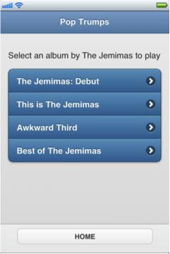 Figure 4.2. Our Pop Trumps home page
 Figure 4.3. The winner’s screen
Rather than go through every line of code, let’s focus on the Mobile-specific code where we can:
Figure 4.3. The winner’s screen
Rather than go through every line of code, let’s focus on the Mobile-specific code where we can:
<link rel=stylesheet href="https://code.jquery.com/mobile/1.0/

➥jquery.mobile-1.0.min.css">

⋮

<script src="https://code.jquery.com/mobile/1.0/

➥jquery.mobile-1.0.min.js"></script>
We have already looked at the Mobile requirement includes, but they are worth mentioning again. Unlike other jQuery projects, and in order to achieve the wide range of platform support, a great deal of manipulation occurs well before the
document.ready event fires. As a result, we need to add our includes in the head of our document to achieve the best user experience.
While we’re in the document head, let’s look at that new meta element:
<meta name=viewport content="width=device-width, initial-scale=1,

➥user-scalable=0">
jQuery Mobile draws heavily on HTML5, and here we have an HTML5 element that normalizes the cross-platform display of our application. It tells our browser that our content should be as wide as it can be and that it should be at a 1:1 scale. This is important, given the wide range of resolutions our application may encounter. That last content value—user-
scalable=0—tells our browser not to make our content zoom. If zooming is something you’d like in your app, just omit that value and go with the browser’s default behavior.
Speaking of HTML5, let’s take a look now at our document structure. Again, if you have already worked with HTML5, there should be few surprises for you—except possibly how well Mobile embraces the language.
<section data-role="page" id="home">

⋮

</section>

<section data-role="page" id="albums">

<header data-role="header">

⋮

</header>

<div data-role="content">

⋮

</div>

<footer data-role="footer">

⋮

</footer>

</section>

<section data-role="page" id="album">

⋮

</section>

<section data-role="page" id="results">

⋮

</section>
At its heart, our page is a group of
section elements with a data-role attribute of page. You could also use div elements instead of sections—here, the attribute is more important than the element, as the data-role tells Mobile each of the sections will be a page in our application. We further delineate our pages with unique id attributes that serve as anchor targets for our navigation. Where a desktop might use ids to jump or scroll to content, Mobile uses them to transition between pageviews.
Inside our second section we’ve shown our basic pageview layout—a header, div, and footer, again all with data-role attributes that help Mobile apply its under-the-hood changes. Inside these elements we just add whatever HTML we need and apply data-role attributes where it suits. Let’s try some now:
<a href="#albums" data-role="button">START</a>Our first
section with the id of home has an anchor which we tell Mobile we’d like to display as a button in our UI—we simply provide the data-role of button, and Mobile does the heavy lifting for us. Using the hash reference in our anchor is all we need do to load our next section, with an id of albums, into view.
In our albums section we continue using the simple HTML5 data attribute-driven approach. We tell our header to apply a theme using, you guessed it, data-theme.
We do the same for our unordered list, as well as telling it to be a data-listview, and the anchors in the list to have a data-transition of flip to control how our pages “turn”:
<header data-role="header" data-theme="b">

<h1>Pop Trumps</h1>

</header>

<div data-role="content">

<p>Select an album by The Jemimas to play</p>

<ul data-role="listview" data-inset="true" data-theme="b">

<li><a href="#album" data-transition="flip">

➥The Jemimas: Debut</a></li>

<li><a href="#album" data-transition="flip">

➥This is The Jemimas</a></li>

<li><a href="#album" data-transition="flip">

➥Awkward Third</a></li>

<li><a href="#album" data-transition="flip">

➥Best of The Jemimas</a></li>

</ul>

</div>
Tapping the anchors in our attractively styled
listview will now cause the album-designated page to “flip” into to view, which adds nicely to our card-like effect. You can also use slide, slideup, slidedown, pop, and fade; if you’re a fan of jQTouch,you might notice that these transitions have been ported from that library with only minor changes. After our flip we’ll have dealt one of our cards, and the players can get into some serious trumping. For us, though, the real interest lies in three new data-roles and a seamless DOM manipulation:
<div data-role="content">

<div data-role="fieldcontain">

<label for="flip-a" class="ui-hidden-accessible">

➥Select slider:</label>

<select name="slider" id="flip-a" data-role="slider"

➥data-theme="c">

<option value="no">☜ Number 1s</option>

<option value="yes">6</option>

</select>

⋮

</div>

</div>

<footer data-role="footer" data-theme="c">

<div data-role="controlgroup" data-type="horizontal">

⋮

</div>

</footer>
The first new
data-role is a fieldcontain, which does what you’d expect: contains fields. If you like, this data-role can be applied to a fieldset for some extra semantic sugar. The next is the slider role inside our fieldcontain, and the last is a controlgroup, which draws its name from an HTML5 hgroup and is used to group buttons.
The DOM manipulation triggered from a slider data-role shows Mobile’s roots in jQuery UI—the select element and its associated label are hidden in the interface and replaced by a sliding flip-toggle switch popular in mobile devices and illustrated in Figure 4.4.
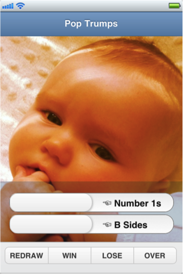 Figure 4.4. jQuery Mobile flip-toggle and grouped buttons
The
Figure 4.4. jQuery Mobile flip-toggle and grouped buttons
The controlgroup value has a no-less-striking effect in the interface, which it achieves using CSS alone (no DOM manipulation). By itself, the controlgroup value draws the links together and applies rounded corners to the first and last elements in the group. If you also add data-type=”horizontal” to the div containing the controlgroup value, as we’ve done in the preceding markup, the grouped buttons display in a row as you’d expect.
And our last data attribute is data-direction=”reverse”, which works with our transitions by reversing them. For example, where the default behavior is for a view to move in from the right of the screen, our data-direction attribute causes it to go out toward the right. When controlled, it provides the user with a strong sense of movement within the application. It doesn’t simply shift along an apparently endless series of views; rather, it moves around a series of pages like moving through chapters in a book:
<a href="#album" data-role="button" data-direction="reverse"

➥id="continue">CONTINUE</a>
And speaking of moving through chapters, we’ve reached the point where we can start talking about writing our jQuery Mobile code. Well, almost. Before we talk about the code we’ll write, we need to cover one more piece of code that runs without us doing anything: the
mobileinit event. jQuery Mobile’s default transformations and styling are so good you’ll have little need to apply any changes, but for those rare times when they are required, you can leverage the mobileinit event—it allows you to extend or configure options as soon as the event fires.
This means you won’t need to overcome defaults—you can change settings before they’re applied, and there’s no need to wait for the DOM to load. So you won’t have to wait for $(document).ready() to take effect, nor document.loaded.
As a result, it’s recommended you reference your own local script files after referencing the jQuery library, as normal, and before referencing Mobile, like so:
<script src="https://code.jquery.com/jquery-1.7.1.min.js"></script>

<script src="../path/to/your/scripts.js"></script>

<script src="https://code.jquery.com/mobile/1.0/

➥jquery.mobile-1.0.min.js"></script>
So we have sorted our semantic HTML, our source files are all in place, and the
mobileinit event has fired. Let’s take a look at the code we’ve written to bring our game to life …
But that’s where we must leave our excerpt. As well as downloading this free sample chapter, you can also browse the Table of Contents and Index before you decide to buy jQuery: Novice to Ninja, 2nd edition – New Kicks and Tricks by Earle Castledine and Craig Sharkie.
Frequently Asked Questions (FAQs) about jQuery Mobile
What is jQuery Mobile and how does it differ from jQuery?
jQuery Mobile is a touch-optimized web framework, a part of the jQuery project, designed to simplify the process of designing websites and apps for smartphones and tablets. Unlike jQuery, which is a fast, small, and feature-rich JavaScript library, jQuery Mobile is specifically built to provide a unified, HTML5-based user interface system for all popular mobile device platforms.
How can I download and install jQuery Mobile?
You can download jQuery Mobile from the official website or from a CDN like cdnjs. After downloading, you can include it in your HTML file by adding the link to the jQuery Mobile CSS file in the head section and the link to the jQuery Mobile JavaScript file just before the closing body tag.
What are the new features in the latest version of jQuery Mobile?
The latest version of jQuery Mobile comes with several new features and improvements. These include enhanced theme framework, improved page transitions, and better touch event handling. It also includes numerous bug fixes and performance improvements.
How can I use jQuery Mobile to create a mobile app?
jQuery Mobile provides a simple way to create mobile apps. You can start by including the jQuery Mobile CSS and JavaScript files in your HTML file. Then, you can use the various jQuery Mobile widgets and events to create the user interface and functionality of your app.
What are some common issues faced when using jQuery Mobile and how can I solve them?
Some common issues faced when using jQuery Mobile include slow page transitions, difficulty in customizing themes, and compatibility issues with certain browsers. These issues can be solved by optimizing your code, using the jQuery Mobile ThemeRoller for theme customization, and testing your app on various browsers and devices.
How can I customize the look and feel of my app using jQuery Mobile?
jQuery Mobile provides a tool called ThemeRoller that allows you to customize the look and feel of your app. You can use it to create custom themes, change colors, and modify the style of various UI elements.
Can I use jQuery Mobile with other JavaScript libraries?
Yes, jQuery Mobile can be used with other JavaScript libraries. However, you need to ensure that there are no conflicts between the libraries. You can use the jQuery.noConflict() method to avoid conflicts.
How can I optimize the performance of my jQuery Mobile app?
You can optimize the performance of your jQuery Mobile app by minimizing the use of heavy animations, optimizing images, and reducing the number of DOM elements. You can also use tools like YSlow and Google PageSpeed Insights to analyze and improve your app’s performance.
What are some best practices for using jQuery Mobile?
Some best practices for using jQuery Mobile include using the latest version of the library, testing your app on various devices and browsers, optimizing your code for performance, and following the jQuery Mobile documentation and guidelines.
Where can I find resources and tutorials for learning jQuery Mobile?
You can find resources and tutorials for learning jQuery Mobile on the official jQuery Mobile website, online coding platforms like SitePoint, and various blogs and forums dedicated to jQuery and web development.
 Ricky Onsman
Ricky Onsman is a freelance web designer, developer, editor and writer. With a background in information and content services, he built his first website in 1994 for a disability information service and has been messing about on the Web ever since.