Incredible Web Designs that Resemble Posters

In recent years, a web design trend has emerged in which designers create web pages that resemble the layout of print posters. If you printed out a copy of the entire length of the web page, the printed version would look like it belonged on a wall. Some common elements in these poster-like web designs include long, eye-catching graphics that often stretch the entire length of the page and very readable text blocks that are located in order of importance down the page. Just like posters, these web pages include the most important information first, with additional less attention-grabbing information near the bottom. Each design starts out with bang in order to capture a visitor’s interest quickly, just like an effective poster does with passersby.
Below are some of the best examples of web pages that follow this poster design trend. Browse the list, get inspired, and if you ever decide to design a web page in this fashion, let us know!
We Came From Mars
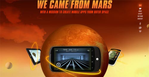
This amazing web page begins as if at Mars. Continue scrolling down the page to see a video, facts, links, and more until you reach Earth.
Prepare to Activate

This very clever site includes a zip line at the top of the page on which an illustrated character keeps sliding down. On the left side of the page is a man atop a tree stand that extends the length of the page.
Good Foot App
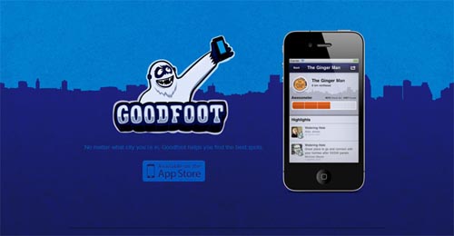
One of my favorites, this site is actually quite simple, like a minimalist poster. The background of the city line extends down the long page with text and images placed in order of importance.
Iutopi.com
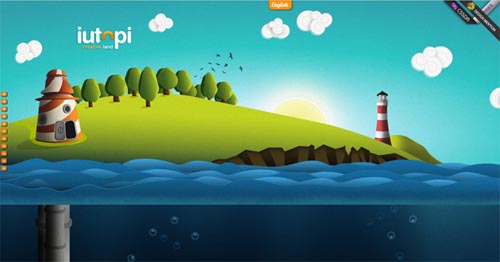
Scroll down this site to watch a lengthy illustration unfold. Unlike a poster, items in the illustration bob slightly as if they are really underwater.
Manufacture D’Essai
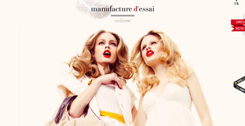
If printed out, this web page could be broken into several posters, each with its own message. The photos are simply gorgeous!
Elless
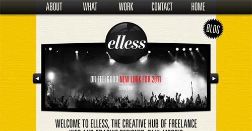
A beautiful design, this web page lists the items in the exact order of the header menu at the top. The ribbons of text are a very nice touch.
Deda
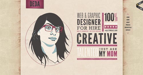
This creative design is not only beautiful but also very well-laid out. The information is easy to skim in a glance, just as with an effective poster.
Amanda Stevens
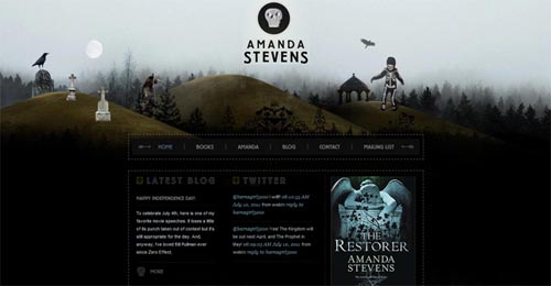
A headline that sits directly center top, information that is neatly contained in the center, and an intriguing image for the background makes for a very intriguing design. Did you notice the upside down trees at the bottom of the page?
Phase 2 Design Studio
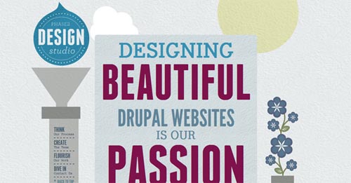
Follow the pipe line down the page to see beautiful illustrations and typography. The menu on the left side previews the content contained down the length of the page.
Full Stop
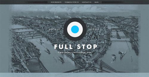
A very eye-catching illustration and logo capture attention at the top of the page. The rest of the information is neatly laid out in sections filled with large, easy-to-read text.
Frequently Asked Questions about Web Designs that Resemble Posters
What are the key elements to consider when designing a web page that resembles a poster?
When designing a web page that resembles a poster, there are several key elements to consider. Firstly, the layout is crucial. It should be clean and uncluttered, with a clear focal point. Secondly, typography plays a significant role. The fonts used should be legible and complement the overall design. Thirdly, color scheme is important. It should be visually appealing and align with the brand’s identity. Lastly, the use of images and graphics can enhance the overall look and feel of the web page. They should be high-quality and relevant to the content.
How can I make my web design stand out like a poster?
To make your web design stand out like a poster, you need to focus on creating a strong visual impact. This can be achieved by using bold colors, large and eye-catching typography, and striking images or graphics. Additionally, the use of whitespace can help to highlight key elements and make the design more readable. It’s also important to keep the design simple and uncluttered, as too many elements can distract the viewer and make the content difficult to digest.
What are some examples of web designs that resemble posters?
There are many examples of web designs that resemble posters. Some of these include the websites for Spotify, Airbnb, and Apple, which all use large, bold typography, striking images, and a clean, uncluttered layout to create a strong visual impact. Other examples include the websites for Nike and Adidas, which use a combination of bold colors, dynamic images, and large, eye-catching typography to create a design that stands out and grabs the viewer’s attention.
How can I create a web design that resembles a poster using Canva?
Canva is a great tool for creating web designs that resemble posters. It offers a wide range of templates, fonts, colors, and graphics that you can use to create a design that stands out. To start, choose a template that fits your brand and content. Then, customize it by adding your own images, text, and colors. You can also add elements like shapes, lines, and icons to enhance the design. Once you’re happy with your design, you can download it and use it on your website.
What are the benefits of designing a web page that resembles a poster?
Designing a web page that resembles a poster has several benefits. Firstly, it can help to create a strong visual impact, which can grab the viewer’s attention and make your website stand out. Secondly, it can help to simplify the content and make it easier to digest, as the design is typically clean and uncluttered. Lastly, it can help to enhance the overall user experience, as the design is often visually appealing and easy to navigate.
How can I print my web design that resembles a poster?
If you want to print your web design that resembles a poster, you’ll need to ensure that the design is high-resolution and suitable for print. This means that the images and graphics used should be at least 300 dpi. You’ll also need to consider the size of the poster and adjust the dimensions of your design accordingly. Once you’re happy with your design, you can save it as a PDF or JPEG and take it to a professional printer.
Can I use Adobe Express to create a web design that resembles a poster?
Yes, Adobe Express is a powerful tool that you can use to create a web design that resembles a poster. It offers a range of features, including templates, fonts, colors, and graphics, that you can use to create a design that stands out. To start, choose a template that fits your brand and content. Then, customize it by adding your own images, text, and colors. You can also add elements like shapes, lines, and icons to enhance the design.
What are some tips for designing a web page that resembles a poster?
When designing a web page that resembles a poster, there are several tips to keep in mind. Firstly, keep the design simple and uncluttered. Too many elements can distract the viewer and make the content difficult to digest. Secondly, use bold colors, large typography, and striking images to create a strong visual impact. Lastly, consider the user experience. The design should be easy to navigate and the content should be easy to read and understand.
Can I use Redbubble to create a web design that resembles a poster?
Redbubble is primarily a marketplace for artists to sell their designs on a variety of products, including posters. While it doesn’t offer the same design tools as Canva or Adobe Express, you can certainly find inspiration from the wide range of poster designs available on the site. If you’re an artist, you can also use Redbubble to sell your own poster designs.
How can I use typography effectively in a web design that resembles a poster?
Typography plays a crucial role in a web design that resembles a poster. It can help to create a strong visual impact and make the content easier to digest. To use typography effectively, choose a font that is legible and complements the overall design. Consider the size, weight, and spacing of the text. Large, bold typography can grab the viewer’s attention, while smaller, lighter text can be used for less important information. Also, ensure that there is enough contrast between the text and the background to ensure readability.
Tara Hornor has a degree in English and has found her niche writing about marketing, advertising, branding, graphic design, and desktop publishing. She is a Senior Editor for Creative Content Experts, a company that specializes in guest blogging and building backlinks. In addition to her writing career, Tara also enjoys spending time with her husband and two children.