For every action on the Web, there should be a reaction. Feedback might tell a user if the action was successful or not, but ideally it will tell them more, such as what to do next or why an action is taking so long.
You’ve probably experienced a situation where you’ve submitted a form. After clicking the submit button, nothing appears to happen. Was the form submitted? Perhaps the form submission failed.
It’s an excellent example of where feedback can remove any doubts or fear the user might experience. A simple progress indicator would resolve this issue. It would visually tell the user that the server has received the form and is actively processing it.
Not providing feedback can cause a lot of trouble. For instance, we submitted the form but didn’t get any feedback. The following scenarios are possible:
- Users refresh the page as they think the form submission failed. This scenario can lead to double data submissions, which impacts your data quality.
- Users seek alternative ways to contact you, such as Twitter, LinkedIn, or Facebook.
- Users submit data via other communication means, such as an email address they find on the website. Therefore, you have to manually process this data and follow up with the user via email.
- Users leave the website without completing the form submission.
As you can see, something as simple as displaying a progress indicator can save a lot of overhead for an organization. In the worst-case scenario of this example, you lose a potential client as they don’t wait for the form submission to complete.
This article explores the importance of feedback, common UI elements to provide feedback, and good and bad examples of feedback.
What is Feedback in UX Design?
A user interface responds to actions. This is what we define as feedback. Feedback is used to engage, explain, and remove fear or confusion, all of which improve user satisfaction.
Most feedback you encounter is visual for user interfaces. For games or other types of content, user feedback can take the form of auditory feedback. Let’s focus on visual feedback.
Visual feedback has three main goals, detailed below.
1. Signal responsiveness
It’s often not clear if an element is clickable. Buttons, therefore, implement visual feedback when you hover over them. Web designers use the CSS :hover selector to apply different styling when a user hovers a web element. We all know the example where the button color changes when you hover over it.
This form of feedback is essential to tell the user they can interact with the element. Without it, the user has to guess which elements allow engagement. But remember that users of touch devices my not be able to take advantage of hover effects.
2. Boost engagement
Feedback doesn’t just signal the outcome of an action. It can also guide a user. A visual effect draws the user’s attention to a particular UI element and encourages the user to click it. Therefore, you can use visual feedback to tell the user what to do next.
Let’s say you want to boost the number of users signing up for your newsletter. What about adding a small visual clue to the sign-up form? For instance, make the “Sign Up” button shake briefly to draw the user’s attention when the newsletter form is visual. It’s a simple yet effective technique to increase engagement.
3. Signal activity
Lastly, feedback is most helpful to tell the user something is happening. As mentioned in the web form example, a progress indicator tells the user the form submission has been received and is being processed by the server.
It’s the most crucial form of feedback! An action always requires reaction. A lack of feedback is the main source of confusion or fear for users interacting with applications. On top of that, feedback improves user experience by removing confusion.
What Are the Most Common Examples of Web Feedback?
Here’s a list of common web elements to provide feedback and their use.
Loading indicator or progress indicator: this element provides visual feedback telling the user that a process has started. The loading indicator holds the user’s attention if the process takes longer than one second. There’s no need for a loading indicator for processes below one second, as we still consider this as “real-time”.
Interactive form labels: interactive form labels immediately provide the user with feedback about their input. For instance, a password field must meet specific criteria.
If the entered password doesn’t meet the criteria, we immediately tell the user what’s wrong and visually signal this.
MailChimp’s sign-up form implements criteria that change color when they’re met. In this example, I forgot to include at least one special character for my password input.

(Source: MailChimp signup form)
Notification bell: one of the most widely adopted forms of feedback to boost engagement is a notification bell. Designers often pair a notification bell with a small circle that displays the number of unread notifications. Many websites opt for a shaking notification bell to draw the user’s attention.
Hover effect: most often, you see the hover effect for links and buttons. First of all, it signals that the UI element is clickable. However, it’s also essential for avoiding misclicks. Without a hover effect, users move their mouse towards the link and have to guess when they can click the link. With a hover effect, users know their mouse is on top of the element, and they can click the element as soon as they see the effect.
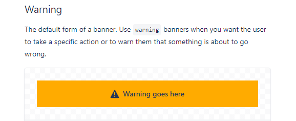
Toast message / banner / snack bars: these types of notifications allow you to share temporary messages that come and go without user input. Most often, they provide contextual information on an app’s processes.
You often see a warning message about certain functionality being maintenanced or temporarily unavailable. Some designers prefer them to organically pop up and disappear, whereas other designers prefer the user to discard them to make sure they’ve seen the message’s contents.

(Source: Atlassian.design)
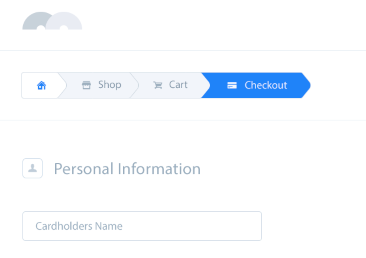
Breadcrumb navigation: breadcrumb navigation presents status information to users to let them know where they are in the process and which actions are still required. This type of feedback boosts engagement as the user knows exactly how many steps to expect.

Conclusion: Should We Focus on UX?
Providing a great user experience is key. User experience often drives sales. For instance, let the user know what step they’re on during the checkout process. Breadcrumbs are a great tool to provide quick feedback to the user.
Again, feedback helps to remove confusion or fear about how long the process will take. In the example pictured above, the user knows that they have to complete three steps to buy the product effectively. It provides mental peace.
This article has shown the importance of feedback and standard UI elements you can implement to provide user feedback. One of the most rudimentary UI elements of feedback is a progress indicator. It’s a great tool to remove any fear or confusion about a process.
Remember, you can use feedback in various ways. Besides signaling activity, you can boost engagement or signal responsiveness.
Frequently Asked Questions (FAQs) on Improving User Experience with Accurate User Feedback
What is the importance of user feedback in improving user experience?
User feedback is a critical component in enhancing user experience. It provides insights into what is working well about your product or service and what needs improvement. By understanding the users’ needs, preferences, and pain points, businesses can make informed decisions to improve their products or services. This not only leads to a better user experience but also fosters customer loyalty and drives business growth.
How can I effectively collect user feedback?
There are several methods to collect user feedback. These include surveys, feedback forms, user testing, social media monitoring, and direct interviews. The choice of method depends on your specific needs and the nature of your product or service. It’s important to ask clear, concise questions and ensure that the process is as easy and convenient as possible for the users.
How can I analyze user feedback?
Analyzing user feedback involves identifying common themes, patterns, and trends in the data. This can be done manually or using specialized software. The goal is to gain a deep understanding of the users’ needs, preferences, and pain points. This information can then be used to make informed decisions to improve the user experience.
How can I use user feedback to improve user experience?
User feedback can be used to identify areas of improvement in your product or service. This could be anything from fixing bugs and improving functionality to enhancing the overall design and usability. By addressing these issues, you can provide a better user experience and increase customer satisfaction.
What are some common mistakes to avoid when collecting user feedback?
Some common mistakes to avoid include asking leading or ambiguous questions, making the feedback process too complicated, and not acting on the feedback received. It’s important to ensure that the feedback process is as easy and convenient as possible for the users and that the feedback is used to make meaningful improvements.
How often should I collect user feedback?
The frequency of collecting user feedback depends on your specific needs and the nature of your product or service. However, it’s generally a good idea to collect feedback regularly to keep up with changing user needs and preferences.
How can I encourage users to provide feedback?
There are several ways to encourage users to provide feedback. These include offering incentives, making the feedback process easy and convenient, and showing appreciation for their input. It’s also important to show that you value their feedback and are using it to make improvements.
What is the role of user feedback in product development?
User feedback plays a crucial role in product development. It provides insights into what features users find useful, what needs improvement, and what new features they would like to see. This information can be used to guide the development process and ensure that the final product meets the users’ needs and expectations.
How can I ensure that the feedback I collect is representative of my user base?
To ensure that the feedback you collect is representative of your user base, it’s important to reach out to a diverse range of users. This includes users of different ages, genders, locations, and levels of experience with your product or service.
How can I use user feedback to drive business growth?
User feedback can be used to drive business growth by informing product development, marketing strategies, and customer service practices. By understanding and addressing the needs and preferences of your users, you can increase customer satisfaction, foster loyalty, and ultimately drive business growth.
Fullstack Blockchain Developer at TheLedger.be with a passion for the crypto atmosphere.


