Is Figma a Serious Option for Sketch Designers?

Key Takeaways
- Figma offers several unique features that set it apart from Sketch, including being an in-browser software, allowing multiple people to work on the same document simultaneously, offering strong typography tools, and built-in version control. It also makes collaboration easy by allowing clients and developers to view projects via a web browser.
- While Figma offers many unique features, Sketch holds a larger market share, has a wider pool of free tutorials and resources, and has the support of major tech companies. Sketch also offers a Symbol tool, which allows the creation of repeatable UI elements.
- The choice between Figma and Sketch depends largely on the specific needs of the designer or team. For cross-platform teams, Figma might be a good fit due to its browser-based nature. For solo designers, either option could work well. Figma and Sketch can also be used in conjunction for their best features.

If you follow design blogs, you might have seen the social buzz around ‘Figma’, a new UI Design program. Product designers in San Francisco have been raving about it and it’s not difficult to see the appeal. Figma takes the best of Sketch, adds a team-friendly workflow and drops the whole thing into your web browser (technically speaking, Chrome).
- But does it work?
- How does it compare to Sketch?
- Should your incorporate Figma into your workflow?
I put Figma through its paces and here’s what I came up with.
How is Figma different from Sketch?
1. Figma lives in your Browser (it’s a Chrome App)
Figma is an in-browser software, making it cross-platform. That means that as long as you have Google Chrome, you can use it on Mac, Windows, and even Linux.
2. Figma has a Multiplayer mode
Figma has a feature called multiplayer mode which allows multiple people to create on the same document at the same time in a live collaboration environment in a manner very similar to collaborating in Google Docs.
I’m not aware of another serious design tool with that level of collaboration.
Getting collaborative with @figmadesign ! #pivotallife pic.twitter.com/Jz7X9y1tOa
— Nicola Rushton (@nicola_rushton) October 23, 2016
3. Figma has Strong Typography Tools
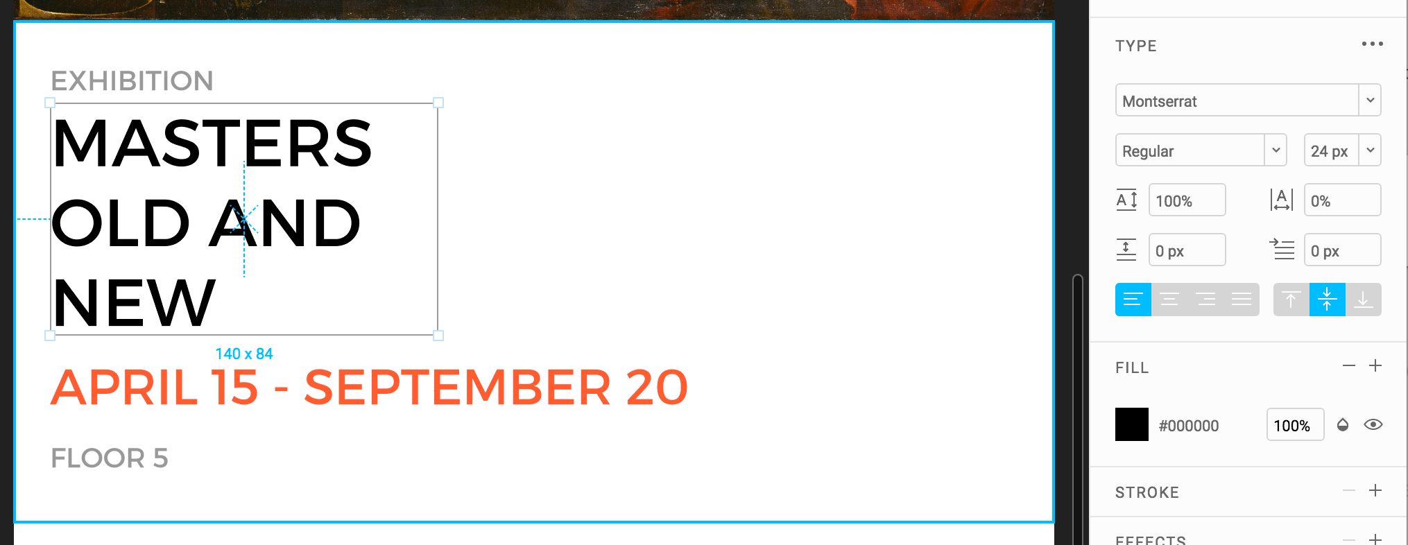
Figma’s typography tools are outstanding. With type features like paragraph spacing, first line indentation, and vertical alignment, they definitely got it right with this one. Sketch is notorious for bugs when using the type tool, but you don’t need to worry about them with Figma.
4. Figma has Re-imagined Vector Tools
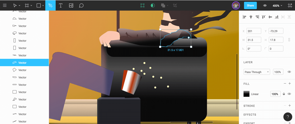
Figma has an amazing pen tool that allows you to easily create icons with overlapping vector points, which makes icon design a breeze.
5. Figma has Built-in Version Control
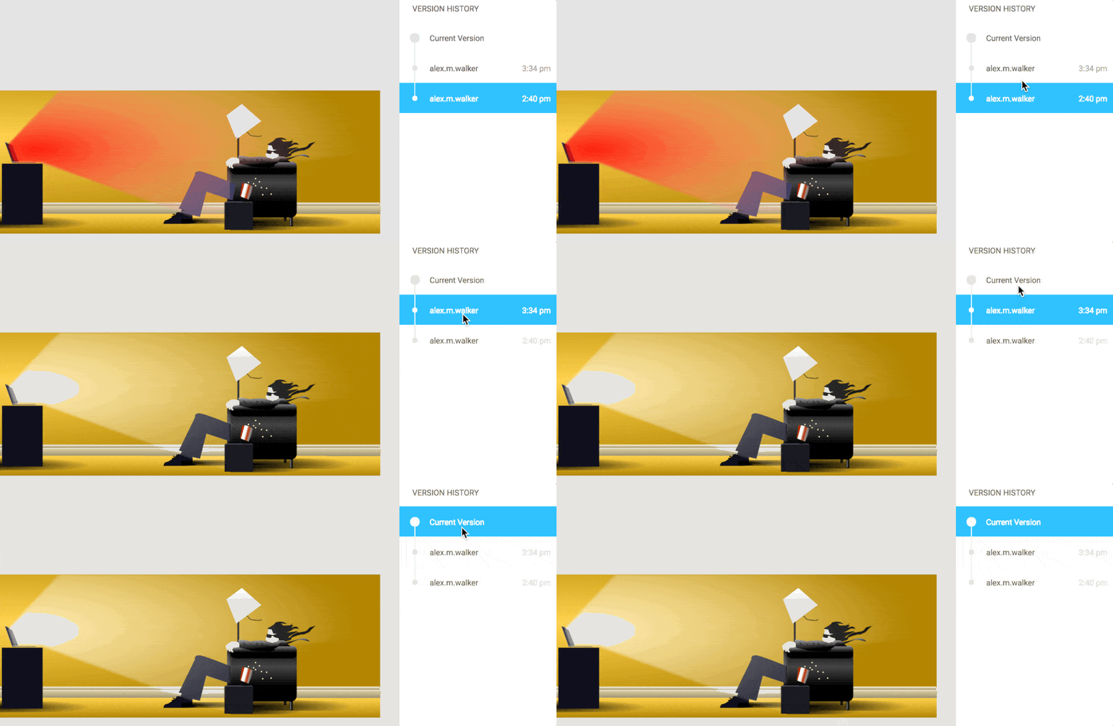
That’s right, Figma has a built-in version control system. Version history allows you to keep a history of all your design revisions. If you’ve ever used GIT for your code, you’ll be familiar with this concept.
6. Figma Imports Your Sketch Files (and SVGs)
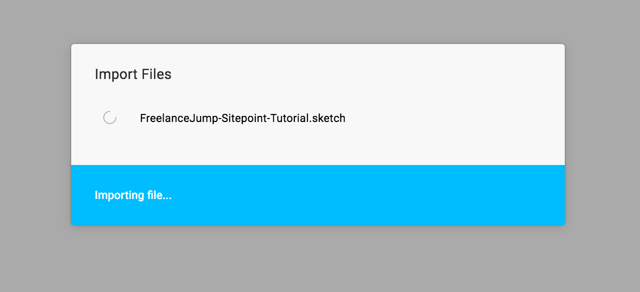
Figma makes it simple to instantly import your Sketch files and start editing the document right away. Simply drag in your Sketch file straight into Figma, and it will start the import process automatically.
7. Figma Makes Collaboration Easy
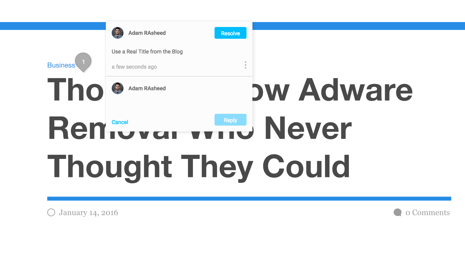
Figma is designed around the idea of easy and effective collaboration. If your design is in Figma, your clients and developers only need a web browser to view your project. A great feature that helps collaboration is the comments tool, which is similar to the comments system on Zeplin or InVision.
Developers and clients can comments on specific parts of the document, making project changes easy to manage. Figma brings this features in-house and natively allows people you’ve shared the document with easily create comments without having to sign up to anything.
What does Sketch have that Figma doesn’t?
1. Sketch has Market Share
Sketch has a much bigger market share for both individual designers and design teams, as well as the support of huge tech companies such as Apple, Google, and Facebook. That makes it less likely to disappear in a year or two.
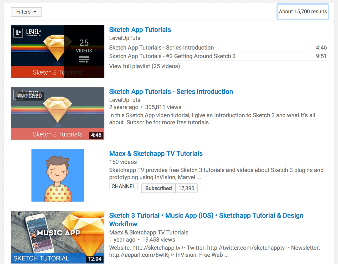
2. Sketch has a Larger Pool of Free Tutorials and Resource
There are a lot of Sketch tutorials on Youtube as well as complete courses available here on SitePoint Premium created by yours truly. Sketch also has a much larger community so you can reach out to other designers for help in Sketch. Figma is quite new for now, but I imagine a lot of designers creating ebooks and video tutorials in the coming months.
3. Sketch has Symbols
Sketch’s Symbol tool (my favorite feature in Sketch) allows you to create modular and repeatable UI elements saving you time and allowing for a much more unified design.
Comparing Costs
Sketch costs $99 with $99 per year for updates, and you get to keep it even if you don’t want to pay for updates.

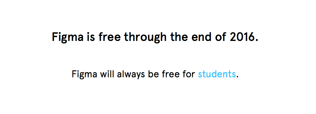
Figma, on the other hand, is free for the duration of 2016. The creators of Figma haven’t released its pricing yet, but will announce it before 2017. For students, however, Figma is and will always be free, while Sketch is available for students for $49.
Which should you choose?
There are multiple scenarios in a design environment. What software you should use depends on the situation you’re designing in.
Solo Designers
If you’re a solo designer who develops his/her own projects, either one is fine. I personally love Sketch, but I love trying out new programs that might make my life easier.
Designing in a Cross-Platform Teams
If you’re working on a UI project with other designers or developers who use windows or Linux, Figma might be a good fit. While there is some concern over whether Figma is ready for production projects, it’s definitely something you should try out Figma for a side project you’re collaborating on. All you need is Chrome.
Designing for Clients
If you’re freelancing for an agency, it’s usually best practice to follow their workflow, but if you’re designing for a client that’s not an agency or one that doesn’t have a specific workflow, it’s up to you to create an easy way to collaborate on the project you’re working on.
For this situation Figma makes a lot of sense as you can simply send your client a link where they can comment directly on your project without having to sign up for anything.
Adding Figma into an Existing Design Workflow
Trying out Figma doesn’t mean you need to abandon Sketch altogether. In fact, Figma has over 90% of the keyboard shortcuts as Sketch and UI is similar so you can quite easily jump into Figma and start using it right away.
However, there are some features available only Sketch (e.g. Symbols) that you can’t use Figma for. In that case, you can mix-and-match the two programs for their best features. For example, I use Figma for its superior vector tools to create killer icons and import them into sketch and continue my design there.
Conclusion

Figma is a promising new tool, and I’m looking forward to seeing how the market reacts to it on a larger scale. Figma’s vector tool make it really attractive to icon designers and a big plus for UI design.
Be sure to check out Figma before the end of the 2016 – while it’s free. Thanks for reading!
Frequently Asked Questions about Figma for Sketch Designers
How does Figma compare to Sketch in terms of collaboration?
Figma stands out in terms of real-time collaboration. Unlike Sketch, Figma allows multiple designers to work on the same design file simultaneously. This feature is particularly useful for teams working remotely, as it allows for instant feedback and seamless collaboration.
Can I use Figma offline like Sketch?
Unlike Sketch, Figma is primarily a web-based tool, which means you need an internet connection to use it. However, Figma does offer a desktop app that allows you to work offline, but you’ll need to open the files you want to work on while you’re still connected to the internet.
How does the pricing of Figma and Sketch compare?
Figma offers a free tier, which is a great option for individual designers or small teams. For larger teams or more advanced features, Figma’s pricing starts at $12 per editor per month. On the other hand, Sketch charges a flat fee of $99 for its software, with an optional $79 per year for updates.
Is it easy to switch from Sketch to Figma?
Yes, switching from Sketch to Figma is relatively straightforward. Figma allows you to import Sketch files directly, preserving most of the layers and design elements. However, there might be some minor adjustments needed due to the differences in the two platforms.
How does Figma handle vector networks compared to Sketch?
Figma uses a unique approach to vector networks, allowing designers to create complex shapes and paths without the need for multiple layers or shapes. This is different from Sketch, which uses a more traditional approach to vector design.
Does Figma offer a wide range of plugins like Sketch?
Yes, Figma has a growing community of developers creating useful plugins. While Sketch has a larger library of plugins due to its longer existence, Figma’s plugin ecosystem is rapidly growing and offers a wide range of tools.
How does Figma’s performance compare to Sketch?
As a web-based tool, Figma’s performance can depend on your internet connection. However, in general, users report that Figma performs well, even with complex designs. Sketch, being a native Mac app, can offer slightly better performance, especially on high-end Macs.
Can I use Figma on different operating systems?
Yes, one of Figma’s advantages over Sketch is its cross-platform compatibility. You can use Figma on any operating system that supports a modern web browser, including Windows, Mac, and Linux. Sketch, on the other hand, is only available for Mac.
Does Figma support prototyping?
Yes, Figma offers robust prototyping features. You can create interactive prototypes with transitions, overlays, and even micro-interactions. This is a significant advantage over Sketch, which requires third-party plugins for advanced prototyping.
How does the learning curve of Figma compare to Sketch?
Both Figma and Sketch have intuitive, user-friendly interfaces. However, some users find Figma’s interface slightly easier to navigate, especially for those new to design software. The real-time collaboration feature also makes it easier to learn from others in a team setting.
Adam Rasheed is a professional UX/UI designer, front-end developer, consultant and commercial photographer. A creative by heart, when Adam is not busy working he's learning a new skill most recently, it’s been hand-lettering and Sketch. In his spare time you'll find Adam exploring Orange County for the newest (and best) restaurants.

Published in
·Computing·Entrepreneur·Entrepreneurship·Low Code·Productivity·Productivity Tools·April 26, 2022


