
Iconography is a lost art. Illustration is super time-consuming, and there’s an abundance of resources out there already. So it’s not always worth reinventing the wheel. But we may need a specific art style, or the icon framework we’re using may not have the icon we want, so it’s worth diving into how illustration works in Figma a little bit. In this tutorial, we’ll learn how to draw and manipulate vectors in Figma as we create a heart-shaped icon to accompany the button.
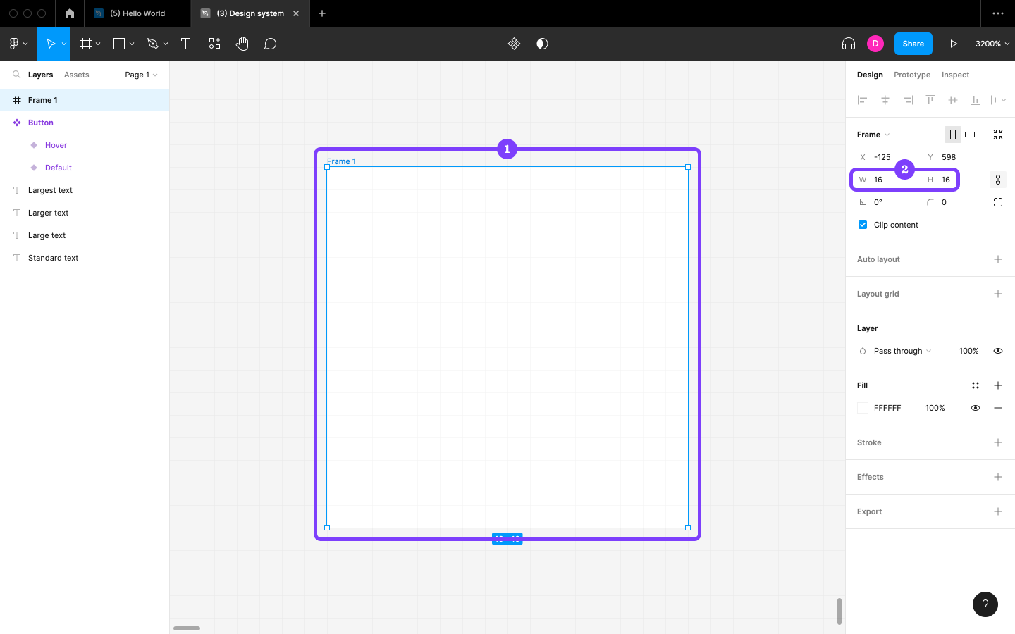
Start by creating a 16×16 Frame, which will be the bounding box for our icon. Paul Wilshaw explains why it’s best to use 16×16 in his write-up on icon design.
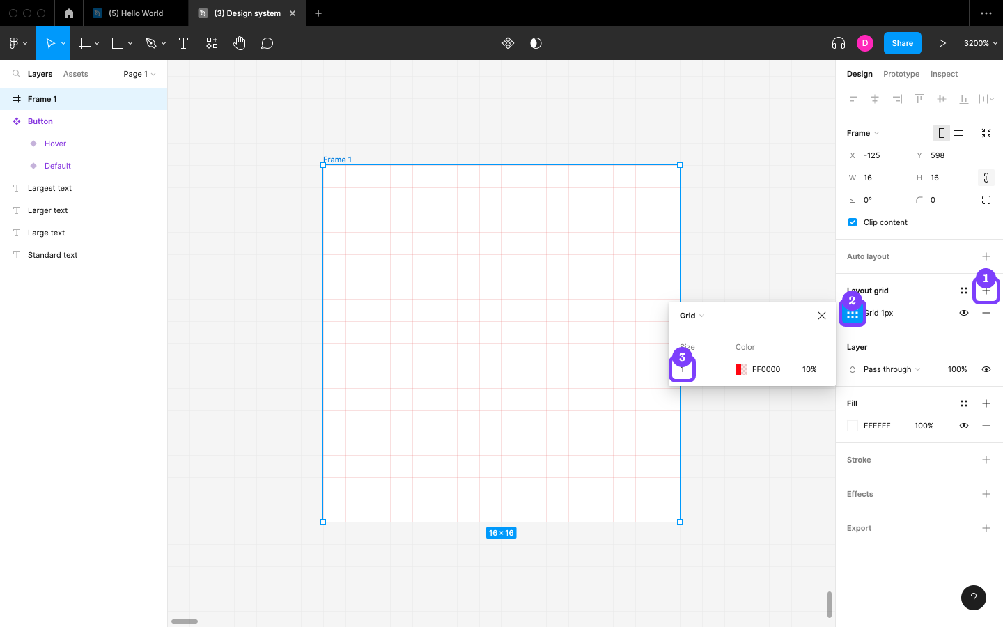
Next, click on the + icon next to “Layout grid” in the Design panel to add a Grid to the Frame, click on the “Layout grid settings” icon, and then change the “Size” to 1 to make the individual square pixels clearer. To ensure the icon displays clearly at most sizes and screen resolutions, the objective will be to align the icon with the grid lines as much as possible.
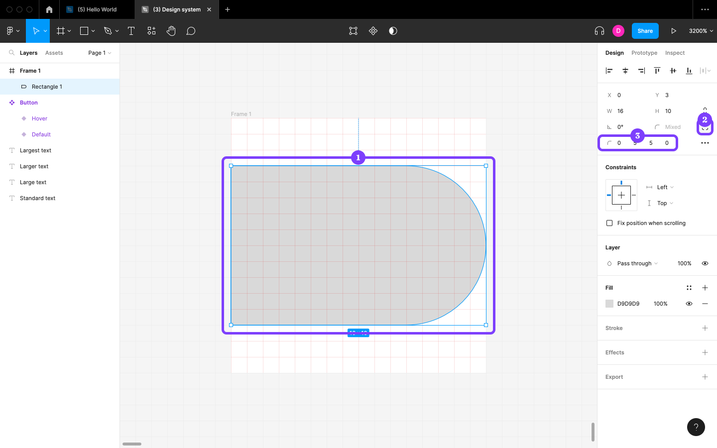
Now for the icon itself. Start by creating a Rectangle shape and specifying the “W” as 16 and “H” as 10, and then click on the “Independent corners” icon before specifying the corner radii as 0, 5, 5, and 0 in that order (that is, clockwise starting from the top-left corner).
Next, duplicate the Layer and change the “Rotation” to 90.
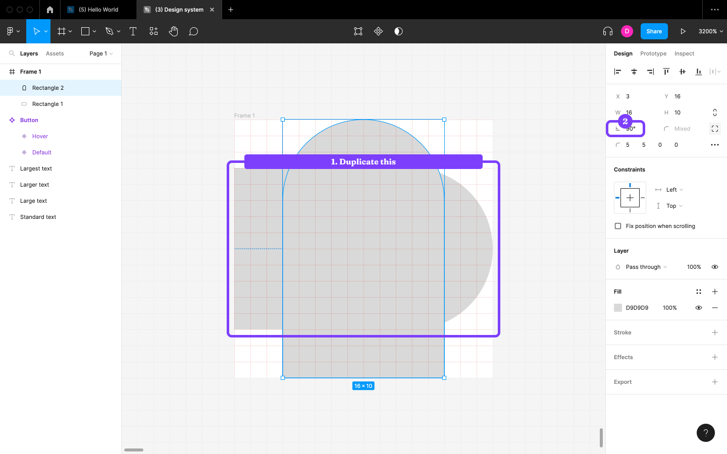
After that, snap the Layer to the left edge of the Frame and the other Layer to the bottom edge of the Frame, and then, with both Layers selected, click on the “Union selection” icon in the horizontal toolbar to fuse the Layers into a single Layer.
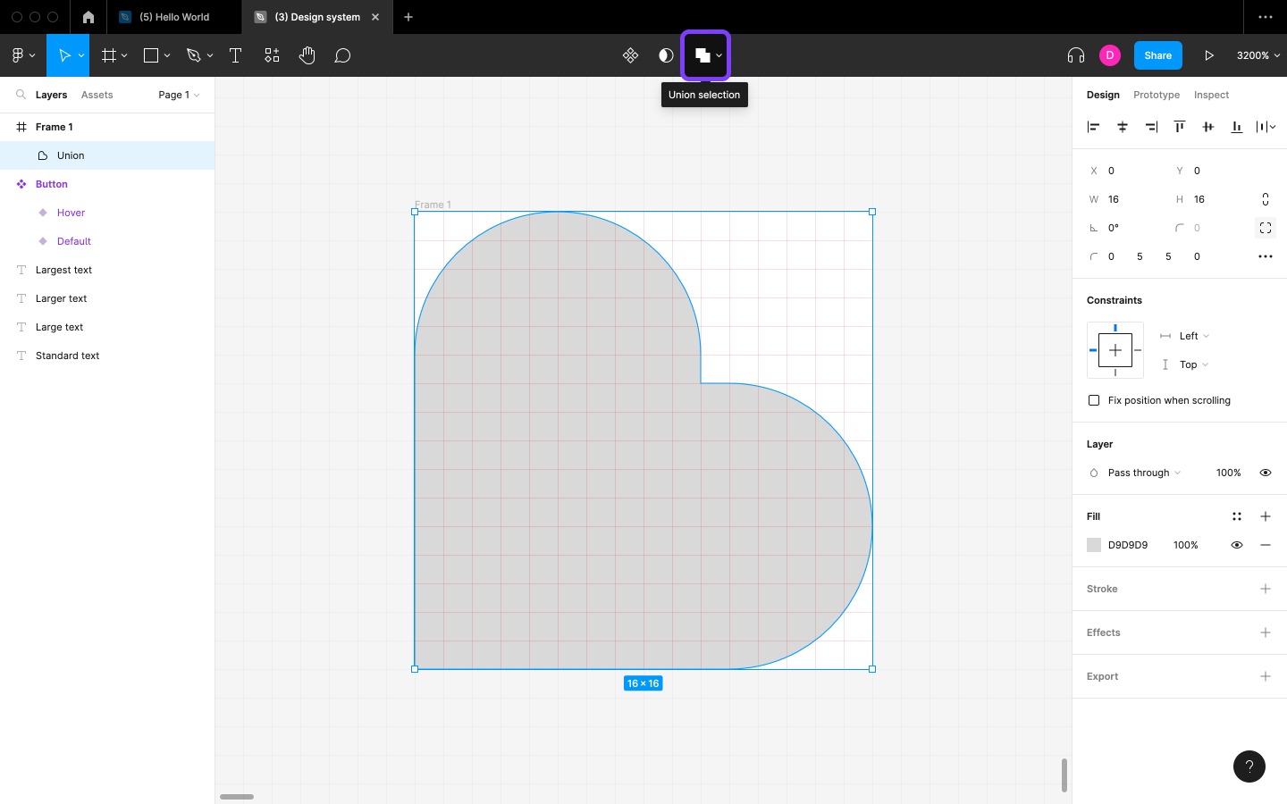
Change the “Rotation” to 45—and that’s the heart shape done.
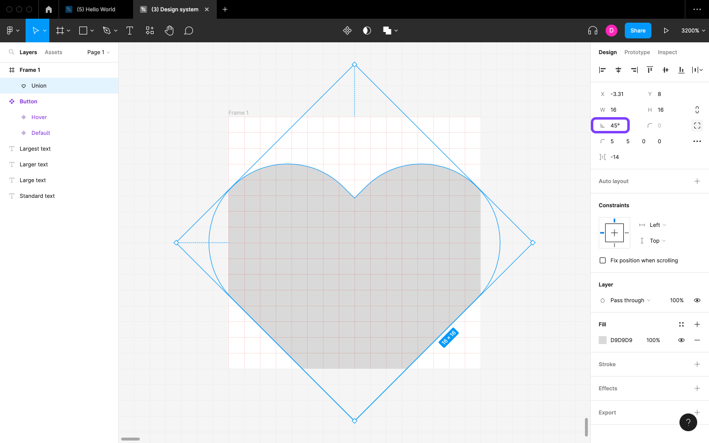
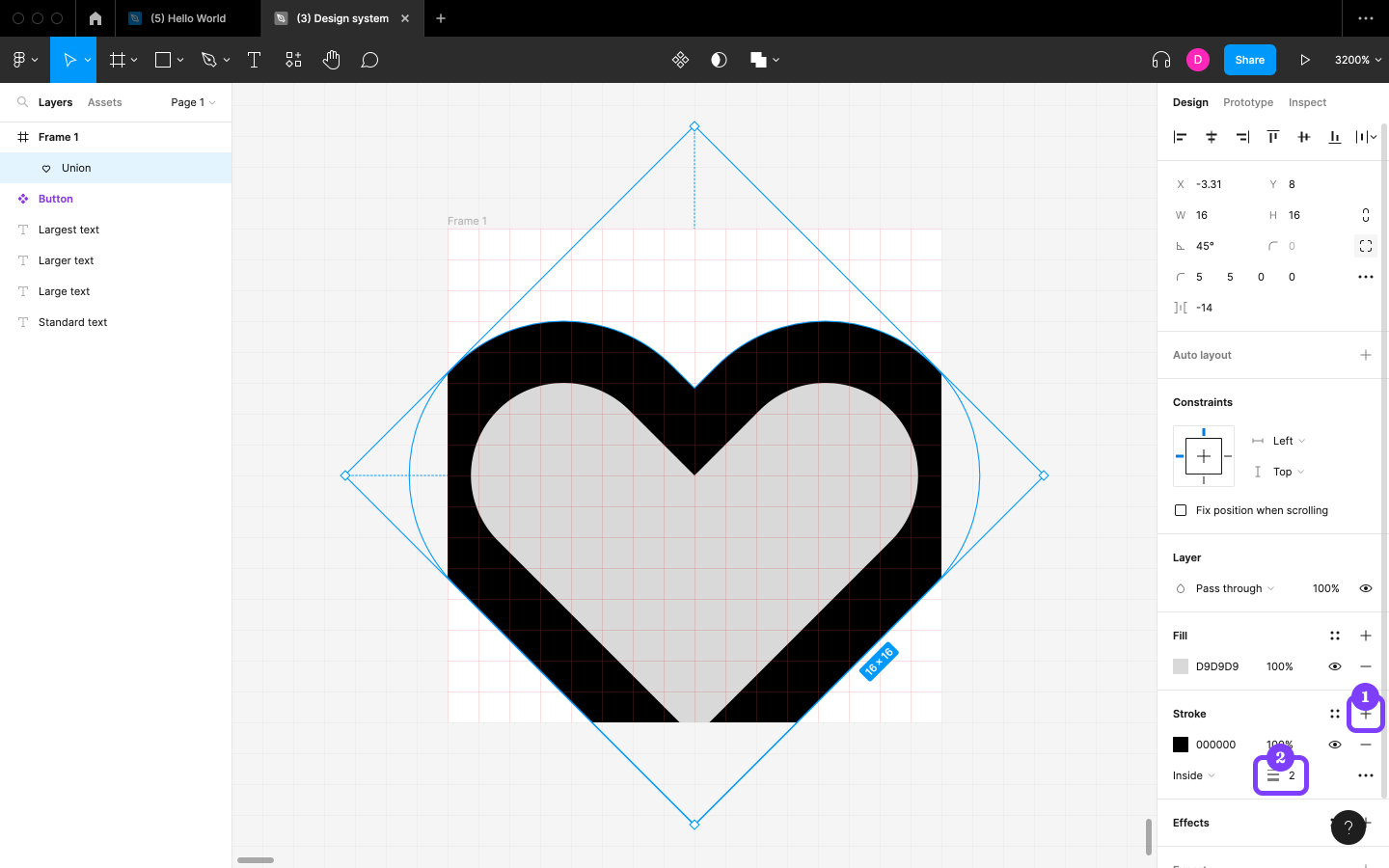
Before we make the heart shape fit into the Frame, add a Stroke (border) by clicking on the + icon next to “Stroke” in the Design panel, choosing 2 for the “Stroke width”. Later on, this will offer us the opportunity to use outlined icons as well as filled icons.
Note: to display icons at a different size, it’s best to scale them rather than resize them. The difference is that the Scale tool—under the “Move tools” icon in the horizontal toolbar (K)—also scales sizes such as Stroke width proportionally, whereas resizing doesn’t affect sizes such as Stroke width.
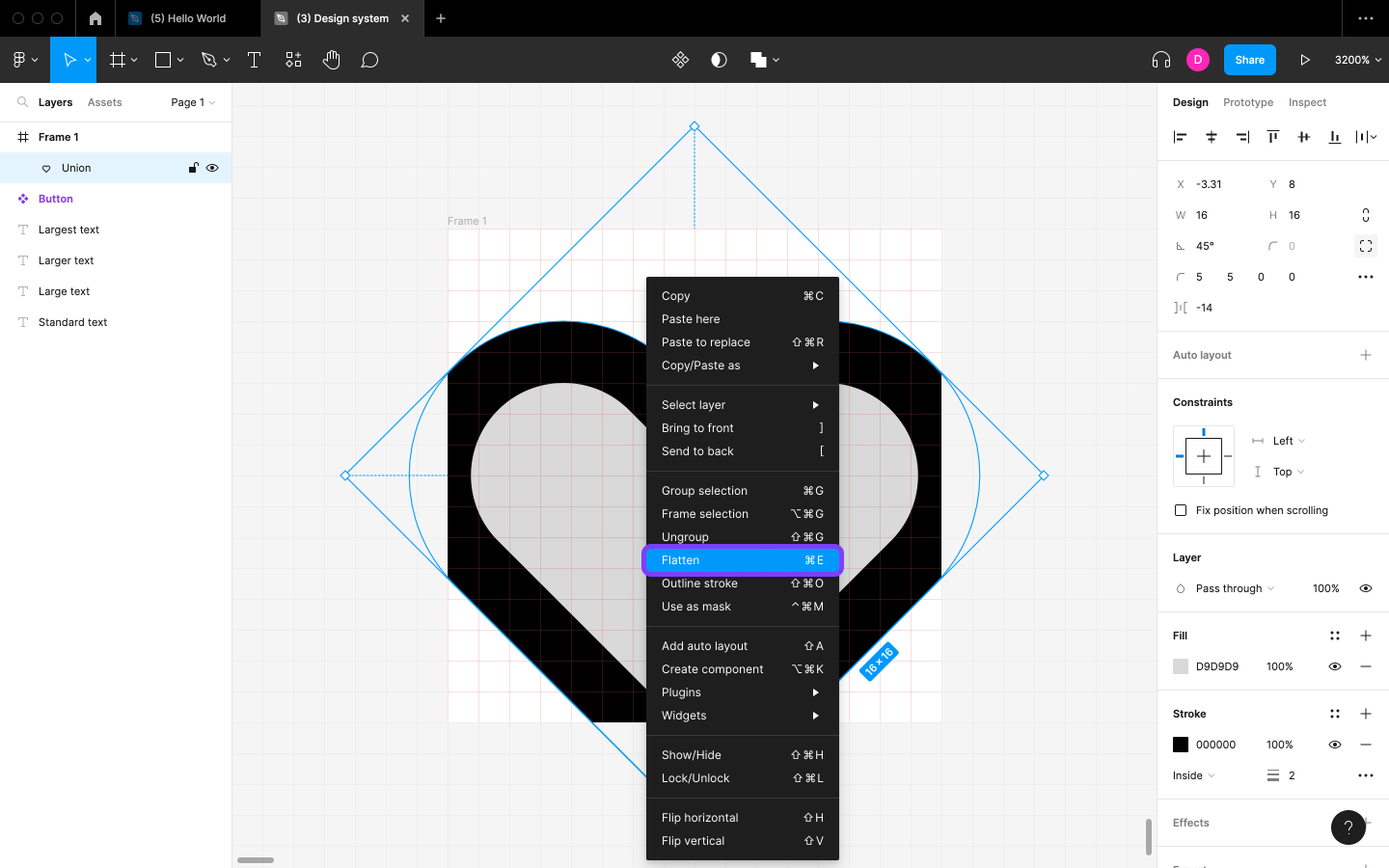
Next, right-click on the icon, and then choose Flatten (command + E / ctrl + E). We’ll see that, while the Rotation is no longer in effect, the Layer remains how we set it, which means that we can now resize it horizontally and vertically instead of diagonally (which yields an odd effect).
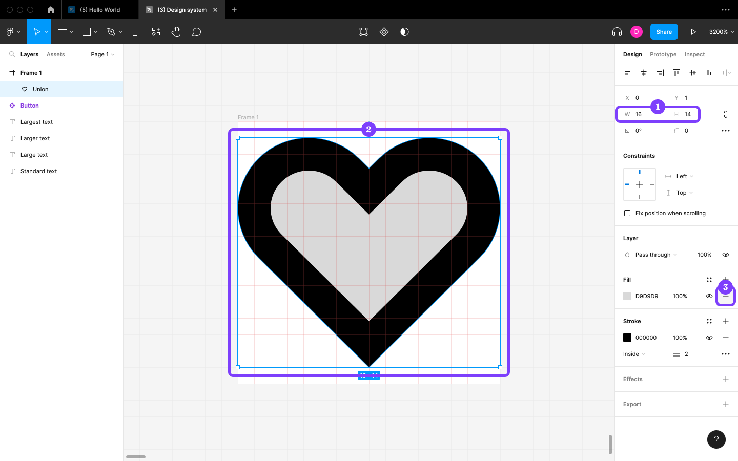
After that, click on the “Constrain proportions” icon in the Design panel, set the largest dimension (which should be “W”) to 16, click on the “Constrain proportions” icon once more (so that the dimensions are no longer constrained), round the “H” down to 14 (so that the icon only fills full pixels), drag-snap it into the center of the Frame, and then click on the — icon in the Fill section to remove the Fill.
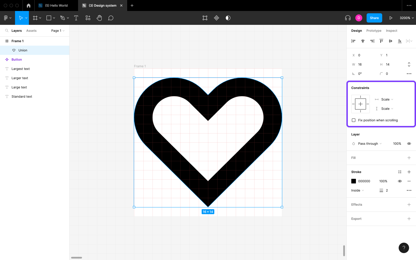
When designing icons, we should try to use all available Frame space so that multiple icons can be aligned horizontally or vertically if needed. However, this isn’t always feasible, so it’s okay to resize icons slightly when necessary. Doing so doesn’t affect Stroke width, so we won’t need to worry about them looking inconsistent. To ensure that an icon scales with a Frame when we resize the Frame, change the “Left” and “Top” to “Scale” in the Design panel (in the Constraints section).
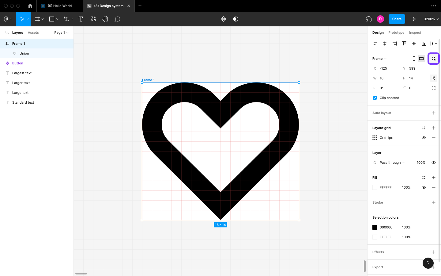
Finally, select the Frame and then click on the “Resize to fit” icon to trim the negative space, thus resizing the Frame.
We now have complete icon! We can also try our hand at drawing from scratch and/or using shapes and editing them. However, it does require quite a bit of skill and time to learn. Icon design itself is also very time-consuming, especially when there are so many free design resources out there. Figma has a video tutorial that walks us through this, but the Font Awesome plugin is probably the best solution for implementing icons today.
This article is a short extract from The Designer’s Guide to Figma, available on SitePoint Premium.
Frequently Asked Questions (FAQs) on Creating Custom Button Icons in Figma
How Can I Create a Custom Button Icon in Figma from Scratch?
Creating a custom button icon in Figma from scratch involves several steps. First, you need to open a new file in Figma. Then, select the ‘Shape’ tool from the toolbar and draw a rectangle on the canvas. This will serve as your button. You can adjust the size, color, and border radius of the rectangle to suit your design. Next, select the ‘Text’ tool and type your button text. Adjust the font, size, and color as needed. To create the icon, you can either draw it using the ‘Pen’ or ‘Shape’ tools, or import an SVG file. Once the icon is created, position it on the button. Finally, group the button and the icon together by selecting both and clicking ‘Group Selection’ in the right-click menu.
Can I Use SVG Files for My Button Icons in Figma?
Yes, you can use SVG files for your button icons in Figma. To do this, simply import the SVG file into your Figma project. Once imported, you can resize, recolor, and reposition the SVG icon as needed. This is a great way to use pre-made icons in your designs, saving you time and ensuring a professional look.
How Can I Make My Button Icons Responsive in Figma?
To make your button icons responsive in Figma, you need to use ‘Auto Layout’. This feature allows your buttons to resize automatically based on the content inside them. To apply Auto Layout, select your button and icon group, then click the ‘+’ button next to ‘Auto Layout’ in the right-hand panel. You can then adjust the padding and spacing as needed.
How Can I Create a Hover Effect for My Button Icons in Figma?
Creating a hover effect for your button icons in Figma involves using the ‘Prototype’ feature. First, duplicate your button and make the necessary design changes for the hover state. Then, select the original button, go to the ‘Prototype’ tab, and create an interaction. Set the trigger to ‘On Hover’, the action to ‘Navigate To’, and the destination to the hover state button.
Can I Create Animated Button Icons in Figma?
Yes, you can create animated button icons in Figma using the ‘Smart Animate’ feature. This allows you to animate changes between different states of your button. To do this, create different versions of your button with the changes you want to animate. Then, use the ‘Prototype’ feature to create an interaction between the different states, and set the animation to ‘Smart Animate’.
How Can I Share My Custom Button Icons with My Team in Figma?
Sharing your custom button icons with your team in Figma is straightforward. You can invite team members to your Figma file by clicking the ‘Share’ button in the top-right corner and entering their email addresses. They will then be able to view, comment on, and edit the file based on the permissions you set.
Can I Use My Custom Button Icons in Other Figma Projects?
Yes, you can use your custom button icons in other Figma projects by creating a ‘Component’. To do this, select your button icon group and click the ‘Create Component’ button in the right-hand panel. You can then use the ‘Assets’ panel to access and use this component in other Figma files.
How Can I Create a Library of Custom Button Icons in Figma?
To create a library of custom button icons in Figma, you need to create components for each button icon and publish them to a team library. To do this, select each button icon group and click ‘Create Component’. Then, go to the ‘Assets’ panel, click the ‘Team Library’ button, and publish your components. Your team can then access and use these button icons in their designs.
Can I Export My Custom Button Icons from Figma?
Yes, you can export your custom button icons from Figma. To do this, select the button icon you want to export, go to the ‘Export’ panel in the right-hand sidebar, and choose your desired export settings. You can export your icons as SVG, PNG, JPG, or PDF files.
How Can I Improve the Accessibility of My Button Icons in Figma?
Improving the accessibility of your button icons in Figma involves several steps. First, ensure your icons are clear and recognizable. Second, use contrasting colors for your buttons and icons to ensure they are visible to all users. Third, consider adding tooltips or labels to your buttons to provide additional context. Finally, test your designs with a variety of users to ensure they are accessible and user-friendly.
 Daniel Schwarz
Previously, design blog editor at Toptal and SitePoint. Now Daniel advocates for better UX design alongside industry leaders such as Adobe, InVision, Marvel, Wix, Net Magazine, LogRocket, CSS-Tricks, and more.