Creating Forms with the Webix Framework — 4 Practical Examples
This article was peer reviewed by Simon Codrington and Mallory van Achterberg. Thanks to all of SitePoint’s peer reviewers for making SitePoint content the best it can be!
As a web designer, the chances are that you have to create web forms on a fairly regular basis. This is often a thankless task and one fraught with headaches (especially if you’re doing something more complex, such as creating a multi-step form). In such cases it can be better to use a UI framework to ease the pain and to speed the development process. In this article I’ll outline various tips and tricks that let you create different types of forms quickly and with minimum hassle using the Webix framework.
Key Takeaways
- Simplicity and Speed: Utilizing the Webix JavaScript UI library significantly simplifies the process of form creation, allowing for rapid development and integration of complex forms such as multi-step and multi-tab forms.
- Versatility in Form Creation: Webix offers a variety of form elements and configurations, including simple forms, forms with multiple selection options, and innovative uses of widgets like the Tree Widget within forms.
- Customization and Flexibility: The framework supports extensive customization options, including creating custom skins and using a visual designer tool for drag-and-drop UI creation, catering to specific design requirements.
- Advanced Features: Webix provides advanced functionalities like multi-combo selection and suggestions, enhancing the user interface and experience of forms.
- Integration and Compatibility: The framework is compatible with various methods of inclusion in projects, supports major browsers and devices, and can be used alongside other JavaScript frameworks, making it adaptable to diverse development environments.
What is Webix?
Webix is JavaScript UI library of HTML5 components that facilitates the creation of mobile and desktop web apps. It provides you with a wide variety of components from a simple button to the SpreadSheet Widget that can be used for developing Excel-like applications. Besides the UI components collection, there’s an event handling mechanism, offline mode support, and a bunch of development tools. You can also create your own skins using the skin builder, use visual designer for drag-and-drop UI creation and play with the code in online source code playground. The project also has exhaustive documentation.
I’ve already written an introductory article that describes the key features and basics of using this framework, so feel free to give that a look beforehand if you’re interested.
Including Webix
There are a variety of ways in which you can include the required JavaScript and CSS files in your project. If you download the library package, you’ll find these files within the codebase folder. You can include them as follows:
<link rel="stylesheet" href="./codebase/webix.css">
<script src="./codebase/webix.js"></script>
Alternatively you can use CDN:
<link rel="stylesheet" href="http://cdn.webix.com/edge/webix.css">
<script src="http://cdn.webix.com/edge/webix.js"></script>
You can also use NuGet:
nuget install Webix
Whereby if you use Microsoft Visual Studio, execute this from Package Manager Console:
install-package Webix
Or try Bower:
bower install webix
Creating a Simple Form
Now, with the libraries in place, let’s see how the Webix Form Widget works.
webix.ui({
  view: "form",
  id: "myForm",
  container: "areaA",
  width: 350,
  elements: [
    { // first form component },
    { // second form component},
    { // n-th form component */}
  ]
});
We start off by calling the ui method of the webix object and passing it various parameters to configure its output.
- The
viewproperty dictates the kind of element created (here we are creating a form, but this could also be a menu or a chart). - The
idproperty assigns an ID to the form, through which you can later reference it. - The
containerproperty specifies the ID of the HTML element into which the form should be rendered. - The
widthproperty is used to set the width of the form element. Webix assumes that you want to use pixels as a unit of measurement here, so you just need to set a proper number. - The
elementsproperty is an array of components that your form will contain. You can use any appropriate component within the form: text field, radio button, checkbox, buttons, etc.
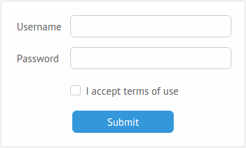
Let’s create a simple login form. We’ll need two text fields (one for username and one for the password), one checkbox, and, of course, a submit button.
webix.ui({
  ...
  elements: [
    { view: "text", label: "Username", name: "username" },
    { view: "text", label: "Password", name: "password", type: "password" },
    { view: "checkbox", labelRight: "I accept the terms of use", name: "accept" },
    { view: "button", value: "Submit", width: 150, align: "center", click: submit }
  ]
});
Note that we are specifying name attributes for our form elements and setting type: "password" for our password field, so as to mask the characters as they are entered. Setting an element’s label property defines a label for that element and we can use an element’s click property to define an event handler that will be called when the form is submitted. Although it is nice to have the possibility of checking that everything is ok with the data, don’t forget that client-side validation should only ever supplement server-side validation.
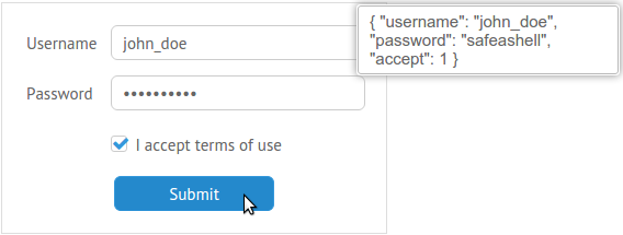
Before we can run this demo, we’ll need to define this event handler. Here I’m using Webix Message Box to give the user feedback as to what was entered:
function submit(){
  webix.message(JSON.stringify($$("myForm").getValues(), null, 2));
}
This code uses the Webix getValues method to derive the inserted data from the form with an ID of myForm and then converts it to a JSON string using JSON.stringify().
Well, everything is ready, and we can check the result:
After you insert some data and hit the Submit button you’ll get the message:
Here’s the demo:
See the Pen NNBgWm by SitePoint (@SitePoint) on CodePen.
Seems like everything works well. Now, let’s add something more interesting.
Multiple Selection and Suggestions
Different form controls allow you to select multiple items or use suggestions. As for me, the most interesting of them is the Multicombo. This is a control that lets you choose multiple values for a input field via a simple, but intuitive interface.
Note: A recent Webix release (26th April, 2016) saw a change to how the Multicombo control works. It is now available in the Webix Pro version only (a paid product).
Imagine that you want to create a page that will help a developer to generate a CV. It could contain the following fields:
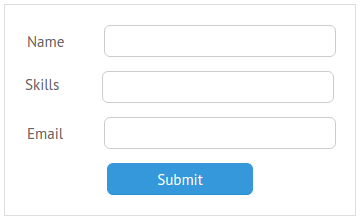
Since you expect that your user will know more than one programming language, you can compose a list of such languages and use the multicombo component to present them. Here’s an example of what that might look like:
var languages = [
  {id: 1, lang: "JavaScript"},
  {id: 2, lang: "PHP"},
  {id: 3, lang: "Ruby"}
  ...
]

webix.ui({
  ...
  elements: [
    {
      view: "multicombo", name: "skills", label: "Skills", button: true,
      suggest: {
        body: {
          data: languages,
          template: webix.template("#lang#")
        }
      },
    }
  ]
});
In addition to the familiar properties, here we’re using the button property and the suggest property. The button property creates a button to confirm the selection, whereas the suggest property defines the source of the items to be displayed in the multicombo. In our example, we are using the data property to specify the name of the array as well as a template property to specify the value to display. It would also be possible to set the path to a file (e.g. suggest: "path/to/file/data.js"), doing t as above is the better option if you want to extract different arrays of data from a big source.
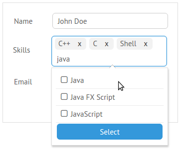
Let’s check how it works. After you click the text field, the drop-down list will appear:
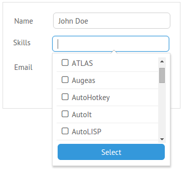
You can either scroll it and select the items you want, or start typing to narrow down the suggestions:
This particular example form will return a bunch of ID’s that match the selected items:
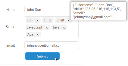
Here’s the demo for this example.
As an alternative to multicombo, you can check the Gridsuggest and Dataview Suggest components.
Using a Tree Widget as a Form Element
Webix doesn’t limit you to conventional form elements such as text fields, buttons, and checkboxes. You can place any widget you like within your form. Let’s take a look at the Tree Widget, for example. It wasn’t initially designed as a form control, that’s why there’s no setValue and getValue methods available for this element. But these methods are required if we want to be able to return or set values for this component. So, what can we do? Luckily, there’s the protoUI method that can help us. It allows the creation of new views on the basis of the existing ones.
Let’s try it:
webix.protoUI({
  name: "formTree",
  setValue: function(id){ this.select(id); },
  getValue: function(){ return this.getChecked(); }
}, webix.ui.tree);
In the above code we’re creating a new view called formTree. We’re then defining two new methods that allow us set and get its id values. Finally, we’re using the Tree widget as a basis for this new view.
Now let’s create some data:
var treedata = [
  { id: "1", value: "Web", data: [
    { id: "1.1", value: "HTML" },
    { id: "1.2", value: "CSS" },
    ...
  ]},
  { id:"2", value:"Scripting", data: [
    { id: "2.1", value: "Shell" },
    ...
  ]},
  ...
];
You can add your new element to the form as you normally would:
webix.ui({
  ...
  elements: [
    {
      view: "formTree",
      name: "skills",
      data: treedata,
      height: 150,
      threeState: true,
      template: "{common.icon()} { common.checkbox() }   #value#"
    },
    ...
  ]
});
We’re introducing a couple of new properties here: the template property adds checkboxes to the tree nodes and the threeState property enables 3-state checkboxes. These are checkboxes where:
- when the user checks/unchecks a parent node, the parent node and all its child nodes (of each level of nesting) are checked/unchecked.
- when the user checks/unchecks a child node, only the individual child node is checked/unchecked.
If you use 3-state checkboxes, you should pay attention to one little issue. When you select a checkbox, Webix re-renders the tree. If you decide to use your keyboard to fill the form, when you push Space to toggle a checkbox’s selection (in the case of WebKit-based browsers such as Chrome) it may lead to the loss of focus and you’ll have start tabbing from the very beginning of the form.
Happily, there is a workaround for this. You can use the on property to attach a new handler to a tree. We’ll use it along with the onItemCheck event that fires when you select the particular tree item. Using some additional methods, we can keep the focus safe:
on: {
  onItemCheck: function(id){
  var node = this.getItemNode(id);
    if(node){
      checkbox = node.getElementsByTagName("input")[0];
      checkbox.focus();
    }
  }
}
This should work. But here’s the other problem: WebKit doesn’t mark checkboxes while tabbing. To counteract this, you can use some CSS code to add an outline or box shadow to the focused checkboxes. Here’s an example:
input[type=checkbox]:focus { outline: -webkit-focus-ring-color auto 5px; }
With all of this in place, we can click the Submit button to check if our handmade methods work:
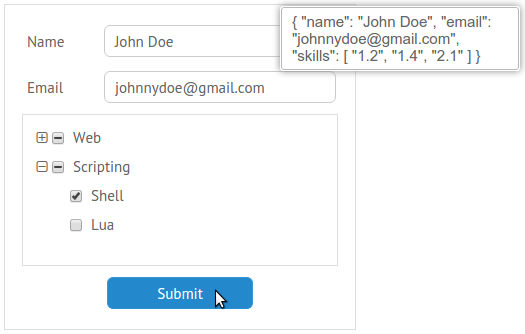
Yep, the IDs were successfully submitted.
You can check this form here:
See the Pen aNjyJR by SitePoint (@SitePoint) on CodePen.
Multi-tab and Multi-step Forms
If you plan to gather a large amount of data from a user, you can separate your form into small parts. Let’s take a look at two possibilities: a form that consists of multiple tabs and a form that allows the insertion of data step by step.
Tabview Component
The Tabview component creates a collection of elements separated into tabs, which the user can switch between. You can use either a single element as the Tabview content or define a combination of rows and columns that contains the elements you desire.
Here’s an example:
webix.ui({
  ...
  elements: [{
    view:"tabview",
    cells: [
      {
        header:"First tab label",
        body: {
          // first tab content
        }
      },
      {
        header:"Second tab label",
        body: {
          rows:[
            { // first row content },
            { // second row content }
          ]
        }
      },
      ...
    ]
  }]
  ...
});
The main idea behind this approach is to compartmentalize the form (thus making it more manageable for your user). However, you should remember that the components relating to the whole form (e.g. the submit button or “I accept” checkbox) should be placed outside of the tabview component.
For example:
webix.ui({
  ...
  elements: [{
    view:"tabview",
    cells: [
      {
        // 1st tab header and content
      },
      {
        // 2nd tab header and content
      },
      {
       view:"button",
       value: "Submit",
       width: 150,
       align:"center",
       click:submit
      }
    ]
  }]
  ...
});
That’s all you need to create a tabbed form. You can check the result below:
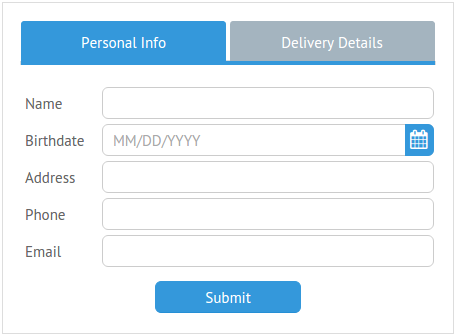
An added advantage to this approach is that there’s no need to add any extra code to make these parts work as one. Just put the tabview component within your form, add the name property to every field and you’ll be able to get all of the inserted values. Clicking the Submit button confirms it:
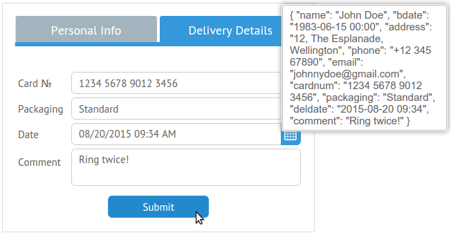
Looks a little bit messy but yet it’s our data.
Keyboard Accessibility
If your intention is to use a big number of tabs and you want to use the Tab key to switch between them, you can use buttons within the tab bar. This approach allows us to add the tabs to the tab navigation order. All you need to do is to change the header property:
header: "<button class='webixbutton'>Personal Info</button>"
You should add some CSS code to make these buttons look native:
.webix_item_tab .webixbutton{
  background-color:transparent;
}
.webix_item_tab.webix_selected .webixbutton:focus{
  background-color:#268fd5;
}
.webix_item_tab .webixbutton:focus{
  background-color:#98abb7;
}
In the following demo we’ll also be using a date picker. We’ll need to make sure it appears when a user hits the Return, as although the user cannot (currently) interact with it via the keyboard, it does provide a helpful visual aid.
One way to accomplish this would be by using the hotkey property. But here’s something you should realise. This property works without any trouble if you want to bind a key to a single page element. But there are two datepickers in our form. Thus, you should use the addHotKey method to create a new handler that works with all of your datepickers:
webix.UIManager.addHotKey("enter", function(view){
  view.getPopup().show(view.getInputNode());
}, "datepicker");
You can see all of this working together in the following demo:
See the Pen ZWjJMj by SitePoint (@SitePoint) on CodePen.
As an alternative, you can use Accordion for this task.
Multiview Component
The Multiview component allows us to create a a sequence of elements which can be viewed one after the other. You could use tabs to switch between the multiview areas, but since we’re interested in creating a multistep form, let’s add buttons to guide a user through the various stages.
First of all, we will need to create two functions to make the Next and Back buttons work:
function next(){
  var parentCell = this.getParentView().getParentView();
  var index = $$("formContent").index(parentCell);
  var next = $$("formContent").getChildViews()[index+1]
  if(next){
    next.show();
  }
}

function back(){
  $$("formCells").back();
}
The next function uses Webix’s getParentView method to obtain a reference to containing cell of whichever button was clicked (i.e. the cell currently being displayed). It then uses the id value of the multiview component (formContent) to calculate which (if any) cell comes next. If there is a next cell, it is transitioned into view using the show method. The back function uses the back method switch the multiview to previously active view
The multiview element can be defined the same way as we defined the tabview element previously. This time however, we should place one extra row at the bottom of every cell. This row will contain the control buttons. If there is only one button to display (as in the first cell), we include an empty object.
Let’s see what this looks like:
webix.ui({
  ...
  elements: [{
    view: "multiview",
    id: "formContent",
    cells: [{
      // First step
      rows: [{
        ...
        cols: [
          // Buttons
          {},
          { view: "button", value: "Next", click: next }
        ]
      }]
    },
    {
      // Second step
      rows: [{
        ...
        cols: [
          // Buttons
          { view: "button", value: "Back", click: back },
          { view: "button", value: "Next", click: next }
        ]
      }]
    },
    {
      // Final step
      rows: [{
        ...
        cols: [
          // Buttons
          { view: "button", value: "Back", click: back },
          { view: "button", value: "Submit", click: submit }
        ]
      }]
    }]
    ...
  }]
});
Let’s now take a look at what we’ve done:
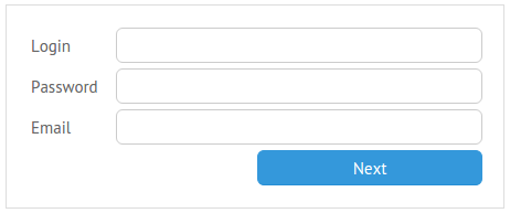
After we click the Next button, next part of the form will appear.
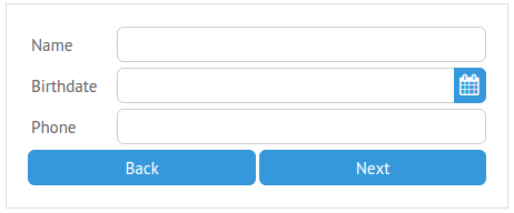
And let’s check if everything works as expected:

It does! Here’s the final demo:
See the Pen aNjLdo by SitePoint (@SitePoint) on CodePen.
Conclusion
In this tutorial I have demonstrated how easy Webix makes it to produce complex, yet stylish and accessible forms. The framework places a whole host of powerful widgets at your fingertips and even if they were not intended to be used as form components out of the box, it is quite simple to redefine their behavior using the protoUI method.
Are you using Webix in your projects? Has this tutorial inspired you to give it a go? Let me know in the comments below.
Frequently Asked Questions (FAQs) about Webix Framework
What is the Webix Framework and how does it work?
Webix is a powerful JavaScript UI library that allows developers to create rich, high-performance web applications. It provides over 100 fully customizable widgets, including data tables, charts, forms, and more. Webix works by allowing developers to create UI components using JavaScript, which can then be easily integrated into any web application. The framework is designed to be easy to use, with a simple and intuitive API, and it also supports a wide range of browsers and devices.
How can I get started with Webix?
To get started with Webix, you first need to download the library from the official Webix website. Once you have the library, you can include it in your project by adding a script tag to your HTML file. From there, you can start creating UI components using the Webix API. The official Webix documentation provides a wealth of information and examples to help you get started.
What are some of the key features of Webix?
Webix offers a wide range of features that make it a powerful tool for web development. Some of the key features include over 100 UI widgets, a simple and intuitive API, support for a wide range of browsers and devices, and the ability to create complex UI layouts. In addition, Webix also provides a number of advanced features, such as data binding, event handling, and AJAX support.
How does Webix compare to other JavaScript UI libraries?
Webix stands out from other JavaScript UI libraries in several ways. First, it offers a much larger selection of UI widgets than most other libraries, allowing developers to create more complex and feature-rich applications. Second, Webix is designed to be easy to use, with a simple and intuitive API that makes it easy to get started. Finally, Webix offers excellent performance, with fast rendering times and efficient memory usage.
Can I use Webix with other JavaScript frameworks?
Yes, Webix can be used alongside other JavaScript frameworks, such as Angular, React, and Vue.js. This allows developers to leverage the strengths of multiple frameworks in their applications. For example, you might use Angular for its powerful data binding features, while using Webix for its rich selection of UI widgets.
Is Webix suitable for mobile development?
Yes, Webix is fully responsive and supports a wide range of devices, including mobile phones and tablets. This makes it a great choice for developers looking to create mobile-friendly web applications.
How can I customize the appearance of my Webix application?
Webix provides a number of ways to customize the appearance of your application. You can use CSS to style your UI components, or you can use one of the many pre-made skins provided by Webix. In addition, Webix also allows you to create your own custom skins using the Skin Builder tool.
What kind of support is available for Webix?
Webix offers a range of support options for developers. The official Webix website provides a wealth of documentation and examples, as well as a forum where you can ask questions and get help from the community. In addition, Webix also offers premium support packages, which include direct access to the Webix development team.
Is Webix free to use?
Webix offers both free and paid versions of its library. The free version includes a limited selection of widgets and features, while the paid version provides access to the full range of widgets and features, as well as premium support.
How can I learn more about Webix?
The best way to learn more about Webix is to visit the official Webix website, where you can find a wealth of information and resources, including documentation, examples, tutorials, and more. You can also join the Webix community on GitHub, where you can find additional resources and connect with other Webix developers.
Web enthusiast with a high interest in JavaScript and HTML5. Sergey is always aware of the latest IT trends and keen on writing about them in his blog.


