Form UX: Sometimes Even Apple, Google and Amazon Make Mistakes

Key Takeaways
- Even tech giants like Apple, Google, and Amazon can make UX mistakes in their forms. Apple’s minimalist design approach can sometimes lead to poor accessibility due to insufficient color contrast. Google’s inconsistent use of color and multiple dropdowns for date entry can confuse users. Amazon’s default setting to show passwords and hidden password requirements can make users feel out of control.
- Forms are a unique type of interface that require specific design considerations. Even small errors in form design can lead to user confusion and frustration. However, understanding these unique elements and interactions can lead to the creation of efficient, user-friendly forms.
- Despite the mistakes made by these tech giants, there are resources available to help designers create effective forms. For instance, the book “Designing UX: Forms” covers the issues mentioned in more detail and offers insights into creating successful forms.


Jessica’s brand-new book ‘Designing UX: Web Forms‘ (September 2016) has just been released.
- Read it on SitePoint
- Or secure your own copy from O’Reilly
Ever been asked to design something ‘as beautiful as Apple’, ‘as simple as Google’ or ‘as popular as Amazon’? The success of technology’s big names makes them appealing goal posts for clients – and in many cases, you’d do well to learn from them.
But when it comes to forms, even the giants of digital sometimes get it wrong.
Apple and Accessibility
Clients often start with a reference to Apple, so let’s do that too. Apple designs interfaces that are minimalist and modern, including their forms. An example is shown in Figure 1.
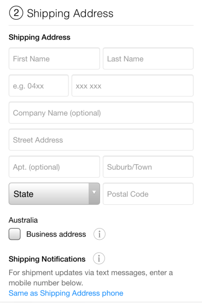
The problem is: sometimes they’re too minimalist.
I’m in my forties and consider myself still fairly young. But my eyesight, as it does with all humans, started to deteriorate in my thirties. Of course, many people need glasses even earlier than that, and there are people of all ages that use a screen magnifier, reverse the colors on screen, reduce brightness and so on.
For a form to be accessible by all its users, it must have enough contrast between colors, especially text versus background. The Web Content Accessibility Guidelines version 2.0 require a contrast ratio of 4.5:1 at a minimum. The ratio between the gray labels and the white background is just under 3:1. Even worse, the ratio between the lighter gray text box borders and the white background is 1.5:1.
So Apple fails the minimum standard of accessibility for all users.
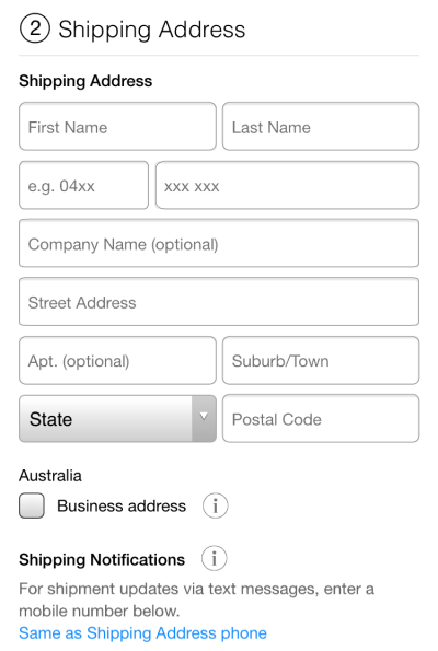
Figure 2 shows an alternative design for the same form, with sufficient contrast ratios. Still minimalist, now much more usable.
All the colors of Google
Like Apple, Google also has a small color issue. Figure 3 shows that red is used for errors (see Birthday at the bottom of the screen) but also the form title (“Create your Google Account” near the top of the screen).
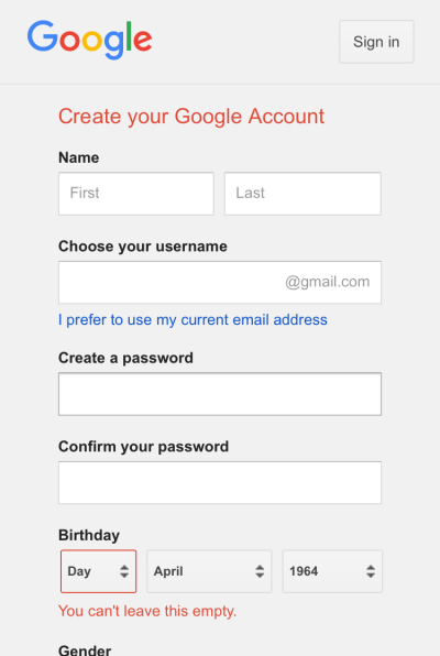
Another unusual difference is the background color behind fields. On text boxes, the background is white, contrasting nicely with the gray form background. Yet dropdowns and the form have the save background color, making these fields quite difficult to see. Some users are likely to be slowed down or confused by this inconsistency.
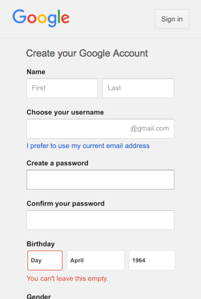
Figure 3 also shows that birthday is collected via three dropdowns: one for day, one for month, and one for year. This approach can reduce – although not eliminate – errors. But it means more work for the user. For a variety of reasons, on balance three text boxes is a better approach. See how this would look in Figure 4.
Amazon takes control
Finally to Amazon, who have been constantly evolving their forms for over two decades. A recent change has been the ability to show password on their account creation form (see Figure 5). Allowing the unmasking of passwords improves usability and reduces errors. When implemented well it also has little to no effect on security – unfortunately, Amazon really missed the mark here.
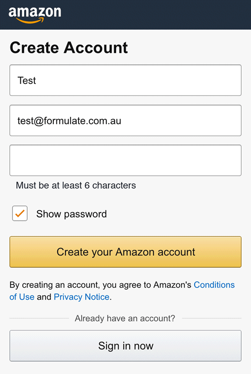
Amazon has the “show password” option selected by default. A typical user will jump straight to filling in the fields from top to bottom, only to be shocked to see their password shown in the clear underneath their masked entry. By that time, anyone nearby may have seen it too.
Nobody likes unexpected behaviors that make them feel like they’re not in control. Another way Amazon takes control away from the user is by hiding the password requirements. The user has to guess and test potential passwords, without knowing when or how they’re going to trigger an error or succeed. What an awful yet unnecessary situation to put users in!
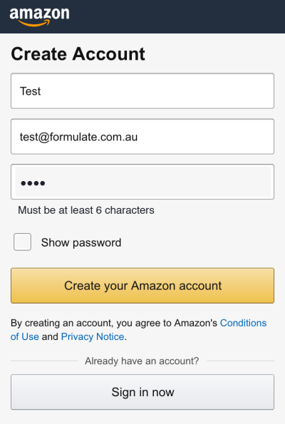
A much better approach would be to state the password requirements right there on the form, and have the “show password” field unselected by default (see Figure 6).
These form design insights and more

Forms are a special kind of interface. They appear everywhere, yet there’s so little knowledge about them in the public domain. And they have elements and interactions that are distinct from all other interfaces.
Indeed, the points raised above are only a subset of the issues with these particular forms (placeholder labels, anyone?). They also do many things well, besides. The trick is knowing which is which.
The great news is there’s a new book out there to help you. You don’t have to be a giant in tech to get forms right, just grab yourself a copy of “Designing UX: Forms”. Each of the issues I’ve raised above is covered in the book – in more detail – plus much more. You’ll gain all the know-how to make great forms, even in a team of one.
Frequently Asked Questions about Form UX Design
What are some common mistakes in form UX design?
Some common mistakes in form UX design include not grouping related fields, using unclear labels, and not providing clear error messages. For example, if a form asks for a user’s address, all the related fields (street, city, state, zip code) should be grouped together. Labels should be clear and concise, and error messages should tell users exactly what they did wrong and how to fix it.
How can I improve the efficiency of my forms?
There are several ways to improve the efficiency of your forms. One way is to reduce the number of fields. Only ask for the information you absolutely need. Another way is to use smart defaults or autocomplete features. This can save users time and reduce errors. Also, consider the placement of your fields. Group related fields together and arrange them in a logical order.
What is the importance of mobile-friendly form design?
With the increasing use of mobile devices, it’s crucial to design forms that are mobile-friendly. This means making sure your forms are responsive and easy to use on smaller screens. Buttons should be large enough to tap, and fields should be easy to fill out without zooming in.
How can I make my forms more user-friendly?
To make your forms more user-friendly, consider the user’s perspective. Make sure your forms are easy to understand and fill out. Use clear, concise labels and instructions. Provide helpful error messages. And make sure your forms are accessible to all users, including those with disabilities.
What are some best practices for form validation?
Some best practices for form validation include providing real-time feedback, highlighting errors clearly, and providing helpful error messages. Real-time feedback can help users correct errors as they go, reducing frustration. Errors should be highlighted in a way that’s easy to see, and error messages should tell users exactly what they did wrong and how to fix it.
How can I use form design to increase conversions?
Good form design can help increase conversions by making it easy for users to complete your forms. This includes reducing the number of fields, using smart defaults or autocomplete features, and making sure your forms are mobile-friendly. Also, consider the visual design of your forms. A clean, attractive design can make your forms more appealing to users.
What is the role of color in form design?
Color can play a big role in form design. It can be used to draw attention to important elements, indicate errors, and guide users through the form. However, it’s important to use color sparingly and in a way that’s consistent with your overall brand and design.
How can I test the usability of my forms?
There are several ways to test the usability of your forms. One way is to conduct user testing. This involves observing users as they interact with your forms and noting any difficulties they encounter. Another way is to use analytics to track how users interact with your forms. This can provide valuable insights into where users are having trouble and where they’re dropping off.
What is the importance of form accessibility?
Form accessibility is crucial for ensuring that all users, including those with disabilities, can use your forms. This includes making sure your forms are keyboard-accessible, using clear and concise labels, and providing alternative ways to submit forms for users who can’t use traditional input methods.
How can I design forms for international users?
When designing forms for international users, it’s important to consider cultural differences. For example, the format for dates, phone numbers, and postal codes can vary by country. Also, consider language differences. Make sure your forms are translated accurately and that the language is clear and easy to understand.
Jessica Enders has suffered from a life long condition known as a love of designing forms and other transactional interfaces. She is attempting to minimise the adverse symptoms by running her own form design business, Formulate Information Design.