Despite the inherent simplicity, logo design can be surprisingly difficult. Fitting in all of the necessary facets and considering all of the constraints can be a challenge for any designer. Attempting to invent new techniques for every new logo is a losing strategy; the best logos are based on fundamentals done right — conveying a large message within a small, simple visual design. In this tutorial, I’ll walk you through the process of designing a logo for a film studio in Adobe Illustrator. We’ll use various shape tools, the pen tool, the rotate tool, the shape builder tool, the scissors tool, and various options within the object and effect menu to achieve the final result. I hope you learn few handy tips along the way. So, let’s get started!
Resources:
Grand Hotel FontFinal result:
 (Download the completed Illustrator file.)
Step 1
Create a new document in Illustrator with a 600px width and a 450px height.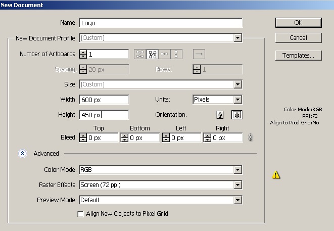
Step 2
We’ll create the logo for a fictional film studio named “Studio Ride.” As I stated, conceptualizing your logo is often the hardest part of the design process. Usually you have several ideas that you want to visually incorporate into your logo. I thought of illustrating this concept in the form of a bicycle (to convey a “forward” sense of narrative, development, and progression) and film rolls as the cycle wheels to symbolize the film studio. Your approach could be different; I am just showing you one way to do it. We’ll start by making the film roll. Pick the ellipse tool (“L”) and click the canvas to open the ellipse window. Enter 210px for both the width and height and hit “OK”. Set your fill to “none” and pick color #0FBBC7 for your stroke. Choose an 8pt stroke weight in the top control bar.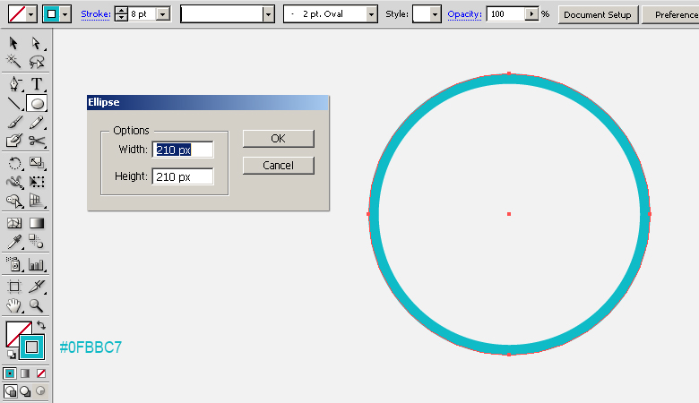
Step 3
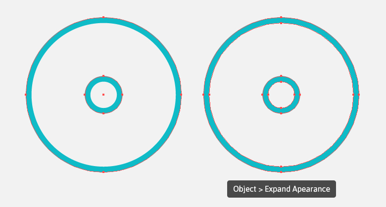
Select the circular stroke by clicking the ring-shaped target present at right side of respective layer. Now, go to “Object” > “Path” > “Offset Path” and offset the path by “-85px” to make a smaller stoke inside it, as shown below. Then, go to “Object” > “Expand Appearance” to convert the strokes into shapes. Label this layer as “Frames”.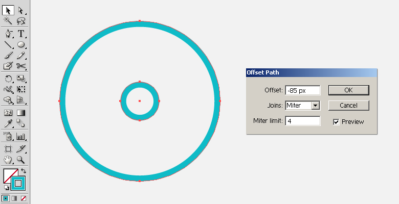
Step 4
Select the rectangle tool (“M”) and click the canvas to open the rectangle window. Enter an 80px width and a 100px for the height and click “OK” to draw a rectangle. Pick #0FBBC7 as your fill color with no stroke.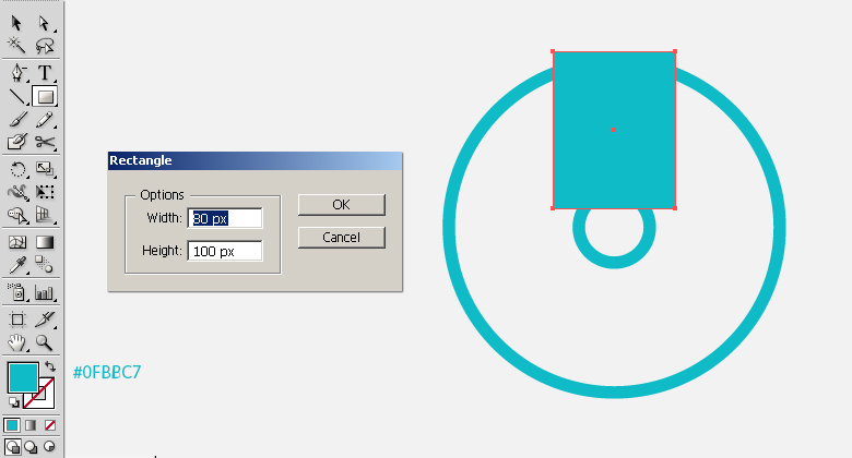
Step 5
Select the direct selection tool (“A”) and click the bottom-left anchor point of rectangle to drag it inside. Then, drag the bottom-right anchor point as shown below.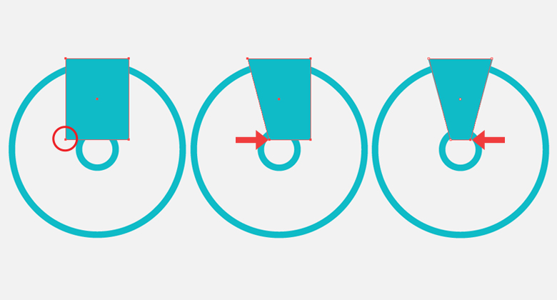
Step 6
Select this new shape and go to “Effect” > “Distort & Transform” > “Transform”. Apply the following settings.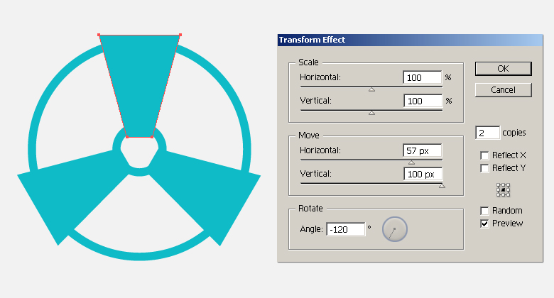 While the shape is still selected, go to “Object” > “Expand Appearance” to modify the shapes. Label this layer as “Wings”.
Step 7
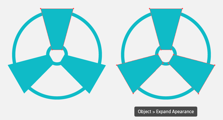
Next, draw a circle using the ellipse tool that’s the same size as the outer circular stroke just below the “Wings” layer created in Step 6. Now, select both the layers and hit “Minus Front” in the Pathfinder Panel (Shift + Ctrl + F9).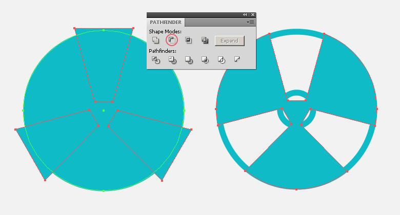
Step 8
To get rid of the central part of “Wings”, select the frames and wings layers and pick the shape builder tool (Shift + “M”). The moment you take the tool over the central part, a pattern should appear. Now, click that part while holding the “Alt” key to delete it. Look below for clarity.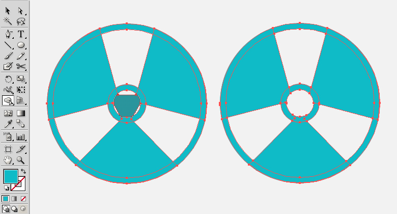
Step 9
Pick the rectangle tool (“M”) and draw a rectangle with a 6px width and a 130px height. Now, select the rectangle and pick the rotate tool (“R”). Click the canvas to view the rotate window and enter a 60⁰ angle. Position the rectangle as shown below with the help of the selection tool (“V”).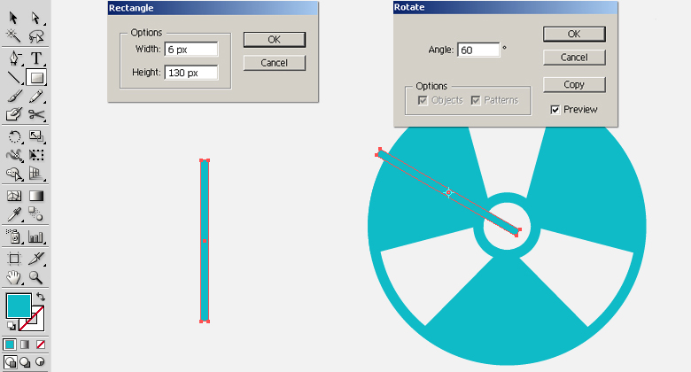
Step 10
Select the rectangle and go to “Effect” > “Distort & Transform” > “Transform”. Apply the following settings here to make and arrange two copies, as shown below.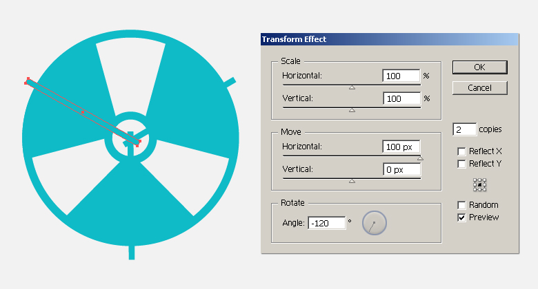 Select the new rectangles and go to “Object” > “Expand Appearance” to convert the copies into shapes. Label this layer as “Bars”.
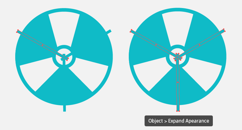
Step 11
Now, select the frames and bars layers and delete the parts of the bars that fall outside of the frame using the shape builder tool (Shift + “M”). The technique is the same as explained in Step 8.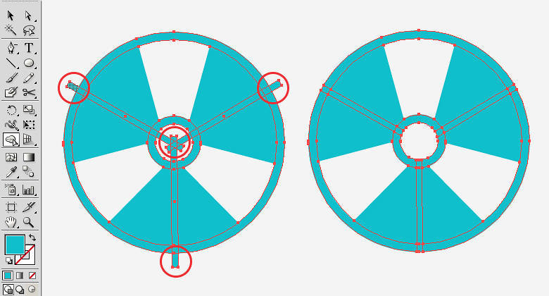
Step 12
Select the wings and bars layers and delete the bars area from the “Wings” layer using the shape builder tool (Shift + “M”). To accomplish this, hover the tool over the bars one by one and press the “Alt” key while clicking to delete them.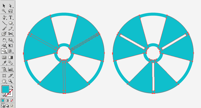
Step 13
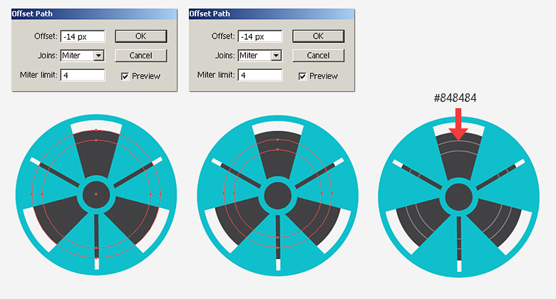
Now, create a new layer below the rest of the layers and draw a 178px by 178px circle on it using fill color #414143.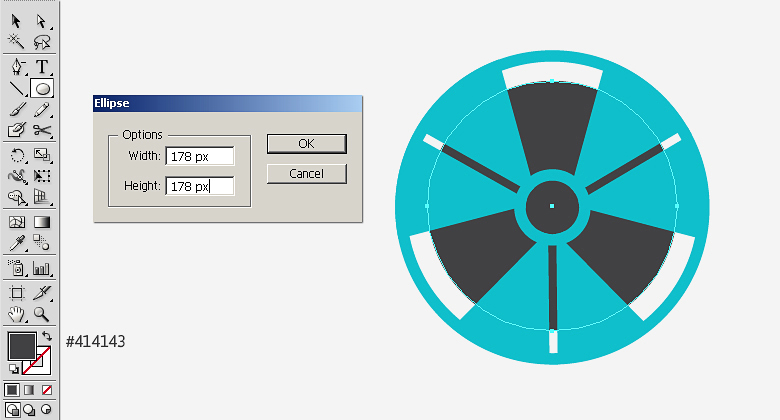 Select the ellipse and go to “Object” > “Path” > “Offset Path”. Offset the path by “-14px”. Now, select this new path and offset it by the same amount — “-14px”. Now, give these new paths a gray (#848484) stroke with a 1pt stroke weight as shown below.
Step 14
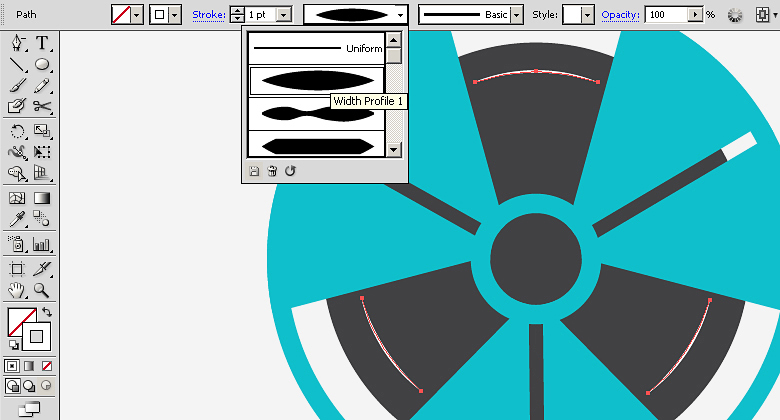
Next, we’ll make few highlights over these circular gray paths. Select one of the circular paths, press Ctrl + “C” to copy it, and then press Ctrl + “F” to paste it in front. Hide the original path for now and select the newly-created copy. We want the highlights in the areas between the wings only, so we’ll get rid of rest of the path using the scissors tool (“C”). Just click the path with the scissors tool at points where you want to cut down your path as illustrated in the image below. Your circular path should be cut into various parts; now delete the paths that lie under the wings.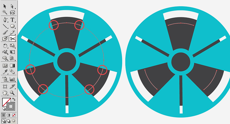 Change the highlights stroke color to white and change their width profile to “width profile1” within the top control bar.
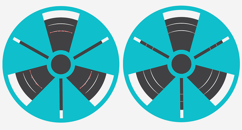
 Make highlights for the inner path using the same technique, and unhide the original paths to get the same effect that I’ve created.
Step 15
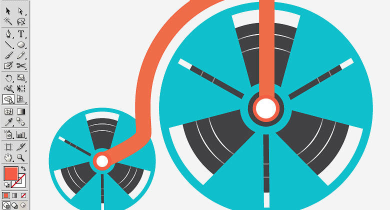
Next, select all the layers and choose “Collect in New layer” from the fly-out menu present at the top-right corner of layers panel. Duplicate it and go to “Object” > “Transform” > “Scale” and scale the copy up by 50%. Now, drag and position it over the left side using the selection tool (“V”) as shown below.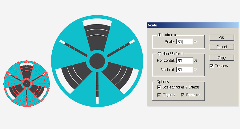
Step 16
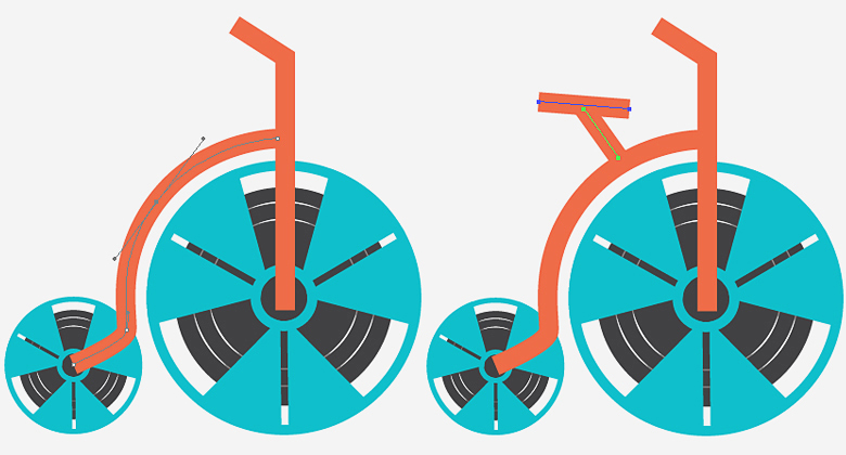
Select the pen tool (“P”) and make the path shown below. Set its fill to “none” and set a stroke of #ED6B48 with a 16pt weight.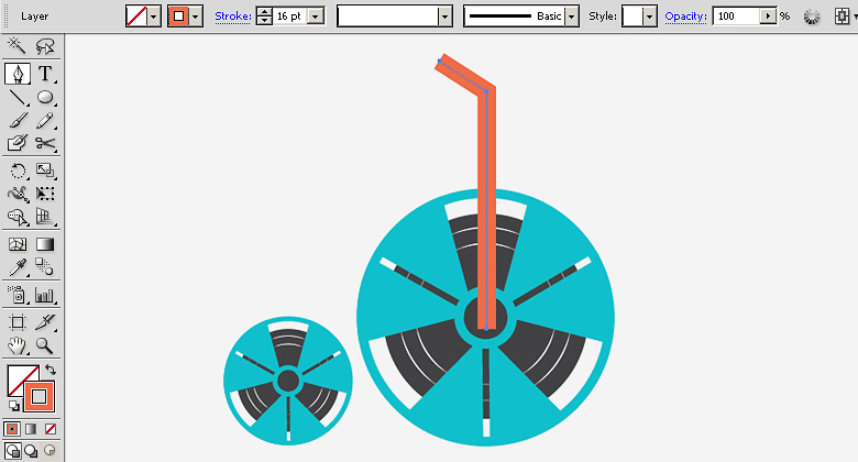 Draw the following paths to complete the bicycle.
Step 17
Select all these paths and go to “Object” > “Expand”. Expand both the fill and stroke to convert them into shapes.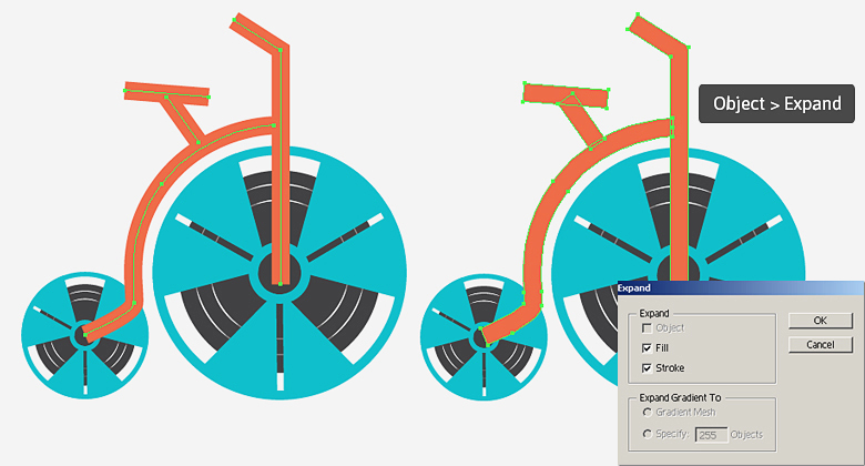
Step 18
Now, select following two paths and go to “Effect” > “Stylize” > “Round Corners”. Enter 8px for the radius to make their corners rounded.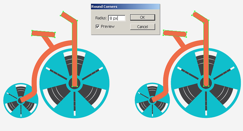 Now, go to “Object” > “Expand Appearance” to modify the shapes and draw two small circles as shown below.
Step 19
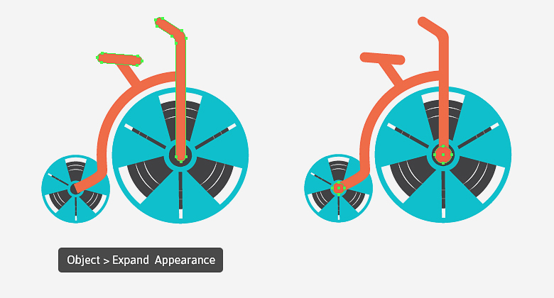
Next, select the two circles and go to “Object” > “Path” > “Offset Path”. Offset them by “-4px” and change the fill of the new paths to pure white.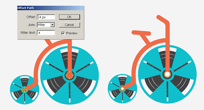 Now, we’ll delete the white ellipse areas from rest of the layers. To achieve this, select all of the layers and delete all the paths inside the white ellipse areas using the shape builder tool (Shift + “M”).
Step 20
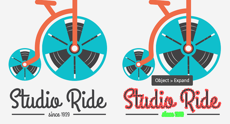
Select the type tool (“T”) to add the company name using #414143 as your fill color. I’ve used the “Grand Hotel” font mentioned above in the resources.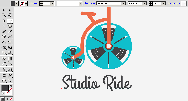 To complete the logo, I added the founding date and two thin rectangles at the sides. Lastly, select the text layers and go to “Object” > “Expand” to convert them into shapes. Make sure that #414143 is your chosen fill color
Final result:
That’s it! I’ve done my best to fit several ideas into a simplistic logo. Let me know what you think.
Frequently Asked Questions about Designing a Modern Pictorial Logo
What are the key elements to consider when designing a pictorial logo?
When designing a pictorial logo, it’s crucial to consider simplicity, relevance, versatility, and memorability. The logo should be simple enough to be easily recognized, yet unique and creative to stand out from the crowd. It should be relevant to the brand’s identity and message. Versatility is important as the logo should look good in different sizes and on various platforms. Lastly, a good logo is memorable, making a lasting impression on the audience.
How can I make my pictorial logo unique and stand out?
To make your pictorial logo unique, you can experiment with different design elements such as colors, shapes, and typography. You can also incorporate elements that are unique to your brand or industry. Additionally, you can play with negative space or create a clever visual pun. Remember, the key is to be creative and think outside the box.
What are some common mistakes to avoid when designing a pictorial logo?
Some common mistakes to avoid include making the logo too complex, using too many colors, relying on trends, and not considering scalability. A complex logo can be difficult to recognize and remember. Using too many colors can make the logo look chaotic and unprofessional. While it’s okay to be aware of design trends, relying too much on them can make your logo look dated when the trend fades. Lastly, your logo should be scalable, meaning it should look good in different sizes and on various platforms.
How can I choose the right color for my pictorial logo?
Choosing the right color for your pictorial logo involves understanding the psychology of colors and how they can influence perceptions and emotions. For example, red can evoke feelings of passion and energy, while blue can convey trust and reliability. You should also consider your brand’s personality and target audience. Lastly, it’s important to test different color combinations to see which one works best.
Can I design a pictorial logo even if I’m not a professional designer?
Yes, you can design a pictorial logo even if you’re not a professional designer. There are many online tools and resources available that can help you create a logo. However, it’s important to understand the basics of logo design and to take the time to plan and conceptualize your logo. If you’re unsure, you can always hire a professional designer to help you.
How can I test the effectiveness of my pictorial logo?
You can test the effectiveness of your pictorial logo by conducting surveys or focus groups. You can ask people what they think of when they see your logo, if it’s easy to recognize, and if it’s memorable. You can also test how your logo looks in different sizes and on various platforms.
What is the importance of a pictorial logo for a brand?
A pictorial logo is important for a brand as it helps in creating a visual identity that people can easily recognize. It can convey the brand’s personality and values, and create a lasting impression on the audience. A well-designed pictorial logo can also help in differentiating the brand from its competitors.
How can I incorporate my brand’s story into my pictorial logo?
You can incorporate your brand’s story into your pictorial logo by using symbols or images that represent your brand’s history, values, or mission. You can also use colors that reflect your brand’s personality. The key is to be creative and thoughtful in your design.
How often should I update or redesign my pictorial logo?
There’s no set rule on how often you should update or redesign your pictorial logo. However, it’s a good idea to consider a refresh if your logo looks outdated, no longer represents your brand accurately, or if you’re not getting the desired response from your audience. Remember, any changes should be done thoughtfully and with consideration of your brand’s history and identity.
Can I use a pictorial logo for any type of business?
Yes, a pictorial logo can be used for any type of business. However, it’s important to ensure that the logo is relevant to your business and resonates with your target audience. The logo should also be versatile enough to be used in different contexts and platforms.
 Anum Khan
Anum is Web and Graphic designer. Addicted to Photoshop and crazy for pixel perfection. She is also an active blogger, sharing her passions, skills and creative details on her blog Websoulz. She loves to connect with the community, sharing the latest design gossips and rolling her eyes on boring trends.