There are many ‘UI frameworks’ out there in the web wild these days.
The most popular of these include Bootstrap by Twitter, Foundation, Pure, HTML5 Boilerplate and Skeleton to name but a few.
They lay a great foundation for building your web projects, without having to worry about re-inventing base grids and styles yourself, or having to deal with browser discrepancies for many of the standard HTML element styles.

Most, if not all, also work on the basis of ‘mobile first’. That is, they use responsive CSS to make sure your website looks great from mobile phones all the way up to desktop browsers.
Some might argue that this is a lazy way to work, and there is certainly no lack of knowledgeable web pundits still advocating building your site from the ground up.
But the true value in any of these frameworks is twofold: ideally they make for a consistent experience for your users, while saving you the development time required to do this yourself. Handy.
So, What Is UIkit?
UIkit is a CSS framework — like Bootstrap and Foundation — that gives you a ‘clean slate’of styles for your web site. All you have to do is drop in the required CSS, markup your HTML with some specific classes, and you can have a lovely, simplistic and easy-on-the-eye website in minutes!
No more worrying about those little inconsistencies across the various modern browsers. Plus, if you don’t want to do any styling at all, you don’t need to. UIkit comes fully boxed with a basic, but beautiful style that will suit most websites. And, it’s really easy to build from if you do want to change things to suit your needs better.
So, Why UIkit?
I have used many of these frameworks myself over the years, but mainly focused on Bootstrap since it’s first release as an open source project in 2011.
And it was great!
It made everything I built so much quicker and easier as long as I used the right classes and markup and even had it’s own icons (Glyphicons) included.
When Bootstrap 3 was released that was the turning point for me, because it felt like such a chore having to go through all of the sites I used it on and re-factor the HTML to work with the change in class names and layouts that were introduced.
So I looked for something new.
Enter UIkit. It wasn’t the first I tried, but it was the one that left a lasting impression not only for it’s ease of use, fairly semantic class names and plethora of options, but the style ‘out the box’ was clean, crisp and modern. I liked.
For specific sections of websites, such as forms, and tables, UIkit handles with it’s components of which there are plenty for most situations you’ll require (and more being added all the time as the project is constantly evolving).
For instance, the standard grid for layouts is called a component, as is buttons, alerts and even modals.
What Does It Do?
UIkit is self-described as ‘A lightweight and modular front-end framework for developing fast and powerful web interfaces’ and works on the basis of mobile-first styles and then working all the way to desktops.
It does exactly what it says on the homepage. It gets out of the of way frontend designers
After downloading the archive, unzipping and then building my first site with it I was amazed at how simple it was!
Rather than applying general classes that dictate how many columns an element should take up (i.e. Bootstrap 2’s ‘<span4>’ class, which takes up a third of the page — 4/12 = 1/3), the classes dictate what proportion of the parent an element should take up.
You can see the examples here. But generally speaking if you want an element to take up half of the parent you give it a class of uk-width-1-2. uk-width-* is the helper class for all width-based measurements so you just put your required modifier at the end and voila !
Consider the following example:
<div class="uk-container">
    <div class="uk-grid">
        <div class="uk-width-1-3"></div>
        <div class="uk-width-1-3"></div>
        <div class="uk-width-1-3"></div>
    </div>
</div>
We have just created a container that has three elements within all taking up a third of the space.
These don’t have to be used in conjunction with <div>s either, any block-level element will do, such as <section>, or <article>.
The library uses box-sizing to ensure that widths remain consistent no matter what padding is applied to them, so you can customise the padding and borders of these elements to your hearts content without worrying about it messing up the display.
However, the caveat is that because the library works really well in laying out the page correctly it is recommended you don’t change these main library elements (much like you wouldn’t with the other libraries) but rather add an element inside one of the uk-width-* elements and style that instead.
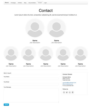
In the example above I used elements from the panel component, which is basically used as a visual layout tool to create panels. THere are three default panel styles added with the UIkit but you can easily add your own by creating classes that specify background-color and color.
Other layout components include ‘Article’, ‘Comment’and a ‘Utility’component used for styling things not covered by the other components such as margin, alignment and heading modifiers. There’s plenty there to play around with.
As well as the layout components there are also those listed under ‘Common’and these include things that you are likely to be familiar with if you have used other CSS frameworks. Things like alerts, badges, buttons and progress meters are included along with many more. Check out the examples on the UIKit website to see them in action.
How Do I Use It?
The same as most frameworks; the only requirement is a CSS file (and Javascript file, if you’d like to use those components). You’ll also need the fonts from Font Awesome as the framework uses these as standard for any icons. The following HTML will get your started:
<!DOCTYPE html>
<html>
<head>
    <title>My UIkit  Document</title>
    <link rel="stylesheet" href="css/uikit .min.css">
</head>
<body>
    <!-- Your document starts here -->
    <script src="js/jquery.min.js"></script>
    <script src="js/uikit .min.js"></script>
</body>
</html>
That’s it! Start coding your HTML with the UIkit classes and you’ll have a website in no time!
JavaScript Too?
There are a number of JavaScript resources bundled with UIkit out-of-the-box. Many of them are standard with most frameworks of this ilk, but are no less effective because of this. One of the JavaScript components I particularly like is ‘Off Canvas’, which is a really simple way to add a navigation system to your site, specifically in the case of mobile users, that can contain anything you want but isn’t on the page until an action is clicked. The animation to bring it in is really nice too. Here’s a little demo of what it does, and below is the code sample:
<div class="uk-container">
    <div class="uk-grid">
        <div class="uk-width-1-1">
            <div class="uk-panel uk-panel-box">Added panels to highlight the grid sections. <button class="uk-button uk-button-primary" data-uk-offcanvas="{target:'#offcanvas'}">Click for off canvas</button></div>
        </div>
    </div>
</div>
<!-- This is the off-canvas sidebar -->
<div id="offcanvas" class="uk-offcanvas">
    <div class="uk-offcanvas-bar">
        <div class="uk-panel">
            <p>Some off canvas text.</p>
        </div>
    </div>
</div>
As you can see, to make the button work to invoke the off-canvas element all you need to do is use a single data-attribute on the button, and this is how all of the JavaScript components work. It’s a really simple and clean way of giving elements that extra bit of functionality. As another example if you wanted to add a tooltip to any element all you’d need to do is give it a title and add a data attribute of data-uk-tooltip and it’s there!
A recent addition to the UIkit set of features sees some nice JavaScript plugins join the mix. The standard Date and Time pickers are really nice, and the Notify add-on is clean, simple and effective. Again, check out the documentation for all the examples and information you need.
Themes
There are a couple of themes ready for use for UIkit . They are all clean and simple and can be easily downloaded from the customizer section of the UIkit website.
Just select the theme you would like the CSS for in the dropdown and choose whether to just download the CSS, or the LESS. I personally prefer the default style, which is flat and square but there are a couple of different options for those that prefer gradients and rounded corners.
It looks like the developer is also looking at creating, or compiling, a list of themes that others have created. You can see screenshots of those in this GitHub repo. But the beauty of UIkit is it’s extensibility.
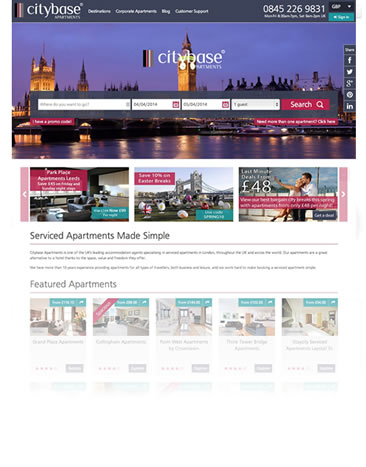
My latest project was a complete website redesign for an online apartment booking company and I used UIkit as the core CSS and JavaScript framework.
However, as you can see from that link, the website does not look anything like any of the themes.
One issue I always find with Bootstrap-based websites is that they always tend to look like they were built using Bootstrap and, unless a lot of work has gone into one, you can very quickly tell the framework it was built on.
Conclusion
Some fantastic things can be done with a tool like UIkit . It has become my go-to tool for all of my recent web development projects because it took no time to learn how the classes work, and which to use as it’s semantic in it’s implementation.
The default styles from the website look great, and don’t require any building upon. But if you need to it’s very easy to do. Even the JavaScript components use the same standards for styling so are very easy to modify.
All of the JavaScript can be easily invoked through data attributes on HTML tags and don’t require any extra JavaScript. But you also have the option to invoke things manually from your own JavaScript if you desire.
There are plenty of examples, and if you don’t know how to do something there is enough of a community using the UIkit that help is not far away.
You can also contribute to the project as it’s hosted on GitHub and make it even better!
So why not give it a try and see what you think? I don’t think you’ll be disappointed and though I know a lot of you tend to stick to what you know (I am very much the same!) this time it might be worth trying something new.
I have never looked back since playing with it myself.
 Alex Hall
Alex is a professional web designer and developer from the UK with over 10 years experience in the field. In his spare he's always tinkering with something new and web-based. He also loves most sports and rock climbing.