Creating a Custom UIkit Theme with Gulp and Less

Key Takeaways
- UIkit’s Customizer can be used to create unique themes and theme variations (styles) for websites, allowing them to stand out from the crowd. The process is straightforward but requires a proper workflow to minimize complications.
- To set up customization, one must download or clone the UIkit repository, install Node and Gulp, and install UIkit’s development dependencies. Then, in the root directory, a folder for the theme can be created and the necessary files added and modified.
- UIkit provides hooks for more complex customizations, allowing developers to add new rules or change existing ones without breaking the core. Each component has a hook, which can be used to create new selectors or modify existing ones.
- The GUI Customizer can be used directly for simpler modifications. It allows developers to modify variables, get the final CSS file for the theme, and create styles automatically when creating theme variations. It also allows control over the visibility and availability of variables in the Customizer’s left panel.
Everyone wants to be unique. I guess you won’t be super happy if in your surroundings there are many people looking just like you, right? This holds true for the other people too. Your friends also won’t be happy to see clones of you everywhere. The same is true for our websites.
Nowadays, building a website with a front-end framework is common. The problem though is that many people blame such frameworks for making all websites “look the same”. But the tool isn’t to blame if developers aren’t willing to make the necessary customizations.
For those of you who want the websites you build to stand out from the crowd, I’ll demonstrate how you can use UIkit’s Customizer to create different themes and theme variations (styles). The process is straightforward, but you need a proper workflow to do it with a minimum amount of headache.
Setting Up Customization
Let’s say that you want to create a dark theme for your website with orange as an accent color. Also, you want two more variations of that theme with blue and green accent colors. Let’s see how we can do it. (Note: For the sake of brevity, I’ll use only buttons to demonstrate the process).
We’ll need to start with ensuring the following steps are complete:
- Download or clone the UIkit repository.
- Install Node and Gulp, if you don’t have them already.
- Install UIkit’s development dependencies. You can do this by navigating to the UIkit root directory and running
npm installfrom the terminal.
When all of this is set up correctly, we can start creating our theme.
Creating our Theme
Still in the root directory, create a folder called “custom”. In that folder, create another one called “dark” and inside it create a file called uikit.less. Open the file and add the following:
@import "../../src/less/uikit.less";
@import "button.less";
The first line will get all Less files from the core framework and the second line will import the file you’re going to use to modify the default UIkit buttons. Save and close the file and create the aforementioned button.less file in the same directory.
Before making any further customizations, you need to make your theme available locally in the Customizer. To do so, in the UIkit root directory, run the following in the terminal:
gulp indexthemesNow launch your local copy of the UIkit website (the one you installed) and click “Customizer” in the navigation bar. When you open the “Select a theme” drop-down list you should see “Dark” at the end of it. At this point, when you select it, you’ll see that there is no styling. Why not? Let’s see.
One thing not mentioned in UIkit’s documentation and which can cost you a lot of headache, is that your theme needs a file called uikit-customizer.less. Create the file and add the following line:
@import "uikit.less"You must put that file, with the above line, in the theme’s root directory (inside the “dark” folder, in our case). If this file is not present, you can’t use the Customizer properly – the theme’s name will appear in the list, but the styles will be missing.
Note: As a rule of thumb, the uikit-customizer.less file should import all files that your theme uses. In our example, importing uikit.less meets this requirement because it includes both the default UIkit styles and your custom button styles.
After adding the uikit-customizer.less file, you will see that this time all components are properly styled. So, we’re ready to move on.
In the component’s drop-down list, placed at the top left corner of the panel on the right side of the Customizer, switch to “Button”. This way you’ll be able to see all available button styles. Now we can open the button.less file and start adding our modifications:
@button-color: #f90;
@button-hover-color: fade(@button-color, 75%);
@button-active-color: @button-color;
@button-background: #000;
@button-hover-background: lighten(@button-background, 20%);
@button-active-background: @button-hover-background;
In the above code we’ve modified the variables for the default button’s text and background colors in their normal, hovered, and active states. For other specific buttons, we need to change those variables too:
@button-primary-color: darken(@button-primary-background, 20%);
@button-success-color: darken(@button-success-background, 20%);
@button-danger-color: darken(@button-danger-background, 20%);
@button-primary-hover-color: fade(@button-primary-color, 75%);
@button-success-hover-color: fade(@button-success-color, 75%);
@button-danger-hover-color: fade(@button-danger-color, 75%);
@button-primary-active-color: lighten(@button-primary-color, 35%);
@button-success-active-color: lighten(@button-success-color, 35%);
@button-danger-active-color: lighten(@button-danger-color, 35%);
Using Hooks in UIkit
Modifying UIkit’s variables is the easiest way to change the appearance of the framework’s components when dealing with simple modifications. But for more complex customizations, such as adding new rules and/or changing the existing ones without breaking the core, UIkit provides a special mechanism. It uses hooks to safely append your changes. Let’s see this in action. Put the following code below the variables, inside the button.less file:
.hook-button() {
  border-radius: 5px 15px;
  box-shadow: 2px 2px;
}
Here, the hook for the button component is used to add a border radius and a drop-shadow effect.
For even more specific changes, UIkit provides miscellaneous hooks. Each component has such a hook. This is useful for creating new selectors or modifying the ones that have neither a variable nor a hook available for customization. Let’s demonstrate this by adding the following code:
.hook-button-misc() {
  .uk-button:active:not(:disabled) {
    box-shadow: none;
  }
  .uk-button-link:hover,
  .uk-button-link:focus,
  .uk-button-link:active,
  .uk-button-link.uk-active {
    text-decoration: none;
  }
  .uk-button-link:focus {
    outline: none;
    border: 1px solid @button-link-hover-color;
  }
}
Here we remove the drop-shadow for every active button that is not disabled. Then we remove the underline of links in all states. Finally, we remove the outline of the button link and instead add a nice border, shown when the link is focused. Save the button.less file.
Note: You can see all available hooks for a particular component by looking at the very end of its corresponding .less file. Here is an example for the button component.
// Hooks
.hook-button-misc;
.hook-button() {}
.hook-button-hover() {}
.hook-button-active() {}
.hook-button-primary() {}
.hook-button-primary-hover() {}
.hook-button-primary-active() {}
.hook-button-success() {}
.hook-button-success-hover() {}
.hook-button-success-active() {}
.hook-button-danger() {}
.hook-button-danger-hover() {}
.hook-button-danger-active() {}
.hook-button-disable() {}
.hook-button-link() {}
.hook-button-large() {}
.hook-button-misc() {}
So now the main theme is ready and you can check it out in the Customizer. Just reload the page and enjoy.
Creating Styles for our Theme
Now we’re ready to create the theme’s styles. In our dark theme’s directory, we’ll create a new folder called “styles” and inside that we’ll create another one called “blue”. In that folder create a blank style.less file. Copy the first three lines of code from your button.less file and paste them into the file, then change the value of @button-color to #09f and save the file. The contents of the file will look like this:
@button-color: #09f;
@button-hover-color: fade(@button-color, 75%);
@button-active-color: @button-color;
Run gulp indexthemes in the terminal again to include the newly created style, then go back to the Customizer and refresh the page. Now at the end of the themes list you should see a “Dark-blue” option. Select it and you’ll see that now the buttons appear with a nice blue accent. For the green style, repeat the same procedure but instead use a color value of #9c0.
When you’re satisfied with your theme you can build it by running this task:
gulp dist -t darkThis will build the dark theme and will put it in a “dist” folder in the UIkit root directory. Then, in the “css” folder you’ll find uikit.dark.css and uikit.dark.min.css files. Unfortunately, these files contain only styles from your main theme. The blue and green styles are not included. But you can get the CSS files for those too by using the GUI Customizer, as I’ll explain next.
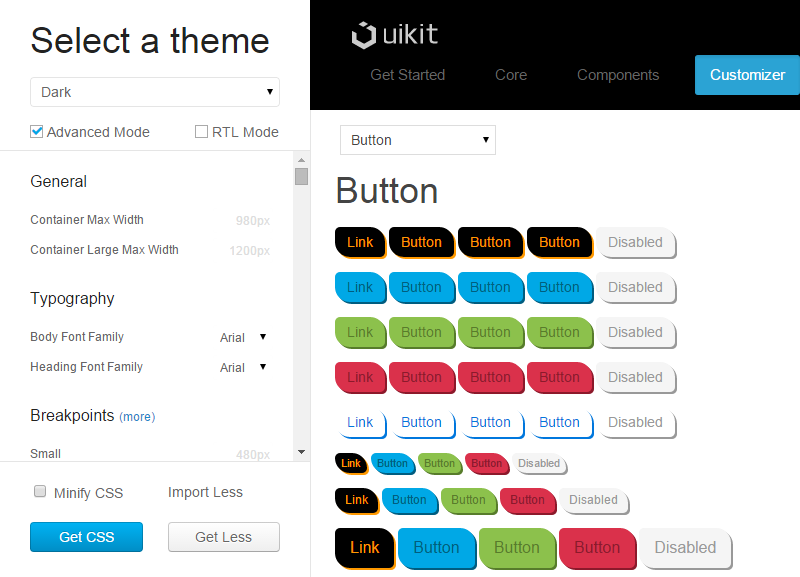
Using the GUI Customizer
I showed you how to create a theme manually, because it’s always good to know the underlying mechanism of a particular process. But if you don’t need complex modifications, you can use the GUI Customizer directly. Let’s explore the needed steps.
- Go to Customizer and select the theme you want to customize.
- Use the left panel to modify the variables. Usually, only the global variables are shown. For the components’ variables to be visible you need to activate the “Advanced Mode” option. By default, a variable whose values are defined through another variable are hidden. In advanced mode you can see a “(more)” button next to groups that include these kinds of variables.
- Make the changes you want and hit the “Get CSS” button. This will give you the final CSS file for your theme. You can use this button to get the CSS files for your blue and green styles. Just select “Dark-blue” or “Dark-green” and click the button.
- If you want a minified version, check the “Minify CSS” option
- If you use left-to-right languages, check “RTL Mode” and the whole theme will convert automatically.
- If you hit the “Get Less” button instead of the “Get CSS” button, the output file will contain only the changed variables. In this way you can create styles automatically when you create theme variations.
Every theme uses a customizer.json file defining which variables are displayed by default or only in advanced mode. By modifying this file, you can control the visibility and availability of the variables in the Customizer’s left panel. For more details on this, see the Customizer.json page.
Note: When you run the indexthemes task, if your theme doesn’t have its own customizer.json file (which is the case when you create a new theme), UIkit uses the file from the default theme (/themes/default/customizer.json). If you plan to customize this file, you need to copy and paste it in your theme’s root directory and run gulp indexthemes again to update the theme.
Conclusion
You saw that customizing a particular front-end framework is not as hard a task as it may seem at first. With some knowledge of Gulp and some extra effort you can make your websites unique enough to stand out from the crowd without being labeled as having been built with a specific framework.
Frequently Asked Questions on Custom UIkit Theme with Gulp & Less
How can I create a custom UIkit theme using Gulp and Less?
Creating a custom UIkit theme using Gulp and Less involves several steps. First, you need to install Node.js and npm on your computer. Then, you need to install Gulp and Less using npm. After that, you can clone the UIkit repository from GitHub and install its dependencies. Once you’ve done that, you can start creating your custom theme by modifying the Less variables in the theme.less file. You can then compile your theme using Gulp, which will generate a CSS file that you can include in your project.
What are the benefits of using Gulp and Less for creating a UIkit theme?
Gulp and Less offer several benefits for creating a UIkit theme. Gulp is a task runner that can automate repetitive tasks like minification, compilation, unit testing, and linting. This can save you a lot of time and effort. Less, on the other hand, is a CSS pre-processor that allows you to use variables, mixins, functions, and other features that can make your CSS more maintainable, themable, and extendable.
Can I use other CSS pre-processors like Sass or Stylus to create a UIkit theme?
Yes, you can use other CSS pre-processors like Sass or Stylus to create a UIkit theme. However, you need to keep in mind that UIkit is built with Less, so you might need to do some extra work to convert the Less code to Sass or Stylus.
How can I customize the colors, fonts, and other elements of a UIkit theme?
You can customize the colors, fonts, and other elements of a UIkit theme by modifying the Less variables in the theme.less file. For example, you can change the primary color by modifying the @primary-color variable. You can also change the font family by modifying the @font-family-base variable.
How can I add custom components to a UIkit theme?
You can add custom components to a UIkit theme by creating new Less files for them and importing them into the theme.less file. You can then use the UIkit mixins and variables to style your components.
How can I test my custom UIkit theme?
You can test your custom UIkit theme by including the generated CSS file in a HTML file and opening it in a web browser. You can then inspect the elements and check if they are styled as expected.
How can I optimize my custom UIkit theme for production?
You can optimize your custom UIkit theme for production by using Gulp to minify the CSS file. This will reduce the file size and improve the loading speed of your website.
Can I sell my custom UIkit theme on marketplaces like ThemeForest?
Yes, you can sell your custom UIkit theme on marketplaces like ThemeForest. However, you need to make sure that your theme meets the quality standards of the marketplace and that you have the necessary rights to sell it.
How can I update my custom UIkit theme when a new version of UIkit is released?
You can update your custom UIkit theme when a new version of UIkit is released by merging the changes from the new version into your theme. You can then test your theme to make sure that it works correctly with the new version.
Can I use my custom UIkit theme in a WordPress theme?
Yes, you can use your custom UIkit theme in a WordPress theme. You just need to include the generated CSS file in your WordPress theme and use the UIkit classes in your templates.
I am a web developer/designer from Bulgaria. My favorite web technologies include SVG, HTML, CSS, Tailwind, JavaScript, Node, Vue, and React. When I'm not programming the Web, I love to program my own reality ;)