I come across a lot of people — often small teams ‘all-rounders’ — who use Photoshop in their job, but never really learned it. Today we’re going to make something new, but we’ll also cover off some useful foundation skills (Photoshop gurus: you’re excused).
Let’s get started!
So, we all know that flat design is very much in vogue, right?. But sometimes the best way to visually distinguish yourself is to ‘zig’ when everyone else ‘zags’.
So, while everyone else tinkers with their Helvetica line-heights, we’re going to make type that is conspicuously — even wantonly — decorative and kitsch. We are talking about some sweet, cookie-textured typography.
Now, although it is cookie textures we’re using in the example, the technique is broadly applicable to almost any texture. In other words, grass, concrete, cityscapes or myriad other imagery should work equally well.
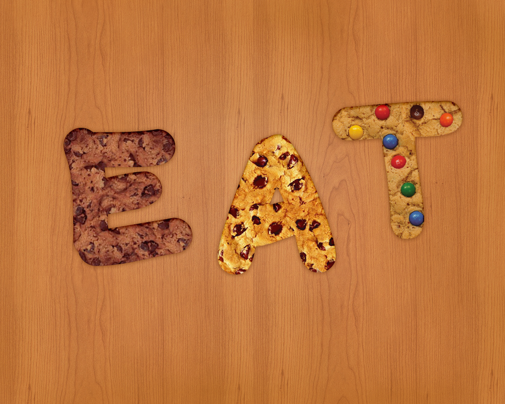
Give it a try. Here you can have a look at the preview of the final work.
STEP 1: The set up
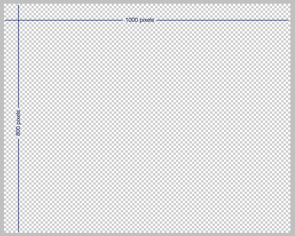
The first thing we have to do is to create a new Photoshop document (Ctrl+N). The dimensions I used are 1000 x 800 pixels.
STEP 2: The background
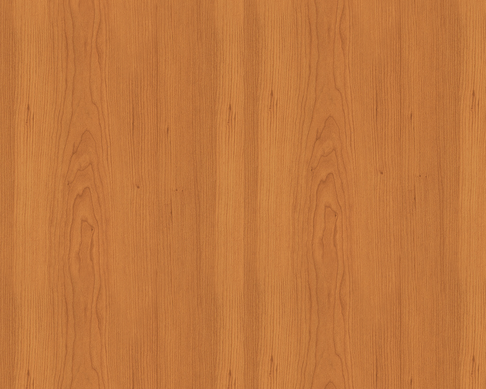
Let’s now create a proper background. I decided to use a wood pattern with which I filled the whole space. This kind of background contributes to evoke an idea of home-baked goodness and that’s fits in with our cookie theme.
Here’s the pattern:
STEP 3: Creating the text
Select the ‘Horizontal Type Tool’, and select a font — ‘Myriad Pro’ looks good, but any broad-bodied font should work — and set the size to 300 pixels. Then write whatever word you like — in this case, I wrote “EAT”.
The color you use is of no importance since we are only going to use this layer as a landmark for our future actions.

STEP 4: Preparing the textures
It’s time to create a cookie texture. You’ll have to source (or photograph) a cookie texture image to sample from. If you use Google Images, just be wary of using unlicensed imagery you find in any commercial work you do.
It’s better if you choose a picture that has no background, otherwise you will have to remove it with the Photoshop’s ‘Background Eraser Tool’.
Open that image in Photoshop:
STEP 5: Integrating the text and texture
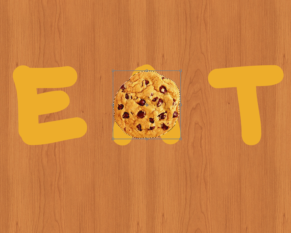
You have now to duplicate the cookie in order to have much more cookies. Then, use them to cover the whole letter. You can also decide to change their shape a little bit.
Select now the “Eraser Tool” and use it to erase the parts of the cookies that overlaps on others; the aim is to get the most homogeneous result as possible.

STEP 6: Merge the result

When you finish erasing the biscuits, merge all the layers; you can do this just by selecting all them (Ctrl + Mouse Click) and pressing Ctrl + E.
We are now going to give the cookies the shape of the letter. So press Ctrl and click on the text layer. You will thus create a selection of the text. Then go to “Selection”, click “Inverse” and finally press the “delete” button on your keyboard. If you did everything right, your cookies should now have a letter shape.
Here you can see my result:
STEP 7: Adding layer effects
We can now proceed to add some layer effects. Open the ‘Layer Style’ panel and go to ‘Drop Shadow’. These are the values you can insert:
– Blend Mode: Normal
– Color: #5c2f04
– Opacity: 70%
– Angle: 90°
– Distance: 1
– Spread: 2
– Size: 10
– Noise: 0
Move to ‘Inner Shadow’:
– Blend Mode: Linear Burn
Opacity: 25%
– Angle: 90°
– Distance: 4
– Choke: 0
– Size: 5
– Noise: 0
In the end, go to ‘inner glow’ and set the parameters like these ones:
– Blend Mode: Multiply
– Color : #630606
– Opacity: 20%
– Noise: 0
– Technique : Softer
– Source : Edge
– Choke : 0
– Size : 3
– Range: 50
– Jitter : 0
Of course, please bear in mind that there is no one perfect set of values here. Play around with these settings. At best, you’ll get an even better result — at worst you’ll have learned a little more Photoshop know-how for next time.
STEP 8: Adding the final touches
Things are looking good, but we have one last step: ‘Fill Layer Style’.

So go to ‘Layer’, ‘New Fill Layer’ and click on ‘Solid Color’. Place this layer on top of the others and set the Blending Mode to ‘Screen’. Also, remember to set the ‘Opacity’ to 10%. Since the aim of this step is to give a warm effect to the whole work, I suggest you choose a warm color such as Red, Orange or Yellow.
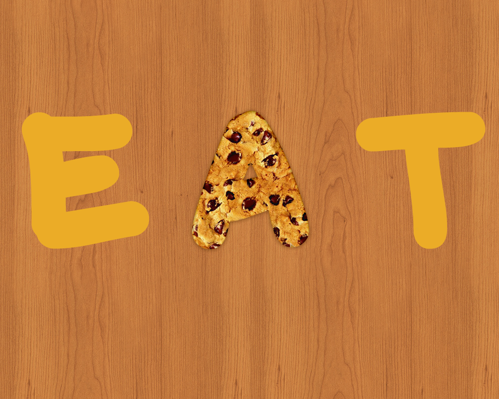
You should get a result similar to this one:
CONCLUSION
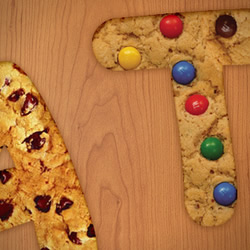
There you have it. We have made the letter A. You can easily create the other letters by repeating this process. If you have a large cookie texture (or whatever imagery you’re using), move it around to minimize pattern repeats. If you texture sample is small, don’t be afraid to rotate the copies a little to help hide any obvious repeats.
This is my final result, what about yours?
 Simone Sala
Simone is a graphic designer who loves technology, design and who is always looking for new trends and innovative concepts. He also likes to give tips and to share his knowledge with other tech-lovers.