Creating “Loading” Animations Using Only CSS3

Key Takeaways
- CSS3 methodologies offer a lighter, faster alternative to GIFs for creating loading animations on the web. Basic HTML elements and CSS3 properties can be used to create these animations, which can indicate that a page or element is loading.
- The creation of a loading animation using CSS3 and HTML involves designing the structure using HTML and applying CSS properties. This can include using the span element, applying display properties, and defining animations using keyframes. The colors, size, and positioning of elements can be adjusted for different effects.
- CSS3 animations have numerous benefits, including smoother and more complex animations, better control over the animation process, and improved performance efficiency compared to JavaScript-based animations. These animations can be made responsive using media queries and can be used in combination with SVG and JavaScript.
If you have spent any significant time on the web, you will almost certainly have seen small animations that indicate a page, image or other web element is loading or being processed. You can easily come across these in many situations such as PayPal transactions, Facebook navigations, logins, form submissions and many more web contexts.
These animations not only look good but also give a feeling of complex processing at the backend. More than anything, these animations tell the user that the “wheels are in motion”, that their request is being processed. Without them, users are often left in the dark wondering whether anything is really happening.
Most of the time, the images used are GIF files that run continuously until another event occurs. Generally, creating loading graphic images requires a good knowledge of photo editing software such as Photoshop, CorelDraw or similar, which can involve complex procedures and tweaks. GIF images can also be heavy in size and take time to load at the front end.
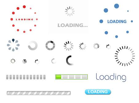
Examples of Loading GIFs
The best alternative to such heavy graphics images is using CSS3 methodologies to replace them. Using only basic HTML elements like span and CSS3 properties like 3D transform you can create beautiful and extremely light animations.
One of the main advantages of using CSS techniques over GIF images is that they don’t take so much time to load. They are much faster and are available whenever we need them.
NOTE: If you are unfamiliar with the transform properties of CSS3 then I strongly recommend you to read “Advanced CSS3 2D and 3D Transform Techniques” in which I cover the subject.
In this post, I am going to show you how to create beautiful loading animations using only CSS3 and HTML.
Let us first start by designing the structure of loading animation using HTML.
Structure Using HTML
We will create a container div classed loadingdiv and then insert five span elements. Follow the example below:
<div class="loadingdiv">

            <span></span>

            <span></span>

            <span></span>

            <span></span>

            <span></span>

</div>
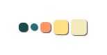
The loading animation which I will be creating will consist of five circles as in the figure below:

Each span in the above HTML will be designed in the form of circles, each having different colors but sharing the same CSS properties, which we will see soon.
The Basic CSS
.loadingdiv span{

   display: inline-block;

    vertical-align: middle;

    width: 10px;

    height: 10px;

    margin: 50px auto;

    background: #174C4F;

    border-radius: 5px;

    -webkit-animation: loading 0.9s infinite alternate;

    -moz-animation: loading 0.9s infinite alternate;

    box-shadow:1px 1px 1px #444444;

}
We have set the span’s display property to inline-block so that each circle floats right next to the previous span.
Now, you might be thinking, “Why didn’t he just float:left?”
The main reason is that when we change the individual heights of each span in a continuous manner they will get dis-ordered and make the animation look wrong. Using inline-block will prevent the span elements getting positioned on top of each other when the height of the previous span gets reduced.
We have also set the vertical-align property to middle so that the circle stays in the middle of the vertical line when its shape changes. This will be clearer when we finish applying CSS3 transform to the above spans.
We have also bound the loading named animation to the span element. We will soon define the loading animation using keyframes. To be on the safe side, we have used vendor defined animation which is expected to work on almost every modern browser.
Now, if you open the browser and check the webpage, you will five static circles that have the same colors.
Our next aim is to change the colors of each circle.
Let’s see how to do it:
.loadingdiv span:nth-of-type(2) {

    background: #207178;

    -webkit-animation-delay: 0.2s;

    -moz-animation-delay: 0.2s;

}

.loadingdiv span:nth-of-type(3) {

    background: #FF9666;

    -webkit-animation-delay: 0.4s;

    -moz-animation-delay: 0.4s;

}

.loadingdiv span:nth-of-type(4) {

    background: #FFE184;

    -webkit-animation-delay: 0.6s;

    -moz-animation-delay: 0.6s;

}

.loadingdiv span:nth-of-type(5) {

    background: #F5E9BE;

    -webkit-animation-delay: 0.8s;

    -moz-animation-delay: 0.8s;

}
We have used the nth-of-type pseudo class to set the colors of each adjacent circle. You can see I have also provided a delay of 0.2s in the animation property for each span. This allows the spans to take action after 0.2s from the time of the previous span’s effect. This way the span will show animation in continuous manner.
Now let’s define the animation using CSS3 Transforms and Keyframes. Here we go!
@-webkit-keyframes loading {

  0% {

    width: 10px;

    height: 10px;

    -webkit-transform: translateZ(0);

  }

  100% {

    width: 24px;

    height: 24px;

    -webkit-transform: translateZ(-21px);

  }

}

@-moz-keyframes loading {

  0% {

    width: 10px;

    height: 10px;

    -moz-transform: translateZ(0);

  }

  100% {

    width: 24px;

    height: 24px;

    -moz-transform: translateZ(-21px);

  }

}
As you can, see we have again given preference to the vendor-specific keyframe definitions. You have to define the property of each span at 0% of the time and at 100% of the time i.e., at the completion.
We have set the width and height of the circle to 10px at 0% and to 24px at 100%. This way each circle grows repeatedly one after another.
To make them look more stylish we have used translateZ which is set to 0px at 0% and -21px at 100%. This will give the circle an elevated effect, moving out of the screen.
Now let’s experiment a bit!
1) Try changing the transform property from transformZ to transformY. You will get a different effect in that the circles will move vertically.
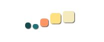
2) Remove the background property from each span and make them share the same color. Let’s say we will go with #888888. Also add opacity:0.1 at 0% transform and opacity:1 at 100% transform . We will get a look like below:

This way you can create unlimited unique and stylish loading animations without having to go through troublesome Photoshop methods.
You can, of course, use your CSS3 creativity to make more decorated objects than just the circles I’ve used for explanatory purposes.
I hope you enjoyed the post and this small CSS trick. If you have any queries then leave a note below in the discussions section.
Frequently Asked Questions about Creating Loading Animations Using CSS3
What are the benefits of using CSS3 for creating loading animations?
CSS3 offers a range of benefits when it comes to creating loading animations. Firstly, it allows for smoother and more complex animations compared to its predecessors. It also provides better control over the animation process, allowing developers to specify the duration, timing function, and delay of the animation. Additionally, CSS3 animations are generally more performance-efficient than JavaScript-based animations, which can lead to a better user experience.
How can I make my CSS3 loading animation responsive?
To make your CSS3 loading animation responsive, you can use media queries. Media queries allow you to apply different styles for different devices based on their screen size, resolution, and other characteristics. You can adjust the size, position, and other properties of your animation to ensure it looks good on all devices.
Can I use CSS3 animations on all browsers?
While CSS3 animations are widely supported by modern browsers, there may be some older versions that do not support them. To ensure your animations work on all browsers, you can use vendor prefixes, which are specific codes that allow CSS3 features to be recognized by specific browsers. Alternatively, you can use JavaScript or jQuery fallbacks for browsers that do not support CSS3 animations.
How can I optimize the performance of my CSS3 loading animations?
There are several ways to optimize the performance of your CSS3 loading animations. One way is to use the ‘will-change’ property, which allows the browser to optimize the animation before it starts. Another way is to limit the number of animated properties, as animating many properties at once can be resource-intensive. Also, using translate and scale transformations instead of changing the position and size properties can lead to smoother animations.
Can I use SVG with CSS3 for creating loading animations?
Yes, you can use SVG (Scalable Vector Graphics) with CSS3 to create loading animations. SVG is a vector-based image format that can be scaled without losing quality, making it ideal for animations. You can apply CSS3 animations to SVG elements just like you would with HTML elements.
How can I test the performance of my CSS3 loading animations?
You can use browser developer tools to test the performance of your CSS3 loading animations. These tools provide a timeline view of your animations, allowing you to see how long they take to run and how much CPU they use. You can also use online tools like CSS Lint to check your code for performance issues.
What are some common mistakes to avoid when creating CSS3 loading animations?
Some common mistakes to avoid when creating CSS3 loading animations include not optimizing for performance, not testing on different browsers and devices, and not considering the user experience. For example, your animation should not be too long or distracting, as this can frustrate users. It’s also important to ensure your animation works well with the rest of your website’s design.
Can I use CSS3 animations for more than just loading animations?
Absolutely! CSS3 animations can be used for a variety of purposes, not just loading animations. You can use them to create hover effects, slide-in menus, scrolling effects, and much more. The possibilities are virtually endless.
How can I learn more about CSS3 animations?
There are many resources available online to learn more about CSS3 animations. Websites like MDN Web Docs, CSS-Tricks, and W3Schools provide comprehensive guides and tutorials on the topic. You can also find many video tutorials on platforms like YouTube and Udemy.
Can I use CSS3 animations in combination with JavaScript?
Yes, you can use CSS3 animations in combination with JavaScript. While CSS3 animations are great for simple animations, JavaScript can provide more control and flexibility for complex animations. You can use JavaScript to trigger CSS3 animations, control their timing, or even create animations that are not possible with CSS3 alone.
Web Designer with over 6 years of experience, including user experience and front end development. Currently, CEO and Co-Founder of Hashnode, a network of software developers. Has published two books: Jump Start Bootstrap and Jump Start Foundation for SitePoint Premium.