For many, planning a multi-screen web experience is no longer an afterthought; it’s the starting point. More and more, people are viewing websites outside of the traditional desktop screen. From tablets and phones to netbooks, laptops, and even TVs, optimizing for a wider audience (and their wider screens) is key. However, there are many considerations to explore before even one line of code is written.
Responsive Web Design
When Ethan Marcotte introduced the concept of creating one website to target multiple screens, the phrase “responsive web design” became part of the vocabulary of anybody who worked in and around the digital space.
With the incorporation of CSS3 media queries, websites can go beyond just increasing or decreasing the width of elements already seen in fluid layouts. Elements of the page can now be adapted gracefully between different resolutions by shifting, resizing, hiding, or even removing different elements. This technique enables the website to respond to the context of the viewer. In addition to maintaining only one code base and updating content for a single site, using an adaptive grid design can also create continuity between each screen’s experience.
At first glance, responsive web design seemed to be the right solution for any mobile website. While it is a great alternative to creating a separate mobile site, there are still some challenges to consider.
The end result of a responsive website will be a single platform that accommodates different resolutions and devices. This is almost certainly better than a website designed for only one viewing device, but it also requires many more decisions and much more extensive planning: additional design mockups will be required to plan each layout, testing will require a wide array of viewing devices, and content strategists will need to undergo a difficult triage process where they decide which content will be marginalized (or removed entirely) from smaller screens.
When making these difficult decisions, mobile designers should remember that people using desktops have different viewing habits than those on a mobile phone. The importance of content and elements depend on the viewer’s device. For example, your phone layout should feature phone numbers much more prominently compared to equivalent desktop layouts. Similarly, your layouts for touch-based devices should have interactive menus that are designed for fingertips instead of cursors. These touch-friendly accommodations could take the form of large buttons, swipe-friendly design, and a lack of hover effects (you can’t truly “hover” your fingertip like you would a cursor). In general, your mobile accommodation decisions should stem from careful study of the common interaction behaviors associated with each device.
To determine how to redistribute these elements, more collaboration between designers and developers will be needed. Rather than the traditional flow where the designer designs first and then hands the PSDs over to the developer, more design iterations combined with development will be necessary as the site goes from conception to completion.

Mobile Websites
For sites that are content-heavy, creating a separate mobile website may still be a better option despite requiring the maintenance of separate code bases and content. The separate needs of the mobile site and the desktop site sometimes require entirely different changes to the structure and content placement. Whole sections may need to be re-imagined beyond resizing elements, shifting columns and pushing sidebars to the bottom.
MailChimp is a great example of how the distinct mobile and desktop sites reflect how the layout and content has been changed to suit the device used to view it.
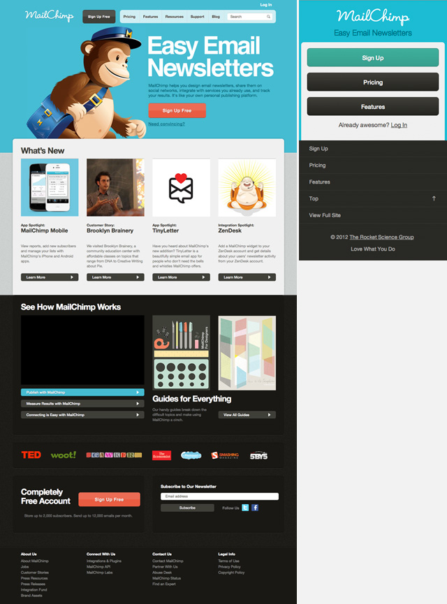
The two versions are drastically different in terms of content and page layout. The desktop version includes a variety of resources and product information, whereas the mobile site’s homepage has been simplified and focuses on signing up, product features, pricing, and login. However, the mobile version still provides an option to view the full site to access all of the information available.
To develop desktop and mobile sites as distinct as these, responsive web techniques would not be the right approach.
Mobile, Native, and Hybrid Apps
Choosing between mobile web apps and native apps has it’s own set of complexities. As seen in the previous example, a mobile website can be styled to look similar to native app. Since it is run from the device’s browser (usually under a sub domain), it can be accessible across all devices and does not require any downloads or updates, leading to a wider reach. You can also easily add touch gestures like tap events and swipe actions using libraries such as jQuery Mobile.
Native apps on other hand are built for specific devices in that device’s programming language (e.g. Objective-C for iOS, Java for Android). Since the native app runs from the device, it can access the device’s resources and can be used offline. Native apps are also distributed through the device’s marketplace that can allow it to be monetized and gain visibility.
Hybrid apps are a combination of the two. Like web apps, it can be written in standard HTML, CSS and JavaScript, but this programming is embedded into the application. It is native because it needs to be downloaded from an app store and runs from the device.
Final Decision
There are so many options for building and maintaining a mobile presence; how does one decide? No two projects are ever the same, so it’s important to consider which options fits the specific project, what the requirements are, and what resources are available. However, with rapid technological advances introducing more ways to view the web, planning a multi-screen experience should be the starting point, not the afterthought.
Do you have any multi-screen projects, frameworks, or experiences to share? Do you consider “responsive web design” to be the one-size-fits-all solution to all mobile projects, or do you find that separate mobile websites and native mobile apps offer significant advantages?
 Christina Truong
Christina Truong holds a Bachelor of Arts in Pyschology and Communications but shortly after graduation, she decided to pursue a career in web development. Since then, she has gained agency experience working on projects for top brands as well as freelance work with small businesses and personal websites. She has also participated in the initiative to encourage more women to join the technology field by volunteering for Ladies Learning Code. Based in Toronto, Ontario she has participated as a guest speaker, workshop mentor and instructor. She is currently at Teehan+Lax, digital experience agency, where she is a Developer and occasional blogger.