Icon design is deceptively difficult. Fitting salesmanship, intuition, and aesthetic appeal into such a small canvas can be quite a challenge, especially if you’re limited by technical constraints or brand guidelines. Skillful designers must go far beyond making their work “pretty”; they need it to communicate effectively and successfully signify the content or software that it symbolizes. Today, I’ll walk you through the process of creating a wall clock vector in Illustrator. We’ll use various shape tools, the pen tool, the rotate tool and various options within the object and effect menus to achieve the final result. I hope you will learn few handy tips along the way. So, let’s get started!
Resources:
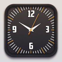
American Captain FontFinal result:
 (Download the completed design file.)
Step 1
Create a new document in Illustrator with a 600px width and a 500px height.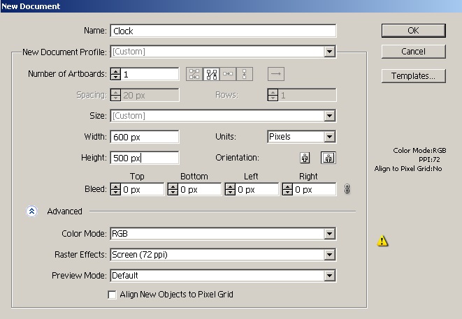
Step 2
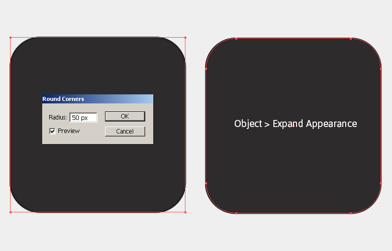
First, we’ll make the clock’s frame in two parts: outer, and inner. Let’s start with the outer frame. Pick #2D2B2C as your fill and #231F20 as your stroke color. Now, select the rectangle tool (“M”) and click on the canvas to view the rectangle window. Enter 290px for both width and height, and press “Ok”. Label this as your “Outer Frame”.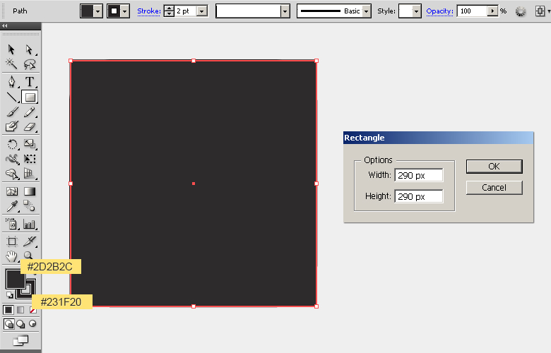 Select the rectangle by clicking the ring-shaped target present at right side of the respective layer and go to “Effect” > “Stylize” > “Round Corners”. Enter a 50px value there to convert it into a rounded rectangle. Now, go to “Object” > “Expand Appearance” to modify the shape.
Step 3
Next, select the outer frame and go to “Object” > “Path” > “Offset Path”. Offset the path by “-12px”. Now, select this new shape, change its fill color to #231F20 with no stroke, and label it as “Inner frame”.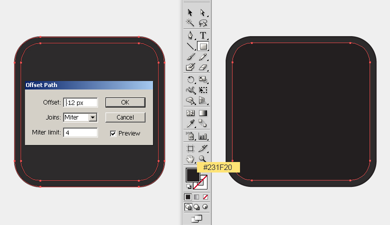
Step 4
Select the inner frame and go to “Object” > “Path” > “Offset Path”. Offset the path by “-4px”. Now, select the new path, change its fill color to #2D2B2C with no stroke, and label it as “Base”.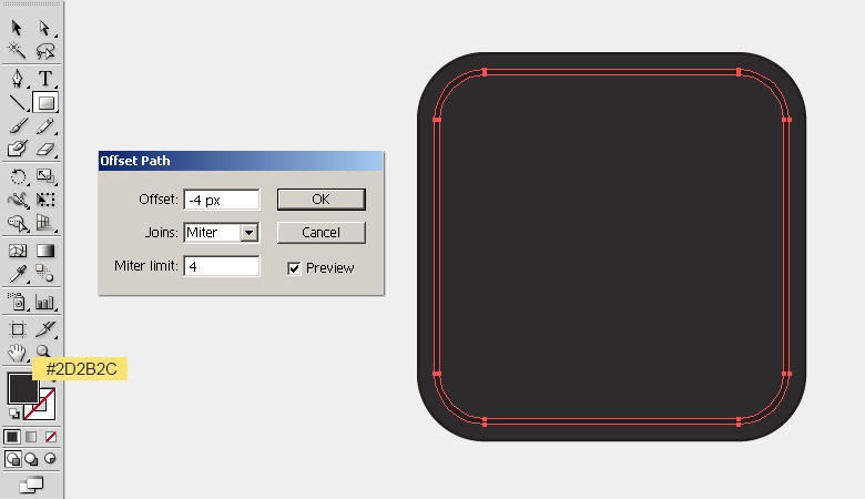
Step 5
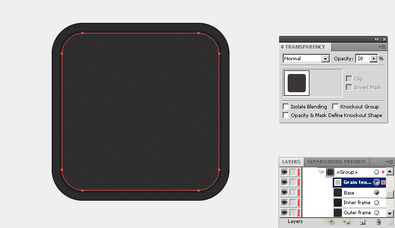
Next, we’ll apply a grainy texture to the clock. Select the base, press Ctrl + “C” to copy, it and press Ctrl + “F” to paste in front. Now, go to “Effect” > “Artistic” > “Film Grain”. Apply the following settings here and hit “OK” to apply the grainy effect.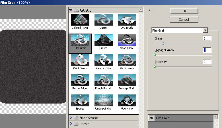 Reduce the texture opacity to 30% within the transparency panel (Shift + Ctrl + F10).
Step 6
To make a highlight over the frame, select your outer frame and go to “Object” > “Path” > “Offset Path”. Offset the path by “-2px”. Now, select this new path, set its fill color to “none,” and give it a white stroke (1pt). Adjust the opacity of the highlight to 22% within the transparency panel (Shift+ Ctrl+ F10).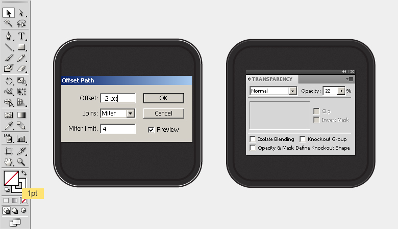
Step 7
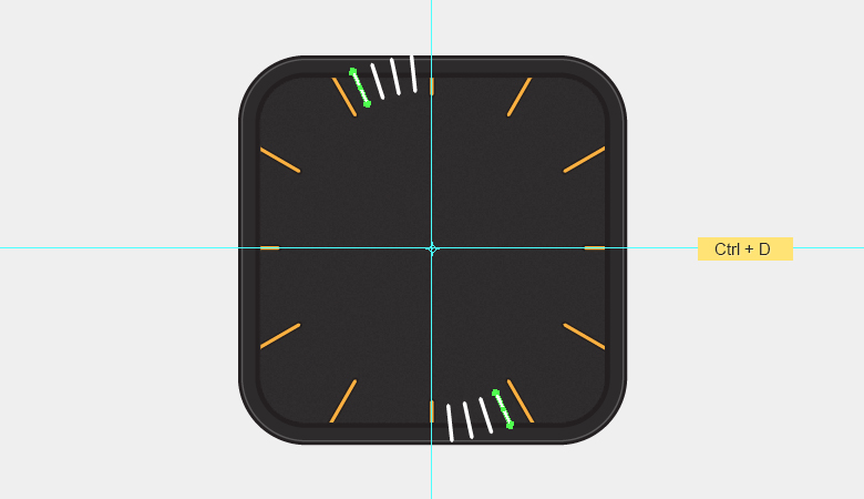
Next, we’ll make the markings over the clock. Position the guides for proper alignment. Press Ctrl + “R” to view the rulers, and drag vertical and horizontal guides to intersect at the center of your clock. Now, draw a thin rectangle over the top edge to make hour markings using fill color #FBB040 and a black stroke (1pt). After that, select it and go to “Effect” > “Stylize” > “Round Corners”. Enter 2px for your radius and go to “Object” > “Expand Appearance” to modify the shape.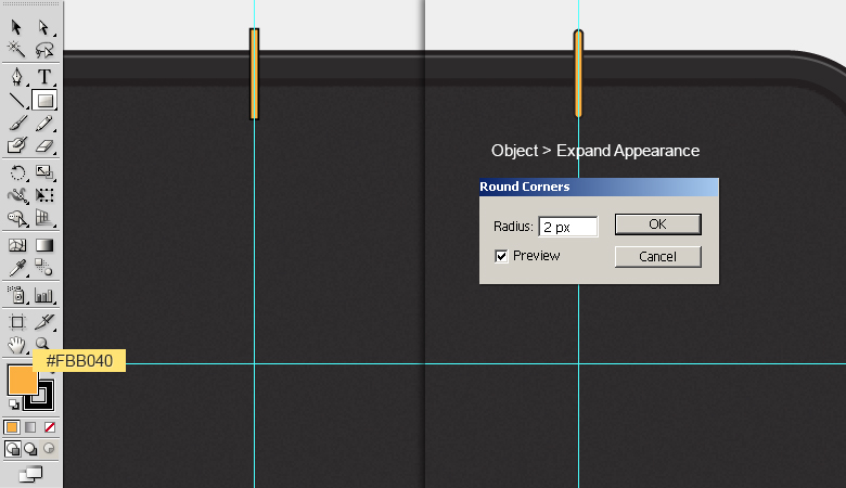
Step 8
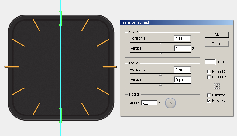
Select the rounded rectangle, press Ctrl + “C” to copy it and press Ctrl + “F” to paste in front. Now, place this copy over the lower edge of clock.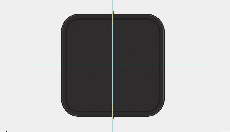 Select both of the markings and go to “Effect” > “Distort & Transform” > “Transform”. Apply the following settings here to make the rest of the markings.
Step 9
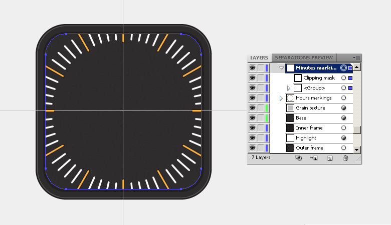
To confine the markings within the base, we’ll apply a clipping mask to them. However, we need to expand the markings first. Select them and go to “Object” > “Expand Appearance”. Now, make a copy of the “Base” layer, remove its fill and stroke, and place it above the markings layer. Now, select both the base copy and markings layer and go to “Object” > “Clipping Mask” > “Make”.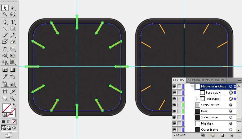
Step 10
Next, we’ll make minute markings. Draw a small rectangle over the top edge of the clock with a white fill color. Convert it into a rounded rectangle with a 1.2px radius and expand it using the same pathway described in step 7. Now, make a copy and position it over the lower edge as shown below.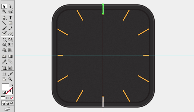
Step 11
Select both rectangles, pick the rotate tool (“R”) and click the canvas to view the options window. Enter 6⁰ for your angle and hit “OK” to move the rectangles by 6⁰. Once again, select the rotate tool (“R”). This time enter a 6⁰ angle and click the “Copy” option.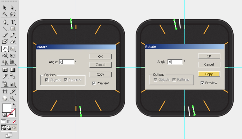 Now, press Ctrl + “D” twice to get two more copies.
Step 12
Select all of these rectangles and go to “Effect” > “Distort & Transform” > “Transform”. Apply the following settings here to make the rest of the markings.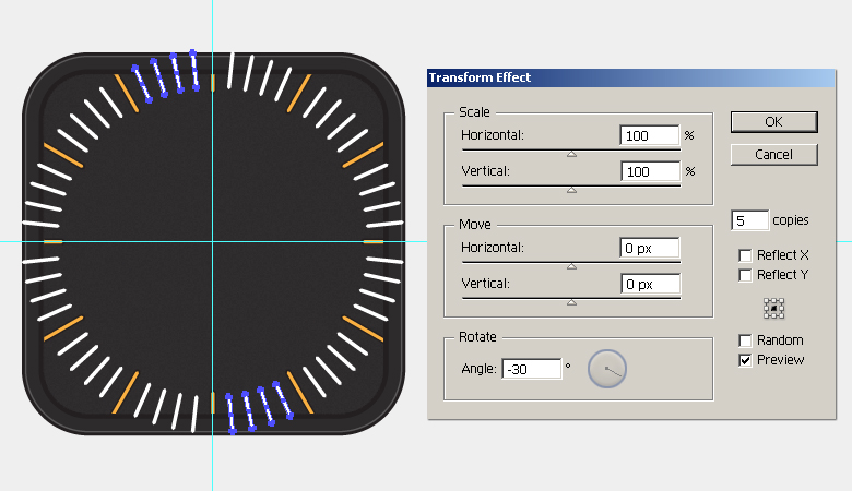 Now, confine the minute markings to the clock base by applying a clipping mask to them using the same technique used in step 9.
Step 13
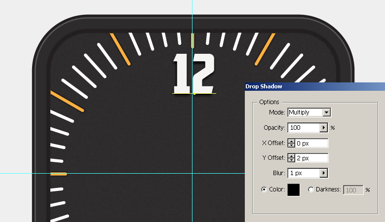
Next, we’ll add numbers. Pick #F6F4F2 as your fill color and select the type tool (“T”) to type in the number “12” aligned along the vertical guide. I’ve used “American Captain” font with a 50pt size.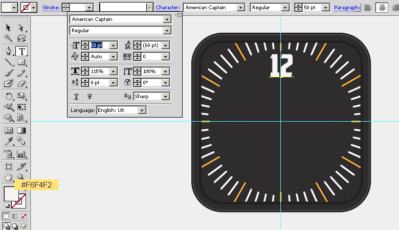 Select the newly-created number and go to “Effect” > “Stylize” > “Drop Shadow”. Apply the following values here:
Step 14
Type in the rest of the numbers with the same drop shadow settings and align them along the guides.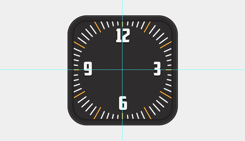
Step 15
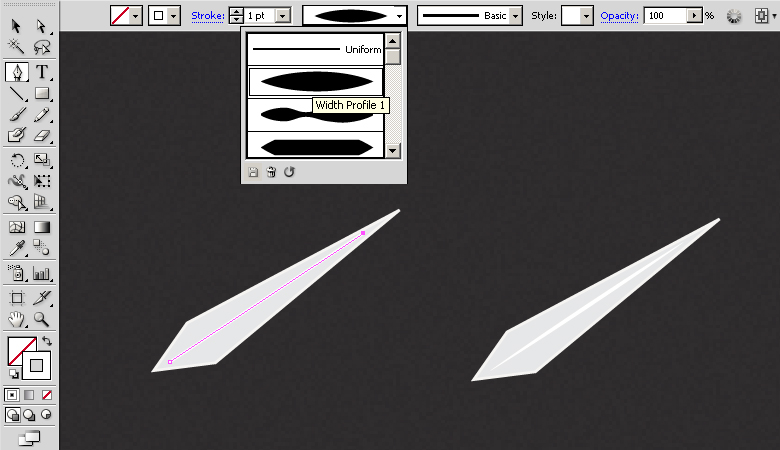
Now, we’ll make the clock’s hands. Pick #E6E7E8 as your fill color and #F6F4F2 for your stroke. Select the pen tool (“P”) to draw the shape shown below.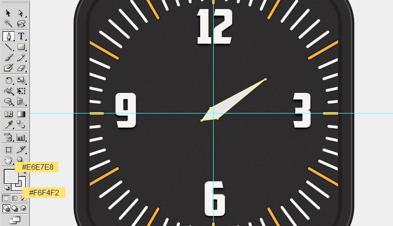 Draw a line using the pen tool (“P”) on a new layer with a 1pt white stroke. Change the width profile of the stroke to “width profile 1” in the control bar at the top of your interface.
 Make minute hand using the same technique.
Step 16
Now, make the seconds hand by combining two rectangles with fill color #F7941E position it as you like. Next, add two circles over the hand: a larger ellipse using color #FBB040 and smaller one using color #F7941E. After that, apply the following settings for drop shadow on these ellipses one by one.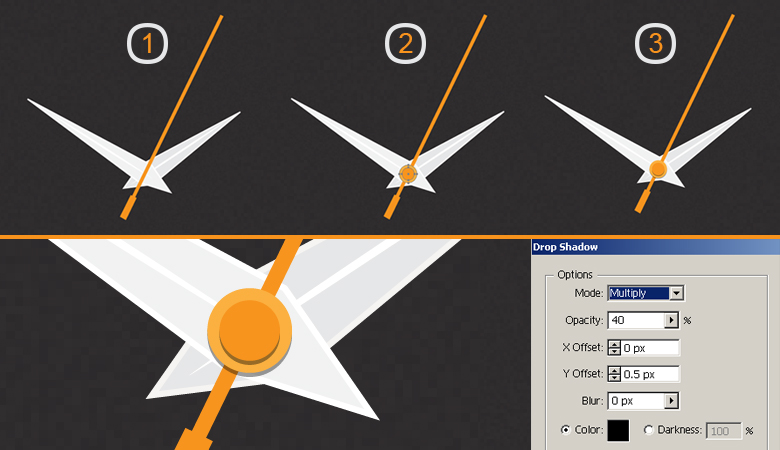
Step 17
Next, we’ll make hands’ shadow. Select the hour hand, press Ctrl + “C” to copy it, and press Ctrl + “B” to paste it in place. Change the fill of this new copy to black, drag it 2-3 steps downwards, and decrease its opacity to 30-35% within the transparency panel. Make the shadow of the minute hand the same way, however, drag it 4-5 steps downwards, as it’s farther from the base compared to hour hand, necessitating a more distant shadow. Similarly, the shadow of the seconds hand should be even more downward, and you must place it below the rest of the layers. However, part of its shadow should be over the short needle, so draw a thin rectangle, rotate and position it as shown below.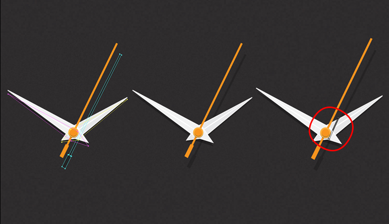
Step 18
We’ll make the shadow under the top border of the clock. To achieve this, select the “Base” layer, press Ctrl + “C” and then press Ctrl + “F”. Make a copy of the layer. Now, drag the topmost copy 6-7 steps downwards. Select both copies and hit “Minus Front” within the pathfinder panel (Shift + Ctrl + F9). Change the blending mode of this new shape to “Multiply” with 50% opacity. Select it and go to “Effect” > “Blur” > “Gaussian Blur” and apply a 2px Gaussian blur effect to it.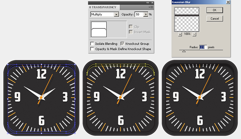
Step 19
Make another copy of the “Base” layer and place it above the rest of the layers. Apply the following gray-to-white gradient on it using the gradient tool. Change its blending mode to “Soft Light” with a 40% opacity.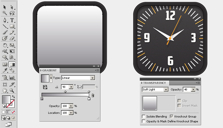
Step 20
Next, we’ll draw few highlights using the pen tool (“P”) with a white 1pt stroke and width profile 1 — the same method we used for the clock hands in step15.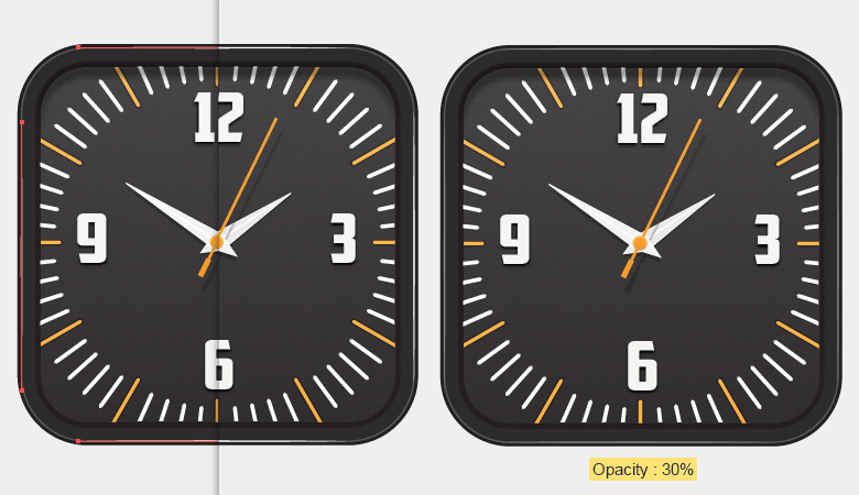
Step 21
To create the shadow of the clock, make a copy of the outer frame layer and press Ctrl + “B” to paste in back. Decrease its height from the top using the selection tool (“V”) and apply the following drop shadow settings: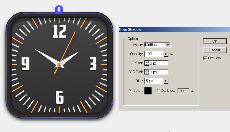
Step 22
To intensify the shadow effect, make a copy of the shadow layer created in step 21 and press “Shift + F6” to open the appearance panel. Double-click its contents and edit the drop shadow settings using the guide below: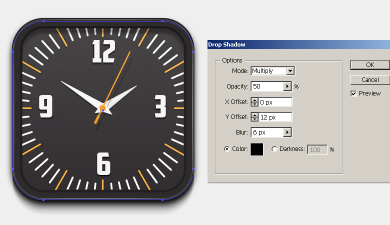
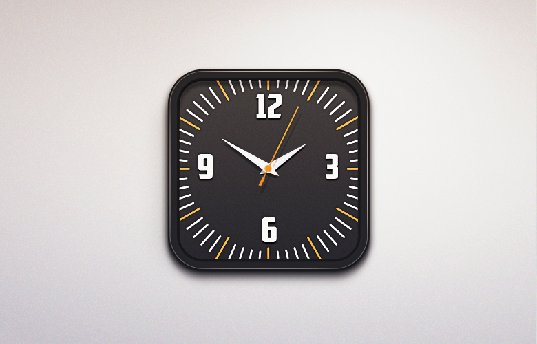
Final result:
That’s it! Your click icon is complete. I hope you enjoyed the tutorial and learned something useful. Do share your thoughts!
Frequently Asked Questions about Creating a Stylish Wall Clock Icon in Illustrator
What are the basic tools needed in Adobe Illustrator to create a wall clock icon?
To create a wall clock icon in Adobe Illustrator, you will need to familiarize yourself with several tools. These include the Ellipse Tool for creating the clock face and hands, the Rectangle Tool for creating the clock body, and the Gradient Tool for adding depth and dimension. You will also need to use the Direct Selection Tool for adjusting shapes and the Pathfinder Panel for combining and subtracting shapes.
How can I add depth and dimension to my wall clock icon in Illustrator?
Adding depth and dimension to your wall clock icon can be achieved by using gradients and shadows. The Gradient Tool in Illustrator allows you to create a gradual blend between multiple colors, which can give the illusion of depth. You can also use the Drop Shadow effect to add shadows to your icon, making it appear more three-dimensional.
Can I customize the design of my wall clock icon in Illustrator?
Absolutely! Illustrator provides a wide range of tools and features that allow you to customize your design. You can change the color, size, and shape of your clock icon, add different types of hands, and even include numbers or markers on the clock face. The possibilities are endless, so feel free to experiment and create a design that suits your needs.
How can I create a set of flat clock icons in Adobe Illustrator?
Creating a set of flat clock icons involves using the basic shapes and tools in Illustrator, such as the Ellipse and Rectangle Tools. You can create different designs by changing the size and position of these shapes. To give your icons a flat design style, avoid using gradients or shadows and stick to solid colors.
How can I save and export my wall clock icon in Illustrator?
Once you’re satisfied with your design, you can save and export your wall clock icon by going to File > Save As. Choose the format you want to save your icon in, such as .ai for Illustrator files or .png for images. If you’re exporting your icon for use on the web, make sure to select the “Use Artboards” option to ensure that your icon is saved at the correct size.
Can I use my wall clock icon in other Adobe applications?
Yes, you can use your wall clock icon in other Adobe applications. For instance, you can import your icon into Adobe Photoshop or InDesign for further editing or to include it in a larger design project. Just make sure to save your icon in a format that is compatible with the application you’re using.
How can I create a realistic wall clock icon in Illustrator?
To create a realistic wall clock icon, you’ll need to pay attention to details such as shading, texture, and perspective. Use the Gradient Tool to add depth to your design, and consider using the Mesh Tool to create more complex gradients. You can also use the Pen Tool to draw more detailed elements, such as the clock hands or numbers.
What are some tips for designing a stylish wall clock icon in Illustrator?
When designing a stylish wall clock icon, consider the overall aesthetic you want to achieve. Do you want a modern, minimalist design, or something more traditional? Choose colors and shapes that reflect this aesthetic. Also, remember to keep your design simple and clean for maximum readability.
How can I add numbers or markers to my wall clock icon in Illustrator?
Adding numbers or markers to your wall clock icon can be done using the Type Tool. Simply select the Type Tool, click on your artboard where you want the number or marker to be, and type it in. You can then adjust the size, font, and color of your text using the Character Panel.
Can I animate my wall clock icon in Illustrator?
While Illustrator itself does not support animation, you can create a static design for your wall clock icon in Illustrator and then import it into an animation software like Adobe After Effects to animate it. You can animate elements like the clock hands to move around the clock face, or even animate the entire clock to spin or move across the screen.
 Anum Khan
Anum is Web and Graphic designer. Addicted to Photoshop and crazy for pixel perfection. She is also an active blogger, sharing her passions, skills and creative details on her blog Websoulz. She loves to connect with the community, sharing the latest design gossips and rolling her eyes on boring trends.