- The Power of React Chart Libraries
- Recharts: A Popular Choice
- Nivo: Creative and Customizable Charts
- Victory: Cross-platform Flexibility
- React-vis: User-friendly Components
- Visx: Airbnb’s Powerful Solution
- BizCharts: Alibaba’s Business-centric Approach
- Apache Echarts: Open-source Versatility
- React-stockcharts: Financial Data Visualization
- Ant Design Charts: User Experience Matters
- Tips for Choosing the Right React Chart Library
- Summary
- FAQs About React Chart Libraries
Data visualization has become an essential aspect of modern applications, with businesses and individuals relying on visually appealing and informative charts to make data-driven decisions. The rise of React, a popular JavaScript library for building user interfaces, has led to an increased demand for a React chart library that’s both powerful and easy to integrate into applications. In this article, we’ll explore the most popular React charting libraries for data visualization in 2024, providing insights into their key features, usage examples, and tips for choosing the right library for your React project.
The Power of React Chart Libraries
React chart libraries have gained popularity due to their ability to offer powerful data visualization tools for developers, making it easier to create interactive and visually appealing charts, with a wide array of options available, such as:
- Recharts
- Chartjs
- React-chartjs-2
- Victory
- Visx
- Nivo
- React-stockcharts
- Ant Design Charts
Developers can find the perfect library to meet their specific needs.
The beauty of these charting libraries lies in their versatility. They cater to various charting requirements, ranging from simple bar charts, line charts, and pie charts, to more complex financial data visualizations
With the abundance of options, choosing the best React chart library for your project can be challenging.
In this article, we’ll explore some of the best React chart libraries, focusing on their distinctive features, adaptability, and user-friendliness.
Recharts: A Popular Choice
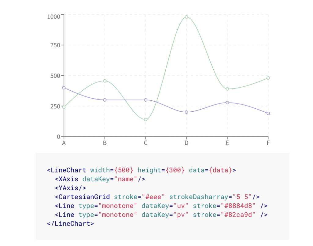
Recharts stands out as one of the most popular React chart libraries, boasting a sizable user base and community. Built with reusability and flexibility in mind, Recharts utilizes React components and SVG to provide developers with a powerful yet easy-to-use charting solution.
Recharts is designed to be highly customizable, allowing developers to create charts that fit their needs.
Key Features
Recharts offers a range of key features, including lightweight components, native SVG support, and simple customization. This charting library provides a wide variety of components, such as line, bar, and pie, which can be easily integrated into React applications.
Recharts utilizes the functionalities of React and SVG effectively, simplifying the process of creating responsive chart components, which contributes to its widespread popularity.
Usage Examples
Developers can employ Recharts’ components to generate a diverse range of charts such as line, bar, and pie charts. With its adjustable and responsive components, integrating these chart types into React applications becomes a seamless process.
Recharts’ popularity stems from its focus on providing a straightforward and adaptable solution for data visualization, catering to a wide array of project requirements.
Nivo: Creative and Customizable Charts
Nivo has garnered a reputation for offering creative and customizable charting solutions for React developers. With its visually appealing website and comprehensive documentation, Nivo makes it easy for developers to onboard and start using its wide range of chart styles and designs.
Key Features
Nivo’s key features include:
- support for SVG, HTML, and Canvas charts
- a variety of chart types and animations
- focus on customization, allowing developers to create unique and engaging data visualizations
This sets Nivo apart from other React chart libraries.
Given its vast selection of chart options and interactive documentation, Nivo serves as a compelling choice for developers aiming to produce visually captivating and interactive charts.
Usage Examples
Nivo components can be used to create a wide range of data visualizations, such as bar charts, pie charts, scatter charts, area bump charts, line charts, treemap charts, and more.
With its emphasis on customization and animation capabilities, Nivo enables developers to create data visualizations that not only convey information effectively but also captivate users with their dynamic and interactive nature.
Victory: Cross-platform Flexibility
Victory is a versatile React chart library that stands out for its cross-platform flexibility. Supporting both React and React Native, Victory provides a consistent API and a variety of chart types for developers to choose from, making it a popular choice for projects that require deployment across multiple platforms.
Key Features
Key features of Victory include cross-platform compatibility, customizable charts, and support for a wide range of chart types. Its focus on providing a consistent API across both React and React Native allows developers to create charts that can be easily integrated into various platforms, reducing the need for code duplication and simplifying the development process.
Usage Examples
Victory components can be used to create various data visualizations, such as:
- line charts
- bar charts
- pie charts
- scatter plots
Victory’s cross-platform compatibility and wide variety of charting options make it a handy solution for developers aiming to design responsive, adaptable data visualizations for deployment across various platforms.
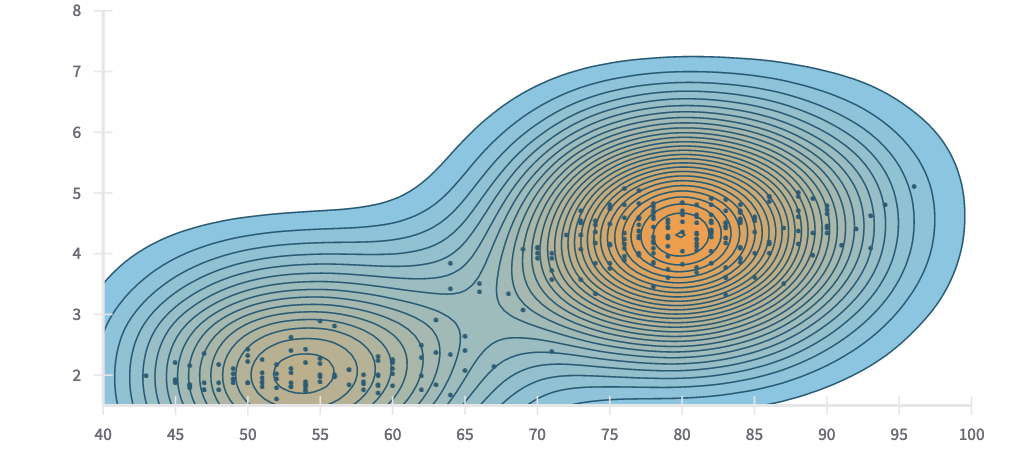
React-vis: User-friendly Components
React-vis is a user-friendly React chart library that offers a variety of common chart types and easy-to-use components. Developed by Uber, React-vis has gained recognition for its visually pleasing charts and comprehensive documentation, which allows developers to quickly onboard and start using the library.
Key Features
React-vis key features include a wide range of chart types, responsive design, and easy customization. With its focus on user-friendliness, React-vis provides developers with an accessible solution for creating visually appealing and interactive data visualizations.
Its range of chart types covers various options, such as:
- heat maps
- scatterplots
- contour plots
- hexagon heatmaps
- pie and donut charts
- sunbursts
- radar charts
- parallel coordinates
- tree maps
All these data visualization charts are available for data visualization.
Usage Examples
React-vis components can be used to create various data visualizations, such as:
- line, area, and bar charts
- heat maps
- scatterplots
- contour plots
- hexagon charts
The user-centric approach and variety of chart types offered by React-vis make it an attractive option for developers who want to create engaging, interactive data visualizations without much hassle.
React-vis, a react charting library, is easy to use and provides a wide variety of chart types, making
Visx: Airbnb’s Powerful Solution
Visx, developed by Airbnb, is a powerful React chart library that combines the best of both worlds by integrating the benefits of React and D3.js. This combination enables developers to harness the power of D3.js for data manipulation and computation while leveraging React’s component-based architecture for rendering.
Key Features
Visx’s key features include low-level graphical components, easy reusability, and a modular design. By offering a set of low-level visualization components, Visx allows developers to create custom and highly expressive charts while taking advantage of React’s component-based architecture.
This approach provides a high degree of flexibility and customization, making Visx an appealing choice for developers who require more control over their data visualizations.
Usage Examples
With Visx, developers can create a variety of custom data visualizations, such as line charts with custom axes, interactive bar charts with custom labels, and stacked bar charts with custom colors.
The potent mix of React and D3.js equips developers to build complex, highly customizable data visualizations, meeting a wide variety of react project needs.
BizCharts: Alibaba’s Business-centric Approach
BizCharts, created by Alibaba, is a React chart library designed specifically for business applications. Its focus on providing a wide range of chart types and customization options makes it a popular choice for developers working on projects that require visually appealing and informative charts.
Key Features
BizCharts offers a focus on G2 and React charting, a large collection of charts, and easy customization. By providing a wide array of chart types and customization features, BizCharts enables developers to create visually appealing and informative charts that cater to various business needs.
Its seamless integration with G2 and React charting ensures that developers have access to a powerful and versatile charting solution.
Usage Examples
BizCharts components can be used to create complex business charts and interactive data visualizations, such as displaying and hiding axis, displaying and hiding axis grid lines, and creating various chart types like line, bar, and pie charts.
The emphasis on a broad spectrum of chart types and customizable options renders BizCharts the perfect choice for developers building business applications that necessitate visually attractive and informative data visualizations.
Apache Echarts: Open-source Versatility
Apache Echarts is a versatile open-source chart library that supports a wide range of chart types and offers extensive customization options. It enables developers to create visually appealing and interactive charts with ease, making it an ideal choice for those looking for a powerful and flexible data visualization solution.
Key Features
Apache Echarts key features include support for various chart types, responsive design, and a rich set of customization options. With its support for multiple chart types, including line, bar, pie, scatter, and others, Apache Echarts enables developers to create visually appealing and informative data visualizations that cater to a wide range of project requirements.
Its responsive design ensures that charts can be easily viewed on any device, providing a seamless user experience across platforms.
Usage Examples
Apache Echarts components can be used to create a variety of interactive data visualizations, such as:
- line charts
- pie charts
- radar charts
- bar charts
- scatter plots
- heat maps
- tree maps
- sankey diagrams
- box plots
- polar charts
- gauge charts
- funnel charts
- word clouds
Its extensive range of chart types and customization options makes Apache Echarts a popular choice for developers looking to create visually engaging and informative data visualizations with ease.
React-stockcharts: Financial Data Visualization
React-stockcharts is a specialized React chart library designed to facilitate financial data visualization. Its focus on providing tools and components specifically for stock charting makes it an ideal choice for developers working on projects that require visually appealing and informative financial charts.
Key Features
React-stockcharts key features include support for various financial chart types, interactive tools, and customizable components. By offering a wide range of tools and components specifically designed for stock charting, React-stockcharts enables developers to create visually appealing and informative financial charts that cater to various financial data visualization needs.
Usage Examples
React-stockcharts components can be used to create a variety of financial data visualizations, such as candlestick charts, volume charts, and technical indicators, making them an excellent choice for those looking to implement react stock charts.
React-stockcharts, with its emphasis on offering tools and components tailored for financial data visualization, is an excellent pick for developers engaged in projects that need visually pleasing and informative stock charts.
Ant Design Charts: User Experience Matters
Ant Design Charts is a user-focused React chart library that offers:
- high-quality default charts
- an emphasis on user experience
- a wide range of chart types
- customization options
Combined with its focus on providing a seamless user experience, Ant Design Charts is an ideal choice for developers looking to create visually engaging and informative data visualizations.
Key Features
Ant Design Charts key features include a wide range of chart types, responsive design, and a focus on user experience. By providing a comprehensive suite of components for data visualization, Ant Design Charts enables developers to create visually appealing and informative charts that cater to various project requirements.
Its emphasis on user experience ensures that charts are easy to understand and interact with, providing a seamless experience for end users.
Usage Examples
Ant Design Charts components can be used to create a variety of data visualizations, such as:
- line charts
- bar charts
- pie charts
- area charts
- scatter charts
- radar charts
- funnel charts
- gauge charts
- heatmap charts
- treemap charts
- waterfall charts
With its focus on user experience and top-tier default charts, Ant Design Charts emerges as an excellent choice for developers aiming to craft visually immersive and informative data visualizations with ease.
Tips for Choosing the Right React Chart Library
While choosing a React chart library for your project, you should weigh aspects like project specifications, adaptability options, and the library’s user-friendliness. Each library has its strengths and weaknesses, and the best choice will depend on the specific needs of your project. For example, if you require complex financial data visualizations, a specialized library like React-stockcharts may be the best fit.
Considering the learning curve associated with each library is also crucial. Some libraries, like Recharts and Nivo, are known for their ease of use and comprehensive documentation, making them an appealing choice for developers new to data visualization. On the other hand, libraries like Visx and Apache Echarts offer more customization options and advanced features but may require more time to master.
By thoroughly weighing your project’s needs and each library’s capabilities, you can make a well-informed decision to choose the most suitable React chart library.
Summary
In conclusion, React chart libraries offer a powerful solution for developers looking to create visually appealing and informative data visualizations in their applications. With a wide array of options available, including popular libraries like Recharts, Nivo, Victory, React-vis, Visx, BizCharts, Apache Echarts, React-stockcharts, and Ant Design Charts, developers can find the perfect library to meet their specific needs. By considering factors such as project requirements, customization options, and ease of use, you can select the right React chart library to create engaging and informative charts that enhance the user experience and drive data-driven decision-making.
FAQs About React Chart Libraries
What is the library for graphs in react?
Recharts is the most popular chart library for React, and provides a variety of components to create sophisticated and interactive visualizations. It supports different types of charts such as line, bar, area, pie, and scatter.
How do you visualize a graph in react?
ReGraph is a toolkit for visualizing graph data in React, offering fully-reactive and customizable components that can be embedded in applications. You can use props to push data into the two visualization components: a chart and a time bar, which will update automatically.
How do I choose the right React chart library for my project?
When choosing a React chart library, weigh your project requirements, customization options, and ease of use to determine the best fit. Evaluate each library’s strengths and weaknesses to make an informed decision for your project. Consider the features that are important to you, such as the ability to create interactive charts, the ability to customize the look and feel of the charts, and the ease of use of the library.
Are there any specialized React chart libraries for financial data visualization?
Yes, there is a specialized React chart library for financial data visualization – React-stockcharts. It provides a variety of tools and components for creating visually appealing and informative financial charts.
Can React chart libraries support responsive design?
Yes, React chart libraries such as Recharts, Nivo, Victory, and Apache Echarts support responsive design, providing users with a seamless experience across any device.
 Dianne Pena
Dianne is SitePoint's newsletter editor. She especiallly loves learning about JavaScript, CSS and frontend technologies.