 Many typographic decisions are based on spacing. This is something that has always been true with printed type, and became applicable to web type with the advent of CSS. Regardless of whether we’re talking about using type for print or for the Web, there are two directions in which we can control spacing — horizontally, and vertically.
Horizontal Spacing
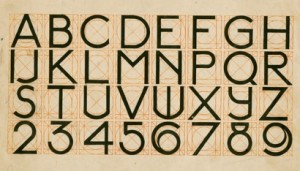
Kerning and tracking are two terms you’ll often hear in conversations about horizontal letter spacing. Kerning is the process of adjusting the space between individual letters. Often when you’re working with type, you’ll notice pairs of letters that appear too close together or too far apart. Most fonts have a set of rules that determine the spacing between specific characters. The kerning between the letters “Wa,” for instance, should be — and is — much tighter than the kerning between “WV.” Most of the time, the rules for the font are sufficient to make the text readable. If not, you can adjust the individual letter pairs within your image creation software of choice.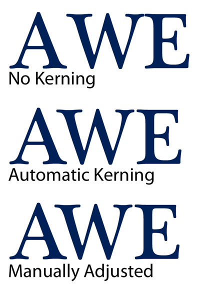 For the text in a web page, it’s impossible to make letter-by-letter kerning adjustments. What you can do is adjust the
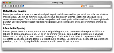
 letter-spacing CSS property, which is known in the print world as adjusting the font’s tracking. Like kerning, tracking adjusts the horizontal spacing between letterforms, but applies to the space between each letter. If you want your text to have a more open, airy feel, try adding a pixel or two to the tracking value. Figure 4.9 shows an example of the effect of spacing. The text in a web page is normally fairly tight, as you can see in Figure 4.9, so assigning a negative value here would probably reduce your text’s legibility.
Another horizontal spacing option in CSS is provided by the word-spacing property. This property can take a positive or negative length, or the keyword normal. As you might expect, this property affects the amount of whitespace between words.
Vertical Spacing
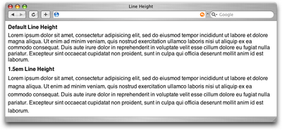
In print design language, the vertical space between lines of text is known as leading (pronounced to rhyme with “bedding”). This term comes from the early days of letterpress when blank strips of lead were used to separate lines of metal type. When there were no added spacers, the lines were said to be set “solid.” Text with added vertical space is much easier to read, but as you can see in the first paragraph in Figure 4.10, the default spacing between lines of text is very small. In the second paragraph in Figure 4.10, we’ve adjusted the CSSline-height property:
line-height: 1.5em;
An em is a CSS unit that measures the size of a font, from the top of a font’s cap height to the bottom of its lowest descender. Originally, the em was equal to the width of the capital letter M, which is where its name originated.
Text Alignment
Have you ever noticed that the text you see in books and magazines is often aligned along both the left- and right-hand sides of the page or column? This type of text alignment is known as justification. When text is justified, the letter and word spacing is automatically adjusted so that each full line of text has a word or letter that lines up against the left and right edges of the text area. Many print designers will use justified text for any text block that’s over two lines long and isn’t too narrow. You can take this same text treatment to the Web with CSS by setting thetext-alignment property to justify. Before you go and justify the whole Internet, though, let me give you two warnings about justified text:
A river runs through it.
Occasionally, a gap created by wider spacing in one justified row will line up with a gap in the next row, and the next, and the next … and you end up with a canyon or river in your type, as shown in Figure 4.11. This can be distracting for the reader. Print designers can makes adjustments to fix this sort of thing, but on the Web, it’s difficult to predict and impossible to fix.
What? Are? You? Saying?
The river problem gets even worse with narrow columns. Words will often get isolated against the left and right margin or stretched over the entire width of the column. Most word processing programs fix this problem by hyphenating words where necessary. Browsers cannot do this kind of auto-hyphenation, so web designers should avoid using justified text in narrow spaces.
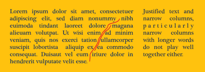 If you don’t want to change the text-alignment of your text to justify, your other options are left, right, or center. When text is centered or aligned along the left or right edge of the page or column, the spacing between the characters and words remains constant. The river problem can occur with any text block, but it’s much less likely to cause legibility issues in text that’s centered, or justified on one side only.
If you want to see how some HTML text will look with different leading, tracking, and alignment settings applied, a great tool to check out is Marko Dugonji’s Typetester.
Typetester gives you an interface to which you can apply any conceivable text options to three columns of text; you can then compare the displays side by side. Once you have some settings you like, you can click on the Tools tab to obtain the CSS that creates the effect.
What text spacing tips do you use to sharpen up your designs? Share them in the comments.
If you don’t want to change the text-alignment of your text to justify, your other options are left, right, or center. When text is centered or aligned along the left or right edge of the page or column, the spacing between the characters and words remains constant. The river problem can occur with any text block, but it’s much less likely to cause legibility issues in text that’s centered, or justified on one side only.
If you want to see how some HTML text will look with different leading, tracking, and alignment settings applied, a great tool to check out is Marko Dugonji’s Typetester.
Typetester gives you an interface to which you can apply any conceivable text options to three columns of text; you can then compare the displays side by side. Once you have some settings you like, you can click on the Tools tab to obtain the CSS that creates the effect.
What text spacing tips do you use to sharpen up your designs? Share them in the comments.
Frequently Asked Questions (FAQs) on Text Spacing Principles
What is the importance of text spacing in design?
Text spacing is a crucial aspect of design that significantly impacts readability and aesthetics. Proper text spacing ensures that the content is easy to read and visually appealing. It helps in guiding the reader’s eye through the text, making the content more digestible. It also contributes to the overall look and feel of the design, enhancing its professional appeal.
How does line spacing affect readability?
Line spacing, also known as leading, plays a significant role in readability. If the lines of text are too close together, it can make the content appear dense and intimidating, discouraging the reader. On the other hand, if the lines are too far apart, it can disrupt the reader’s flow and make it difficult to follow the text. Therefore, finding the right balance in line spacing is essential for optimal readability.
What is the difference between kerning and tracking?
Kerning and tracking are both techniques used to adjust the space between characters in a text. However, they are applied differently. Kerning refers to the adjustment of space between two specific characters to correct visually uneven spacing. On the other hand, tracking involves adjusting the spacing uniformly over a range of characters to change the overall density or appearance of a block of text.
How can I adjust the leading in my design?
Leading can be adjusted in most design and word processing software. In general, you can find the option to adjust leading in the typography or text settings. The exact method may vary depending on the software you are using. It’s important to experiment with different leading values to find what works best for your specific design and content.
What is the ideal line spacing for readability?
The ideal line spacing for readability can vary depending on the typeface and size of the text. However, a general rule of thumb is to set the line spacing at around 130%-150% of the text size. This tends to provide a good balance, making the text easy to read without appearing too sparse.
How does text spacing contribute to the overall design?
Text spacing contributes to the overall design by affecting the layout, readability, and visual appeal of the content. It helps in creating a clean and organized look, guiding the reader’s eye through the design, and enhancing the overall aesthetic appeal. It’s a subtle yet powerful tool in the hands of a designer.
What is the role of white space in text spacing?
White space, or the empty space around and between elements in a design, plays a crucial role in text spacing. It helps in separating different elements, making the content easier to digest. It also contributes to the overall aesthetic appeal of the design, creating a sense of balance and harmony.
How does text spacing affect the hierarchy in design?
Text spacing can be used effectively to establish a visual hierarchy in design. By varying the spacing between different elements, you can guide the reader’s eye and highlight the most important parts of your content. This can help in making your design more intuitive and easy to understand.
What are some common mistakes to avoid in text spacing?
Some common mistakes to avoid in text spacing include using too little or too much space, not considering the relationship between different elements, and not maintaining consistency in spacing. These mistakes can make your content difficult to read and your design appear unprofessional.
How can I improve my skills in text spacing?
Improving your skills in text spacing involves understanding the basic principles, practicing regularly, and learning from others. You can start by studying well-designed materials and observing how they use text spacing. Experiment with different techniques in your own designs and seek feedback from others. There are also many resources available online, including tutorials, courses, and articles, that can help you learn more about this important aspect of design.
 Jason Beaird
Jason Beaird is a designer and front-end developer with over ten years of experience working on a wide range of award-winning web projects. With a background in graphic design and a passion for web standards, he’s always looking for accessible ways to make the Web a more beautiful place. When he’s not pushing pixels in Photoshop or tinkering with markup, Jason loves sharing his passion for the Web with others.